No products in the cart.
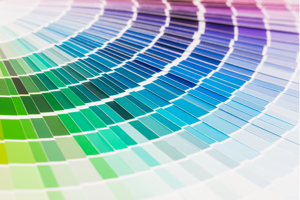
What does “getting the colors right” really mean when you design packaging? You know from experience that it means not only getting it right on the screen but when printed, not only when printed once but every time, and not only by one printer but all your suppliers wherever they are located. Whether used on a logo, package, or instruction brochure, the right color is essential to the brand because “brand” means continuity, consistency, and quality. At CarePac, we use the Pantone Color system to get your bags done right.
Color interpretation
For all our personal familiarity with color, of course—its emotional meaning to us, its stimulative qualities, and its evocation of memories—we all perceive colors slightly differently. Most often it is not the basic colors but the huge variations in shades that drive those disagreements, even arguments, about what color we are seeing. There are now thousands of colors available to use in creating packaging, so there is plenty of room for diverging perceptions.
So the challenge of getting the colors right is not when we are standing beside someone and looking at a swatch, but, instead, conveying that precise color to multiple printers, often in different countries, sometimes in different languages. And doing so over decades of changes in our suppliers.
These are the kind of challenges that gave rise to the Pantone color sets and the systems for using them in any possible context. Pantone identifies thousands of colors, in different sets for different applications, by letters and numbers to create a unique tag for every color.


Multiple materials
These different color sets specify and communicate color across different industries. For example, the Pantone Plus Series is based on graphic/printing ink and for half-a-century has constituted the Pantone Matching System (PMS). Each of the colors is specified with numbers and a suffix (for example, “C” or “U” to specify if the color is printed on coated or uncoated paper). Depending upon the paper, a Pantone color can look quite different when printed. The number and the suffix get the color right.
The only exception to this number-and-suffix system are the 18 Pantone Basic Colors (base inks) used to mix the rest of the colors. The basic colors have names such as Pantone Yellow. Another Pantone color system well worth mentioning is the Fashion Home + Interior Guides (FHI). The system is based on specifying textiles: paper (TPG) or cotton (TCX). Again, depending upon the material you are working with, you would choose the guide on which you want to visually see the color.
Thus, when you work with multiple materials and naturally want to achieve precisely the right color in final production, the pantone number makes possible complete satisfaction with the results. The reason is that the Pantone physical color reference guides, and also the Pantone digital tools for searches and matching, let you see before the printing and manufacturing process begins precisely the color you will get—and convey your choice unmistakably to everyone in the production process.
Multiple suppliers
Using different suppliers to produce your packaging and other brand materials inevitable entails some variations in the equipment and processes that will be involved. That means that the resulting color can be considerably different from supplier to supplier. The Pantone system of color tools—physical, digital, and cloud-based—enables you to specify unambiguously a single desired outcome for all those involved. The number given to any color tells the same story in every language, every culture.
Of course, if you can assign your production to a single supplier and use that supplier repeatedly, the process of communication and the opportunities for inconsistent results are greatly reduced. But for most companies the printing of a logo, packaging, and other brand-related materials must be repeated constantly. And as the company grows and production runs become larger and larger—and perhaps are most efficiently done in other countries—the color problem arises, again. Color measurement and evaluation tools from Pantone and its parent company, X-Rite, make it possible to achieve consistent color from run to run, no matter when or where it is produced. Pantone’s color measurement and evaluation tools mean precision and consistency in your color run after run in any location.
Pantones and digital printing
It is highly likely that your design process, today, is in large measure digital whether you are creating real-world or online designs. That means, you want to preserve color accuracy and consistency in moving between digital and physical environments. Pantone has the tools you need to move easily and confidently between those two worlds—to translate a brand’s printed colors into a website design and know how your website designs will look in physical form. Pantone Connect is a new digital platform that gives you immediate access to every Pantone Color in every Pantone Library. The Pantone color sets we discussed—and many more—are there.
Onscreen color is produced by a red-green-blue (RGB) system, mixing those primary colors to create others. But when you print from the screen, the resulting colors are produced by CMYK, which is called “four-color process” because it uses Cyan (C), Magenta (M), Yellow (Y) and Black (K). The problem is that RGB and CMYK colors do not precisely match. Pantone has all the tools you need to make the translation again and again to achieve the same results in both environments.
At Carepac we rely on Pantone
At Carepac, we use the Pantone color systems and tools in designing our bags for the spectrum of companies that seek excellent, consistent, distinctive packaging for their products.
Your next step in getting the color for your packaging every time is to reached out to the Carepac team of bag experts for all the support you need on art design. There is a Carepac bag for virtually any product you want to package efficiently, imaginatively, and for optimal marketing impact and sales. We are ready to discuss your individual needs at every step of the package planning, design, and production process.
Be sure to check back here for the latest information, insights, and updates.
Meanwhile, don’t be a stranger. Follow us any day on Twitter for new ideas, offers, and advice on getting your product in the right package.
Tags

