No products in the cart.
Spice Packaging Design
Spices add flavor to our life. They make food exciting, they elevate basic cooking, and they open doors to new cuisines and cultures. Help them add flavor to their own life by crafting the perfect spice packaging design that makes them want to grab it right off the shelf and step into the kitchen. Looking for five tips for creating packages that sell? Here you go!
Spice Packaging Design Tips
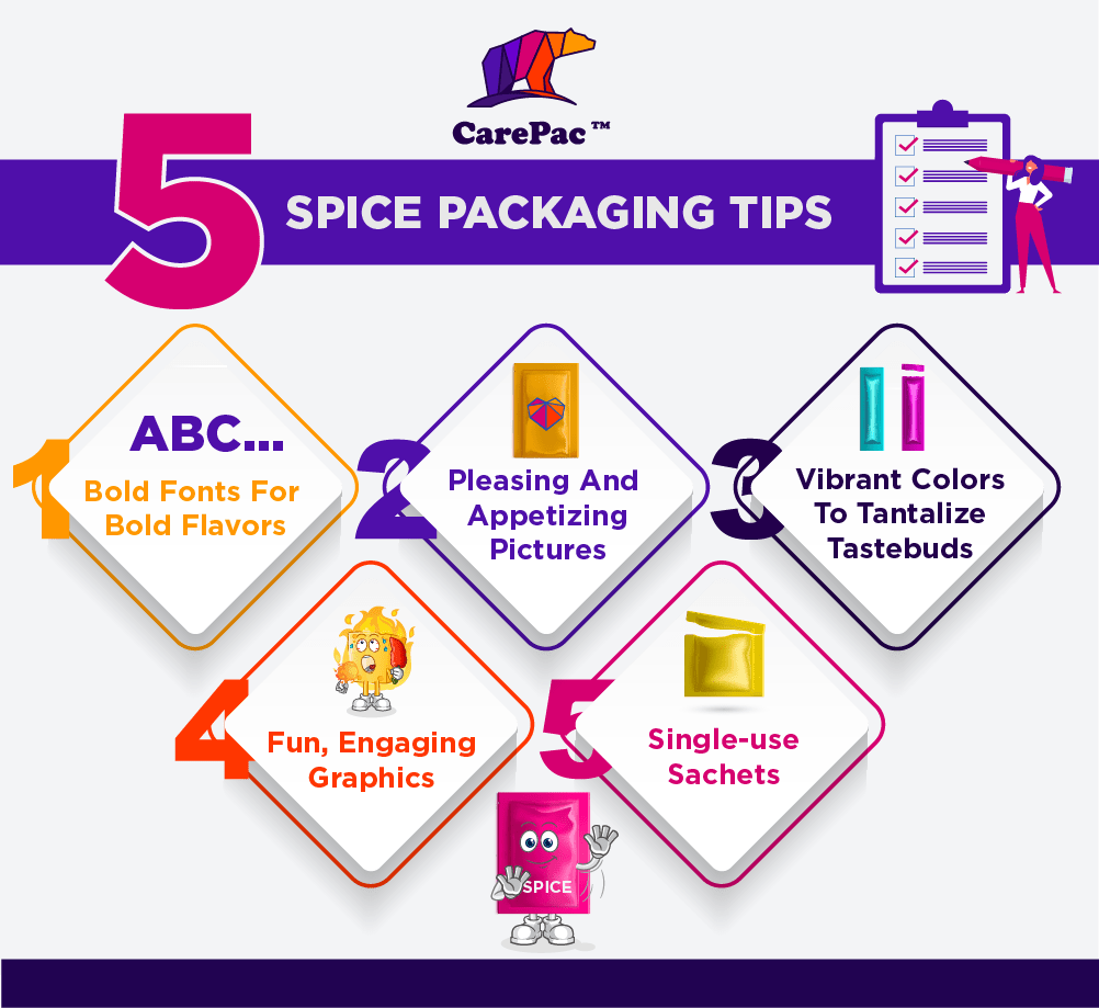

1. Bold fonts for bold food flavors.
Everything about selling flavor has to stand out, and the font choice is no exception! Fonts should be bold, playful, fun, and energetic. Serifs, san serifs, scripts, and a combination of the three are all welcome in exciting but still legible fonts. It's an opportunity to pick a font that would otherwise be taboo for most products. Let the fonts play a significant visual role and add plenty of variety. Flavors, brand names, ingredients, and nutritional information can be displayed in a way that is crafty, unique, and aesthetically pleasing.
2. Pleasing and appetizing pictures.
When we eat, we enjoy food with more than just our sense of taste. We smell as it cooks, we feel the texture as we chew, and we see how yummy and appetizing they look. Selling a spice packet is easier when you have appetizing images of the finished product, so consumers have an immediate idea of how to use it as well as a newly whetted appetite. Likewise, you can also incorporate images of what the spices look like in the packet or even include a viewing window in the package so they can see it directly. They can see it and then visualize how they might use it in their own cooking or imagine how it might taste rubbed on some chicken or tossed in with vegetables, or sprinkled over a taco.
3. Vibrant colors to tantalize tastebuds.
This trend goes right alongside the suggestion regarding font choices. Generally, the more colorful a plate is, the tastier we often presume it to be. This is true for the packaging of your spice or mix as well. Incorporate fun, exciting colors that catch their eye and draw in your consumer. Add some flair to dinner with this delicious mix that will easily elevate your cooking. Keep them bright and vibrant, but still within a uniform color palette. Avoid chaos, but don't be afraid to be loud and bold with the colors.
4. Pepper in fun, engaging graphics.
Consumers want to feel the excitement that comes with cooking and eating delicious food. Sell them on your product with fun and engaging graphics that decorate the package itself. Be creative with logos and design elements or incorporate graphics that relate to the dish or the culinary origins of whatever your mix pack involves.
5. Make good use of single-use sachets.
Single-use sachets make trying something new easier because they don't bring the commitment of having a 50-serving pack of the spice blend. They also make it easier on the consumer, who can simply pour the packet into whatever they're making without needing to measure it out. They're a product of convenience, and most modern home cooks looking to buy flavor are looking for a convenient way to do it. If you aren't going to use a single-use sachet, however, make sure to incorporate some way of closing the container, whether it's a resealable zip-top or a fold-over box-top. Even though seasonings are dried and generally have a longer shelf life than other products, consumers want to ensure they preserve the freshness of their purchase!

1. A Dozen Cousins
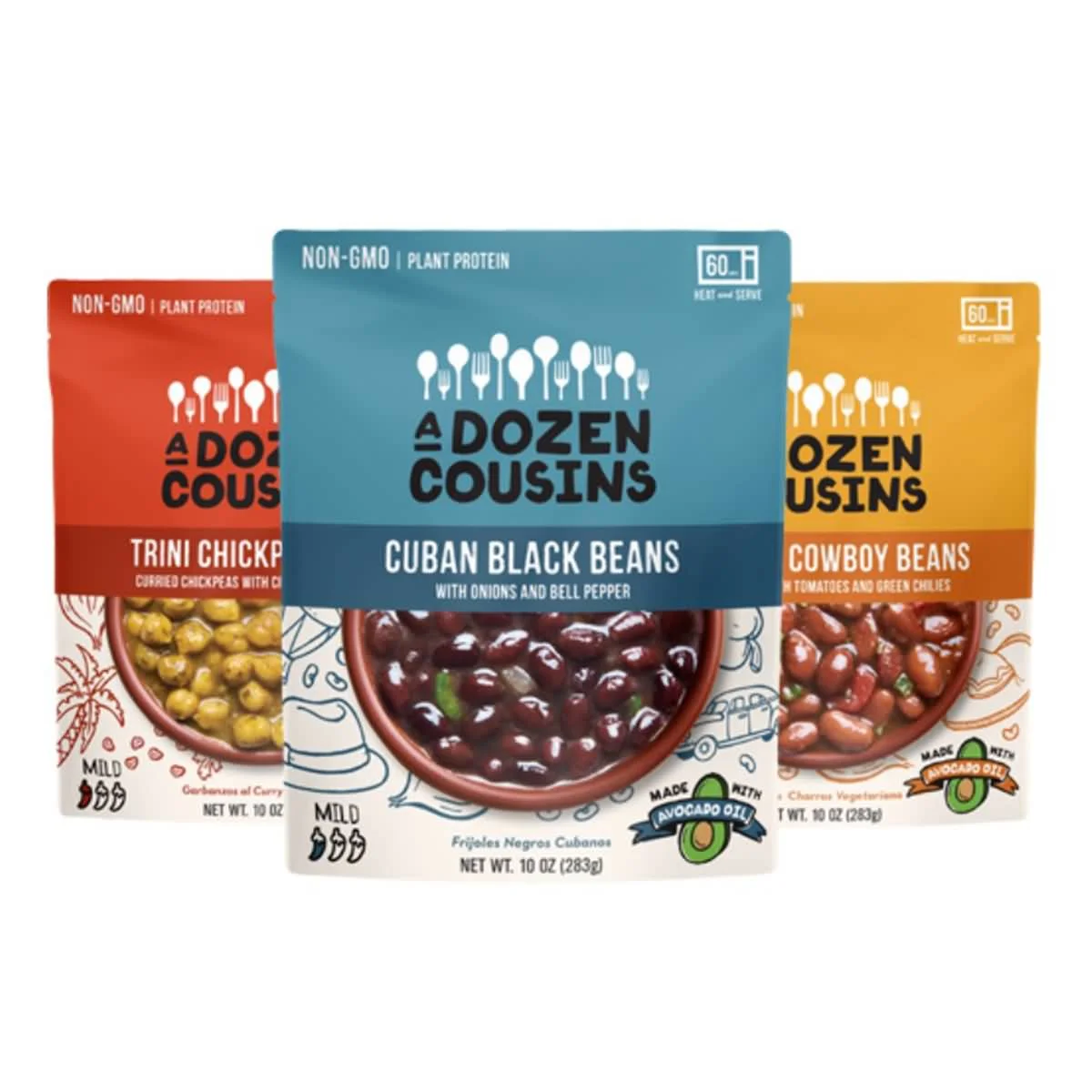
A Dozen Cousins creates flavored food, like rice pouches, but they also sell their own blend of seasoning sauce mixes. They sell single-use packs in groups of ten or more and include images of what the seasoning sauce is used for right on the front. They immediately look tasty and delicious. They also incorporate fun, cute graphics around the packaging and in creative ways like to denote the type of product and spiciness level. On these packets alone, there are five different fonts used throughout.

2. Iya Foods
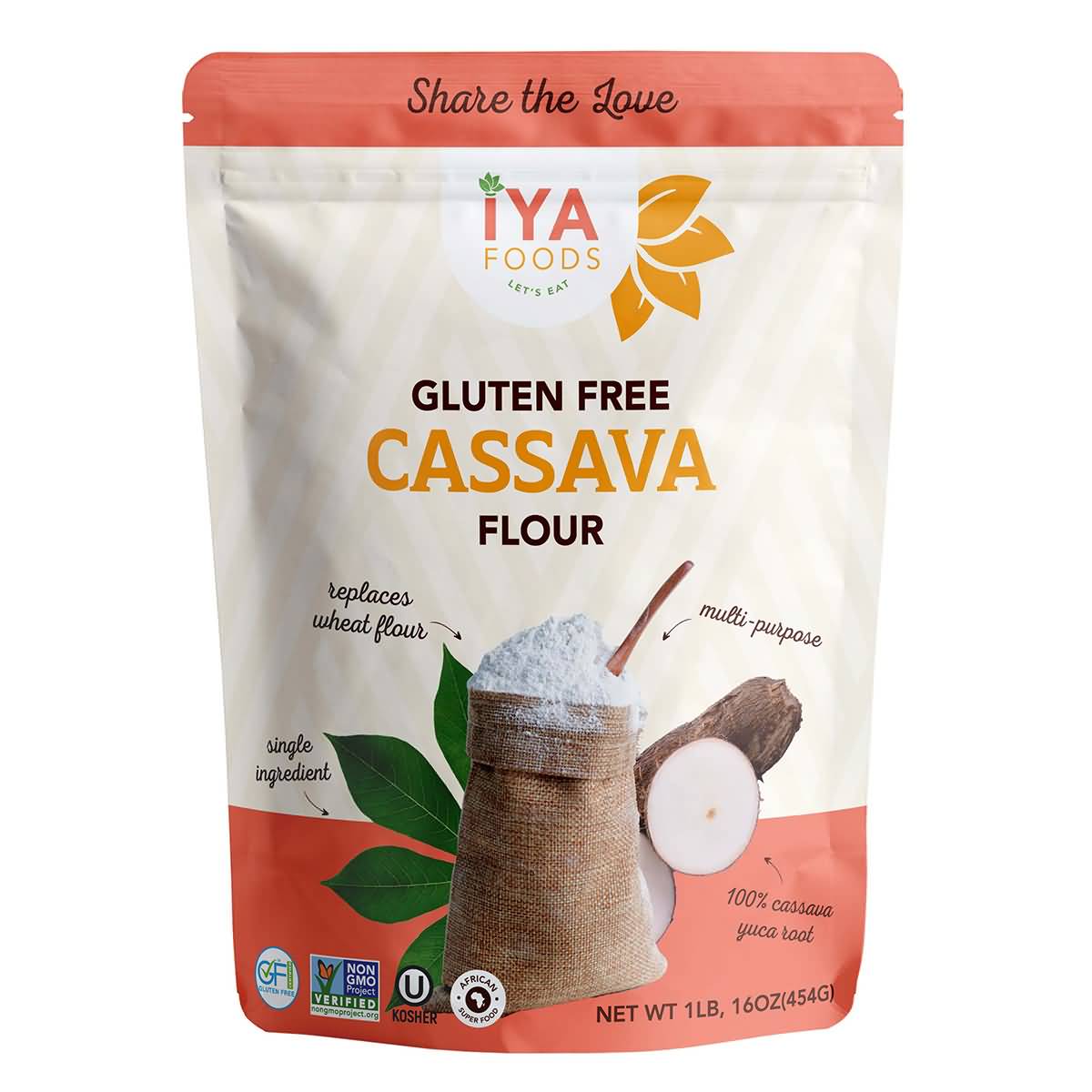
Iya Foods uses a few of the items from the trending list, starting with a number of fonts to bring some flair and variety. They aren’t the most exciting of fonts, but they give a touch of enthusiasm to the package that would otherwise be missing with one uniform font. Each flavor pack has a different color on the top and bottom and for the flavor title (e.g., Pepper Soup). They decorate the package with plenty of ingredients, namely, what would be used in the spice packet, so you have familiarity with the ingredients right off the bat. It's a multi-serving packet, but the flexible packaging and resealable top are a must.

3. Flavor Seed
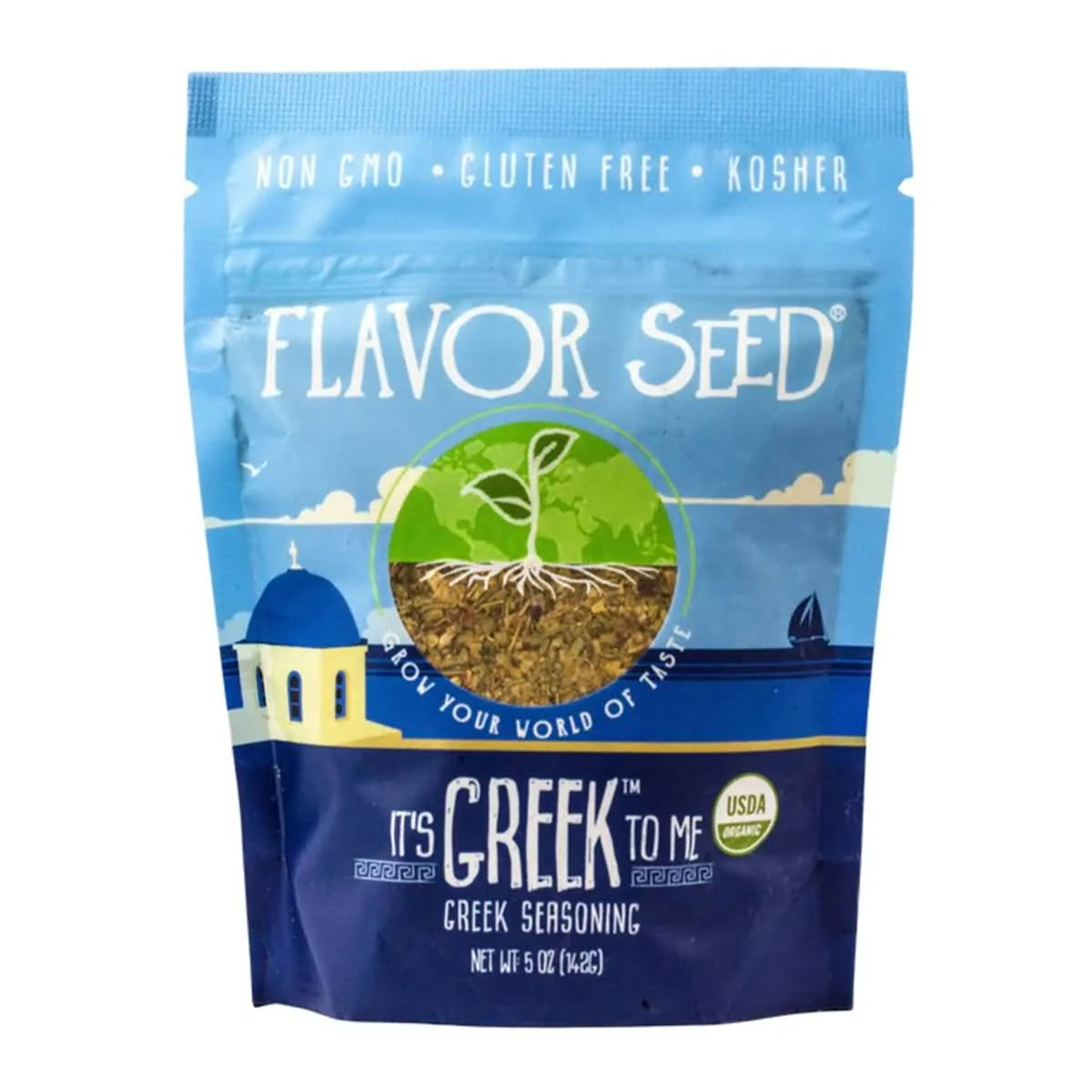
Flavor Seed starts off its packaging with bright, friendly, welcoming shades of blue, emblematic of the blue skies and blue ocean waters surrounding much of Greece. This Greek seasoning has a graphic of the iconic white structures famous on islands like Mykonos and Santorini, and the fonts are fun and unique and placed all throughout the package. It is also a multi-use package but has the flavor seal to lock in and preserve the freshness of the herbs and spices used.

4. Milk Street
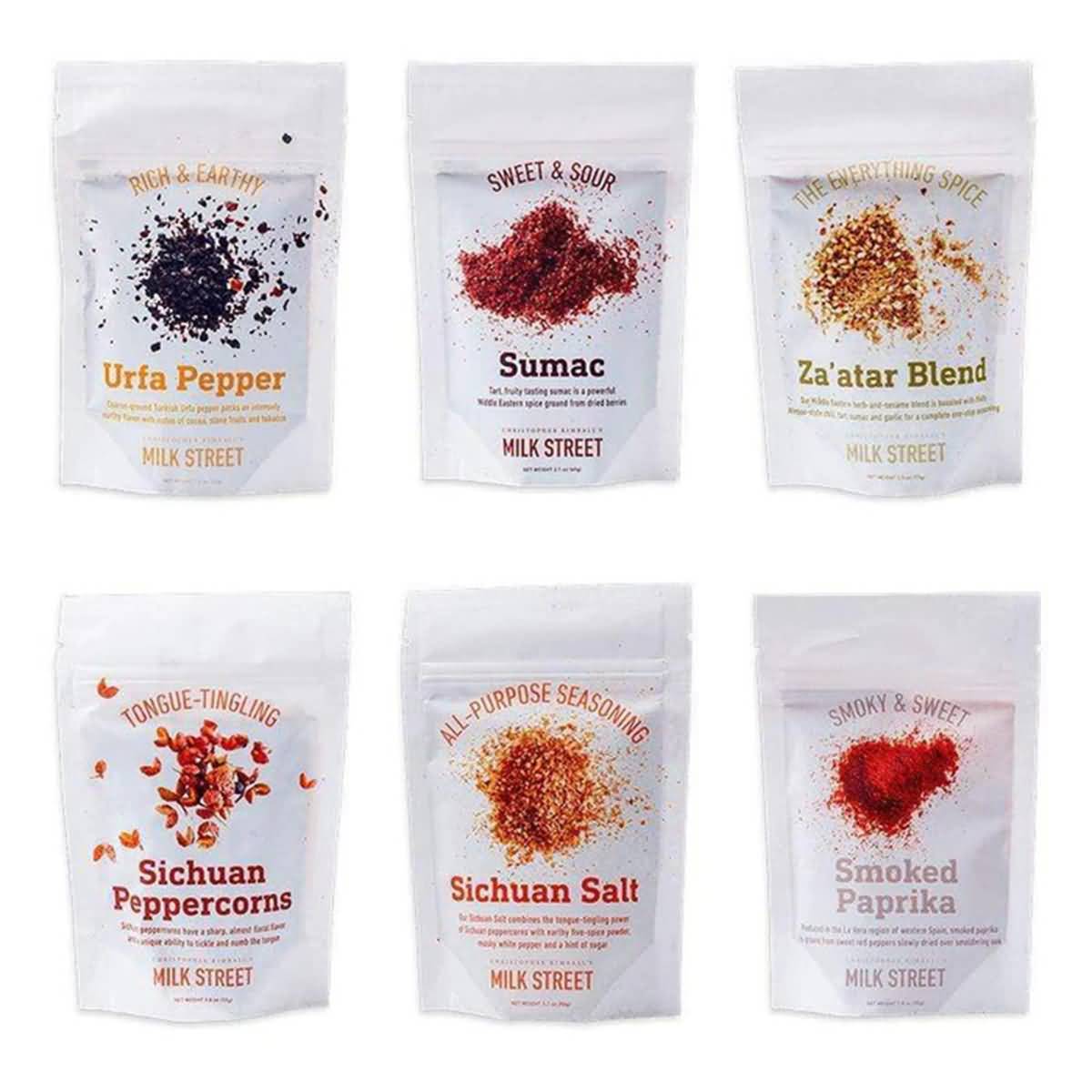
Milk Street uses white space effectively on its packaging, keeping it white and clean to place greater emphasis and attention on the name of the seasoning and the images as well. The three-font combination is consistent across the different packages, with one font for the name, another for the brief description (e.g., "Tongue-Tingling"), and a third for the information. The spices look visually powerful, displayed on top of the all-white wrap. The packages are also resealable and stand-up pouches, which make them great for storing in kitchen cupboards.

5. Spice Cartel
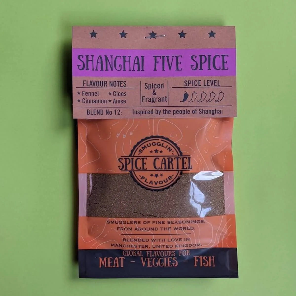
The Spice Cartel has a great branding concept that feels natural and earth-bound, with playful but legible fonts, a creative name, a viewing window to view the exact product you're buying, and plenty of essential information on the packet, like spice level, flavor notes, and taste.

6. Siete
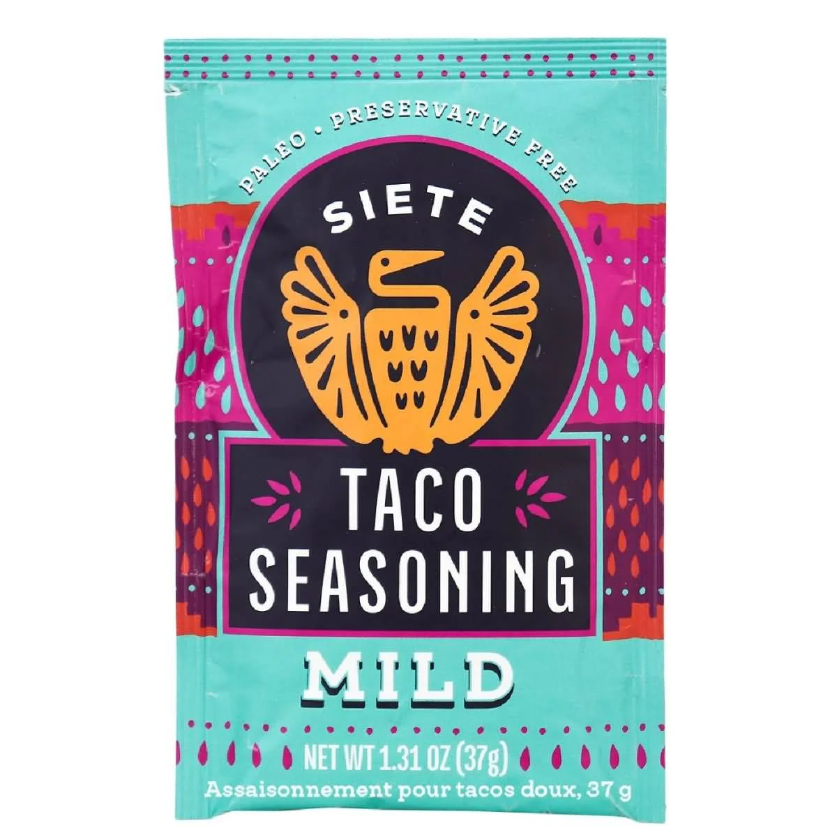
Siete Family Foods sells better-for-your Mexican-American foods, including grain-free tortillas and chips, paleo seasonings, and dairy-free queso for those with sensitive food allergies. Their taco seasonings come in a range of spice levels and purposes, but all have their signature Siete bird logo and bright, colorful packaging that emphasizes the bright, vivid flavors in their foods. The matte packaging makes their products look slick and smooth without dulling the colors at all. They have their signature fonts as well, which are fun and creative. They're also single-use packets with a clear designation on how to use them, which make them nice for those looking for convenience!

7. Sugar Roti
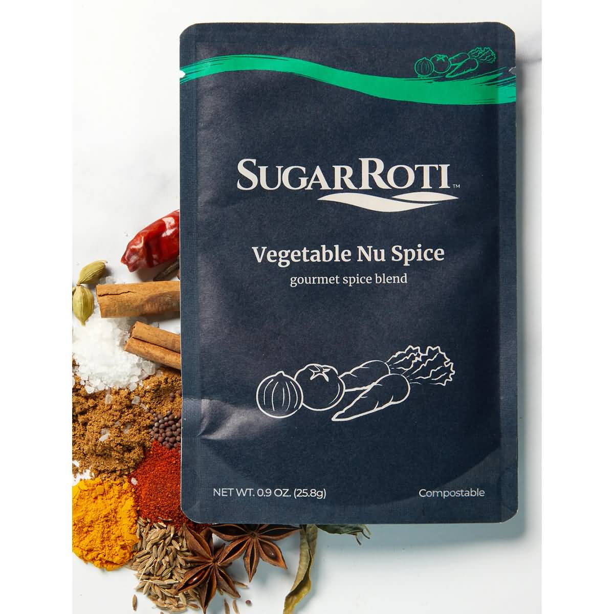
Sugar Roti is a great example of a company that strays from the trends but still has a powerful impact and uses subtlety in an appealing way in their spice packaging designs. Their matte, flexible packaging contains minimal graphics, with a single symbolic logo on the front, along with a flavor, the logo, and unique color to denote the flavor. There isn't much variety, but the consistency is clean and refined. The single-use, flexible packages are convenient and easy to use when cooking, which is a major bonus.
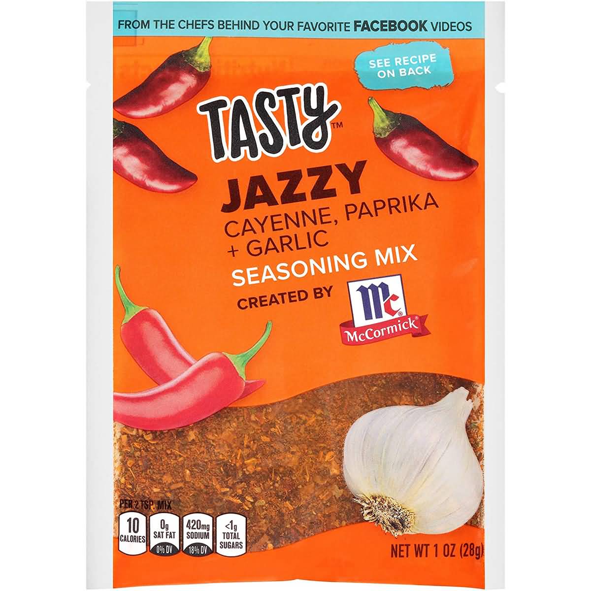

8. Tasty
This spice packaging isn't the cleanest of packaging, but it hits a lot of points well. There's the blending of fun, energetic fonts, along with a bright color palette of orange and blue. They also include graphics of the ingredients, like garlic and cayenne peppers. The viewing window is the biggest bonus to their packaging, which looks distinctly red-orange and very flavorful. The flexible packaging is single-use, making it easy for those cooking, too.
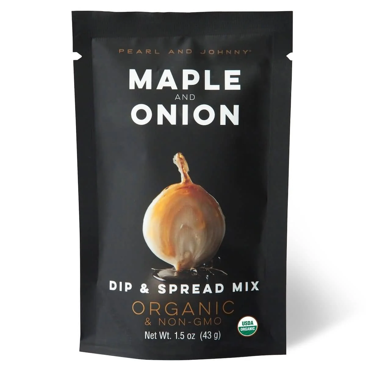

9. Pearl and Johnny
The Pearl and Johnny dip and spread mix is another example of a company that strays from the formula a bit, although their packaging looks a bit better than SugarRoti. The matte finish of their flexible packaging looks bold, especially when the graphics of the chili and lime are placed in the center with a reflection beneath. It looks rich and bold in flavor. The combination of bold and thin fonts is also elegant alongside the rest of the packaging. It's a single-use sachet with an easy-tear top, which is perfect for throwing together a delicious dip in little time.
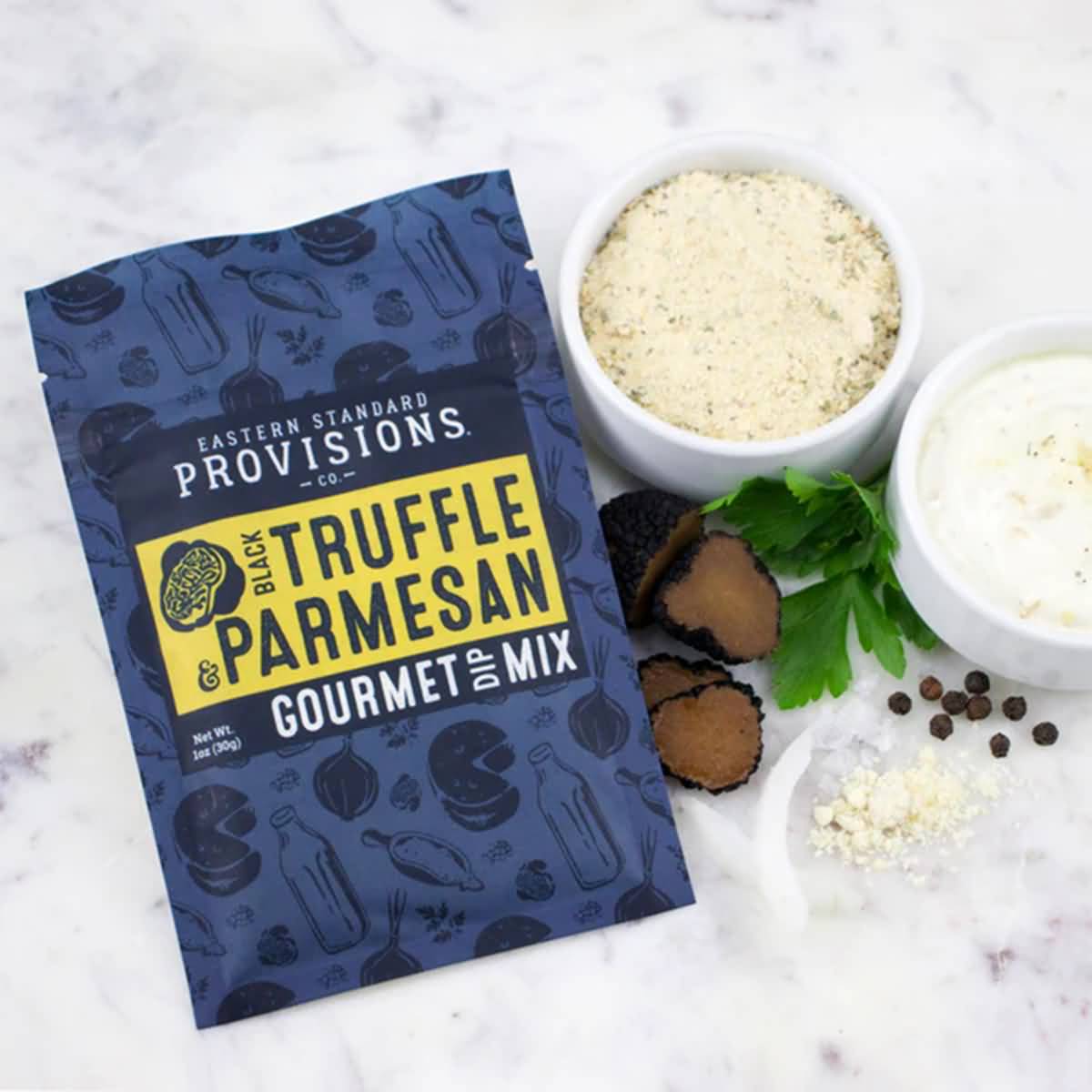

10. Eastern Standard Provisions
Eastern Standard Provisions sells gourmet food products like jams, waffles, toppings, and pretzels. Their gourmet Black Truffle and Parmesan dip has to look gourmet as the name suggests, and an elegant blue is just the color to do so. Their packages are resealable and have an easy-to-tear top. It's a flexible package that makes it easy to work with and use. The royal blue package is emboldened with a yellow block denoting the flavor and is covered in little graphics relating to the product. Their font combinations aren't as loud or bold as some of the others on this list, but the choices here go better with the gourmet product line.
Care Pac makes deciding on the right spice packaging design easy. With customizable pouches in a variety of styles, you can select the ideal pouch that works with your product and appeals to your target demographic. Find out more about our packaging for seasonings, spices, rubs, and more. Our helpful packaging designers are on stand by to help you start your spices packaging. Get started now!
Tags

