No products in the cart.
Understanding Neutral Color Palettes: A Guide for Packaging Designers
What is a color scheme?
A color scheme refers to a combination of soft or rich colors that work together to make a color palette. The colors in a color palette use color theory and color psychology to turn on certain moods in your customers, and using a color palette takes a lot of the guesswork out of thinking up a color scheme for your advertising, room design, or print project.
By using a specific color scheme or color palette, your design team already knows that a certain shade of blue works well when used in the same space or room as a particular navy or green. No need for market testing or research and you won't need to paint a room in a sample color to find the perfect, dreamy shades or gray, green, or tan you're looking for.
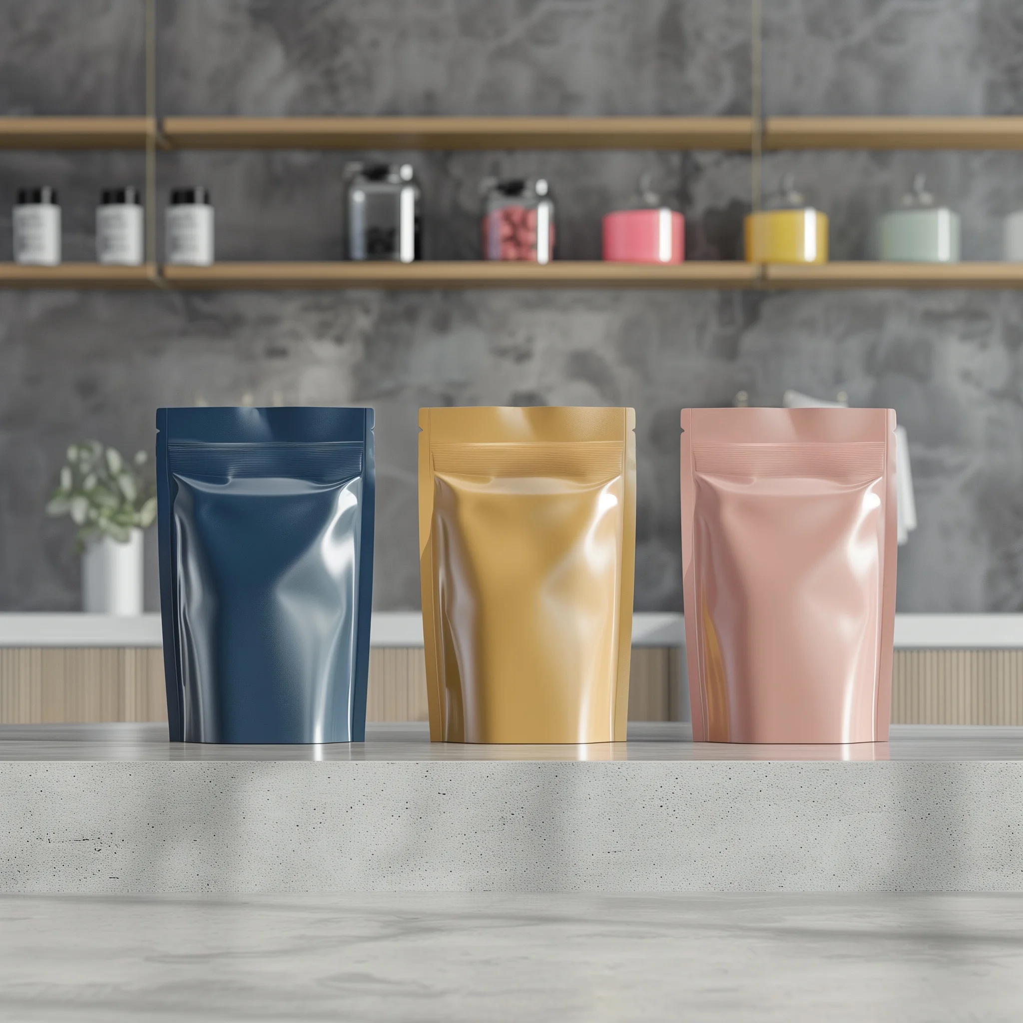
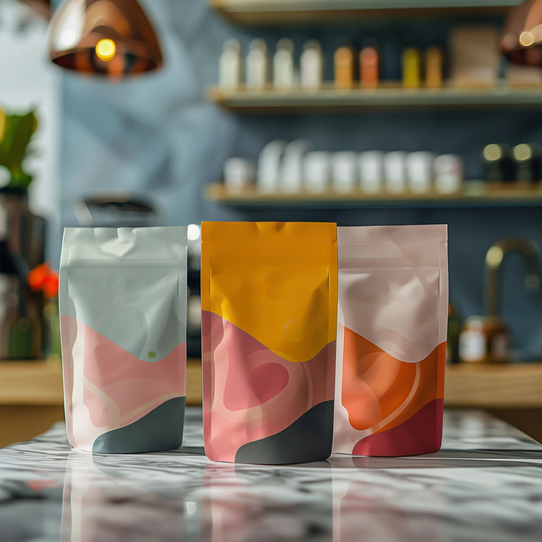
Though a color palette can incorporate bright shades and tones, like bright pink, orange, neon green, and other colors, this blog will focus on the muted neutrals found in a neutral color palette. The colors found in a neutral color palette include subtle, muted, warm, and neutral colors and shades like beige, wood, stone, slate, gray, cream, tan, taupe, and light blue, green, and navy.
As you can see, if you opt for a neutral color palette for your photo, art, or packaging, there's a wide range of soft and rich neutrals to explore.


What is a neutral color palette?
A neutral color palette is exactly what it sounds like: it's a color palette that incorporates neutral colors and winter or wood tones. These color palettes invoke a cozy feel and a dreamy or airy vibe. Neutral colors used in a clothing outfit are flattering on many skin types and are quite dreamy and pleasing to the eye. This color palette is often incorporated into art and interior design projects, as neutral colors are luxurious and help create a sense of calm.
Many individuals claim that a neutral color palette limits personality in design, but others claim that it brings out the natural beauty and life in a space and helps provide balance. It can also act as an anchor or base for other more prominent colors used elsewhere in the room or space.
Implementing neutral colors in packaging design
Incorporating a neutral palette into your packaging design is a great choice because it can fit a variety of applications, lighting, and mediums. Sometimes more is less! Similar to monochromatic color schemes used in wardrobe capsules, neutral color schemes evoke a sense of calm and serenity, like a snowy winter day. If you're packaging products that will be used in a spa or beauty shop, for example, going for something a bit more soft and muted can be a great choice.
It's important to note that a color palette is not intended to be restrictive; rather, it's a way for designers to easily find soft colors and shades with similar undertones that will work well together. By relying on a color palette, a designer will know exactly which shade of muted gray works well with a specific hue of green. Here are a few tips for finding neutrals that look great in all types of lighting:

Wood tones create a Scandinavian feel
Wood tones (warm brown, blue gray, and white) can help bring a "coastal chic" or Scandinavian feel to your packaging. By incorporating different patterns into your packaging, you can take it a step further and design a truly stunning package for your product.
Light blues and grays create an airy vibe
If you want your packaging to invoke dreamy feelings, you cannot go wrong with a classic mix of shades of light blue and grays. These colors provide just enough contrast to stand out from each other, but won't confuse or overwhelm your customers. This color palette is a classic.
Soft gray and tan make people feel at home
If you're packaging a product that will be used at home, soft neutrals like light gray, beige, pale orange, and tan will make people feel warm and cozy. These shades can be used with other colors, like cream and off-white beiges, to make a look that's versatile and has depth.

How CarePac can help
At CarePac, we live and breathe packaging design, and that includes understanding the warm colors of a neutral color palette and how they work together. Though we can fully customize our packaging to incorporate a bright color palette (i.e., deeper beige, orange, or green), we understand that this isn't the right concept for all brands.
If you prefer a neutral color palette and would like to incorporate the perfect and complementary neutral hues of beige, light orange, green, and other natural colors found in the world around us, we're ready to help you design the perfect packaging.
If you're looking for the best packaging provider, your search is over. Get in touch by filling out a form or calling us directly, and we'll help you design the perfect packaging for your product, with just enough contrast.
FAQs about neutral color palettes
Here are some common questions we receive about our design process and neutral color palettes:
What are neutral color palettes?
Neutral color palettes are a color scheme that includes soft neutral colors, like light green, light orange, light beige, and other soft and neutral colors that invoke feelings of winter time.
Is beige included in neutral color palettes?
Although most people think beige isn't a "color" (the way green or orange is), in the design world, beige is included in a neutral color scheme.
Is green considered a neutral?
When it comes to neutrals, it's less about colors and more about shades. For example, a pale green would certainly be lumped in with the other neutrals, but a bright neon green would not.

