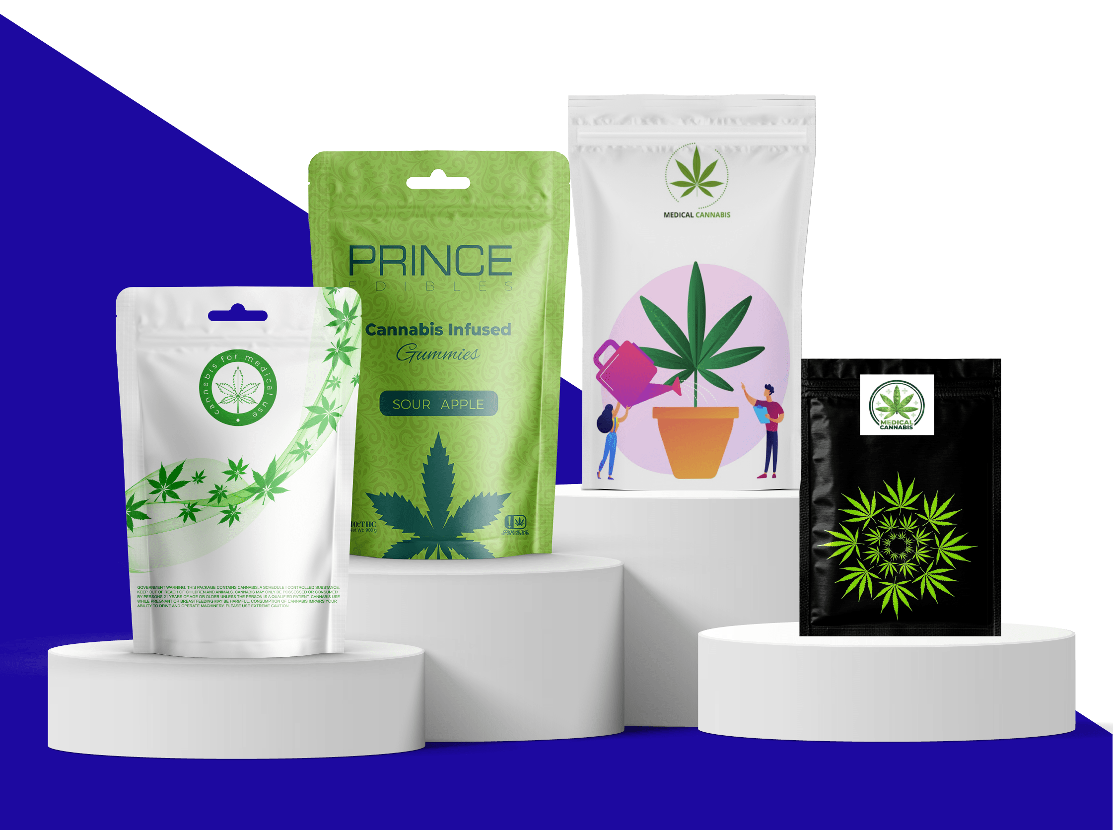
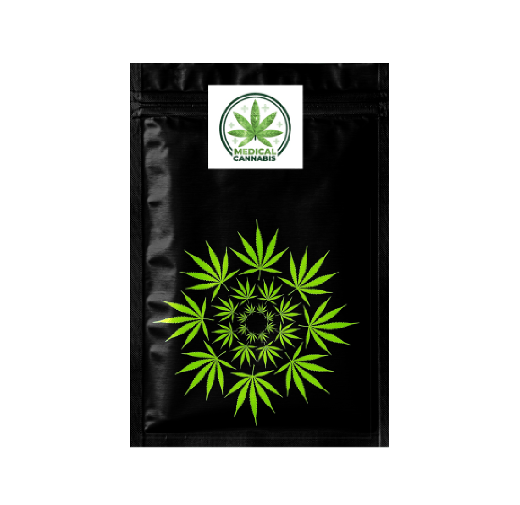
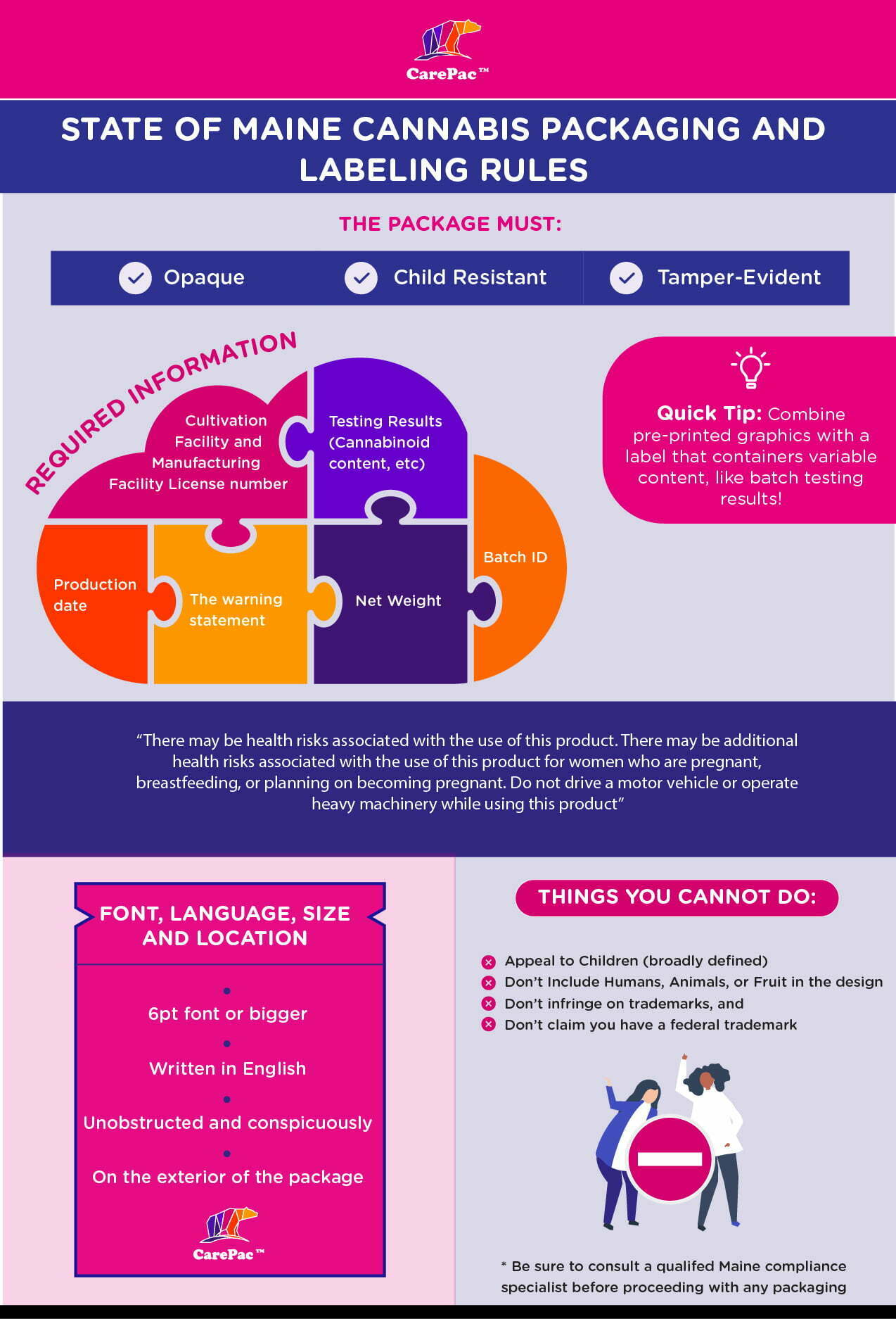
5 Cannabis packaging tips 02 Cannabis Pouch Designs
Packaging Design

Cannabis Pouch Designs

Cannabis Pouch Designs

Cannabis can be a tricky business to enter into. With more and more states legalizing its use, 

brands know some areas are oversaturated with competition while others are ready for shops 

to start opening up. To successfully brand, market, and sell your designer weed brand, your cannabis packaging design is key. 


Cannabis Pouch Designs & Marijuana Bag Ideas for Weed


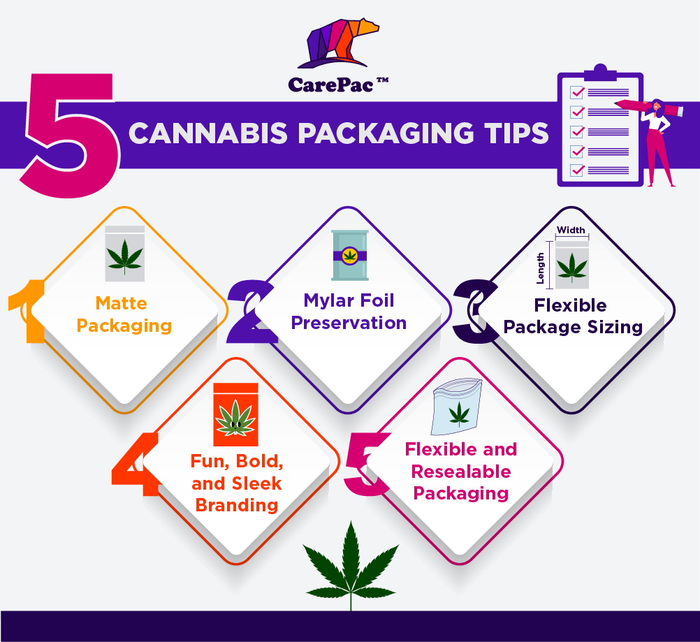
Here are five packaging tips from cannabis professionals that will boost your chances in the 

market. 
5 Cannabis packaging tips 02 Cannabis Pouch Designs


1. Matte Packaging Design for Marijuana & Cannabis

Matte colors, and, in particular, matte black, are among the most popular cannabis packaging trends. It's a major trend among both big and little cannabis brands alike. Matte black is easy to spot on shelves across stores everywhere. The sleek finished look pairs well with the modern, clean, and futuristic styles of many up-and-coming designer weed shops. Matte blacks paired with one bright, vivid color is attractive but refined at the same time. Matte finishes also add an elegant texture and a regal look to packaging, whether it’s black or another color.

2. Mylar Foil Preservation for Weed & Cannabis

Mylar foil packaging is one of the biggest demands in the cannabis industry for a couple of reasons. The first reason is because the mylar foil is able to contain the very pungent odor that typically emanates from cannabis. It has a very distinct smell, and most customers are looking to be discreet with their products. If you can offer packaging that allows them to keep it in a purse or briefly store it in a car or in the cupboard without attracting unwanted attention from children or adults, it will help your product maintain an element of professionalism and desirability.

3. Custom Flexible Package Sizing for Weed Bags

Some cannabis companies sell a variety of products, from vape cartridges to flowers to pens, blunts, and gummies, while some sell just blunts and flowers. Regardless of what types of products you’re marketing for cannabis, consider the size of your packaging in how you market different types or quantities of products. Different sizes help customers become regulars because they can recognize the sizes and associate it with their familiar products. It also allows them to feel more discreet in their purchase or bold in their purchase (with a larger size package) and ultimately appeals to a wider variety of customer needs.

4. Print Fun, Bold, and Sleek Branding & Cannabis Labels

If you walk into some of the most popular cannabis shops today, shoppers will often find themselves in these hyper-modernized, almost futuristic facilities that feel clean, sharp, and almost like walking into some sort of health clinic. They have a similar aesthetic to the Apple stores we walk by in malls. With the increasing legalization of cannabis, many companies are looking to capitalize on the relaxed experience consumers desire, rather than the former days of what felt like shopping for illegal substances. It's about transparency, attractiveness, and crafting a full consumer experience from the moment they walk in the doors. Your packaging can easily reflect this attitude, with fun and unique packaging, bold and bright colors, and sleek styles that look as smooth as the cannabis feels.

5. Custom Flexible and Resealable Weed Packaging Bag

Flexible packaging is a big draw and works for everything from gummies to buds and flowers to cartridges. They're easy to toss away once you have what you need, but they're also easy to store in back pockets and purses or to keep up high on a shelf in the home. In addition to flexible packaging, resealable packaging is also essential. Keep edibles and flowers from drying out by allowing buyers to close their packages back up afterward. Some states and counties even require child-proof seals or a film to ensure that small children aren’t able to mistake a pack of THC gummies for their own sweet treats.

With these five trends in mind, check out these 10 brands and how they use the trends in their own print and packaging.
Leafs by Snoop

1. Leafs by Snoop

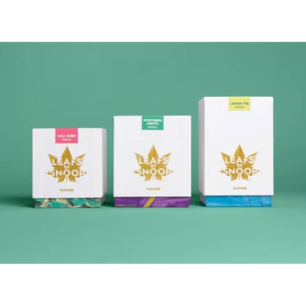
Leafs by Snoop is one of the biggest selling products on the market, for both the quality but also the branding. The small boxes are among our favorites- they're stylish and iconic, with minimal-color icons and graphics so shoppers can identify different products and ounce connotations. The packaging centers around the recognizable logo and is largely white, drawing attention to the logo. The only downside is the lack of flexible packaging. While boxes look nice and clean and professional, they’re also easy to smash, including in transit, leading to dented packaging on the shelves.
Rythm High CBD

2. Rythm

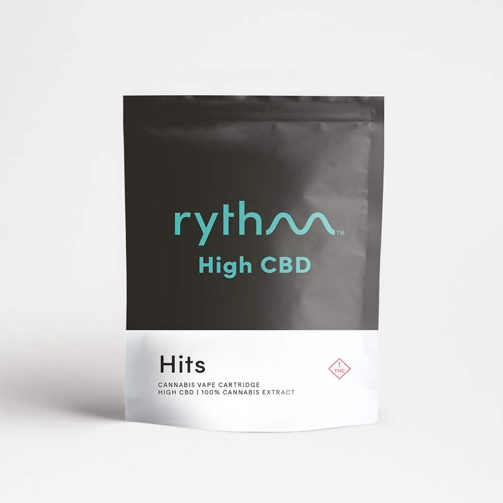
The logo for rythm does a lot of the work for their branding and their marijuana bags, with the smooth beat symbol taking over the ‘m’. They use the matte black packaging effectively, keeping the color palette minimal with a black and teal ensemble. There’s little else going on for a powerful minimalist appearance, but it all works well together.
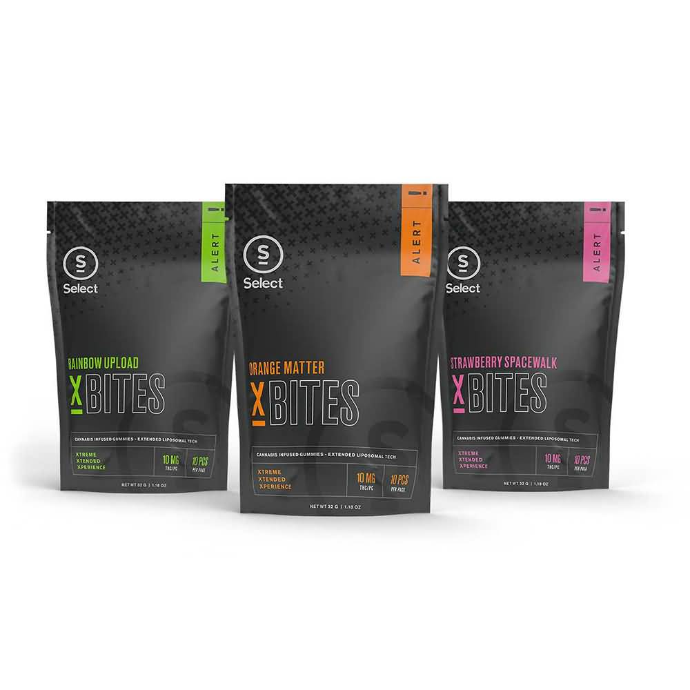
Select X Bites Cannabis Packaging

3. Select X Bites

Another great example of matte black packaging paired with a few select flavor/product colors is Select X Bites. The matte black sheen gives texture and a subdued, cool finish with small pops of color in the different flavors. The highlighter colors, green, orange, and pink are very minimal, as well. It's bold, flexible, and odor-blocking, as well.
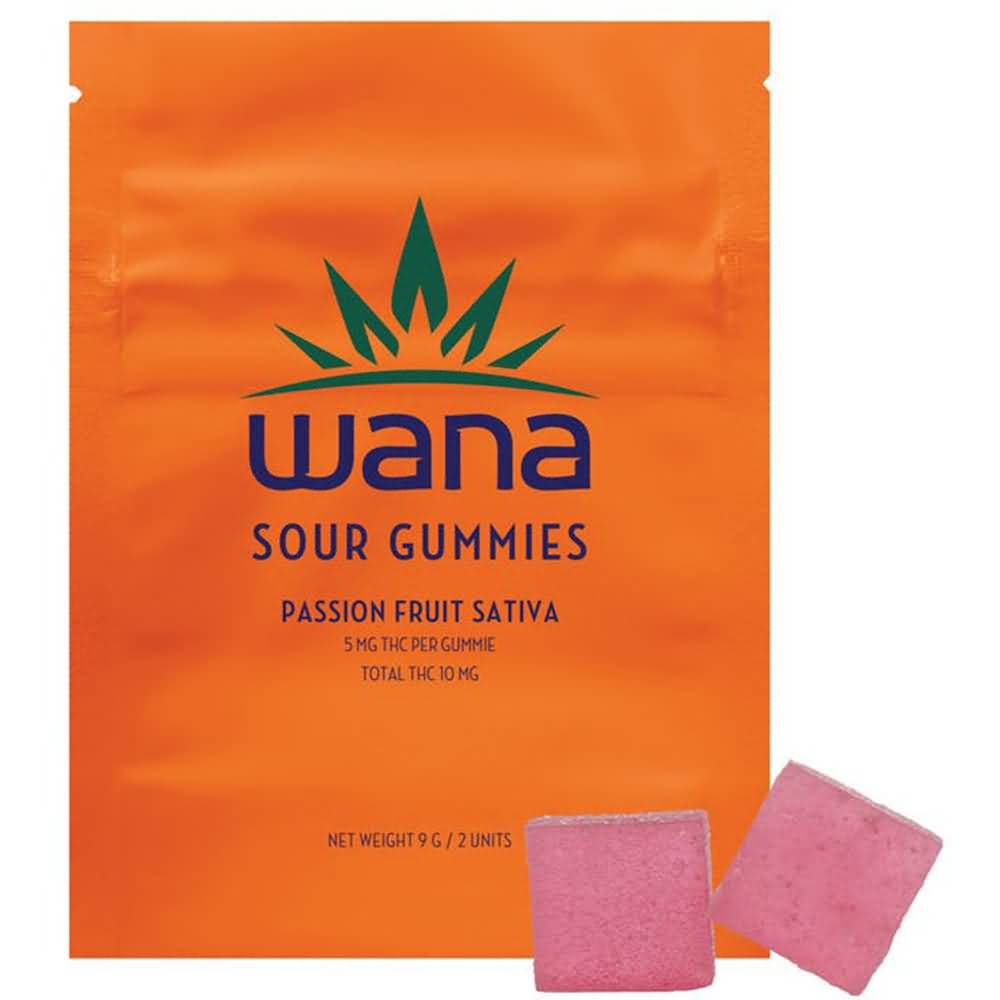
Wana Gummies Cannabis Packaging

4. Wana

Wana is a great example of how matte doesn’t always have to come in black, especially on cannabis bags. They use whole package matte colors in a monochromatic design that parallels the flavor of their gummies. Their fonts are unique and recognizable, which helps set themselves as a familiar brand to their consumers. The packages are also resealable, which is essential for saving the remaining gummies until it’s time to enjoy.
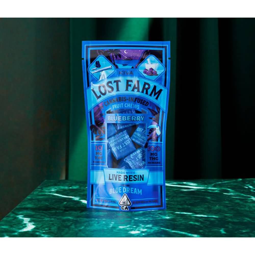
Lost Farm Cannabis Packaging

5. Lost Farm

The Lost Farm gummies and chews are sweet cannabis candies individually wrapped in their flexible, easy-to-open gloss package. The colors are bold and attractive and evoke smooth vibes, similar to how they market their product. They also use a viewing window to show the wrapped product in its packaging, which can be a great bonus for consumers. It's resealable as well, although, with a window, it is unlikely to be perfectly odor-proof.
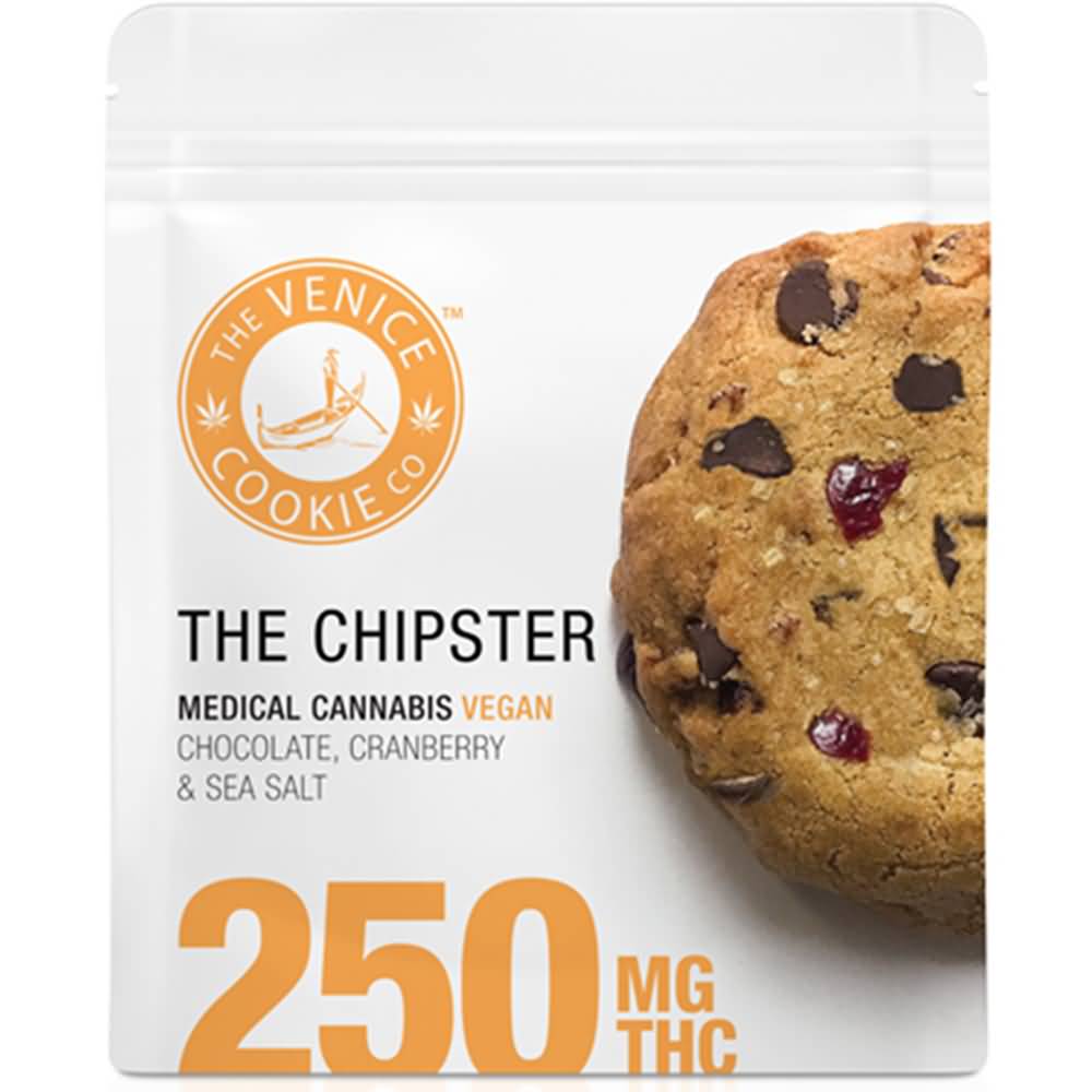
Venice Cookie Co

6. Venice Cookie Co.

There's nothing flashy or bold about The Venice Cookie Co. packaging, nothing unique or particularly eye-catching, but they keep it straight, simple, and to the point. Consumers immediately know exactly what they're getting (a chocolate chip cookie) and how much (250mg THC). It’s a two-tone color palette with orange and white, and the big tasty graphic of the cookie is physically appealing and appetizing for potential buyers. The package is for one cookie, but it has a resealable package for keeping that cookie fresh in case a user would like to save some for later. 
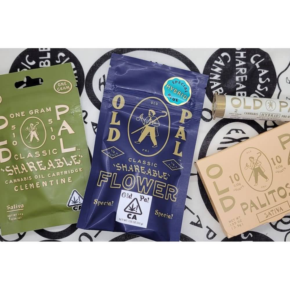
Old Pal Vape

7. Old Pal

Yet again, we see effective use of matte packaging, and yet again, it's not a matte black. The sage green is soothing, earthy, and herbal, which makes it quite the appropriate color for cannabis packaging. It partners well with the gold tone of the lettering and graphics that decorate the package as well. The package is for a shareable vape pen and is packaged in a flexible and resealable wrapper.
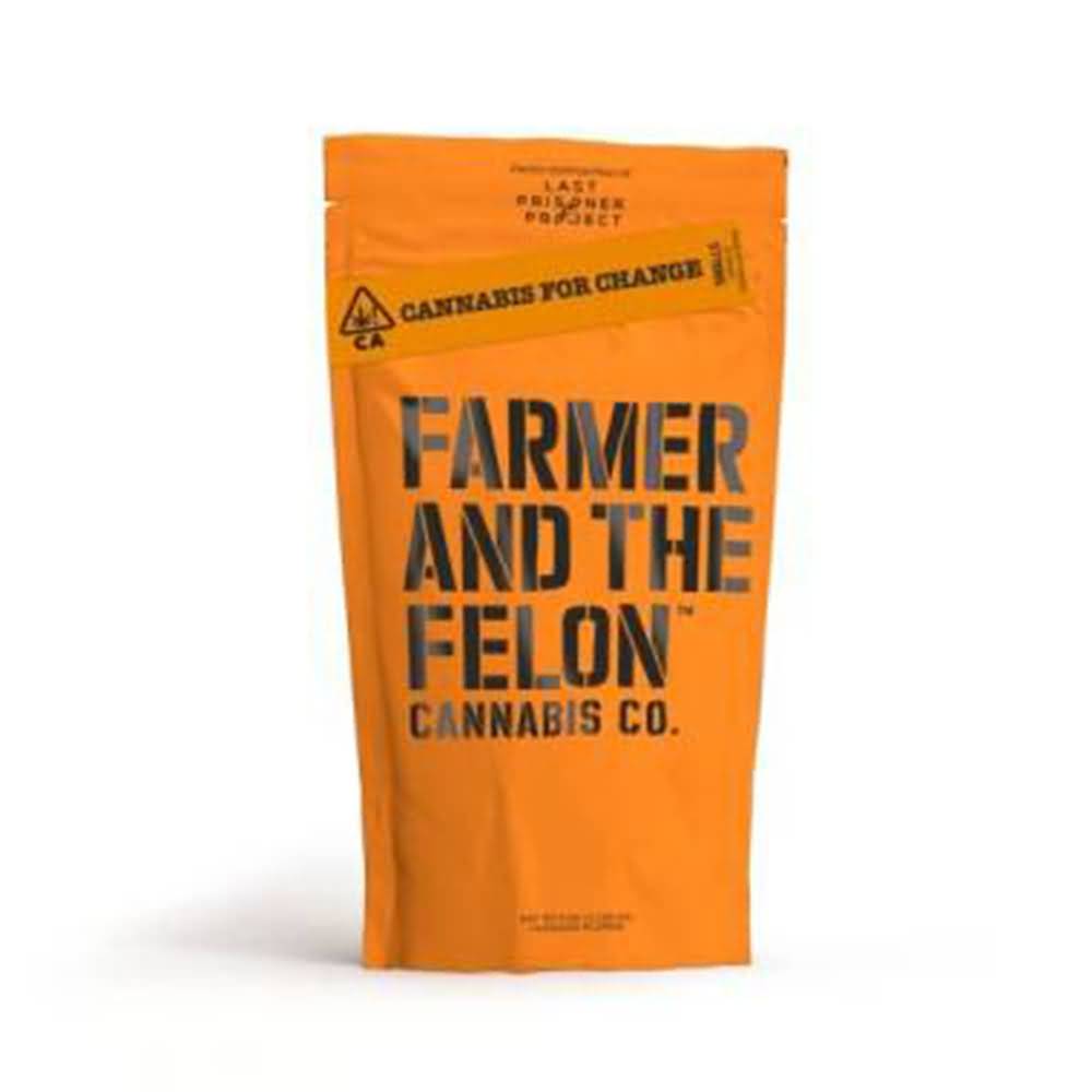
Farmer and the Felon

8. Farmer and the Felon

The Farmer and the Felon has masterfully crafted an out-of-the-box design for their packaging that really makes it stand out from the other trends. Their font is a bold typeface in all capitals that stands at the forefront of their package's branding. The orange and black tones play off prison colors, which plays off of the felon connotation, making light of the former illegality of cannabis. The packaging is also flexible and resealable, and odor-proof.
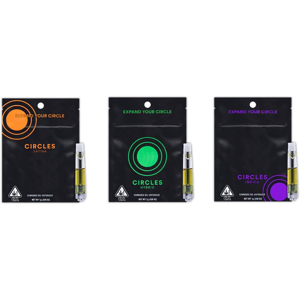
Circles Vape Cannabis Pouch Design

9. Circles

One more matte black finish is thrown into the mix with Circles. If you aren’t picking up on the sleek, elegant look of the matte finishes, then it’s time to start. Circles, as their name suggests, uses circles placed throughout the package as their logo, but in different colors and places. Each matte black package is resealable, has minimal design elements, and has a two-tone color theme.
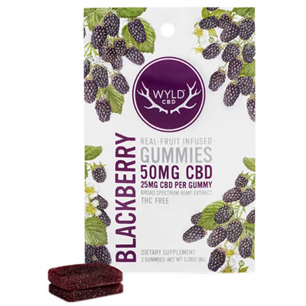
Wyld Blackberry Gummies Cannabis Pouch Design

10. Wyld 

Wyld sells its gummies in a white matte finish, with resealable packages that are flexible and easy to grab and store. They also play off the “wild” theme of their namesake, with graphics representing the flavor decorating the package and a collection of colors to match the flavor as well. It feels earthy and natural and includes all the necessary information right on the package.

Packaging that is designed to be fun, functional, and attractive is easy when you work with Care Pac designers. Small and medium-sized businesses can find an affordable way to make their own cannabis products stand out with a range of sizes, materials, package types, and closures to meet the needs of your product as well as your state laws. Check out the CarePac website for more information or to see some options! Contact one of our designers today and fill your cart with wonderful options! 

Read More
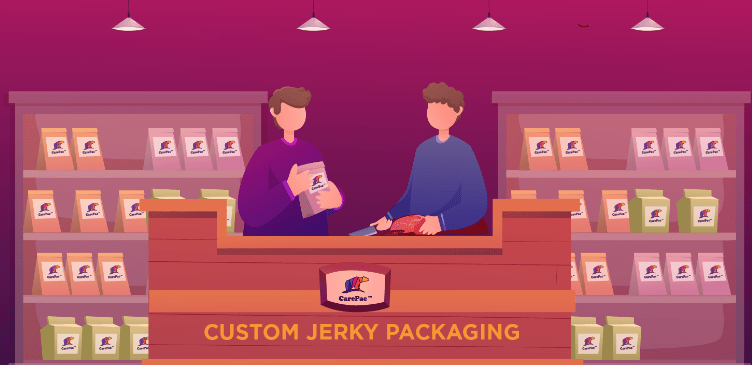
Jerky pouches 5 Tips for Jerky Packaging That Sells and 10 Companies Who Get it Right
Food Industry Packaging

5 Tips for Jerky Packaging That Sells and 10 Companies Who Get it Right

5 Tips for Jerky Packaging That 

Sells and 10 Companies Who Get it Right

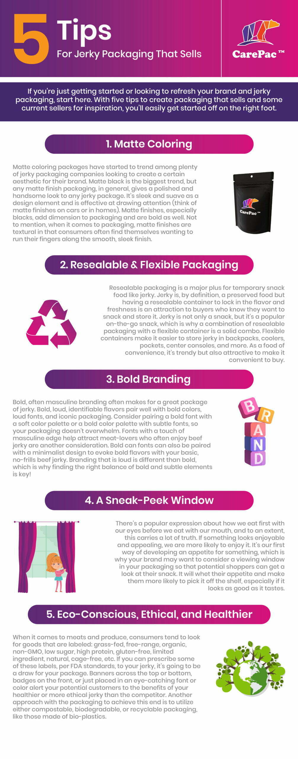
If you’re just getting started or looking to refresh your beef jerky packaging design, start here. 

With five tips to create a packaging design that sells and some current sellers for inspiration, you’ll easily get started off on the right foot.  Learn more package design tips below. 

Jerky pouches 5 Tips for Jerky Packaging That Sells and 10 Companies Who Get it Right

5 Tips to Consider for Your New Jerky Packaging Design

1. Matte Finish Packaging For a Sleek Look

Matte coloring packages have started to trend among plenty of jerky packaging companies looking to create a certain aesthetic for their meat. Matte black is the biggest trend, but any matte finish packaging, in general, gives a polished and handsome look to any jerky package. It's sleek and suave as a design element and is effective at drawing attention (think of matte finishes on cars or in homes). Matte finishes, especially blacks, add dimension to packaging and are bold as well. Not to mention, when it comes to packaging, matte finishes are textural in that consumers often find themselves wanting to run their fingers along the smooth, sleek finish.


2. Resealable & Flexible Jerky Packaging

Resealable packaging is a major plus for temporary snack food like jerky. Jerky is, by definition, a preserved food but having a resealable container to lock in the flavor and freshness is an attraction to buyers who know they want to snack and store it. Jerky is not only a snack, but it's a popular on-the-go snack, which is why a combination of resealable packaging with a flexible container is a solid combo. Flexible beef jerky bags make it easier to store jerky in backpacks, coolers, pockets, center consoles, and more. As a food of convenience, it's trendy but also attractive to make it convenient to buy.


3. Bold Branding on Your Beef Jerky Packaging

Bold, often masculine branding often makes for a great package of jerky. Bold, loud, identifiable flavors pair well with bold colors, loud fonts, and iconic packaging. Consider pairing a bold font with a soft color palette or a bold color palette with subtle fonts, so your packaging doesn't overwhelm. Fonts with a touch of masculine edge help attract meat-lovers who often enjoy beef jerky are another consideration. Bold can fonts can also be paired with a minimalist design to evoke bold flavors with your basic, no-frills beef jerky. Branding that is loud is different than bold, which is why finding the right balance of bold and subtle elements is key!


4. A Sneak-Peek Window So Customers Can See the Meat Snacks

There's a popular expression about how we eat first with our eyes before we eat with our mouth, and to an extent, this carries a lot of truth. If something looks enjoyable and appealing, we are more likely to enjoy it. It’s our first way of developing an appetite for something, which is why your brand may want to consider a viewing window in your packaging so that potential shoppers can get a look at their snack. It will whet their appetite and make them more likely to pick it off the shelf, especially if it looks as good as it tastes.


5. Eco-Conscious, Ethical, and Healthier Bags for Your Beef Jerky

When it comes to meats and produce, consumers tend to look for goods that are labeled: grass-fed, free-range, organic, non-GMO, low sugar, high protein, sustainable, gluten-free, limited ingredient, natural, cage-free, etc. If you can prescribe some of these labels, per FDA standards, to your jerky, it’s going to be a draw for your package. Banners across the top or bottom, badges on the front, or just placed in an eye-catching font or color alert your potential customers to the benefits of your healthier, sustainable, or more ethical jerky than the competitor. Another approach with the packaging to achieve this end is to utilize either compostable, biodegradable, or recyclable packaging, like those made of bio-plastics for a more sustainable effect for your flat barrier bags.


10 Jerky Companies to Look to for Design Inspiration

Stryve Jerky Packaging

1. Stryve

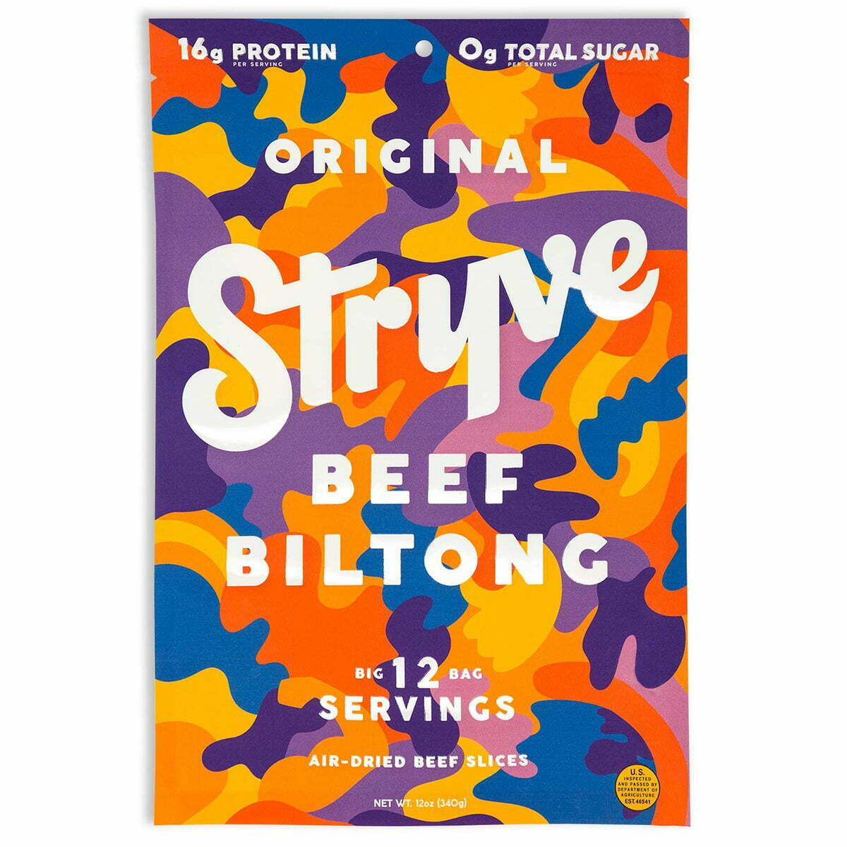
Stryve hits a few great trends with its packaging. The bold, easy-to-read fonts placed on bright, matte packaging with a fun blend of colors combine eye-catching with convenience. The flexible packaging is also easy to store for later in small spaces, making this a great choice for on the go. Also included in their packaging are nutritional essentials, like the zero-sugar and high protein markers across the top.

Righteous Felon Jerky Packaging

2. Righteous Felon

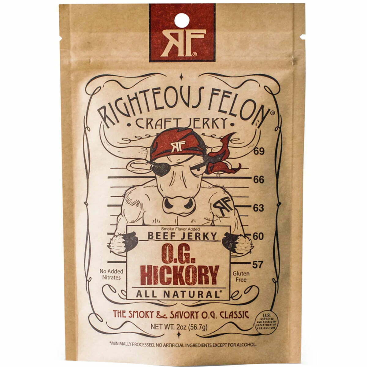
The Righteous Felon uses creative, fun, and engaging graphics that are immediately eye-catching. It's framed perfectly on their eco-friendly packaging, with a minimalist color palette of a touch of red. They incorporate all the key information, like flavor, gluten-free, and all-natural labels, into the primary graphic on the front. They also have a resealable pouch which further attracts buyers. It has a masculine name as well as a more masculine graphic, but in a fun, comical way so as to not seem overcompensating. Overall, it's fun meets functional in a great way.

Country-Archer-Provisions-Jerky-Packaging

3. Archer

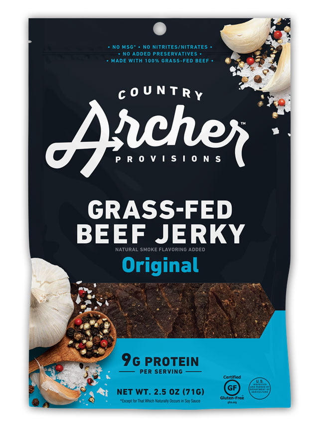
Country Archer Provisions plays off of colors to help identify their different flavors, with navy blue and light blue for their original flavor jerky. They use orange for a mango-habanero blend, magenta pink for their teriyaki flavor, and lime green for hatch chili. Their typography is straightforward and to the point, keeping it simple and not distracting but not too eye-catching as well. Their biggest wins are the flexible packaging, the health and ethical labels stamped on the front (9g of protein, gluten-free, etc.), and the viewing window in the front to buyers can see the freshness of their snack.

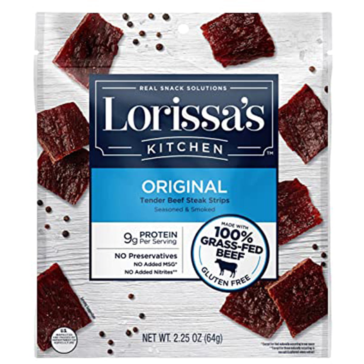
Lorissa’s Kitchen Jerky Packaging

4. Lorissa’s Kitchen

Lorissa’s Kitchen uses color to identify essential information: organic, grass-fed sustainable beef, gluten-free. Buyers know what they’re getting and are drawn in by the bright green labels. The packaging is flexible and has a resealable top for preserving freshness. They also use all the official labels for USDA Organic and NonGMO foods. Another big bonus is that they’ve printed images of their jerky all over the package, which isn’t as effective as having a viewing window but is better than nothing.

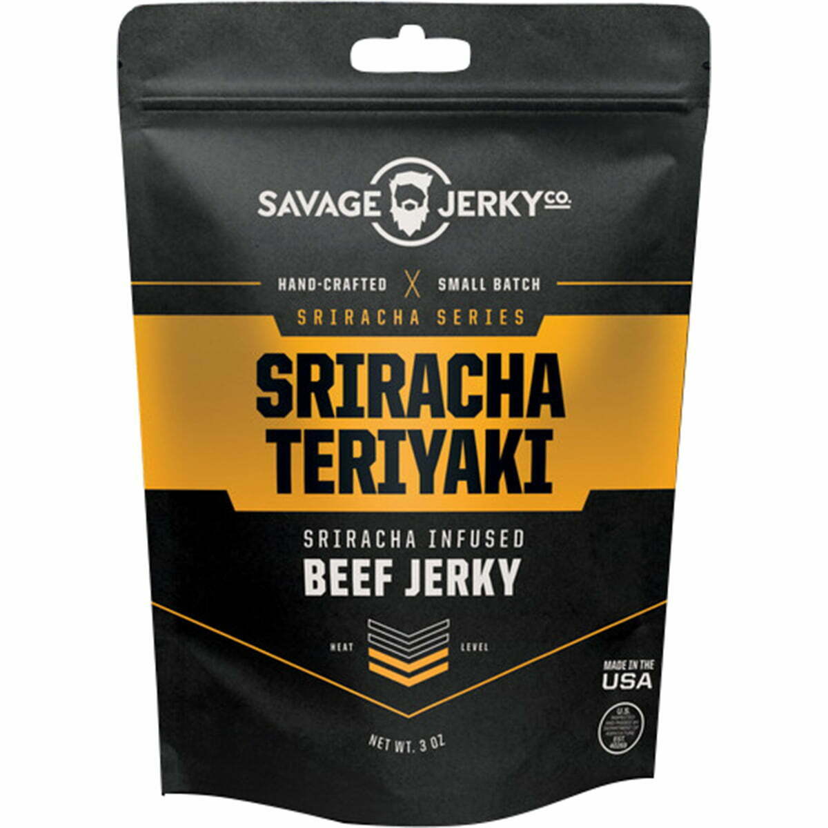
Savage Jerky Co Jerky Packaging

5. Savage Jerky Co

Savage Jerky Co uses matte black packaging to the best effect, with a sleek, smooth package with a lone bold color. This flavor, Reaper, uses a vibrant red, while other flavors use different colors, like Maple Buffalo Bacon in burnt orange and Lime & Garlic with rich green. It makes their packaging bold but iconic and not too busy or loud. The package has a tear-top and a resealable closure for freshness, plus the flexible packaging for the convenience of carrying it everywhere. Their logo is simple and memorable, just like the rest of their package.

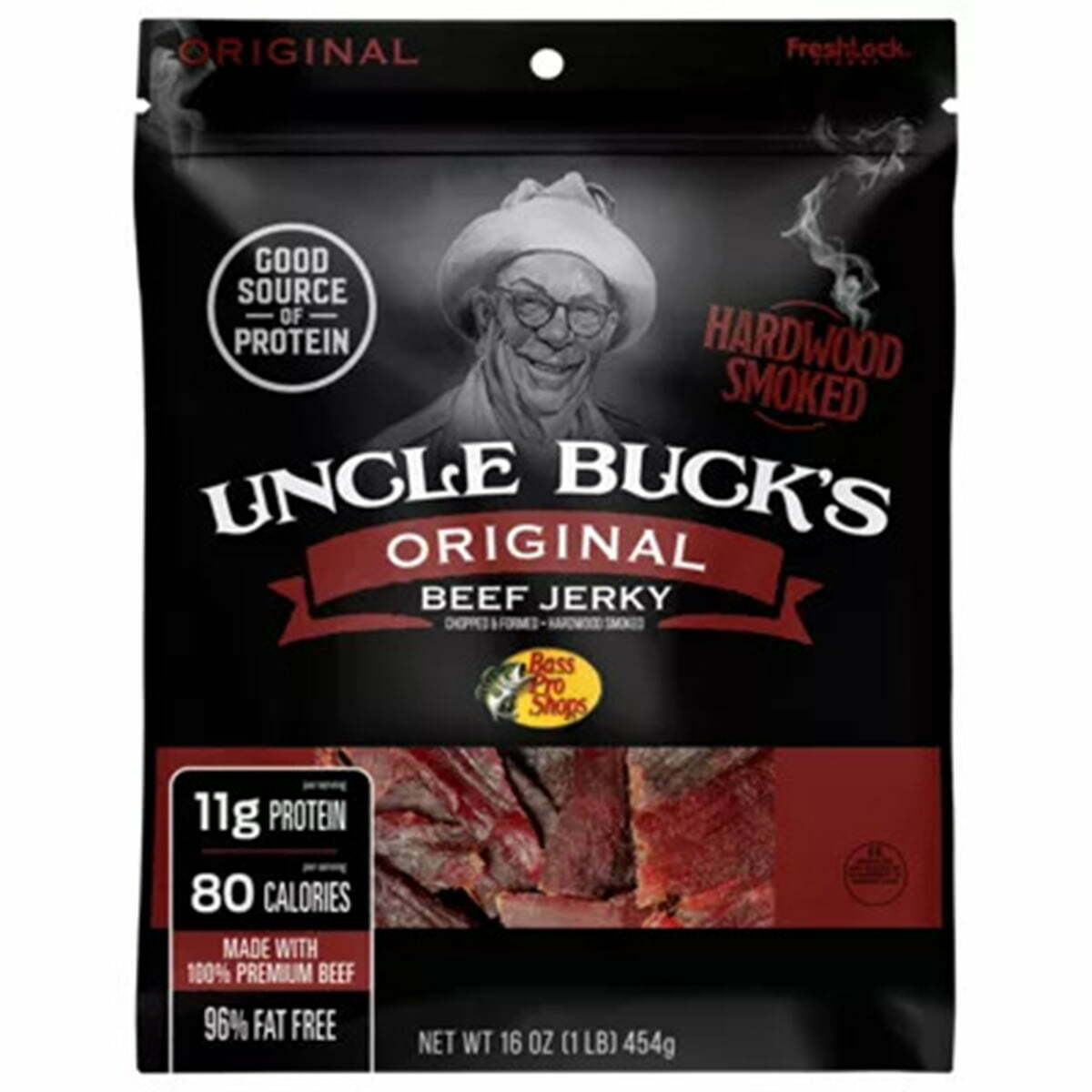
Uncle Buck’s Original Jerky Packaging

6. Uncle Buck’s Original

Uncle Bucks’ Original Beef Jerky is in a matte black finish, similar to a lot of other stand-out brands. It’s handsome and masculine, with a simple font pairing that doesn’t detract from the logo and information. They don’t use a viewing window, but like Lorissa’s, they print an image of their jerky on the front of the package. Printing images can be great when you don’t use a viewing window, but your final product should look very similar to the printed images. They also include essential information on the front, including protein, calories, and fat-free.

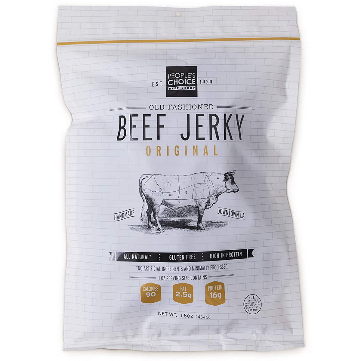
7.	People’s Choice Old Fashioned Beef Jerky Packaging

7. People’s Choice Old Fashioned Beef Jerky

The packaging for People's Choice Old Fashioned Beef Jerky evokes old-fashioned energy and traditional simplicity with its graphics, fonts, and logos. The overall design is constructed of thin lines, thin fonts, and kerning that makes everything simple, minimal, and legible. They incorporate big selling points into creative graphics, like banners and stamps across the packaging to identify "Handmade in LA," “ Gluten-Free," "All-Natural," and the fat and protein counts. Visually, it's a mostly black and white color palette, which goes with the theme of old-fashioned and traditional. Although it is in flexible packaging, they don't use a reseal top for preserving what's left uneaten.

Kalahari Biltong Jerky Packaging

8. Kalahari Biltong

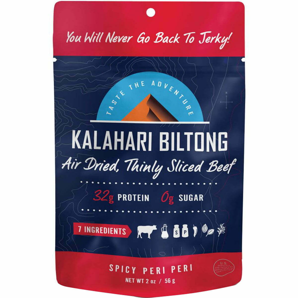
Kalahari Biltong keeps it vibrant, colorful, and eye-catching with flavor-coordinated colors that are bold and bright- orange for original, lime green for chili lime, red for their spicy peri, and blue for garlic. All the colors are extremely bright and pair well with a consistent package graphic across all the flavors. They creatively pair a san serif and script font, and they use it to convey all the necessary information.

Prevail Beef Jerky Packaging

9. Prevail Beef Jerky

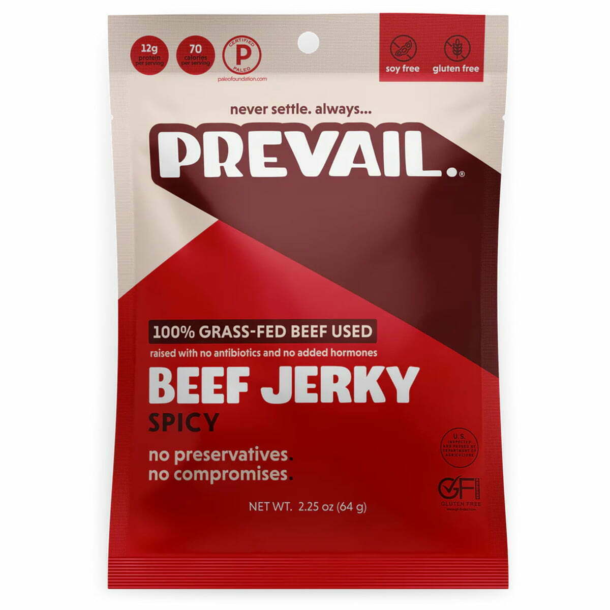
Prevail is another brand that combines the matte finished packaging but, unlike some of the others, uses a monochrome color palette, like the oranges shown here. Their other flavors use a similar method, but with green tones for their lemongrass flavor, blue tones for their original flavor, and red tones for their spicy flavor. The matte finish is smooth and refined but keeps it simple and handsome. The fonts are in either all capital letters or all lower-case letters, which pair well together with san serif choices. They use the same colors to convey their information in stamps (gluten-free, protein count, soy-free, etc.).

kaimana jerky packaging

10. Kaimana Jerky

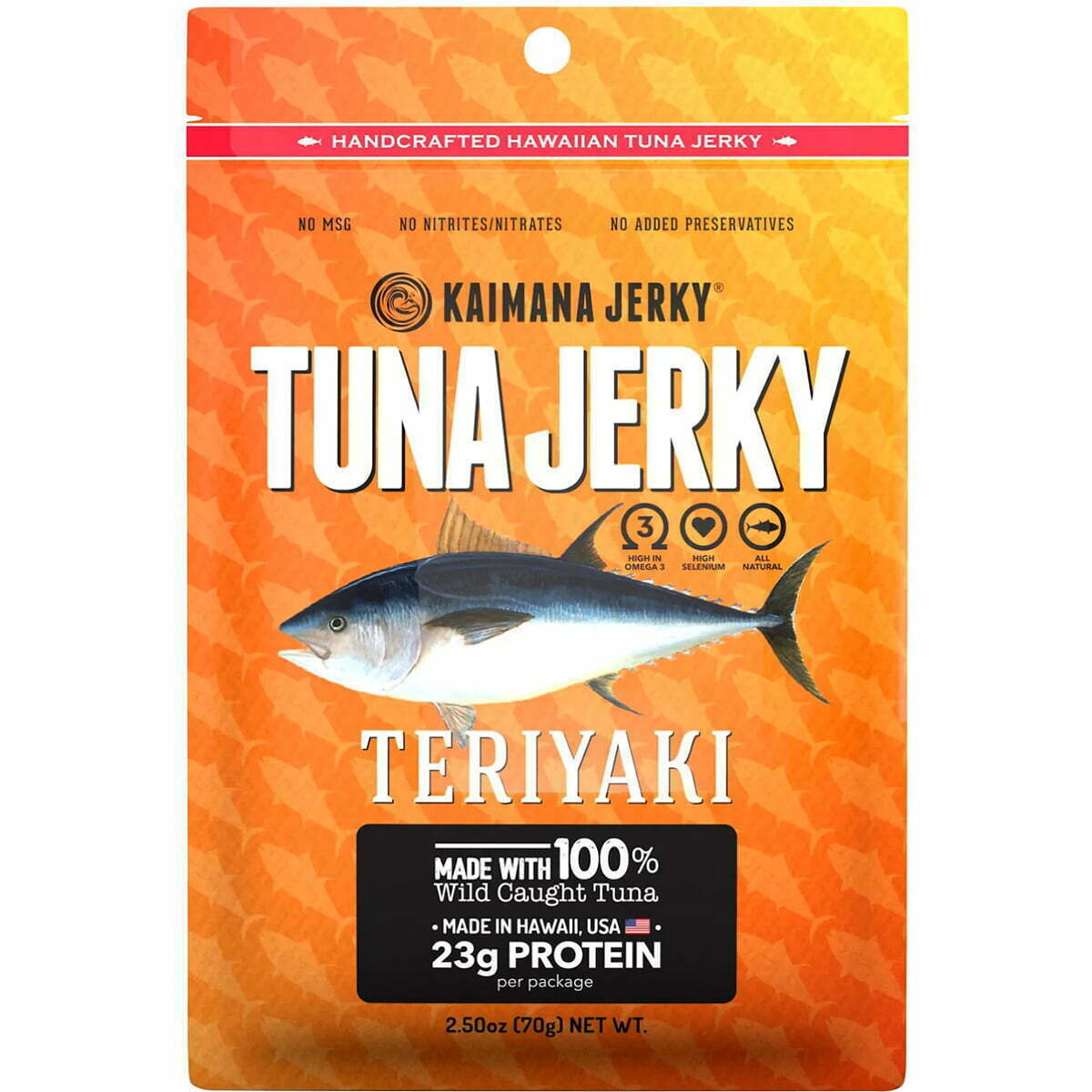
Salmon jerky is often seen as a healthier, better-for-you version of beef jerky, like Kaimana Salmon Jerky. Along with selling a healthier version of the product, their packaging appeals to the type of buyer who is more likely to go for healthier choices- those who are also eco-conscious. The packaging is environmentally friendly, with compostable packaging that is printed without colors to look even more natural and earth-friendly. Their logo and graphics are simply printed in shades of brown, black, and white to keep things minimal and attractive, as well.

Luckily, a lot of these great ideas can be achieved at an affordable quote from this site, simply email us. With CarePac, you can transform your packaging without blowing up your budget on the web. Reach out for more information or to order some samples to see your packaging first-hand! Email us -- we'd be happy to provide a quote. 

Jerky Packaging Design Tips scaled 5 Tips for Jerky Packaging That Sells and 10 Companies Who Get it Right


Read More
CareSilver PVP CareSilver-PVP (PET/VMPET/PE)
Data Sheets

CareSilver-PVP (PET/VMPET/PE)

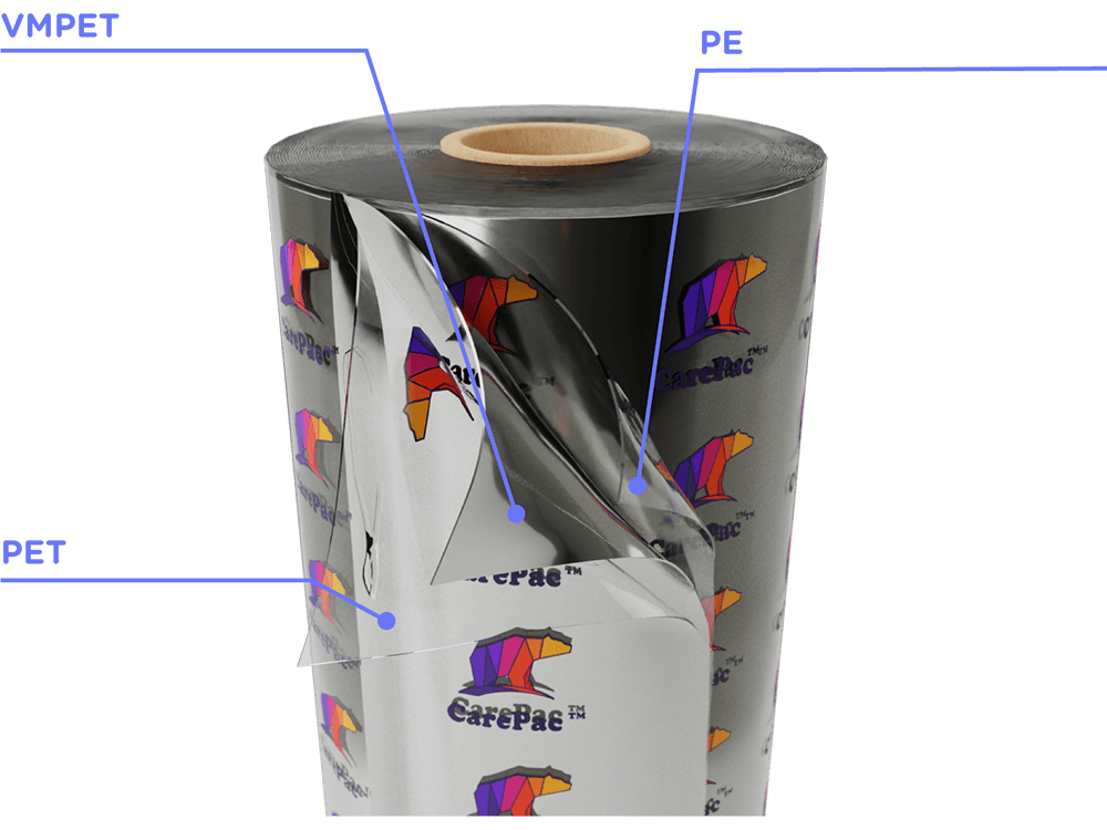
CareSilver-PVP is a PET/VMPET/PE barrier lamiation film that serves as a great base for printed bags, and provides a quality general use barrier to protect the contents from oxidation, moisture, and premature spoilage. CareSilver, is a 3-layer lamination structure consisting of PET, Vapor Metalized Polyethylene Terephthalate, and PE. It is the primary line of Vapor Metalized polyethylene Terephthalate (VMPET) or Mylar films. 


As with most of CarePac's barrier films, CareSilver-PVP is designed for FDA applications (foods and beverages). CareSilver-PVP is free of toxins such as TSE, Sulfur, Phthalates, and BPA. It is specifically designed to maintain the freshness of FDA Food Items like dried goods, snacks & chips, pet food (cats, birds, and all kinds of dog breeds), and its low thermal permeability rate, as well as the UV resistance. 

Barrier Properties

PET/VMPET/PE is a good general use three-layer film . Cost effective with medium-high barrier properties, CareSilver-PVP provides a better barrier than most clear films. 

Note: The performance of any film will be influenced by a number of factors and testing must always be performed to ensure the film meets the use.

Relative Performance Indications

Oxygen Barrier

Moisture Barrier

Light Barrier

STrength

Heat Resistance

Freezer Storage

Customer Profile

PET/VMPET/PE is a great choice for many food products.
PET VMPET PE Granola Bag CareSilver-PVP (PET/VMPET/PE)

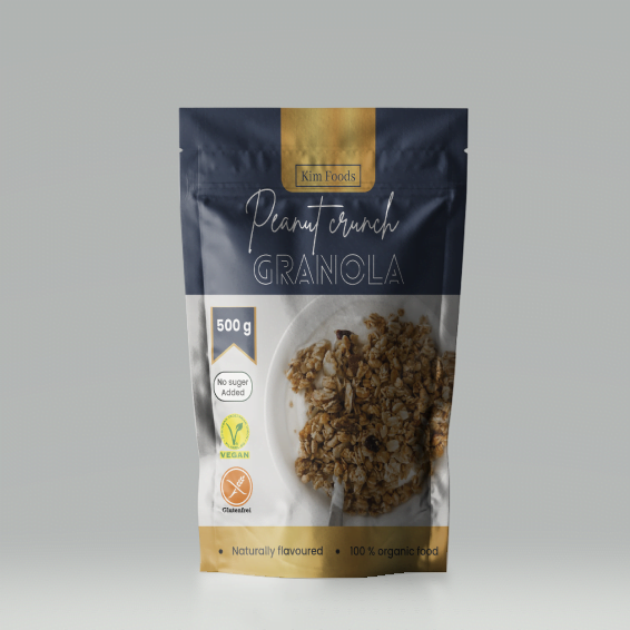
Granola, snacks, and other food items are a great use for Care-Silver-PVP. In the case of granola a full color CMYK lifestyle photo of granola displays well with CareSilver-PVP as its base material. 


Film Specifications for CareSilver-PVP

Our lamination film is finely coated with vaporized Aluminum film (AL) to provide an opaque base material for printing while enhancing the barrier properties of the base polymer film.

Here are some of the common indicated properties for this film

Property
Sample Data

Available Thicknesses

2mil - 8mil

Sample Data Thickness

4mil

MVTR 

<1.5 JIS Z 0208

OTR 

<0.9 JIS Z 1707

Elongation at Break

MD > 55 TD > 50

Bond Strength

PET/VMPET >400g/15mm VMPET/PE >400g/15mm

Environmental Impact of CareSilver-PVP

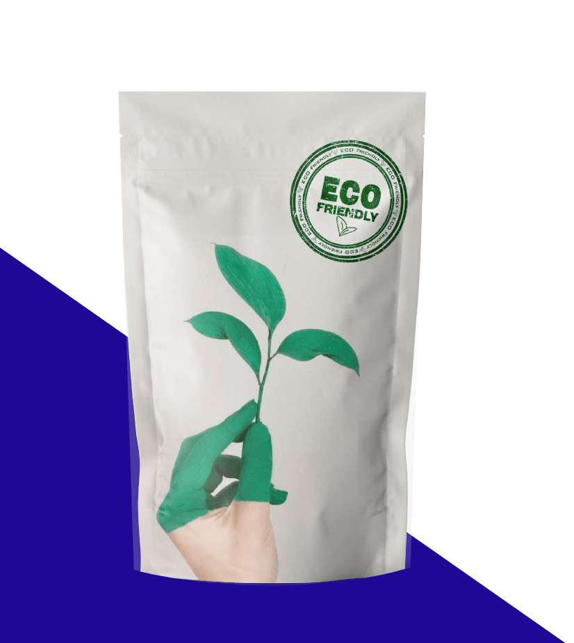
This material is a multi-layer laminated plastic and will typically fall into the check-locally. The product is not compostable.

icons eco 20 CareSilver-PVP (PET/VMPET/PE)

At Home Compost

icons eco 20 CareSilver-PVP (PET/VMPET/PE)

  Industrial Compost

icons eco 19 CareSilver-PVP (PET/VMPET/PE)

    Recyclability 

ECO 09 1 CareSilver-PVP (PET/VMPET/PE)
Select Columns Layout

Compliance Information

Compliance is always an important topic. All our films including our CareSilver-PVP PET/VMPET/PE film meets or exceeds applicable compliance and regulatory standards. 
 
small Icons 18 33 CareSilver-PVP (PET/VMPET/PE)

Kosher

logos 24 CareSilver-PVP (PET/VMPET/PE)

BPA FREE

logos 29 CareSilver-PVP (PET/VMPET/PE)

FDA Food Approved

small Icons 18 32 CareSilver-PVP (PET/VMPET/PE)

EU Food Approved

logos 26 CareSilver-PVP (PET/VMPET/PE)

PROP 65

logos 21 CareSilver-PVP (PET/VMPET/PE)

RoHS / R.E.A.C.H

Read More
Montana cannabis laws 05 Montana Cannabis Laws
Other Packaging Topics

Montana Cannabis Laws

Montana Cannabis Laws

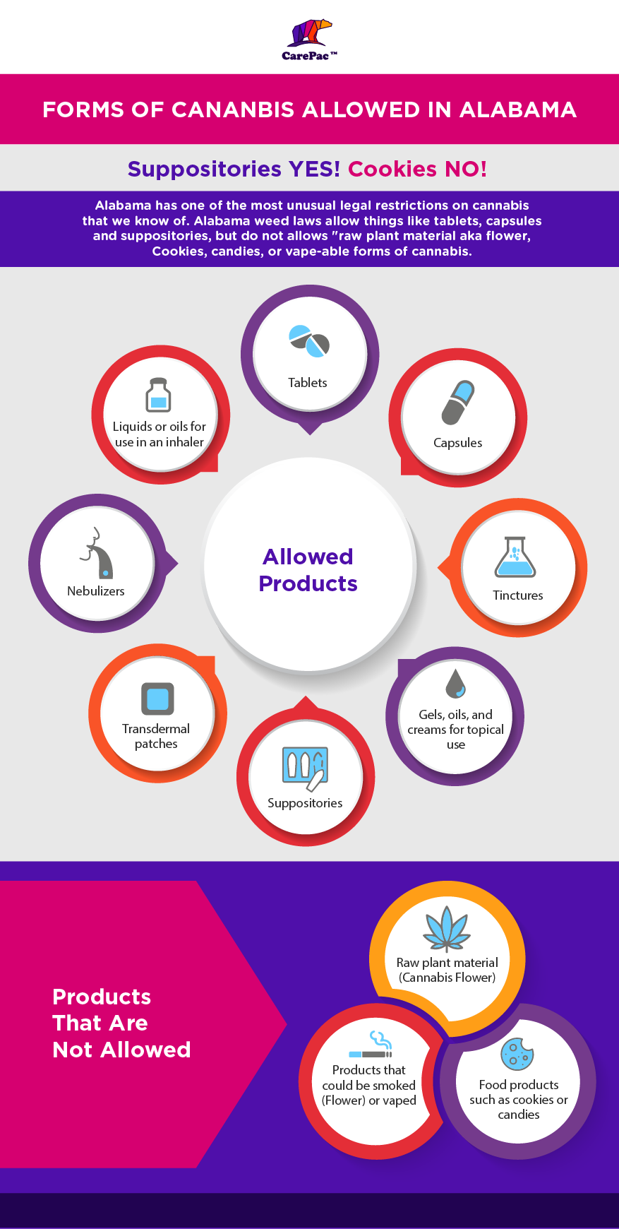
Montana has a long history of legal cannabis legalization, starting in 2004 with medical. But then back-and-forth made Montana medical marijuana harder to get. In the US state of Montana, marijuana has been legal for both medical and recreational use since January 1, 2021, when Initiative 190 came into effect. Prior to the November 2020 initiative, cannabis was illegal for recreational use from 1929. Medical marijuana was legalized in 2004 in an attempt to vote. [1]

The labeling and packaging rules apply to marijuana and marijuana products that are for ultimate adult-use cannabis sales to a consumer, registered cardholder, or their designated purchasers. Please note: cannabis legalization is not currently national and this blog and the policy information in it is specific to Montana. 


Montana Cannabis Laws - Marijuana Packaging Requirements

Protect: Cannabis packaging must protect the product from contamination and not impart any toxic or deleterious substances to the marijuana products. This means you should use FDA approved barrier packaging, like flexible barrier packaging.


Resealable:  If the package contains more than one serving, it needs to be resealable, meaning it needs to have a recolorable zipper.


Not 'primarily' appeal to children.

You cannot include depictions (pictures, illustrations, or other graphics) of children. 

Your graphics and packaging, cannot include images, drawings, or other portrayals of objects, images, celebrities, or cartoon figures that "primarily appeal to children" or are "commonly used to market products to children". This can be dicey territory, but generally avoid all cartoon characters.

Finally the state includes a subjects catch all provision that doesn't allow packaging or labeling that otherwise has special attractiveness for children beyond the general attractiveness for adults.


Use of Trademarks

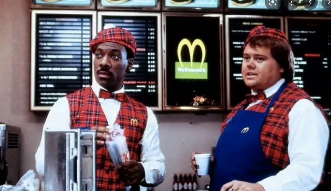
McDowells Montana Cannabis Laws

The regulations prohibit trademark infringement. So unfortunately you can't be the McDowell's of Montana Cannabis.  and this section is similar to several other states like Maine and Oklahoma, the state of Montana very much limits the use of trademarks or graphics that resemble trademark, or and this is a bit of a distinction  between it and other states, which "bears any reasonable resemblance to" the trademarked or "characteristic packaging of any commercially available product, including but not limited to candy, snacks, baked goods, or beverages. 

 In this way it appears the legislative intent of this section was to prevent confusion of marijuana products with non-medicated products, and not encourage knock off marijuana versions of unmedicated products. 

Exit Packaging

Montana is a exit bag state. Exit bags or exit packaging is a required for all marijuana and marijuana products at the point of sale. This means that at the point of purchase all marijuana products have to be put in "exit packaging" which is:

  • Child Resistant
  • Opaque
  • Includes required warnings. 

Child Resistant Standard in Montana

In the state of Montana the child resistant standard is found in ARM 42.39.102(8). The standard of child resistance is defined by reference to the Federal Consumer Product Safety Commission (CPSC) and 16 CFR 1700.20. 

Labeling Requirements for Legal Marijuana

The general labeling requirements for Marijuana products in Montana are found in ARM 42.39.314. These basic requirements are in addition to specific requirements that are set for Flower[2], Edibles[3], Topicals[4], and Concentrates and extracts[5]. 

Montana cannabis label 05 06 06 06 Montana Cannabis Laws
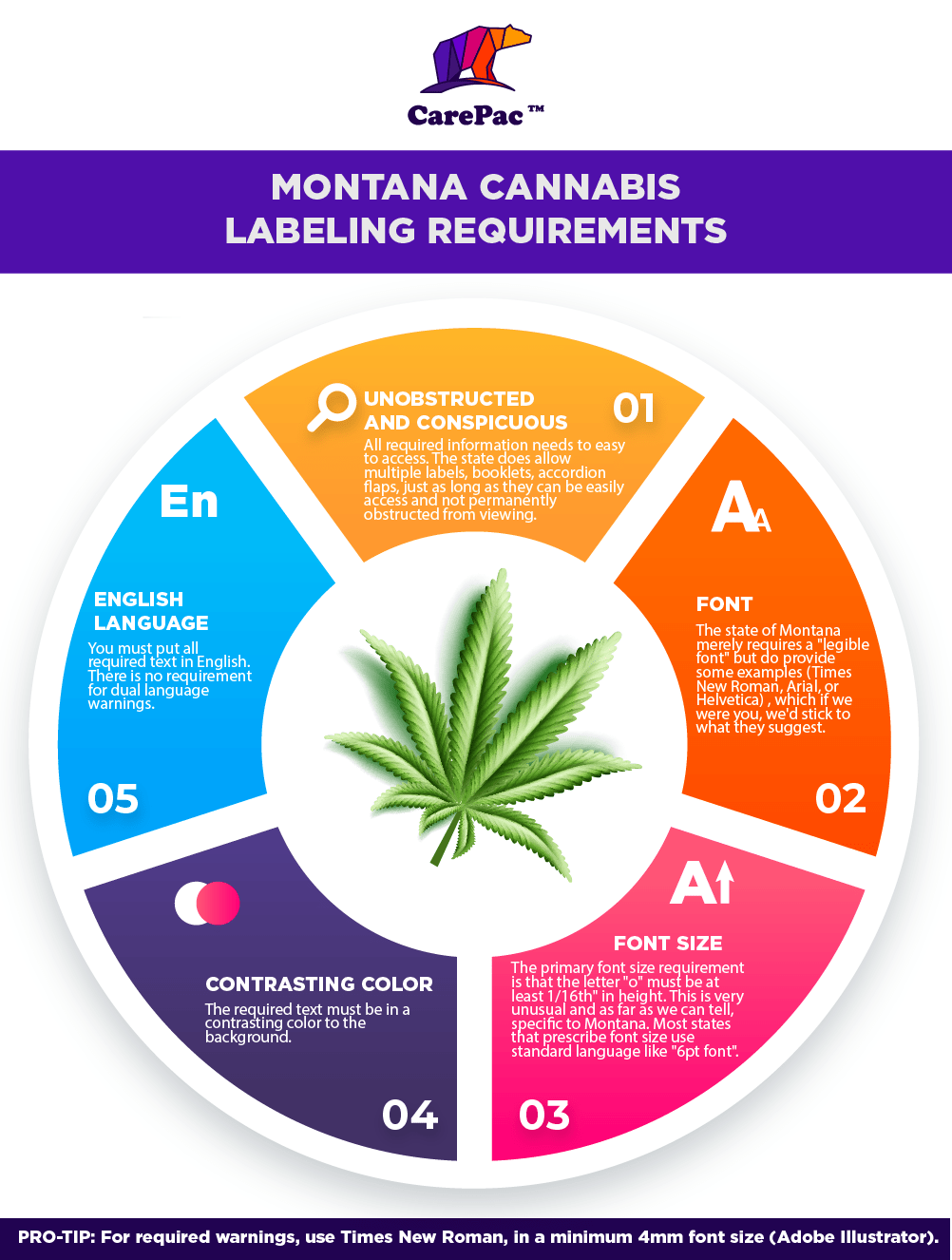
  • Unobstructed and Conspicuous: All required information needs to easy to access. The state does allow  multiple labels, booklets, accordion flaps, just as long as they can be easily access and not permanently obstructed from viewing. 
  • Font: The state of Montana merely requires a "legible font" but do provide some examples (Times New Roman, Arial, or Helvetica) , which if we were you, we'd stick to what they suggest. 
  • Font Size: The primary font size requirement is that the letter "o" must be at least 1/16th" in height. This is very unusual and as far as we can tell, specific to Montana. Most states that prescribe font size use standard language like "6pt font". 
  • Contrasting Color: The required text must be in a contrasting color to the background.
  • English Language: You must put all required text in English. There is no requirement for dual language warnings.  

PRO-TIP: For required warnings, use Times New Roman, in a minimum 4mm font size (Adobe Illustrator). 


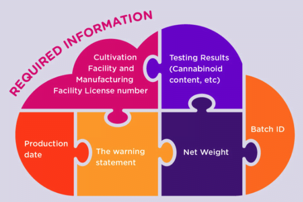
Required State Information List 

  • Strain Name: They don't state how specific you must be with the strain. 
  • Common name: This is an interesting one, they want the package to include the "common" name for the product, so what the laws refer to as ingestible Marijuana-Infused Products" you must include "edible" or Marijuana cookie on the package as applicable. 
  • Names:  of the dispensary, and license number of the cultivator, manufacturer. 
  • ID Number: ID number from the seed to sale tracking system. 
  • Date: Harvested, or manufactured. 
  • Net Quantity: They are very specific on weight / net content, it must be stated first in "U.S. Customary" and also Metric (SI) units with the metric in parentheses. For example. 1/2OZ (28g). 
    • If Solid or Semi Solid: Net quantity  is expressed by weight, and must be prefaced with "Net Weight", or "Net".
    • If Liquid: use fluid measure and include the preface "Net Contents" or Net".
    • Number of Servings: You must also include the number of servings. 
  • Testing Statement: ""This product has been tested and meets the requirements of the state of Montana."
  • QR Code: QR Code must link to the products certificate of analysis, and statement telling the user they can scan code for "additional product information"

PRO-TIP: Here is an example of a good net weight statement. 

Net Weight: 2 oz. (56.7 g) (10 cookies));

Montana's Universal Marijuana Symbol

Montanas Universal Marijuana Symbol Montana Cannabis Laws

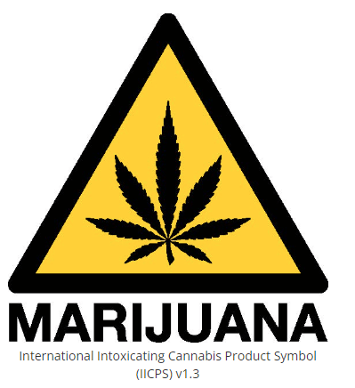
Ah yes, the ever-present "universal symbol" which as we have discussed before, is anything by universal... In the case of the state of Montana though, they did op for the International Intoxicating Cannabis Products Symbol (IICPS) which is a step in the right direction towards "universal". 


The state requires the symbol will be at a minimum .33" x.33" in size. 

Below we have included press ready, vectorized copies of the three symbol versions available on the state's website. 


Download the Montana Marijuana Warning Symbol Vector format.

Required Warnings Label Text

Basic Warnings:

Montana's required warning labeling for Marijuana products is found in MCA 16-12-215. And is as follows: 

(1) "WARNING: Consumption of marijuana may cause anxiety, agitation, paranoia, psychosis, and cannabinoid hyperemesis.
(2) "WARNING: Consumption of marijuana by pregnant women may result in fetal injury and low birth weight."
(3) "WARNING: Consumption of marijuana by nursing mothers may result in infant hyperactivity and poor cognitive function."

The format required for the Montana warning is found in MCA 16-12-208

Additional Warnings:

  • "Keep out of reach of children and pets
  • "This product may be addictive"
  • "This product may have intoxicating effects. Do not drive while under the influence of marijuana."

Ingestible / edibles warnings

"The intoxicating effects of this product may be delayed by two or more hours."

Medical Use Warnings

If the product is for medical use card holders only, there are two additional warnings: 

- "For medical use only"; and

 - "This product is not approved by the U.S. Food and Drug Administration to treat, cure, or prevent any disease."

Flower Specific Requirements 

Each package of marijuana flower must include a marijuana fact's panel which must indicate the percentage of concertation of:

Must Include:

  • Total potential psychoactive THC;
  • THC;
  • THCa;
  • CBD; and
  • CBDa

May Include: 

  • the percentage concentration of each additional marketed cannabinoid or terpene, if applicable[6]

Edibles Specific Requirements

Ingredient List

Edibles and other ingestible products must have an ingredient list which must include all ingredients listed.

  • List all ingredients
  • Use common names
  • list ingredients in order of predominance by weight. 
  • use the word "marijuana" before the part of plant (flower, trim) or type on concentrate (oil, infused butter, etc). 
  • Trace, insignificant amount that doesn't serve a technical purpose, or have any functional effect does not need to be listed. 

Allergen Statement

Declare the presence of all major food allergens that may be present. No specific format is required other than the use of "plain language"

Marijuana Facts Panel

The milligrams per serving size or dose of:

  • THC;
  • THCa;
  • CBD; and
  • CBDa;

The number of servings or doses per package; and For multi-serving packages, the total milligrams per package of:


  • THC;
  • THCa;
  • CBD;
  • and CBDa;

Additional Warning required for any ingestible product:

"The intoxicating effects of this product may be delayed by two or more hours."

Lotions, Patches, & non-ingestible product Specific Requirements 

The requirements for non-ingestible products is substantively similar to that of ingestible products. With the exception of there is no requirement for Allergen list, or delayed effects warnings.  


Extracts and Concentrate Specific Requirements

The legislation requirements for extracts and concentrates are substantively similar to that of ingestible products. Food allergen statement can be omitted if the product is not intended to be cooked with, eaten, or otherwise swallowed or digested.  

Additional warning regarding delayed effects is also required. [7]

Frequently Asked Questions About State Law

Q: What is the THC limits for recreational marijuana products?

Montana's THC limits are found in 16-12-224. any product that exceeds the threshold must be labeled as "for medical use only" and "This product is not approved by the U.S. Food and Drug Administration to treat, cure, or prevent any disease."

  • Flower:  1 ounce of usable marijuana. The total potential psychoactive THC of marijuana flower may not exceed 35%.
  • Capsules: Maximum 100 milligrams of THC per capsule and no more than 800 milligrams of THC per package.
  • Tincture; Maximum 800 milligrams of THC;
  • Edible or food product:
    • Single Serving maximum 10 milligrams THC
    • Maximum 100 milligrams of THC per package.
  • Topical product: Max concentration 6% THC and 800 milligrams of THC per package;
  • Suppository or transdermal patches: Maximum 100 milligrams of THC per suppository or patch and maximum 800 milligrams of THC per package
  • Maximum total for any marijuana product, no more than 800 milligrams of THC.

Q: If the marijuana product DOES NOT require heat to administer must the marijuana facts panel contain total THC or total potential psychoactive THC values?

No, these items are not required on the facts panel for non-heat products. 

Q: Does Montana require the method of manufacturing and solvent used be listed on the label?

Yes, the method of manufacturing, and if chemical extraction was used, the solvent used in the manufacturing process must be listed on the label. 

Q: What is the packaging is too small to fit all the required compliance information?

You can (if approved by the department) display the information in a legible font that otherwise does not meet the minimum size requirement. 

Labeling and Packaging Template

Montana labeling and packaging templates can be found here.

Conclusion 

States with a lot of open land, natural resources, and a fertile environment for agriculture, such as Montana. There are about 28,000 ranches and ranches in the state, each averaging 2,000 acres. Cannabis farms have sprung up all over the state over the past few years. In 2019, Montana farmers planted a total of 22,000 acres of hemp across the state, averaging half a million dollars per farm. Medical marijuana, like cannabis, is not accessible to everyone and cannot be thrown in a jar. After the plant is grown, harvested and cured, there are regulations that must be met for both packaging and labeling. If one doesn't adhere to these laws, it could result in a punishable misdemeanor, fine, or felony.

Footnotes

Read More
Mana Granola Packaging scaled 5 Essential Granola Packaging Ideas
Food Industry Packaging

5 Essential Granola Packaging Ideas

5 Essential Granola

Packaging Ideas

Granola Companies Who Did It Right:

5 Essential Rules for Creative Granola Packaging & 10 Brands for Inspiration

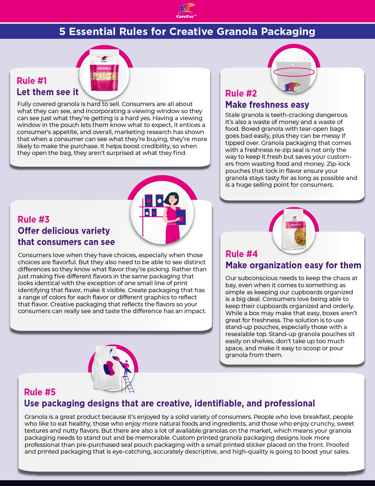
It’s crunchy, tasty, healthy – and maybe a little bit messy – but with big-brand competition on the shelves, how can you package your granola to really make it sell? It’s not just about the flavor because your consumers first have to pick it off the shelf! When it comes to packaging your granola to sell, there are five essential rules any company should follow. Read on for some great granola packaging ideas. 


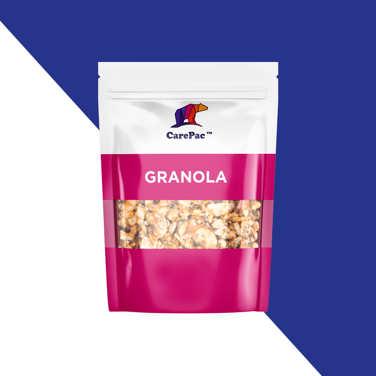
Rule #1: Let them see the snack.

Fully covered granola is hard to sell. Consumers are all about what they can see, and incorporating a viewing window so they can see just what they’re getting is a hard yes. Having a viewing window in the pouch lets them know what to expect, it entices a consumer's appetite, and overall, marketing research has shown that when a consumer can see what they’re buying, they’re more likely to make the purchase. It helps boost credibility, so when they open the bag, they aren’t surprised at what they find.

Rule #2: Make food freshness easy.


Stale granola is teeth-cracking dangerous. It’s also a waste of money and a waste of food. Boxed granola with tear-open bags goes bad easily, plus they can be messy if tipped over. Granola packaging that comes with a freshness re-zip seal is not only the way to keep it fresh but saves your customers from wasting food and money. Zippered pouches that lock in flavor ensure your granola stays tasty for as long as possible and is a huge selling point for consumers. Also consider using a high barrier material like CareClear-XP.

Rule #3: Offer delicious variety that consumers can see.

Consumers love when they have choices, especially when those choices are flavorful. But they also need to be able to see distinct differences so they know what flavor they’re picking. Rather than just making five different flavors in the same packaging that looks identical with the exception of one small line of print identifying that flavor, make it visible. Create packaging that has a range of colors for each flavor or different graphics to reflect that flavor. Creative packaging that reflects the flavors so your consumers can really see and taste the difference has an impact.

As a bonus, if you create limited-edition flavors or flavors that go with the seasons, you can create a new sense of demand with your buyers. A sense of urgency over a delicious flavor leaving at the end of summer, with fun, creative packaging to match, encourages them not to want to miss out.

Rule #4: Make organization easy for them.

Our subconscious needs to keep the chaos at bay, even when it comes to something as simple as keeping our cupboards organized is a big deal. Consumers love being able to keep their cupboards organized and orderly. While a box may make that easy, boxes aren’t great for freshness. The solution is to use stand-up pouches, especially those with a resealable top. Stand-up granola pouches sit easily on shelves, don’t take up too much space, and make it easy to scoop or pour granola from them.

Rule #5: Use packaging designs that are creative, identifiable, and professional.

Granola is a great product because it’s enjoyed by a solid variety of consumers. People who love breakfast, people who like to eat healthy, those who enjoy more natural foods and ingredients, and those who enjoy crunchy, sweet textures and nutty flavors. But there are also a lot of available granolas on the market, which means your granola packaging needs to stand out and be memorable. Custom printed granola packaging designs look more professional than pre-purchased seal pouch packaging with a small printed sticker placed on the front. Proofed and printed packaging that is eye-catching, accurately descriptive, and high-quality is going to boost your sales.

granola infographic 5 Essential Granola Packaging Ideas

10 brands that understand packaging! 

Manna Granola

Mana Granola Packaging scaled 5 Essential Granola Packaging Ideas

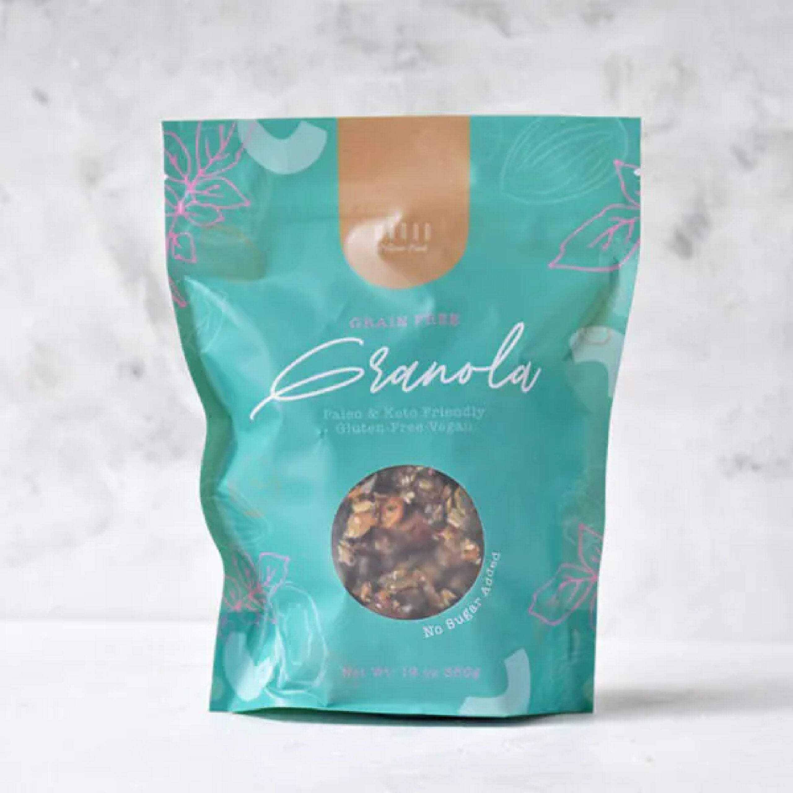
Manna Granola does a lot right with their artisanal granola packaging. The matte finish package, a vibrant color that doesn’t overwhelm, minimal graphics to match a minimal-ingredient granola, and a peephole so buyers can see their food. The color palette is a bit retro, but it works. The only questionable choice is the script font for the word “Granola,” which is hard to read. Good thing we have that window to know what we’re getting.

Sacura

Sakura Packaging scaled 5 Essential Granola Packaging Ideas

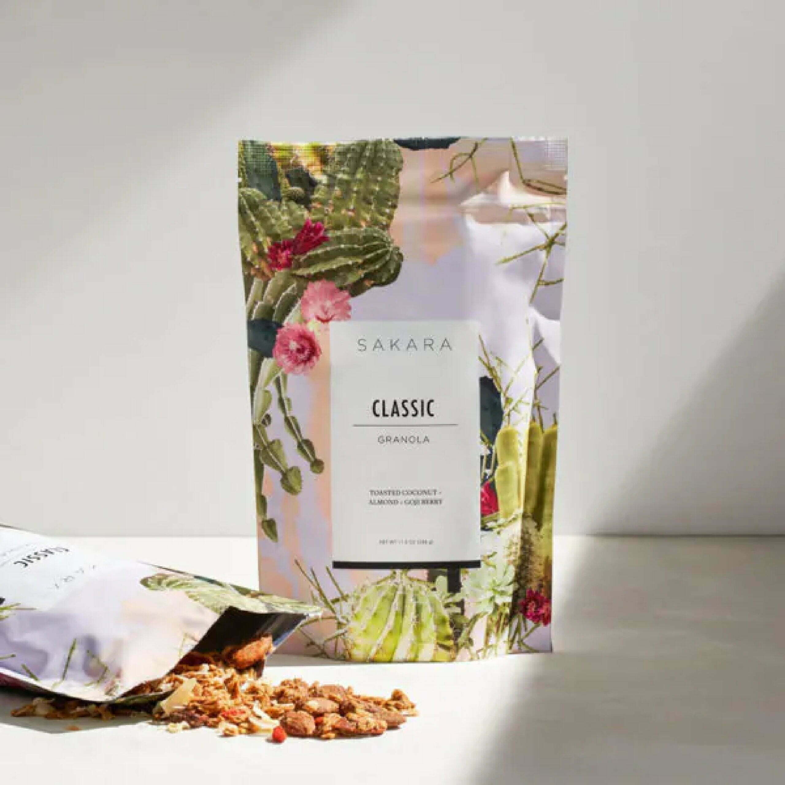
Sakura’s granola packaging brings bright, colorful, and exciting graphics to their granola in a resealable stand-up pouch. Although they’re missing the window for viewing the granola, it’s still a very appealing package. The choice for the graphics is questionable, though, because although they are pretty, what do the cacti and florals have to do with the flavor? Overall, it’s eye-catching and likely to grab a consumer's attention.

Small Batch Organics

Small Batch Organics Packaging scaled 5 Essential Granola Packaging Ideas

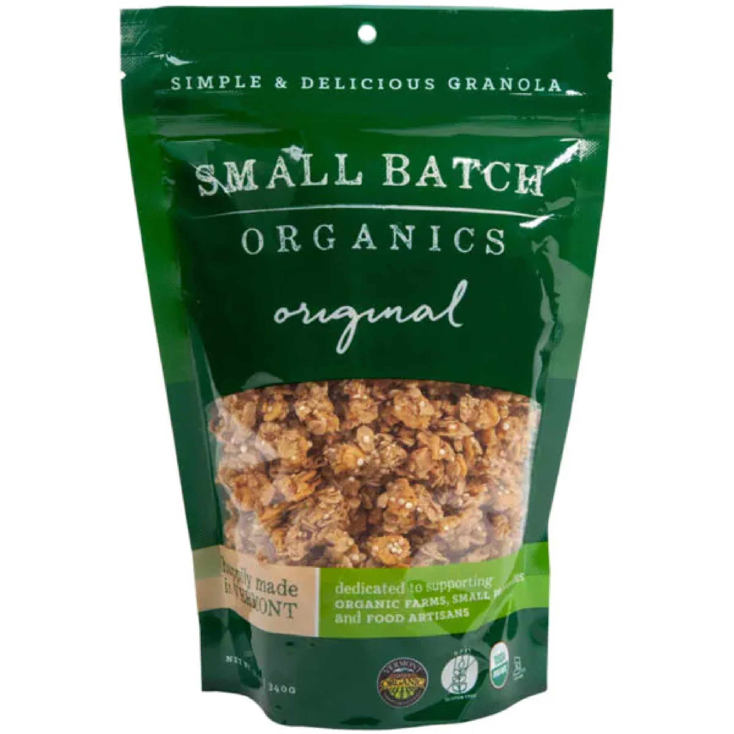
Small Batch Organics checks off most of the rules. They don’t have the most exciting, stand-out packaging, but it hits their target demographic well. It is simple and easy on the eye. The font choices go well together. The color palette is very much reflective of a natural, organic product with greens and browns. It may not be the most eye-catching product on the market, but when it comes to finding a healthy and wholesome granola product, the package reflects the product.

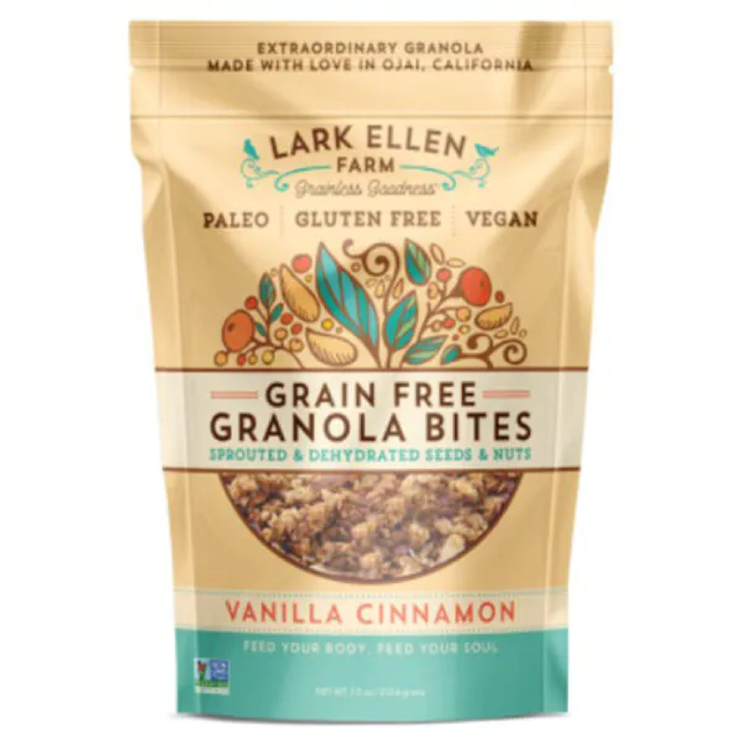
Lark Ellen Granola

Lark Ellen Granola scaled 5 Essential Granola Packaging Ideas

Lark Ellen Farm’s packaging gives off a cute, friendly, and wholesome with a matching color palette, fun typography, and inviting graphics. It combines fun and functional together well, with a package that keeps the granola fresh and the packaging fresh. It’s easy to read, it’s easy to see, and it looks like it’s going to taste good.

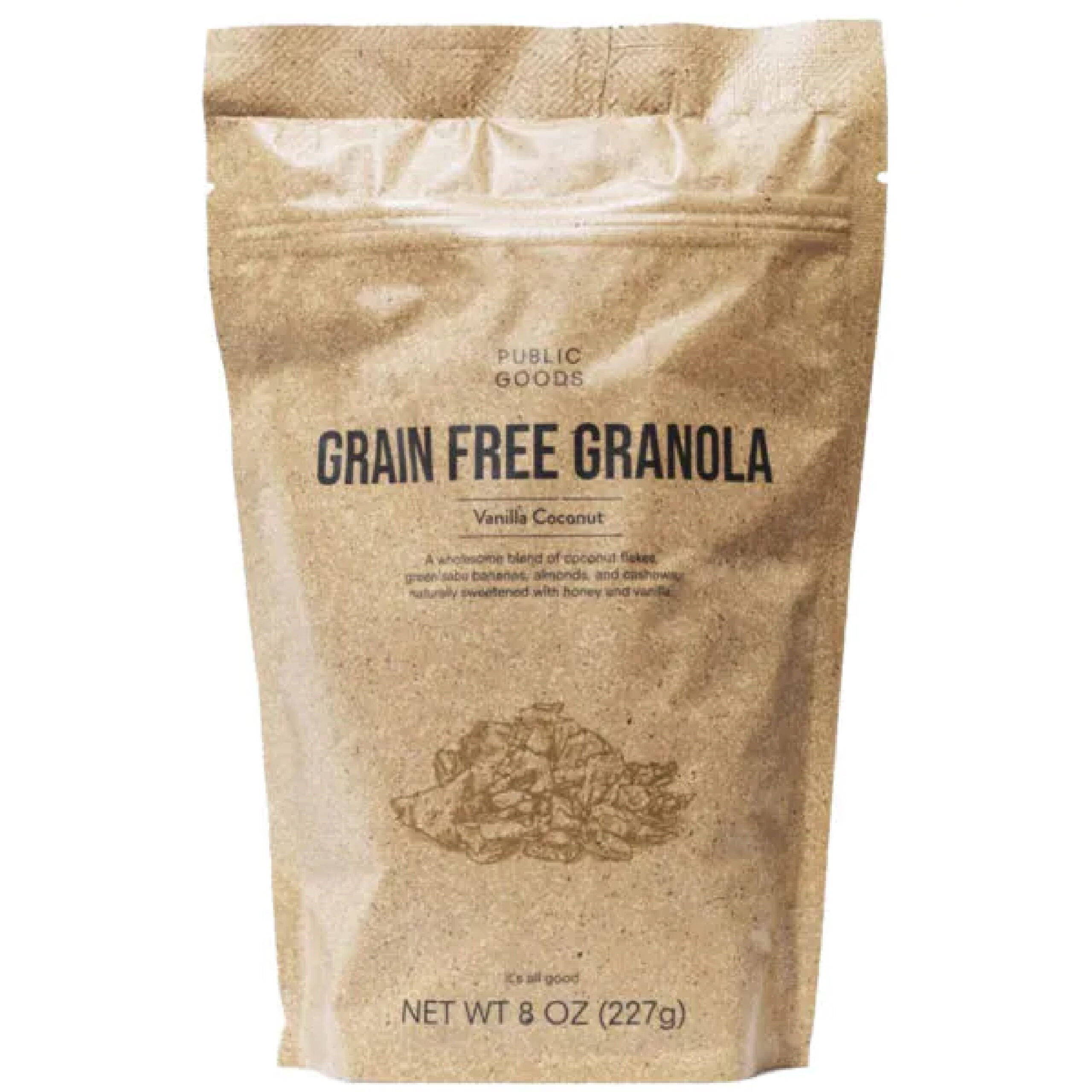
Public Goods

Public Goods Granola Packaging scaled 5 Essential Granola Packaging Ideas

Public Goods goes with an ultra-minimalist packaging that works for their product and their brand identity. It keeps it simple and to the point. The packaging would definitely benefit from a viewing window, which would match the packaging with the shades of brown and make it a bit more appetizing to the consumer. However, the rest of it is right on the money.

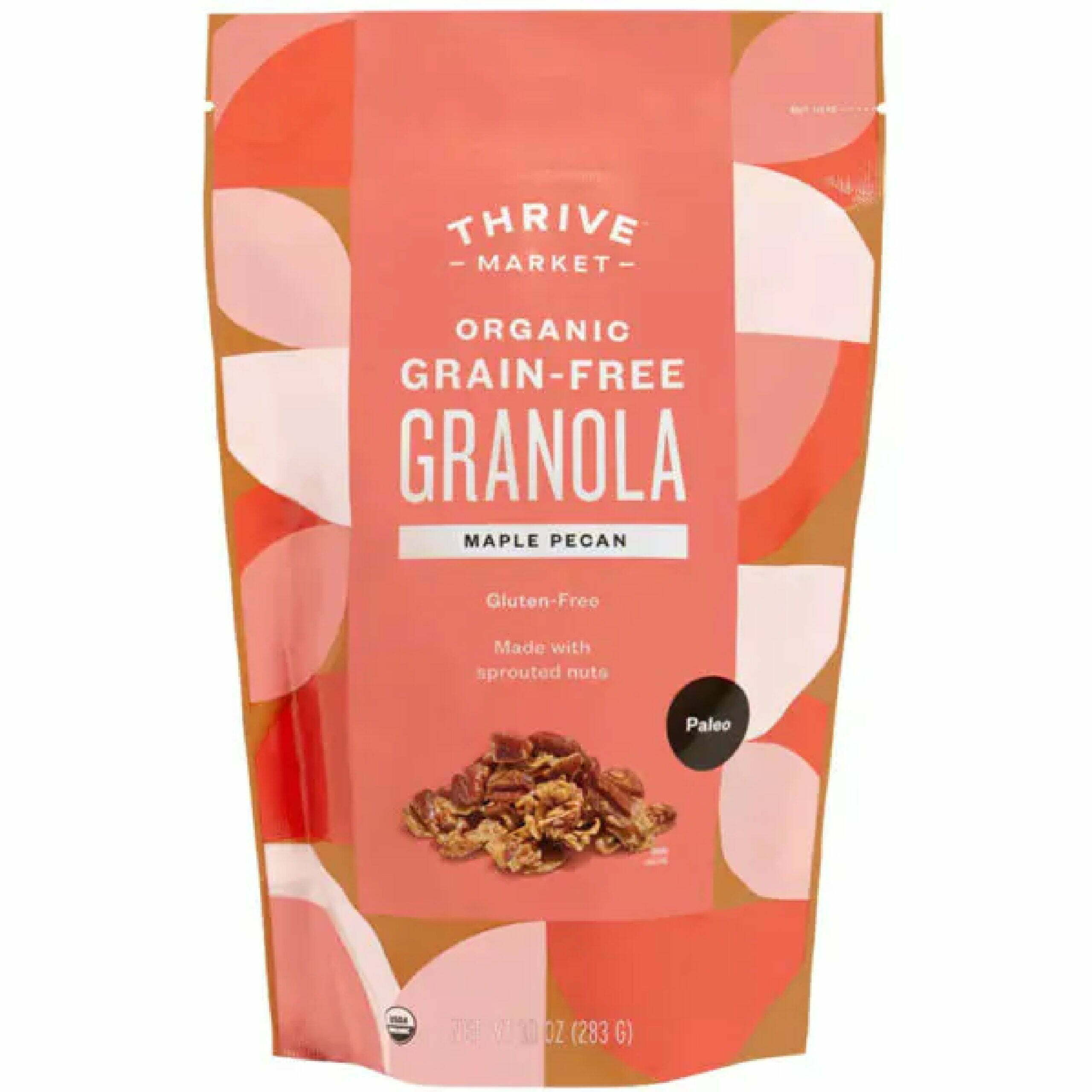
Thrive Granola

Thrive Granola Packaging scaled 5 Essential Granola Packaging Ideas

The soft yet colorful shades of pink and peach on the Thrive granola packaging, along with the large color blocks, make it stand out without being overbearing. The easy-tear, stand-up pouch with fun graphics is certainly going to appeal to a consumer. The biggest downside is going to be the lack of a zip-lock top to keep it fresh and to avoid any spillage from a tipped bag.

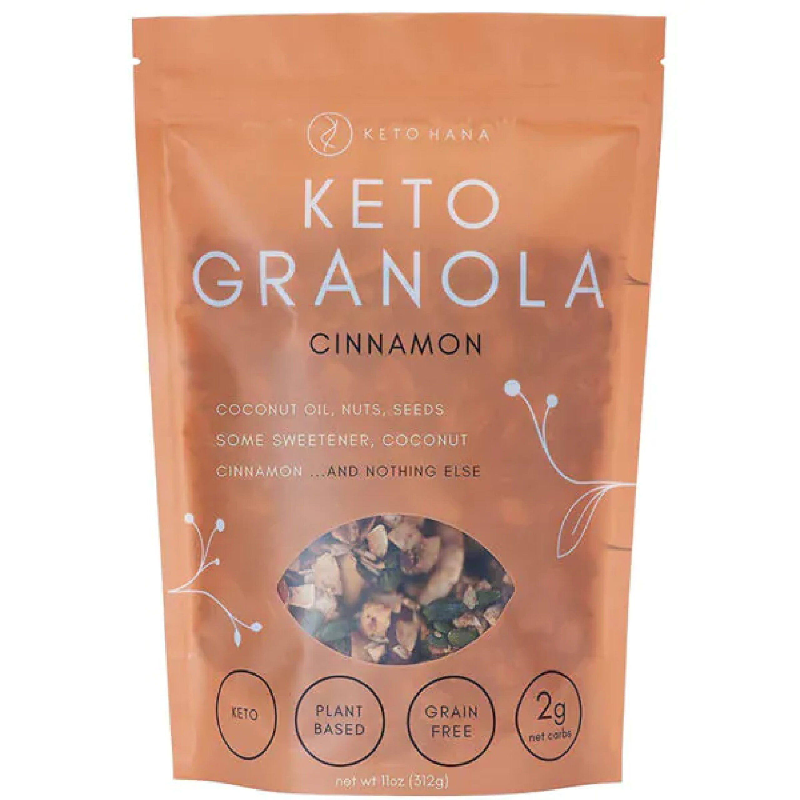
Keto Hana

Keto Hana Granola Packaging scaled 5 Essential Granola Packaging Ideas

Keto Hanas font choice is simple and direct, but the typography goes perfectly with their brand premise and the limited ingredient, simplified granola concept. The faded packaging with a peekaboo window gives the impression of transparency, literally with the ingredients. Although it is simple, the vine graphics elevate it with a touch of sophistication.

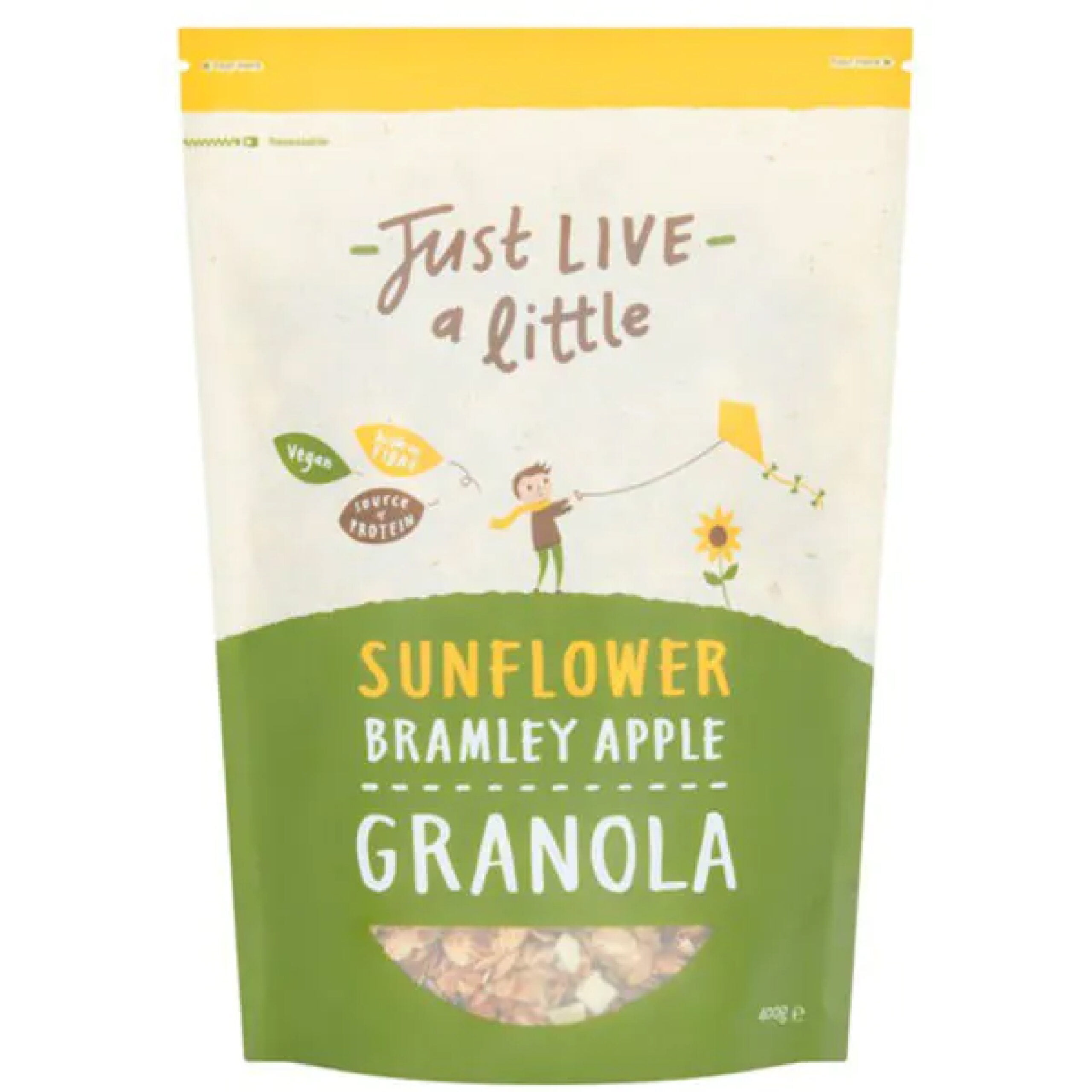
Just Live a Little

Just Live a Little Granola Packaging 74 scaled 5 Essential Granola Packaging Ideas

Just Live a Little has cute and wholesome energy, just like the Lark Ellen Granola. Their typography is inconsistent but in a cohesive way with two unique fonts. They have different color packaging for all their flavors, so it’s easy to tell them apart, but they all stick to the same color palette. It stands up, and it’s easy to tear open and just as easy to reseal.

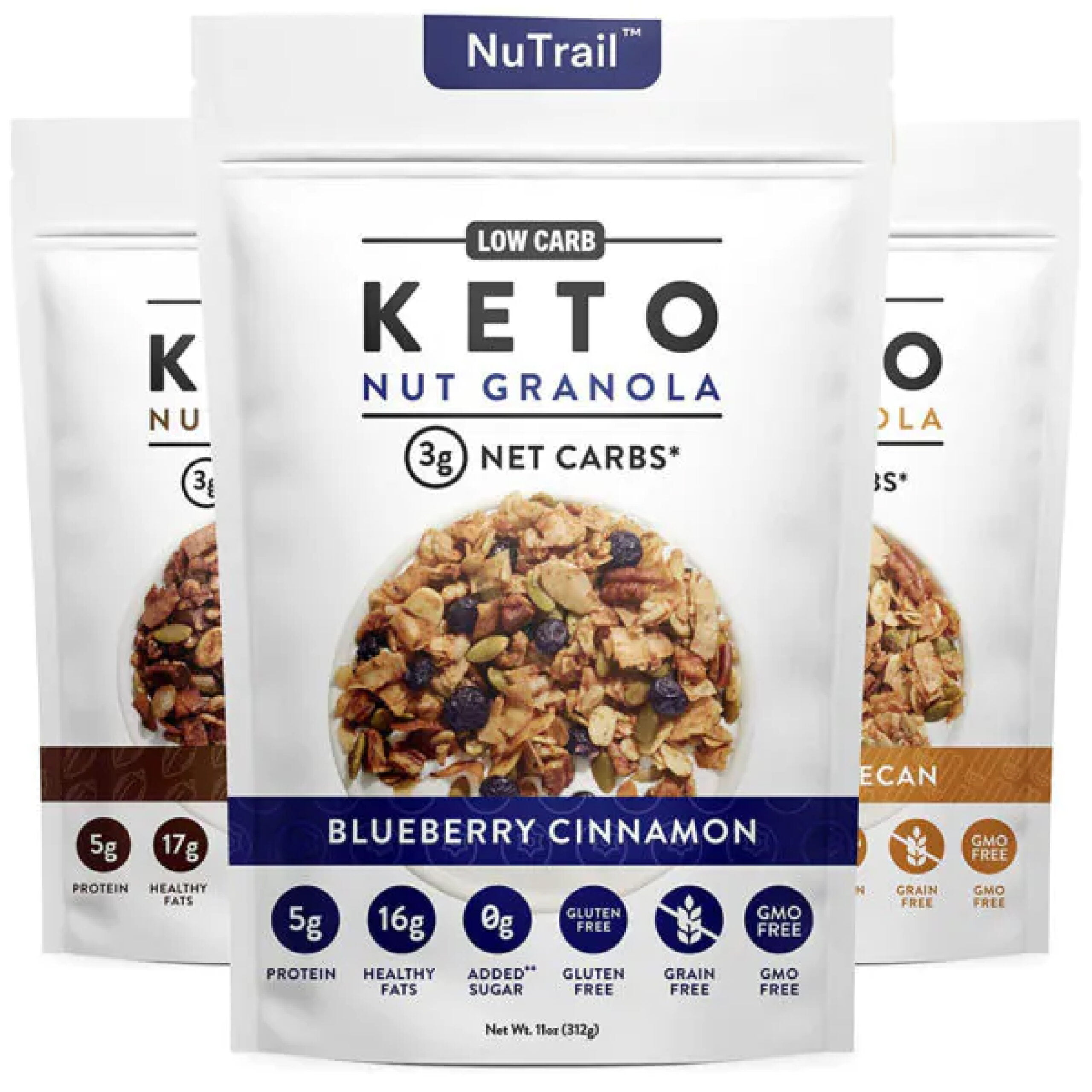
NuTrail Keto Granola

NuTrail Keto Granola scaled 5 Essential Granola Packaging Ideas

The packaging for NuTrail looks clean-cut and healthy. There’s nothing fancy or exciting, but most people who follow a keto diet just need to know what they’re putting in their body, which is the focus of the packaging. They don’t have a window, but at least provide a picture of the granola itself. The small color bands differentiate flavors. Clean fonts, clean colors, and clean graphics for clean eating.

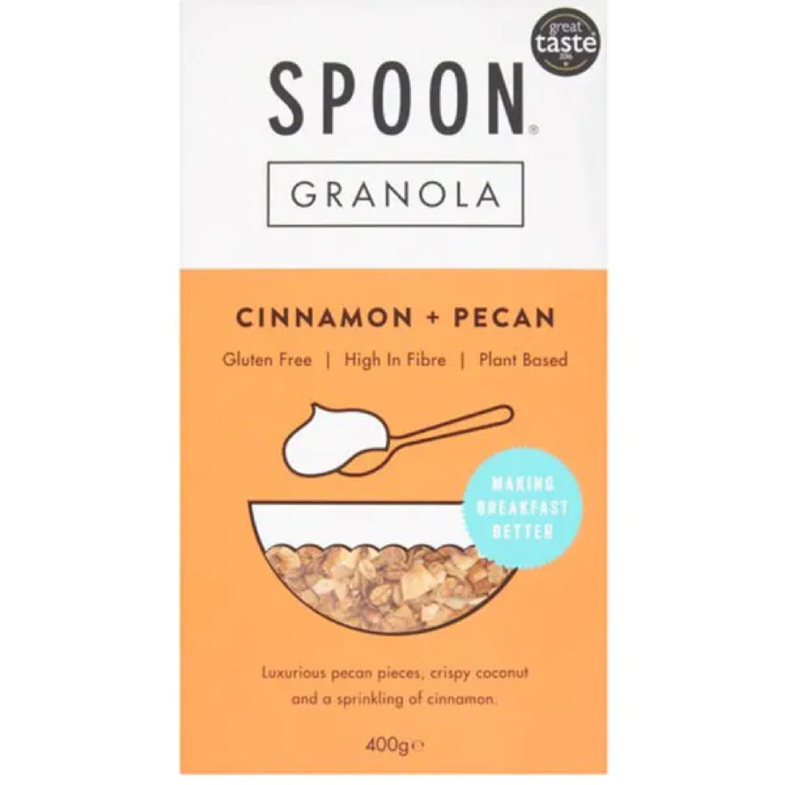
 Spoon Granola

Spoon Granola scaled 5 Essential Granola Packaging Ideas

Spoon Granola is a great example of minimalist design. The graphics are super simple, and the same can be said of the font choices. The typography pairs well with the colors, the lines, and the creative use of the little bowl for the viewing window. Boxes are much harder to stay fresh, but the square packaging still works with the overall design.

Bags 12 5 Essential Granola Packaging Ideas

Whether you’re looking to get your granola product into grocery stores or you want to elevate your stand at your local farmers’ market, custom seal pouch packaging for granola should be your next step. CarePac offers budget-friendly professional packaging that features stay-fresh packaging and seals with viewing windows and stand-up packages that will hit all the branding rules. With product packaging design you can print directly on, we have three different film materials to choose from and can help bring your vision to life. Customize each aspect of your flexible packaging and elevate your granola brand for 2022!


Reach out to us today to find out more about our customizable food packaging and what makes us one of the best flexible packaging companies in the U.S. Don't make a mistake -- call or email us today! 

Read More
Flowerhead Tea Packaging
Food Industry Packaging

11 Tea Packaging Ideas For Inspiration

11 Tea Packaging Ideas For

Inspiration

ezgif.com gif maker 8 11 Tea Packaging Ideas For Inspiration

Finding the perfect packaging aesthetic is no easy feat, especially when it comes to teas. You need to find just the right combination of font and color, pair it with the right logo and graphics, and maintain a visual that evokes the voice of your brand. There’s a reason why major companies pay millions a year to craft their dream packaging design. But with the right know-how, you can skip out on spending millions and develop packaging for your products that works for you and keeps you within budget.


Keep reading to learn more about how to design great tea packaging with a designer like us. 

ith over 40 films available, we have a material that will ensure your stand up pouch is of the highest quality. We can also combine materials in a custom order. You can combine a black film with a clear film, or metallized with a glossy finishing. It's your choice! Contact us to learn more about custom printed pouches and stand up pouch projects. Give us a call at 626-559-0377 and request a quotation. We'll be happy to help you.

Things to Keep in Mind When Designing Tea Packaging

So, what’s there to remember as you go into designing your new packaging? To create a tea packaging concept that sells, here are some essential trends to keep in mind:

Typography-Focused Tea Packaging Designs

Blending a fun, unique, and energetic collection of fonts together can do more for a logo and brand than any poorly conceived, thrown-together clip-art graphic. Melting a bold san serif font with the perfect pointed serif text can create a visually stunning and impactful display that catches the eyes and interest of shoppers. In fact, a lot of big-name companies focus on typography-centered packaging that relies solely on a combination of font lettering, kerning, and leading to effectively convey their brand to customers. Tea label design ideas should have the perfect font.

Tea-lovers have a sensitive palette for delightful blends- whether it’s the teas or the typography!

Experiential Designs

Appealing to the senses is about more than just appealing to the sights of your customers. Enjoying tea is a full experience, from the warm sensation of one’s mug, to the aromatic fragrances of the tea leaves, to the tingling taste of the unique blend of flavors. That’s why some of the more successful packaging actually aims to craft a whole experience, with colors, textures, text, and specific language - visual “flavors,” so to speak.

Finding a way to appeal to as many of your potential customers’ senses draws them in with your packaging, only to leave them further delighted with your flavor.

Maximize or Minimalize

Two contrasting, yet equally powerful design trends that tend to convert buyers of tea - but there’s a trick to it! You can have a product packaging design that is energetic, bold, colorful, loud, and busy enough to constantly engage, or a design that is sleek, minimal, clean, and fresh. The appeal is to calm and soothe or to inspire energy and sensations. But the trick is to fully commit to one or the other, or neither. Before you pick one or the other, consider what sensations your tea evokes in the drinker. Are you expecting them to generally feel imbued with soothing, calming, aromatic flavors, or are you wanting to entice their senses and awaken their spirits?

The Eco-Aesthetic

Although tea drinkers are not exclusively eco-lovers and environmental champions, there is an element of earthy appreciation among them. The eco-friendly aesthetic design for tea packaging uses browns and earth tones on their packaging, and is often environmentally friendly, green, or sustainable in production. They often stick to soft greens, light beiges and browns, taupe color palettes, or other colors of a more natural feel. They tend to be minimal and fresh, with delicate fonts. Some of them have paper packaging that looks recycled (and typically is). Cardboard, paper packaging, and other compostable materials are a big part of this design look.

But, food packaging and tea packaging, in particular, still need to appeal to the tastes of consumers, so if you’re aiming for an eco-aesthetic, it still needs to look and feel palatable. It should read as good for you, and good for the environment as well as tasty.

Soft and Neutral Color Palettes for Your Creative Tea Packaging

Soft, neutral, and natural color palettes are another key design trend for tea packaging designs. Unlike coffees, sodas, and alcohols, teas have a healthier connotation attached. It’s a beverage for quiet moments of solitude and relaxation, chilly mornings, or afternoon pick-me-ups. Color palettes that are based around natural, earthy tones or soft, muted pastel shades bring similar energy to the packaging. If you’re packaging a chamomile tea with a label that reads loud and overbearing, it’s likely to push consumers away. Gentle neutral tones that calm and soothe are going to better parallel the experiences of your tea-drinkers. 

tea packaging 11 Tea Packaging Ideas For Inspiration

11 Great Tea Packaging Concepts and Ideas for Design

Euphoric Herbals

tea 74 11 Tea Packaging Ideas For Inspiration

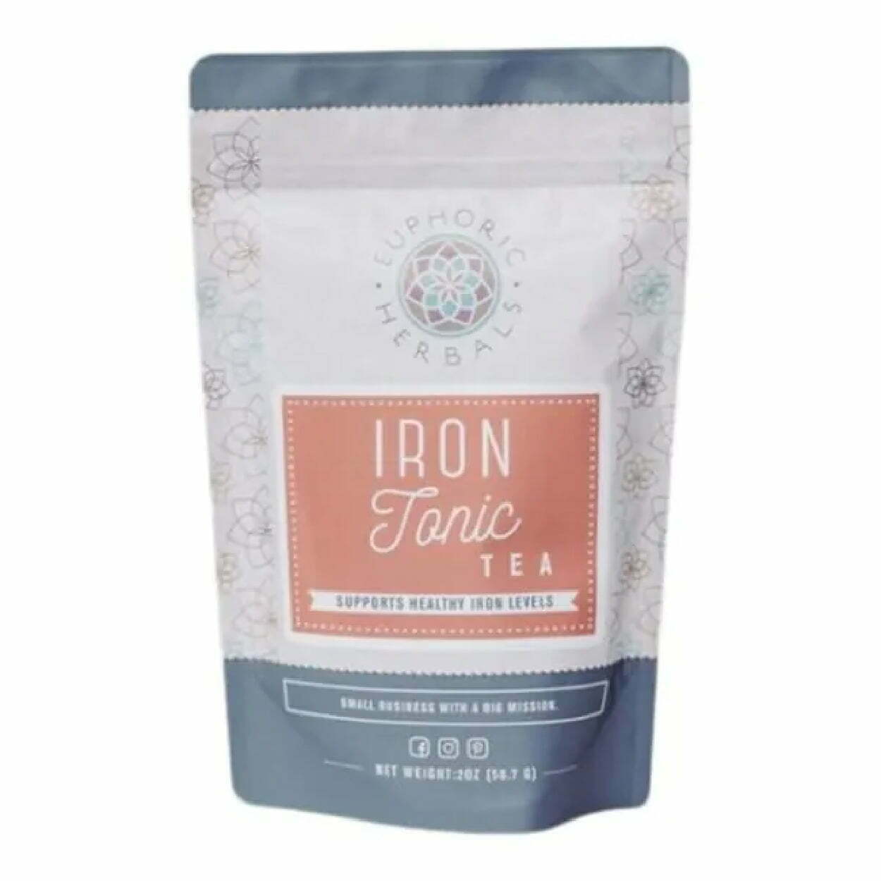
The Euphoric Herbals packaging for their Iron Tonic tea is a great example of the typography-centered packaging that uses a three-font combination. They also have a soft color palette that pairs well with the fonts for an overall calming yet vibrant and eye-catching package. The neutral tones of brick and slate-blue are contrasting, similar to the script and san serif font of the label. Although it’s not the most exciting packaging, it also has a lot going on, with the floral shape graphics covering the side panels of the package.

The Pink Tea Box

tea 75 11 Tea Packaging Ideas For Inspiration

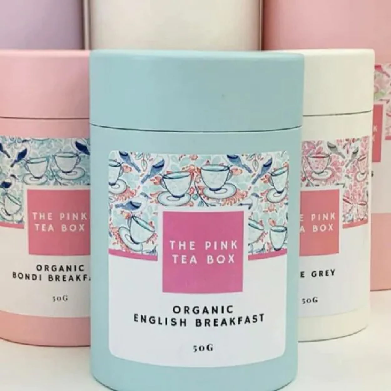
The pastel palette of the Pink Tea Box is cohesive, concise, and effectively conveys the springtime, floral flavors, and subdued energy of the brand. They pair it well with scribbled graphics of teacups on the label to give a bit of pop while not overwhelming the frame of the label. It breathes feminine energy to appeal to its target demographic. The use of the circular cardboard boxes is also circular, smooth and further maintains the serenity of the packaging as a whole.

Zest Tea

tea 76 11 Tea Packaging Ideas For Inspiration

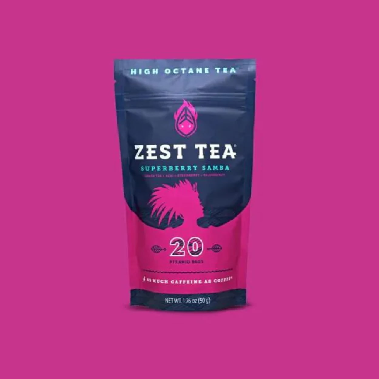
Zest Tea advertises itself as a high-octane tea, a tea that delivers as much caffeine as a cup of coffee. This means their packaging should evoke high energy, with loud, bold, and dynamic colors and fonts. The bright, contrasting colors play with the bold-paired font in a way that is smooth and appealing, but gives off the same dynamic energy of their tea.

 Woash

tea 77 11 Tea Packaging Ideas For Inspiration

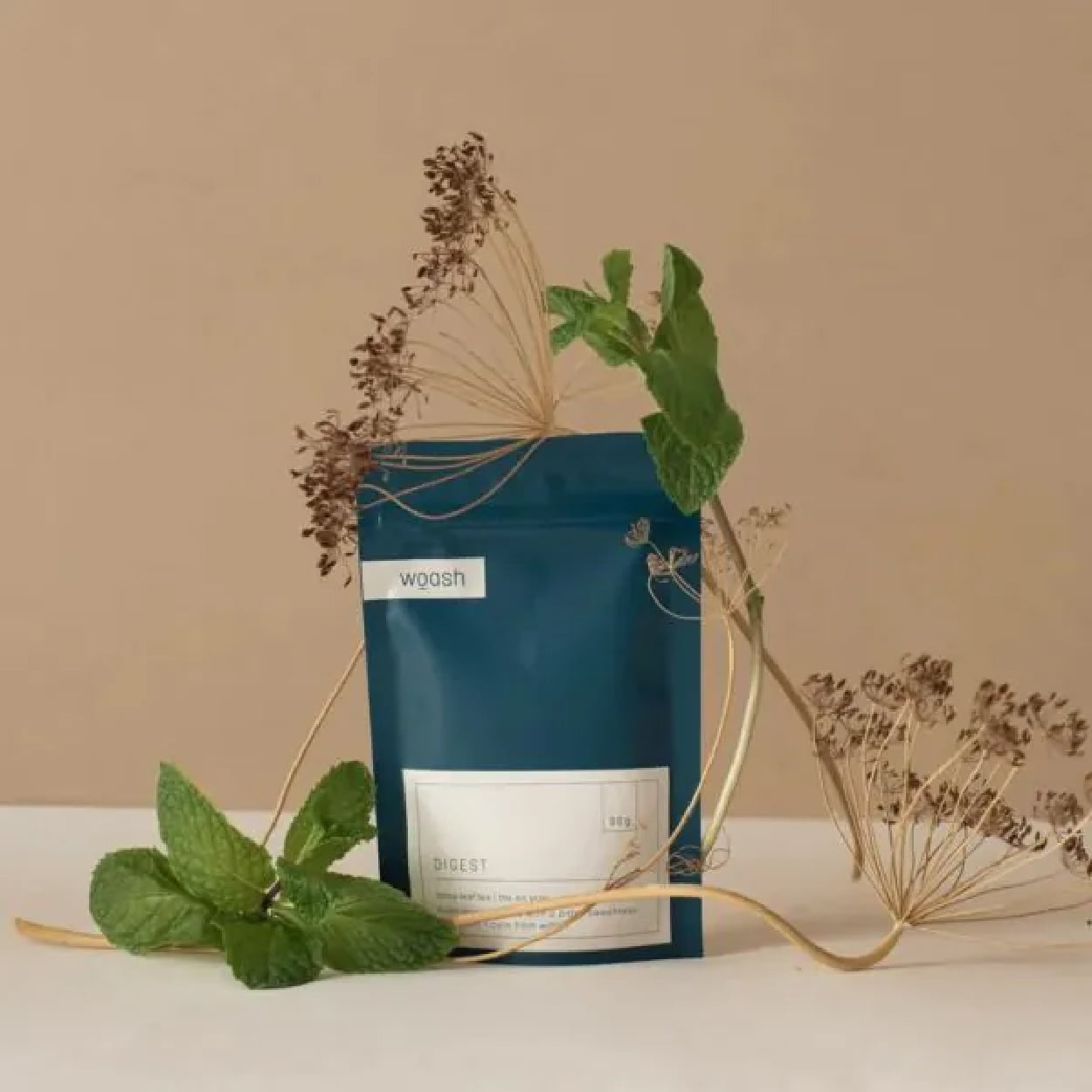
Woash takes minimalism and neutral coloring to the max with a deep blue and beige palette. No real logo is needed when you take your typography and transform it into a cohesive aesthetic. The packaging pairs it with smooth, clean lines for a simple yet sleek package that looks as easy on the stomach as it is on the eyes.

Flowerhead Tea

tea 78 11 Tea Packaging Ideas For Inspiration

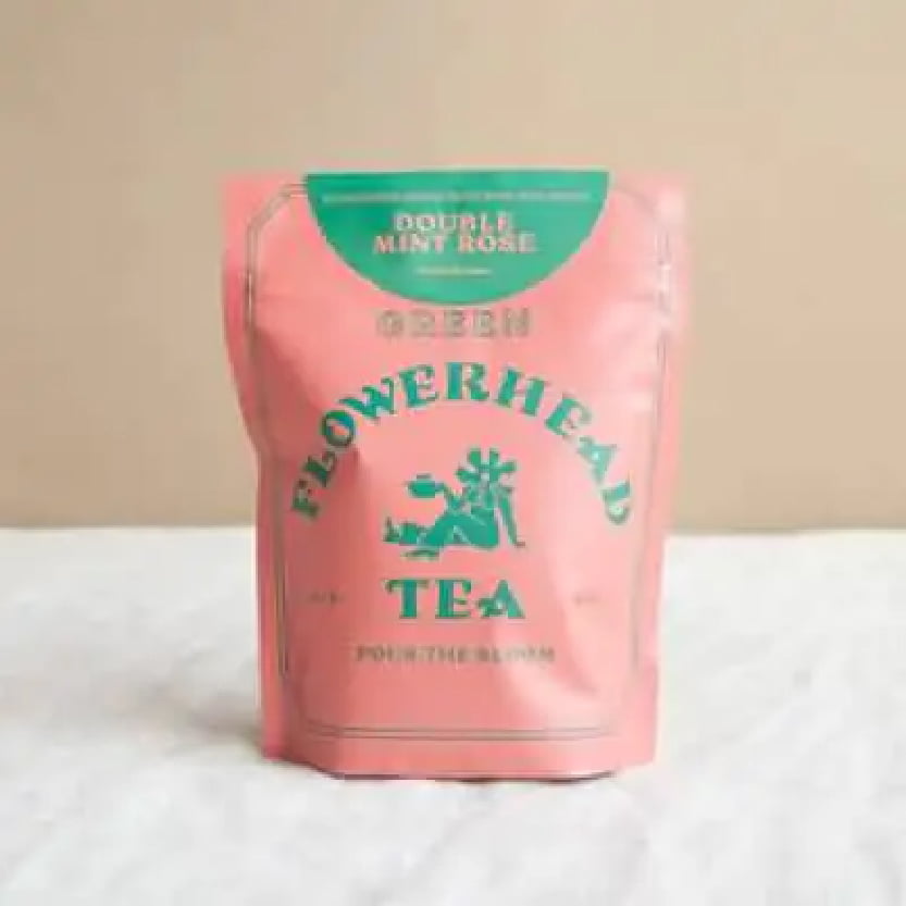
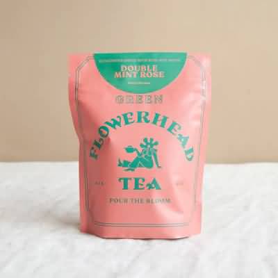
Flowerhead Tea’s packaging follows its own rules of designs for an experiential effect, with a clashing color palette that is almost hard to look at. The bold, all-caps font choice is equally loud and in-your-face. It’s a bold risk, but it somehow works. It’s all simple, with just two colors, three fonts, and one minimal graphic, but it comes together to sell.

August

tea 85 11 Tea Packaging Ideas For Inspiration

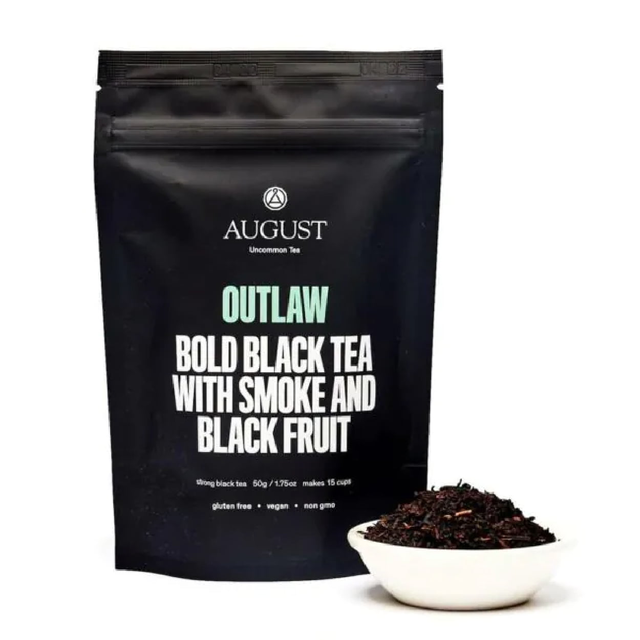
August’s Outlaw tea packaging is all about dramatic and bold. The stark, all-black packaging paired with simple, loud lettering (it’s literally yelling) strays from the more traditional tea packaging. The typography stays focused and centered with minor pops of color. The consumer knows exactly what they’re getting they and can expect a flavor that’s as bold as the look.

Healthify Tea

tea 80 11 Tea Packaging Ideas For Inspiration

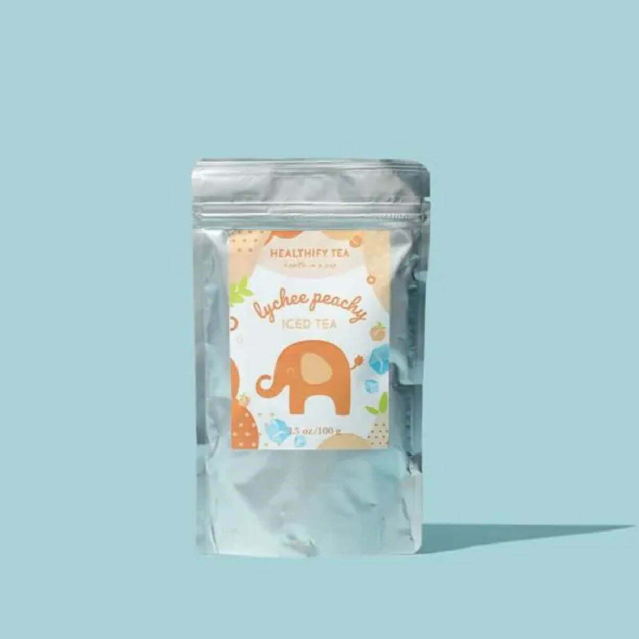
Healthify Tea has cute, bright, cheery, and fun packaging that is visually pleasing. Although full package branding, as opposed to a sticker on a package, would give it more professionalism and pop, the label is experiential in design, with bright colors, textures, graphics, and unique lettering in the typography. You get a little tingle of joy even just looking at the package, let alone sipping the tea.

Blume

tea 81 11 Tea Packaging Ideas For Inspiration

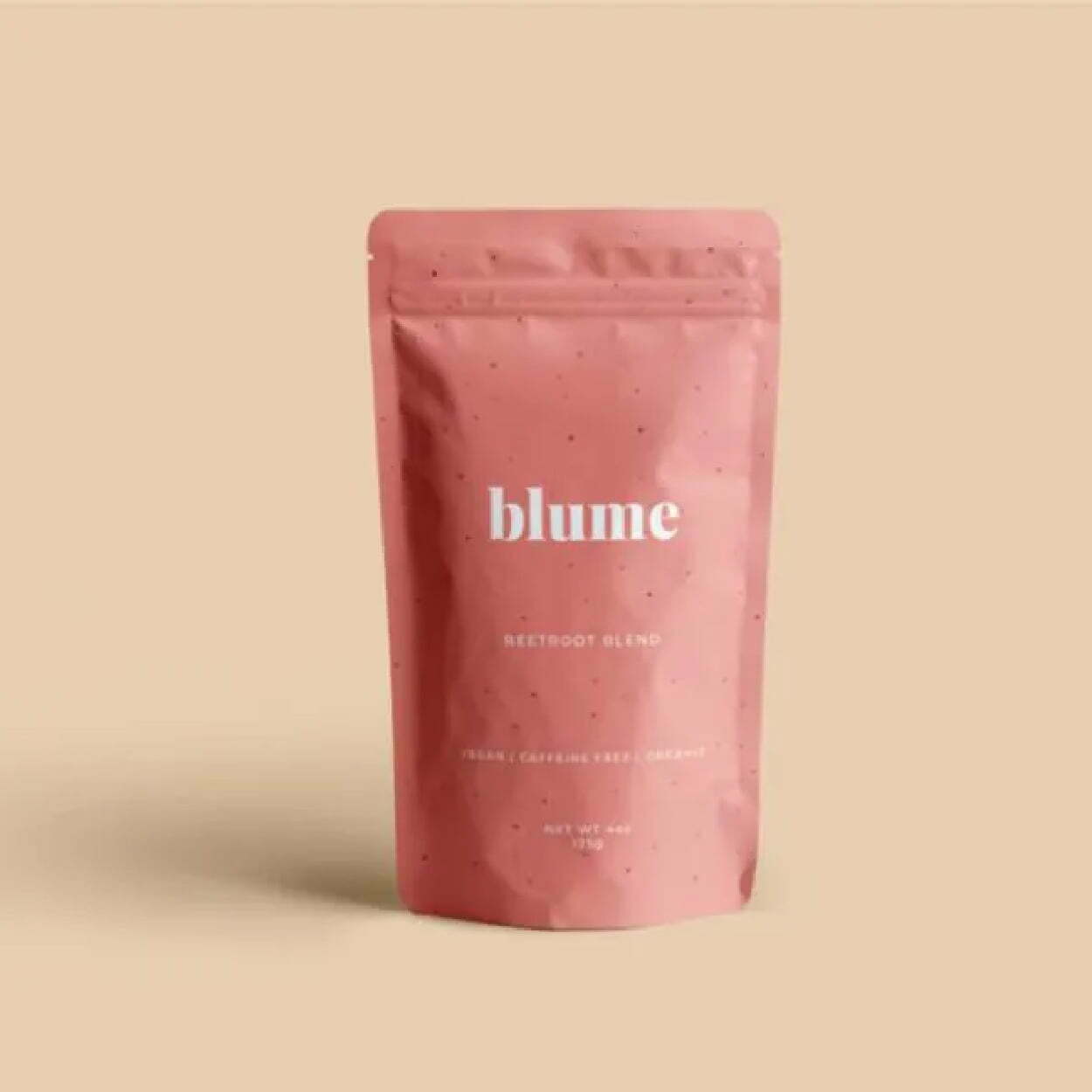
Blume’s minimalist packaging stays consistent across most of its flavors, with the primary difference being the color of the package. They vary but stay neutral and pastel, with faded shades and tones. They’re also typography-focused for the logo and packaging, with the simple, all-lowercase “blume” as their logo in the key font, paired with san serif fonts that are sleek and linear.

Sammee

tea 87 11 Tea Packaging Ideas For Inspiration

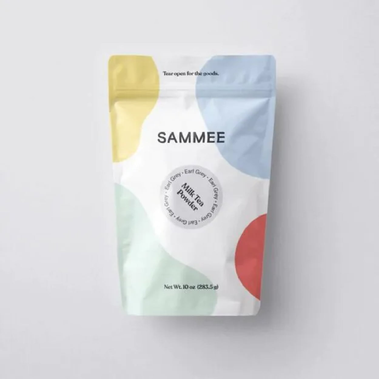
Sammee takes primary colors and shifts them to a soft, gentle pastel. It keeps the aesthetic simple but with a pop of color that gives energy but doesn’t overwhelm. It feels fluid with the unshaped blocks of color and feels palatable. It’s visually stimulating with colorful, abstract shapes, but in a calm and subdued way. The typography could give more than it currently does, but at least it doesn’t detract from the design.

Rishi

tea 83 11 Tea Packaging Ideas For Inspiration

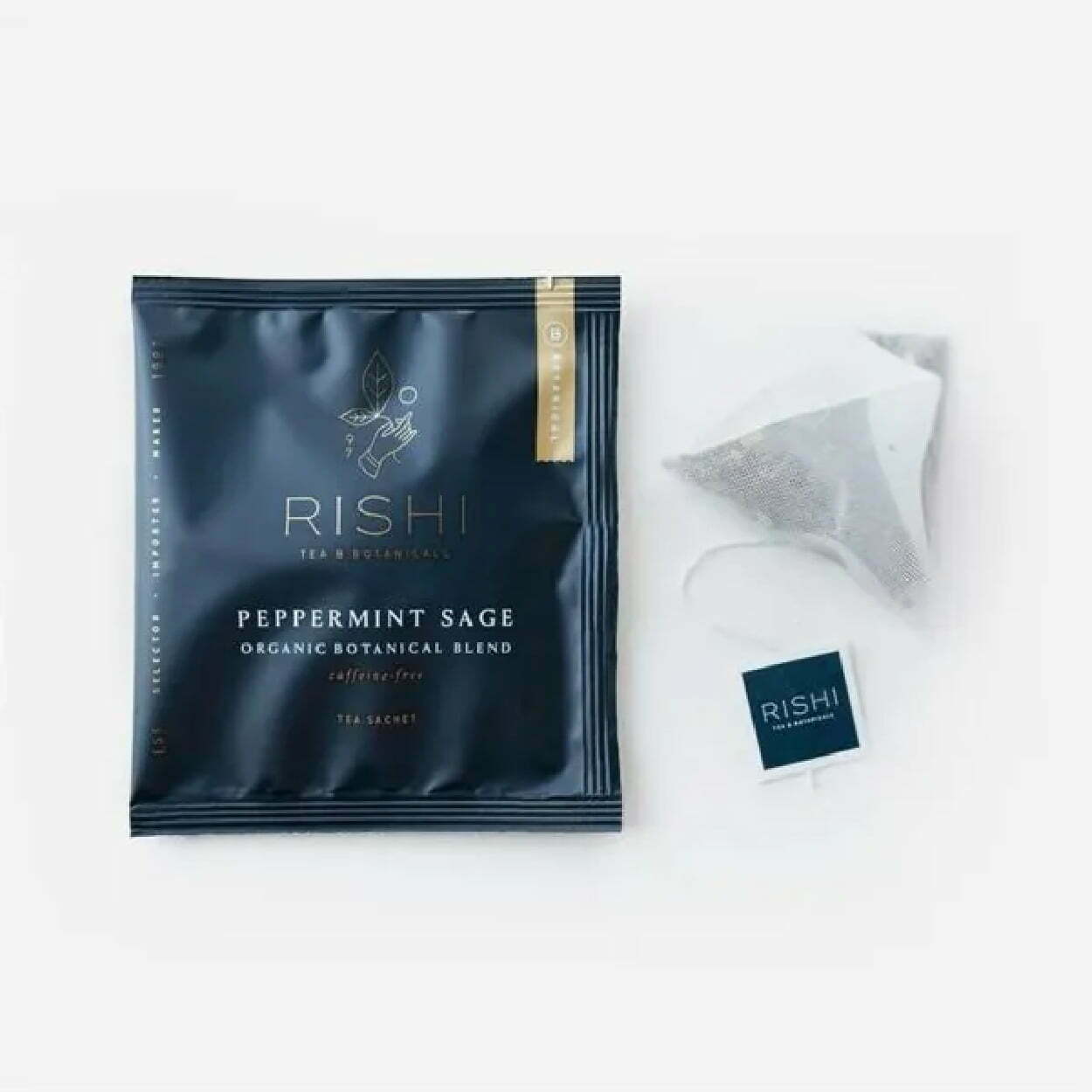
Rishi’s packaging feels luxurious and rich, with an almost velvet matte finish of the sachet that’s coupled with minimal amounts of gold detailing and sleek, thin lettering. Experiential designs make you feel something other than just a visually appealing package. It looks like whatever you drink from it will feel smooth, calming, and rich with flavorful tea.

Alaya 

tea 84 11 Tea Packaging Ideas For Inspiration

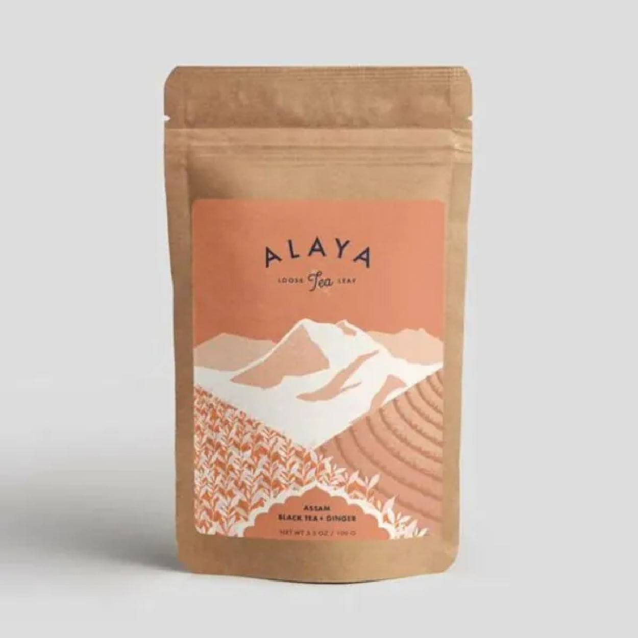
Alaya takes eco-friendly and sustainable packaging and pairs it with a minimalism that feels organic, fresh, and healthy. The colors are earthy, with the natural paper bag of the package and the mint-green and white tones on the label. The graphics add a level of complexity but still keep it minimal on the detailing, which matches well with the eco-friendly feel of the tea packaging.

Professional Packaging with CarePac

Bags 25 11 Tea Packaging Ideas For Inspiration

Finding affordable but professional packaging that helps sell your tea is easier said than done - unless you’re using the right custom packaging services. Eliminate your need to stress about quality packaging for sachets, loose leaf tea bags, and sachet bags with our customized tea packaging. 


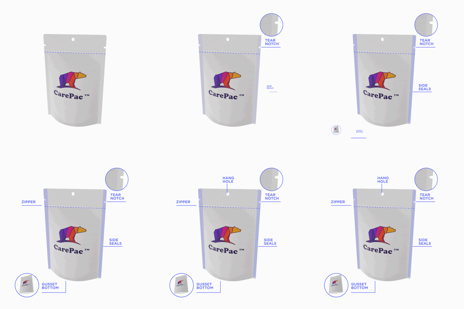
But having a killer packaging design doesn’t mean much if your package isn’t functional, as well. Tea needs to stay dry, preserved and sealed to maintain its aromatic tastiness, and the tea information should be clearly stated on your tea product packaging. Our standup box package design and packaging's feature a multi-layer preservation barrier, easy-to-use zip closures, tear notches, hang holes, and more.


Reach out today to find out how we can help perfect your packaging! Contact us for more information! 

Read More
candy packaging 75 75 5 Candy Packaging Ideas as Sweet as Your Candy
Food Industry Packaging

5 Candy Packaging Ideas as Sweet as Your Candy

5 Candy Packaging Ideas as

Sweet as Your Candy

The candy industry is not an easy one to break into. Candy producers are competing with big-name companies for market share in a massive industry. But luckily, more and more consumers are turning to new, small-business treats to satisfy their sweet tooth. Now’s the time to go all-in with your candy packaging ideas to embrace the moment for your candy business. With the right packaging, you can establish your identity, attract consumers to your candy, and build loyalty with those consumers.

candy packaging 5 Candy Packaging Ideas as Sweet as Your Candy


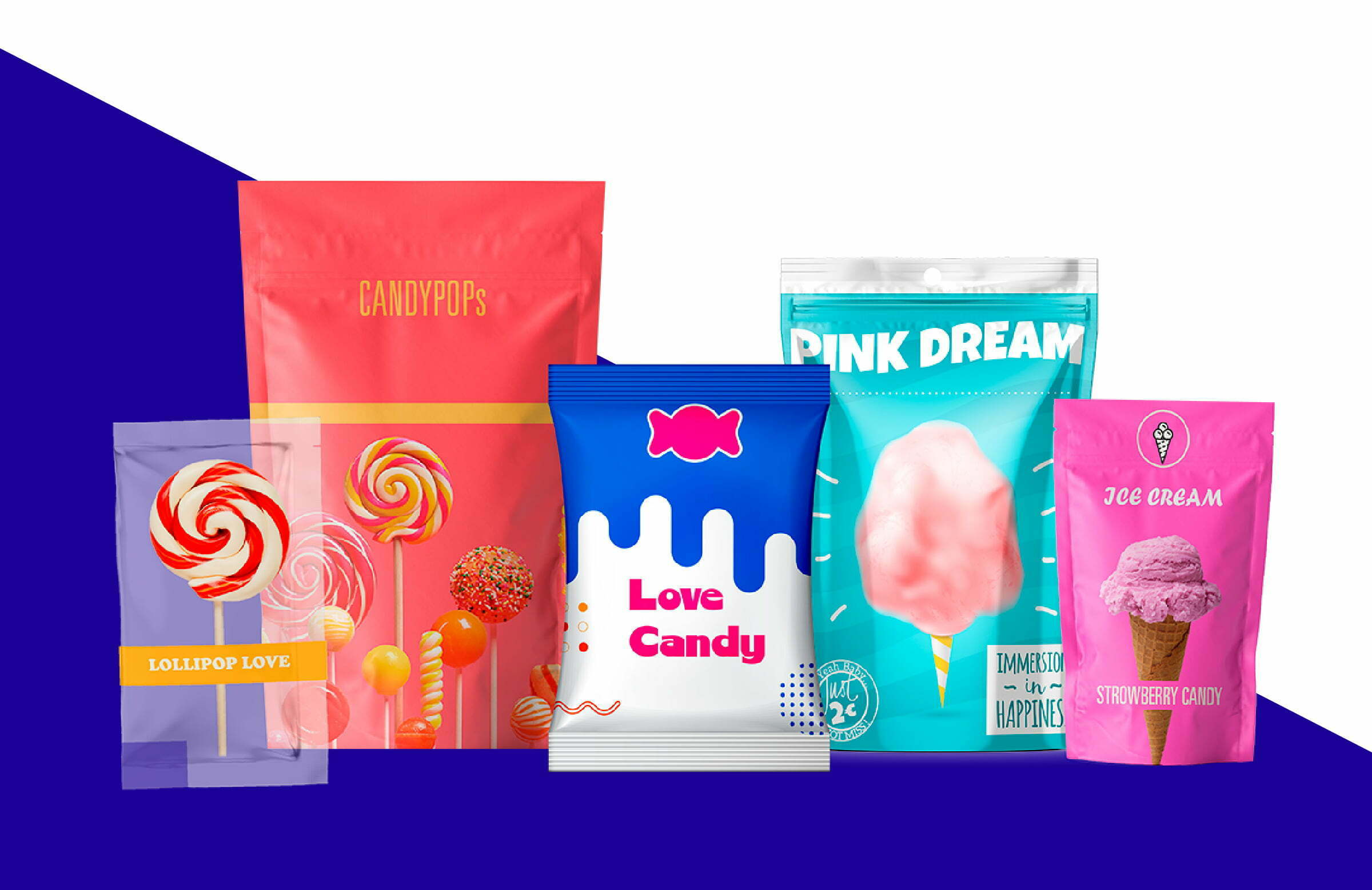
As good as your candy may taste, they first need to pick it off the shelves. So before you dive into planning out your own candy packaging, here are five trends in 2022 to keep in mind.


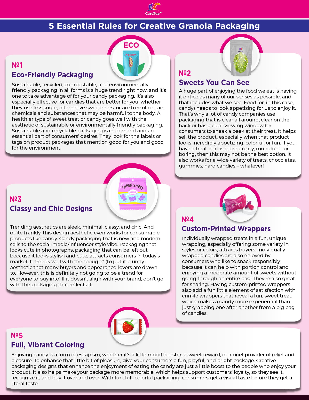
Sweets You Can See

A huge part of enjoying the food we eat is having it entice as many of our senses as possible, and that includes what we see. Food (or, in this case, candy) needs to look appetizing for us to enjoy it. That’s why a lot of candy companies use packaging and boxes that is clear all around, clear on the back or has a clear viewing window for consumers to sneak a peek at their treat. It sells the product, especially when that product looks incredibly appetizing, colorful, or fun. If you have a treat that is more dreary, monotone, or boring, then this may not be the best option. It also works for a wide variety of treats, chocolates, gummies, hard candies – whatever!

Popular Candy Packaging That's Eco-Friendly 

Sustainable, recycled, compostable, and environmentally friendly packaging in all forms is a huge trend right now, and it’s one to take advantage of for your candy packaging. It’s also especially effective for candies that are better for you, whether they use less sugar, alternative sweeteners, or are free of certain chemicals and substances that may be harmful to the body. A healthier type of sweet treat or candy goes well with the aesthetic of sustainable or environmentally friendly packaging. Sustainable and recyclable candy packaging is in-demand and an essential part of consumers’ desires. They look for the labels or tags on product packages that mention good for you and good for the environment.

Classy and Chic Design Ideas

Trending aesthetics are sleek, minimal, classy, and chic. And quite frankly, this design aesthetic works for consumable products like candy. Candy packaging that is new and modern sells to the social-media/influencer style vibe. Packaging that looks cute in photographs, packaging that can be left out because it looks stylish and cute, attracts consumers in today’s market. It trends well with the “bougie” (to put it bluntly) aesthetic that many buyers and appearance-lovers are drawn to. However, this is definitely not going to be a trend for everyone to buy into! If it doesn’t align with your brand, don’t go with the packaging that reflects it.

Custom-Printed Plastic Candy Boxes

Individually wrapped treats in a fun, unique wrapping, especially offering some variety in styles or colors, attracts buyers. Individually wrapped candies are also enjoyed by consumers who like to snack responsibly because it can support portion control and enjoying a moderate amount of sweets without going through an entire bag. They’re also great for sharing. Having custom-printed wrappers also add a fun little element of satisfaction with crinkle wrappers that reveal a fun, sweet treat, which makes a candy more experiential than just grabbing one after another from a big bag of candies.

Full, Vibrant Coloring

Enjoying candy is a form of escapism, whether it’s a little mood booster, a sweet reward, or a brief provider of relief and pleasure. To enhance that little bit of pleasure, give your consumers a fun, playful, and bright package. Creative candy packaging designs that enhance the enjoyment of eating the candy are just a little boost to the people who enjoy your product. It also helps make your package more memorable, which helps support customers’ loyalty, so they see it, recognize it, and buy it over and over. With fun, full, colorful candy packaging, consumers get a visual taste and idea before they get a literal taste.

Candy infographic 5 Candy Packaging Ideas as Sweet as Your Candy

Designs That Work

Gem Gem

candy 73 5 Candy Packaging Ideas as Sweet as Your Candy

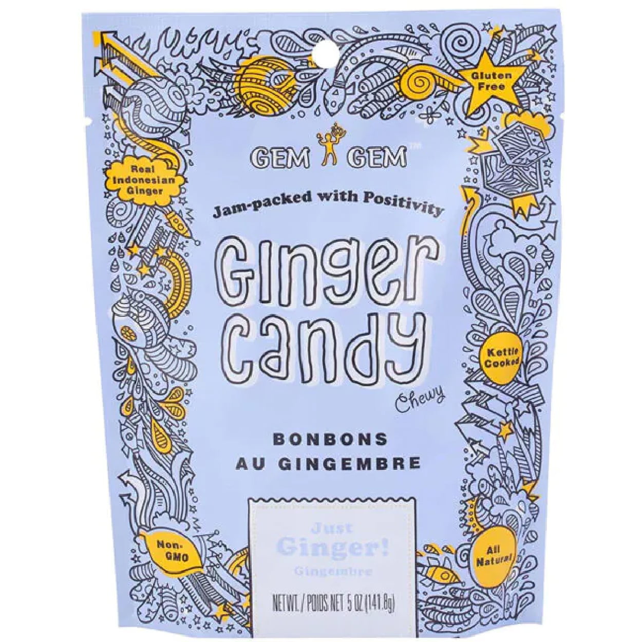
The ginger candy chews by Gem Gem come in an adorable, energetic packaging design that is playful, fun, and easy. The two-color palette of blue and yellow pair well together in a fun and bright way, while the fun fonts add to the playful feel. The unique scribbled graphics also make it fun and playful since it feels like a teenager’s notebook that is distracting and reflects the ease that is enjoyable with candy. This popular candy packaging is full of color with also feels cohesive and consistent.

Crow & Moss

candy 74 5 Candy Packaging Ideas as Sweet as Your Candy

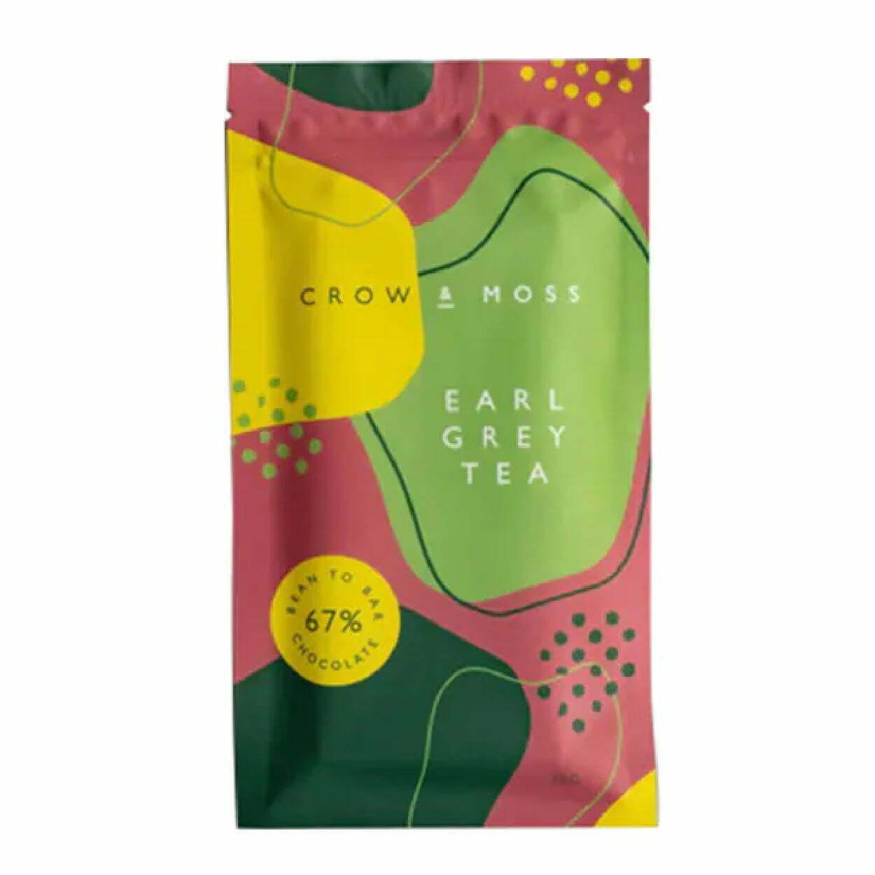
Crow and Moss has a classy and chic tear-away packaging for their chocolate brittle bar that is sophisticated and looks rich with deep colors. The abstract shapes and patterns scattered throughout almost make it too handsome to just be chocolate. But overall, the aesthetic of this candy packaging paper totally works! 

The Organic Candy Factory  

candy 75 5 Candy Packaging Ideas as Sweet as Your Candy

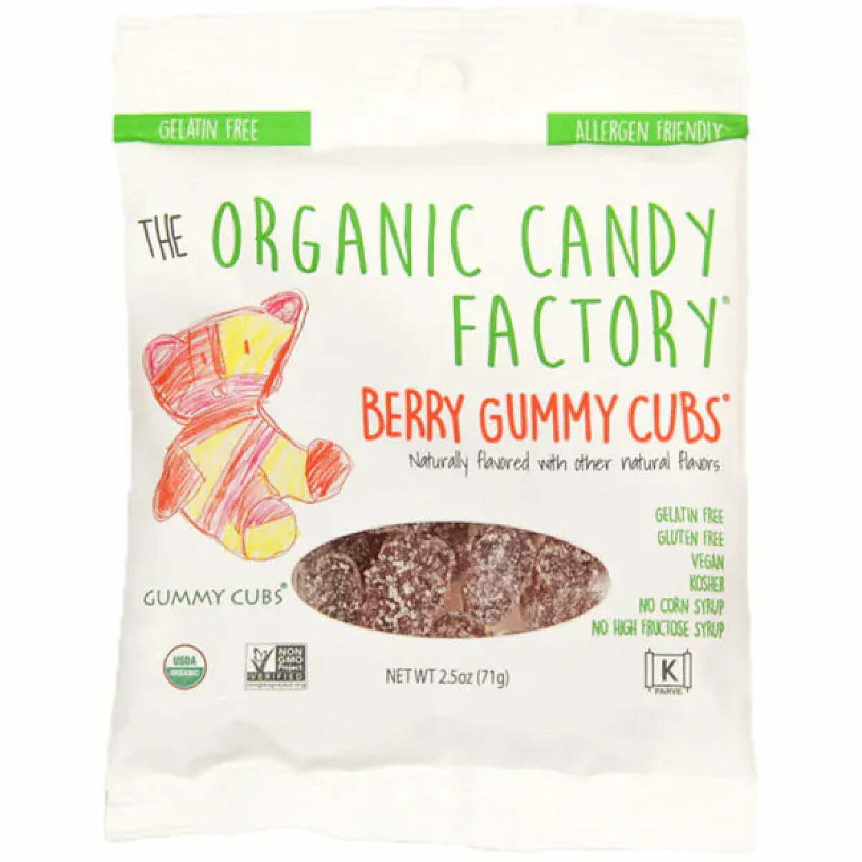
Organic candies are marketed as earth and natural, which is why the Organic Candy Factory’s sweet package uses a font that almost looks handwritten, along with a bear sketch that definitely looks handwritten. The handwritten tone of the package makes the candy seem almost homemade, so the buyer gets the impression that it contains better-for-you ingredients. Plus, organic can mean healthy, which can mean flavorless – so including the package window so buyers can sneak a peek at how delicious the gummies look only helps to sell them even more.

Sabadi Organic Italian Candies

candy 76 5 Candy Packaging Ideas as Sweet as Your Candy

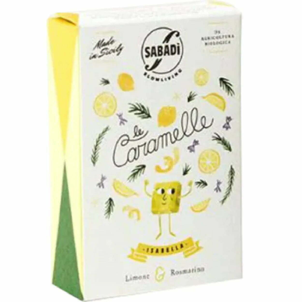
Sabadi Organic Italian Candies has a lot of good packaging going on. First, the box is light and playful with a bright and vibrant color palette that uses the white space well. Boxes aren’t the easiest to store or stash, but luckily, they also have individually candies custom wrapped and ready to grab. Better yet, the packing of these wrappers is fun, eye-catching, and unique. The packaging of the candy is as delightful as the candies themselves!
Giddy Up Nuts 

candy 77 5 Candy Packaging Ideas as Sweet as Your Candy

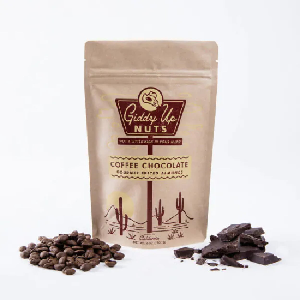
The packaging for Giddy Up Nuts is minimal, sharp, and simple. Two shades of brown between the print and the packaging material make it look natural and earthy, which makes sense since both cocoa and nuts are earth-made. The eco-friendly packaging is spot on and works for them, although the package isn’t the most eye-catching.

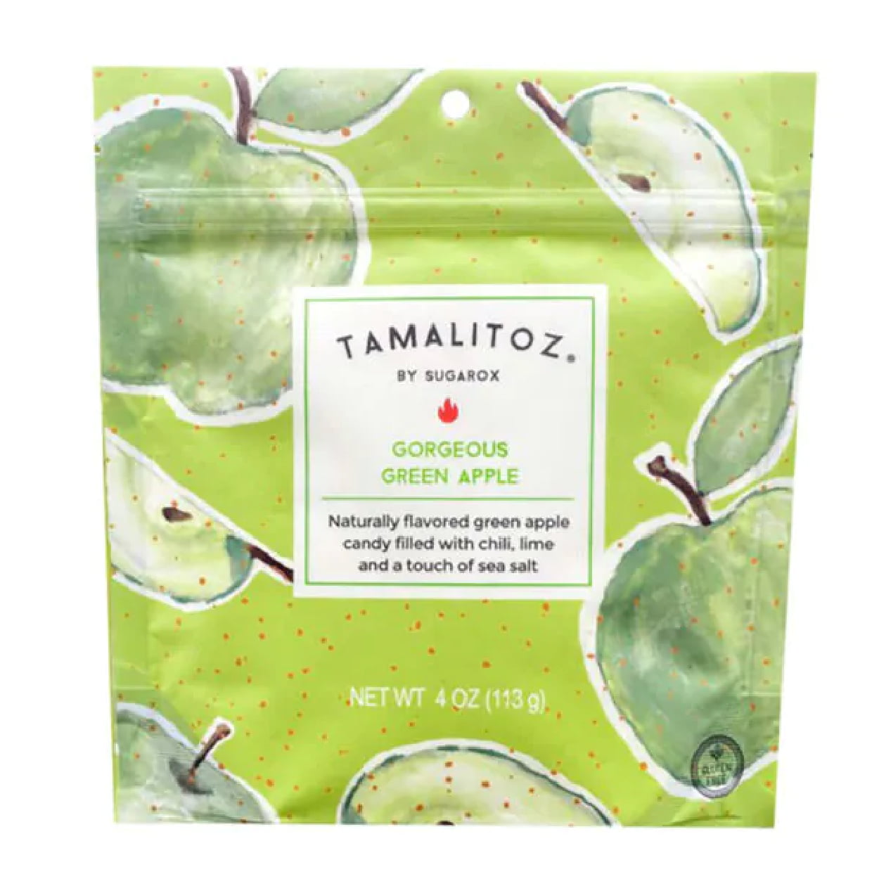
Tamalitoz

candy 78 5 Candy Packaging Ideas as Sweet as Your Candy

The designs of Tamalitoz packagings are refreshingly original. Each package takes the color of the fruit that inspires the flavor of that particular candy bag. The graphics are scattered and fun and make it look as fresh and delicious as the candy tastes. The fruity colors are super bright and vibrant, which makes their packaging pop out on the shelf.

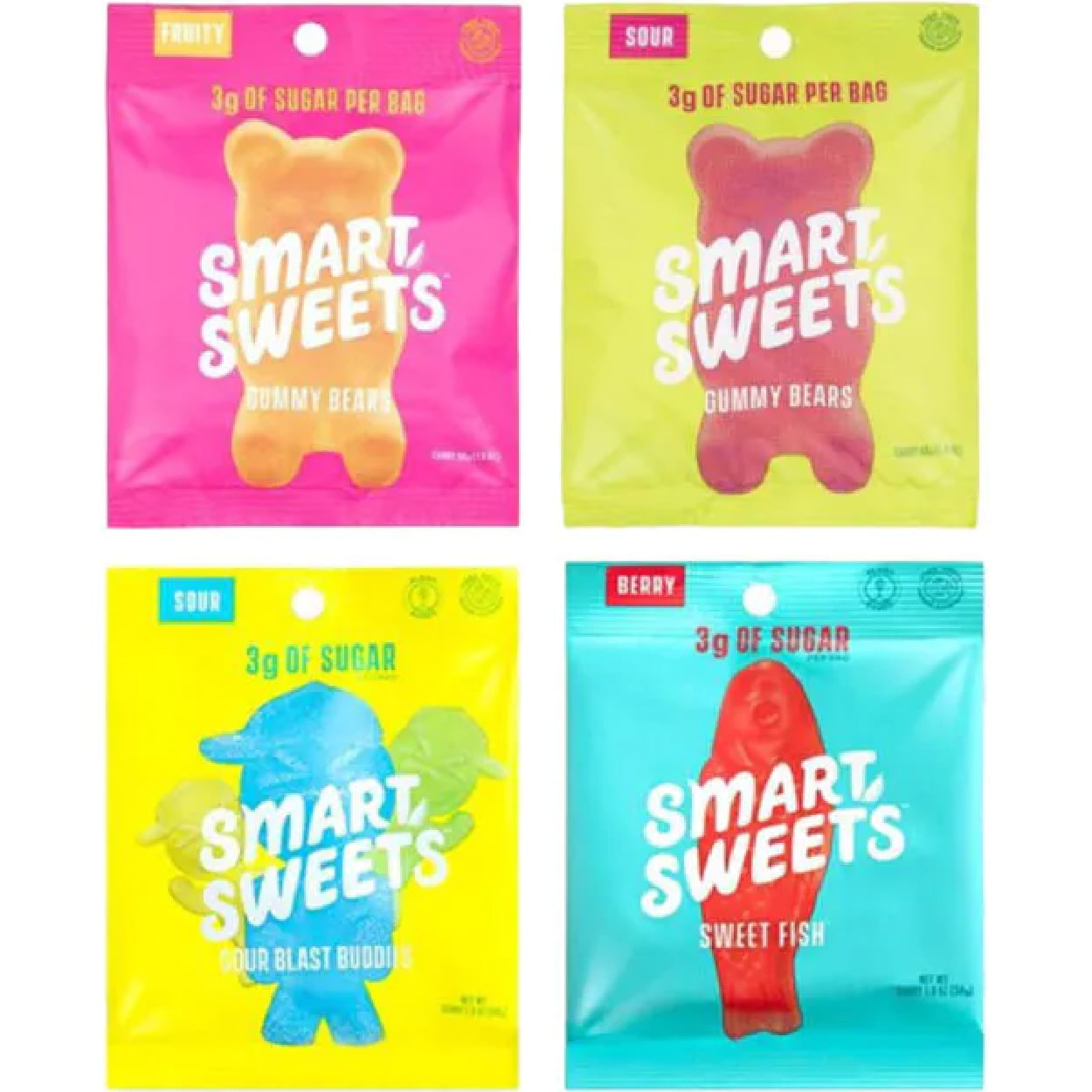
Smart Sweets

candy 84 5 Candy Packaging Ideas as Sweet as Your Candy

All of the Smart Sweets plastic candy boxes have three things going for them: bright and loud full-package color, flavor stamps, and the sugar quantity, which is their primary selling point. Smart Sweets is all about low-sugar candies with zero alcohol sugar, so they keep it straight and simple on their bags with only the essential bits of information on them. When considering your packaging, think about making your unique selling point clear.

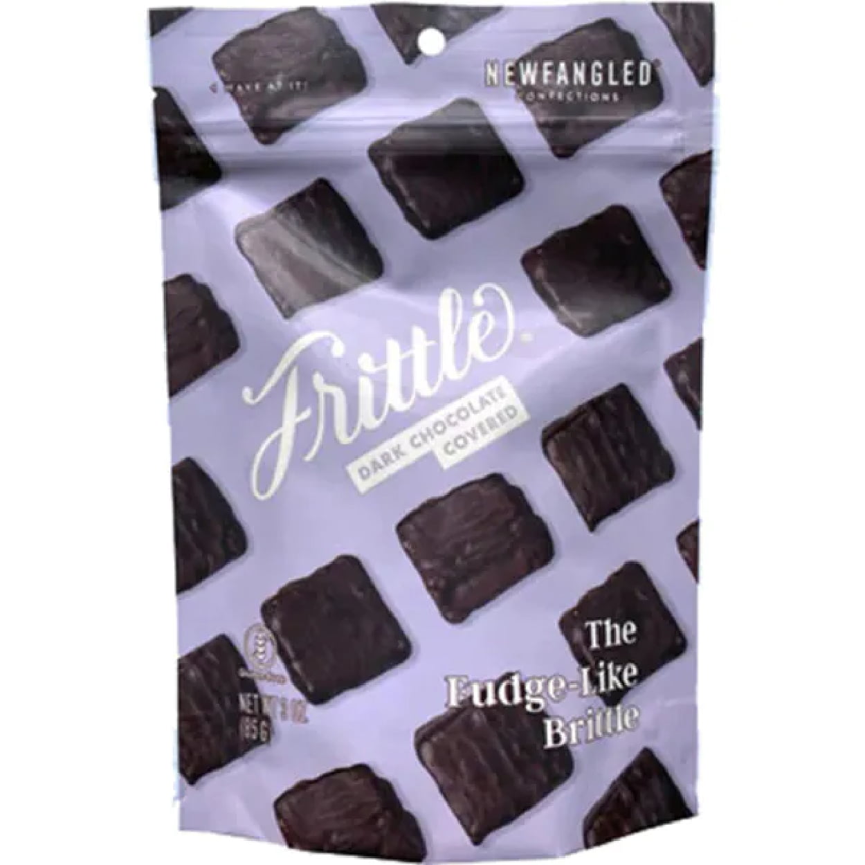
Newfangled Confections Frittle

candy 80 5 Candy Packaging Ideas as Sweet as Your Candy

Newfangled Confections makes a bag that is recognizable and memorable but without being loud or too bright. The purple tone, which is a luxurious and rich color, paired with deep dark chocolate and a script font makes for a packaging that pairs bright and fun with classy and chic -- perfect for their peanut brittle.

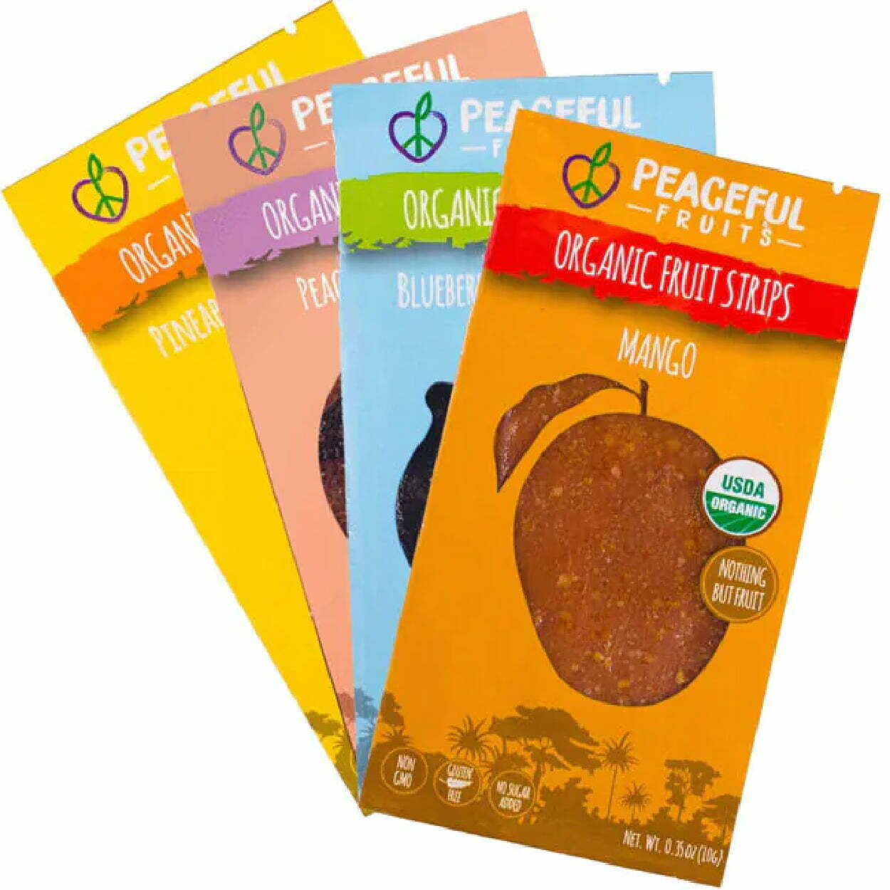
Peaceful Fruits

candy 81 1 5 Candy Packaging Ideas as Sweet as Your Candy

Peaceful Fruits packaging is another vibrant and colorful packaging, with easy tear-away notches for easy opening for a light snack. Each package has a two-toned color with colors close on the color wheel, so they match together well. The “organic” identification goes well with the large, all-caps typography that identifies the product and flavor, and they use the package window in a creative way, shaped like the fruit that matches its flavor.

Unreal Chocolates

candy pouch 87 5 Candy Packaging Ideas as Sweet as Your Candy

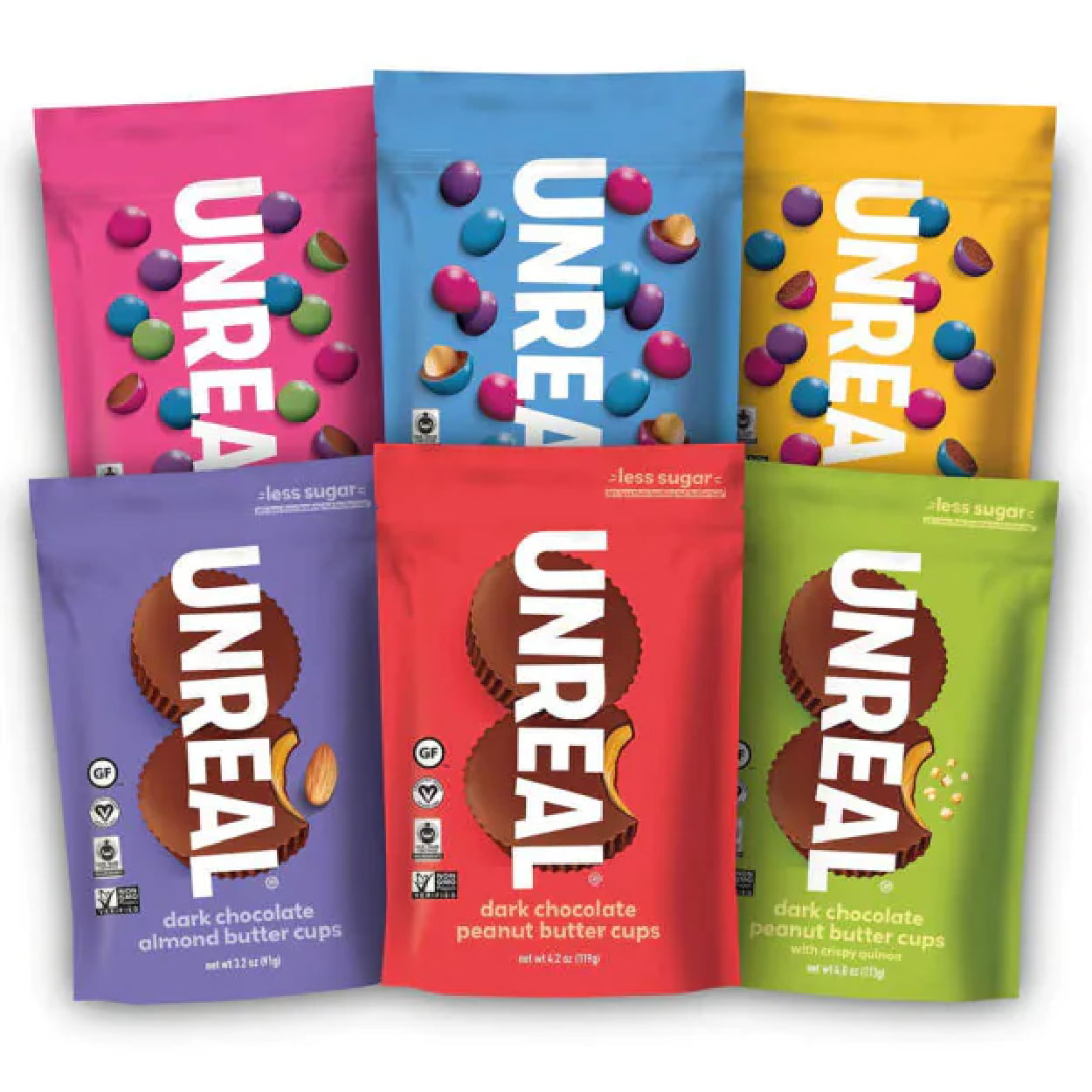
Unreal is another brand that uses bright, colorful, eye-grabbing packaging that helps it stand out on the shelves. The flexible packaging has a tear-away notch but isn’t resealable, which is okay since each piece is individually wrapped, so it still stays fresh. Their big, bold typography logo is memorable and has earned an ability to be identified by consumers, which has helped them build loyalty, too.

Budget-Friendly, High-Quality Custom Candy Packaging

Bags 02 5 Candy Packaging Ideas as Sweet as Your Candy

This year, boost your candy sales with great candy packaging that’s perfect for your product. CarePac offers customizable candy packaging design in different sizes, styles, and materials, with full-print packaging however you want it. Easy-tear packages, triple-seals, zip closures to keep it fresh, or individually wrapped packages are all options, along with clear, black, and silver films that preserve freshness. No matter what kind of chocolates, gummies, hard candies, or chews you’re looking to sell, our flexible packaging can be personalized to best attract your target consumers and can feature health information on an easy-to-read menu. 


Interested in finding out more about our packaging prices or options? Check out our website today!

Read More
skin care packaing 29 6 Skin Care Packaging Ideas
Non Food Items Packaging

6 Skin Care Packaging Ideas

6 Skin Care Packaging Ideas

Skin Care Packaging Ideas | Packaging for Cosmetics

skin care packaing 29 6 Skin Care Packaging Ideas

Expectations are high when it comes to skincare and the cosmetics container it comes in, and in an aesthetic-driven industry, the aesthetic of your packaging is extremely important to your customer when it comes to creating a product that sells. Skincare brands focus on clean products, convenience, minimalism, a fresh look, limited ingredients, and eye-catching designs that attract without overwhelming. 


Help your skincare brand and skin care products catch the spotlight with these 6 skin care packaging tips. 


Six Skin Care Packaging Ideas

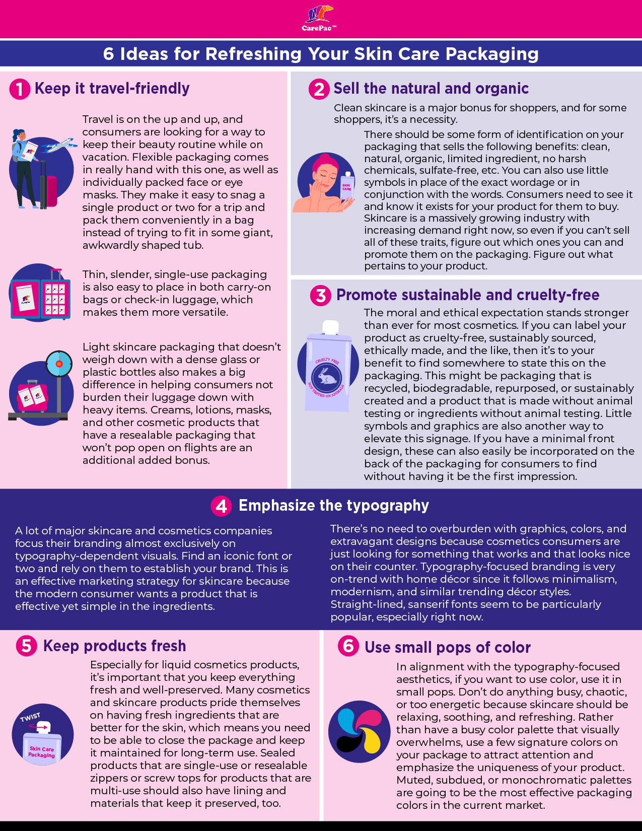
1. Keep it travel-friendly.

Travel is on the up and up, and consumers are looking for a way to keep their beauty routine while on vacation. Flexible packaging comes in really hand with this one, as well as individually packed face or eye masks. They make it easy to snag a single product or two for a trip and pack these cosmetics conveniently in a bag instead of trying to fit in some giant, awkwardly shaped tub or bottles. Thin, slender, single-use packaging is also easy to place in both carry-on bags or check-in luggage, which makes them more versatile. Light skincare packaging that doesn’t weigh down with a dense glass or plastic bottles also makes a big difference in helping consumers not burden their luggage down with heavy items. Creams, lotions, masks, and other cosmetic products that have a resealable packaging that won’t pop open on flights are an additional added bonus.

2. Sell the natural and organic.

Clean skincare is a major bonus for shoppers, and for some shoppers, it’s a necessity. There should be some form of identification on your packaging that sells the following benefits: clean, natural, organic, limited ingredient, no harsh chemicals, sulfate-free, etc. You can also use little symbols in place of the exact wordage or in conjunction with the words. Consumers need to see it and know it exists for your product for them to buy. Skincare is a massively growing industry with increasing demand right now, so even if you can’t sell all of these traits, figure out which ones you can and promote them on the packaging. Figure out what pertains to your product and make sure your buyers know it.

3. Promote sustainable and cruelty-free.

The moral and ethical expectation stands stronger than ever for most cosmetics. If you can label your cosmetics product as cruelty-free, sustainably sourced, ethically made, and the like, then it’s to your benefit to find somewhere to state this on the packaging. This might be packaging or bottles that are recycled, biodegradable, repurposed, or sustainably created and a product that is made without animal testing or ingredients without animal testing. Little symbols and graphics are also another way to elevate this signage. If you have a minimal front design, these can also easily be incorporated on the back of the packaging for consumers to find without having it be the first impression.

4. Emphasize the typography.

A lot of major skincare and cosmetics companies focus their branding almost exclusively on typography-dependent visuals. Find an iconic font or two and rely on them to establish your skin care brands. This is an effective marketing strategy for skincare because the modern consumer wants a product that is effective yet simple in the ingredients. There’s no need to overburden with graphics, colors, and extravagant designs because cosmetics consumers are just looking for something that works and that looks nice on their counter. Typography-focused branding is very on-trend with home décor since it follows minimalism, modernism, and similar trending décor styles. Straight-lined, sanserif fonts seem to be particularly popular, especially right now.

5. Keep products fresh.

Especially for liquid cosmetics products or facial care products, it’s important that you keep everything fresh and well-preserved. Many cosmetics and skincare products pride themselves on having fresh ingredients that are better for the skin, which means you need to be able to close the package and keep it maintained for long-term use. Sealed products that are single-use or resealable zippers or screw tops for products that are multi-use should also have lining and materials that keep it preserved, too.

6. Use small pops of color.

In alignment with the typography-focused aesthetics, if you want to use color on your cosmetics packaging, use it in small pops. Don’t do anything busy, chaotic, or too energetic because skincare should be relaxing, soothing, and refreshing. Rather than have a busy color palette that visually overwhelms, use a few signature colors on your package to attract attention and emphasize the uniqueness of your product. Muted, subdued, or monochromatic palettes are going to be the most effective packaging colors in the current market. 

Skin care infographic 2 6 Skin Care Packaging Ideas

Skin Care Packaging Design Inspirations 

These brands get it, and have implemented a lot of the best practices. The designs below should inspire some creative ideas of your own! Check out the best skin care trends and cosmetic packaging ideas. 

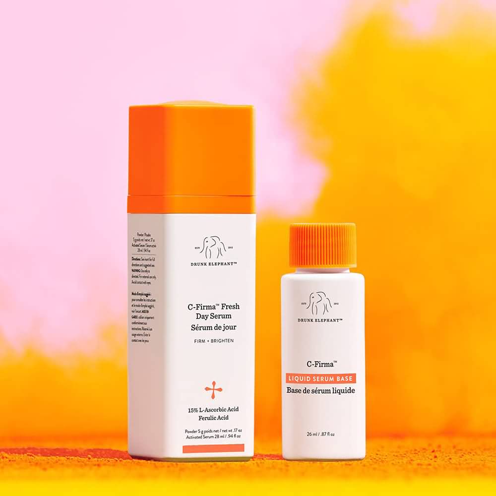
Drunk Elephant

Drunk Elephant Packaging

The entire Drunk Elephant line of facial care products features white bottles with colorful, monochromatic lids. The minimal use of color is refreshing and eye-catching, and the minimalistic, drawn elephant graphic is cute yet professional. They pair it with little pops of additional orange throughout the bottle (or whatever the signature color is for that product). The typography isn’t anything crazy, but overall, the packaging is effective and sells well.

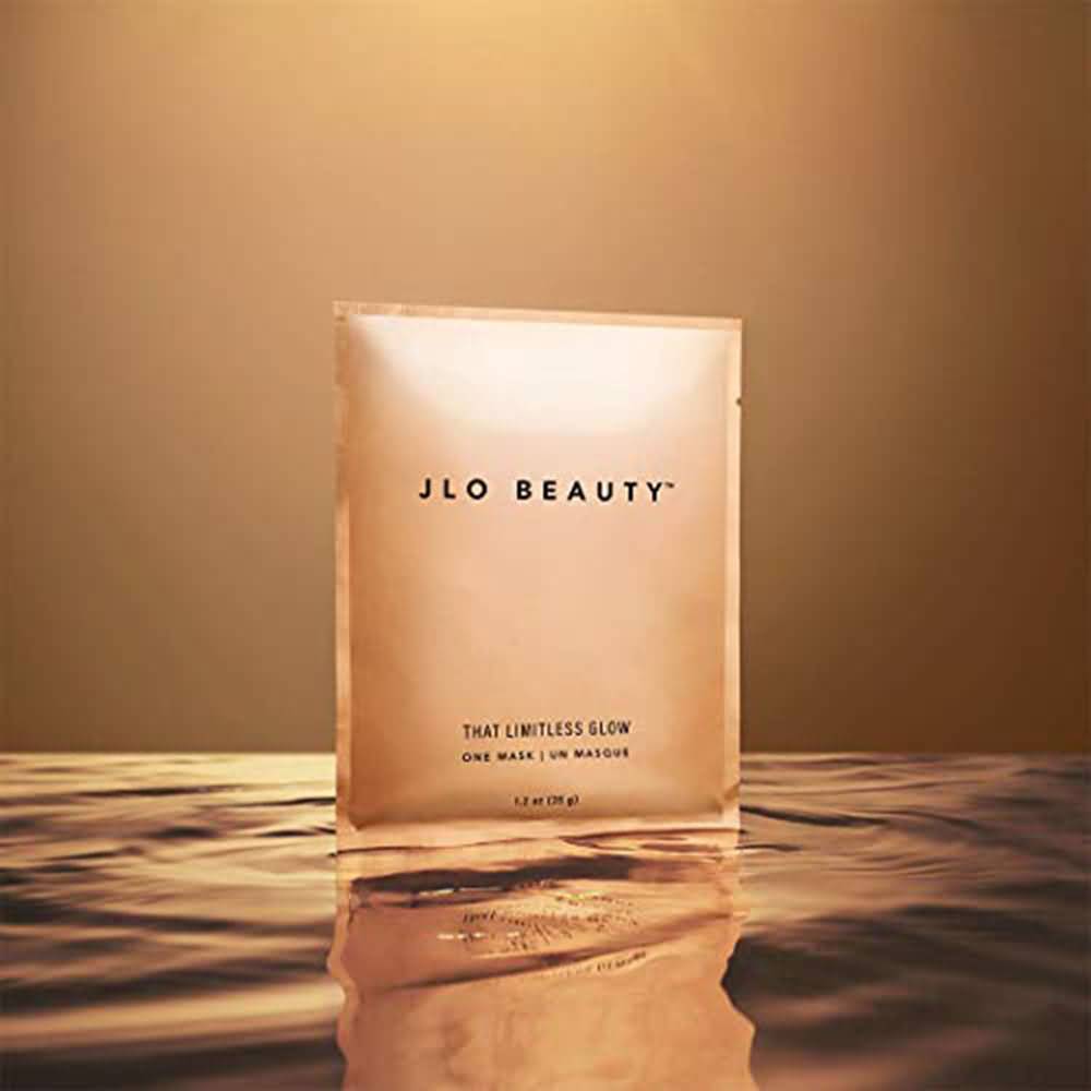
JLO Beauty

JLO Beauty Packaging

Jennifer Lopez’s new skincare and cosmetics line is typography-focused, with no graphics, no color, and a simple font pairing that looks professional, sleek, and stylish. It’s modern and aesthetically pleasing for facial care products, which particularly targets the modern consumer. Two bold san-serif fonts strategically placed on the package that is single-use with one mask are all it took to sell. It’s also in convenient tear-open packaging that contains one mask and makes it easy to pack or store.

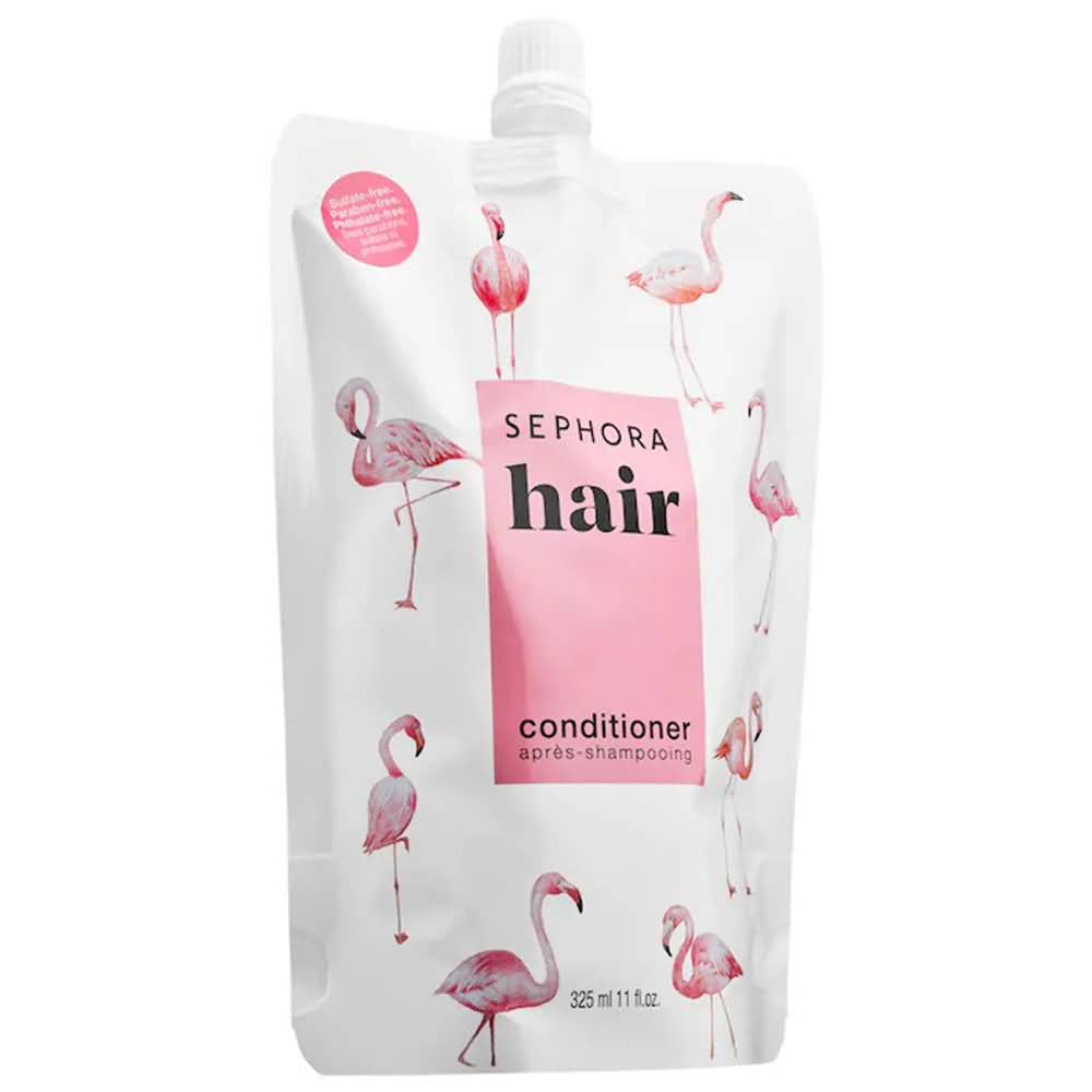
Sephora Hair

Sephora Hair Packaging

The Sephora brand of skin care formulas and cosmetics products all follow similar packaging designs, although they have plenty of variety with the types of packaging they use. Simple color palettes, usually just one or two colors that are engaging and often energetic and bright, are characteristic of them. Most of their Sephora brand packaging also has cute graphics, fun colors and styles, and bold and funky fonts. It strays from the norm but still keeps it fun on a visual level.

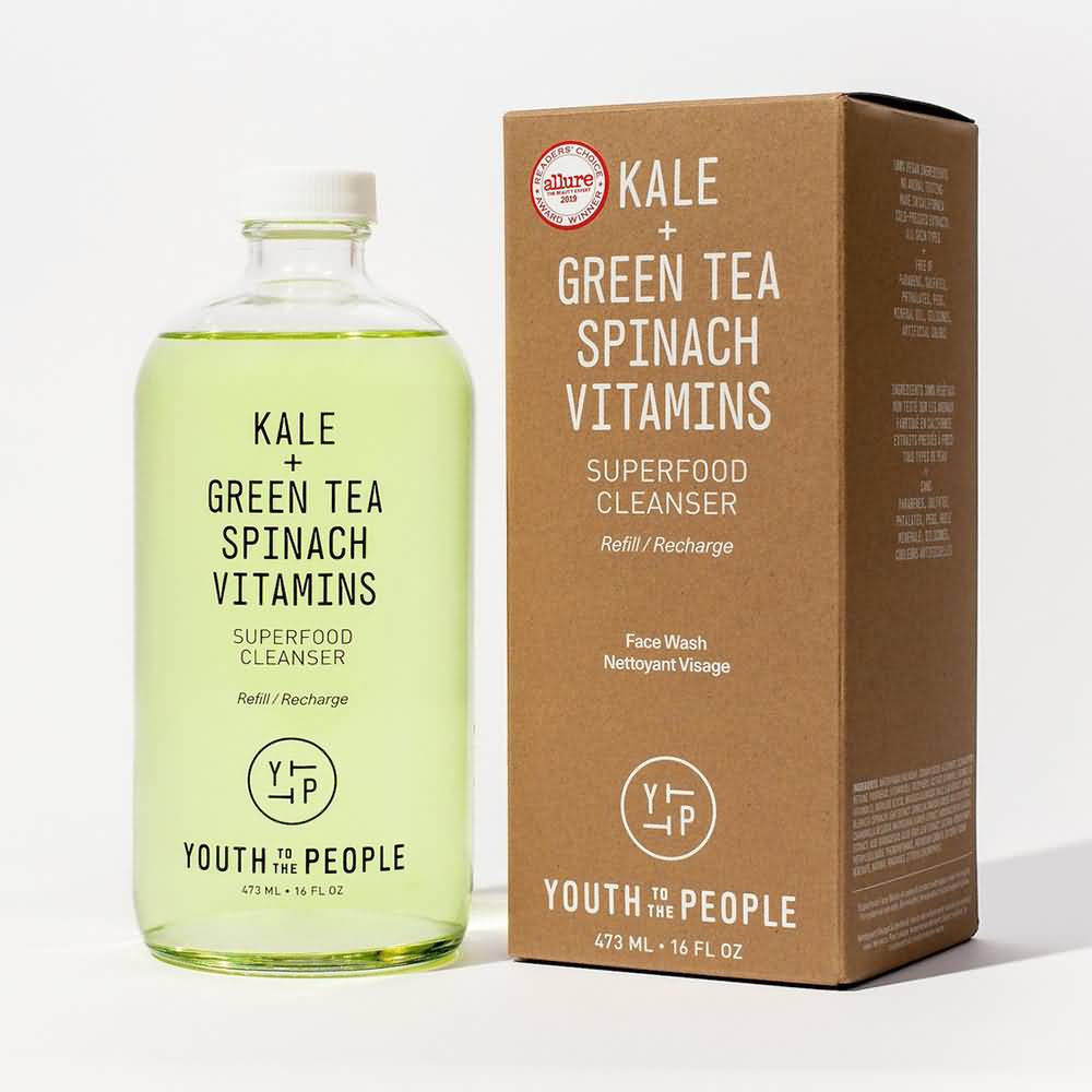
Youth to the People

Youth to the People Packaging

Youth to the People markets itself with its beauty products packaging as being nutrient-rich, health-food-focused, and made with natural ingredients. Clear packaging bottles and cosmetic containers gives off a sense of transparency, which consumers want since they want to know what is in their product (although clear packaging works better for clear liquids and not for thicker creams). They emphasize “kale” and “green tea” on most of their packaging. They also give off a natural and eco-friendly tone with the simple brown cardboard packaging.

Volition 

Volition Packaging

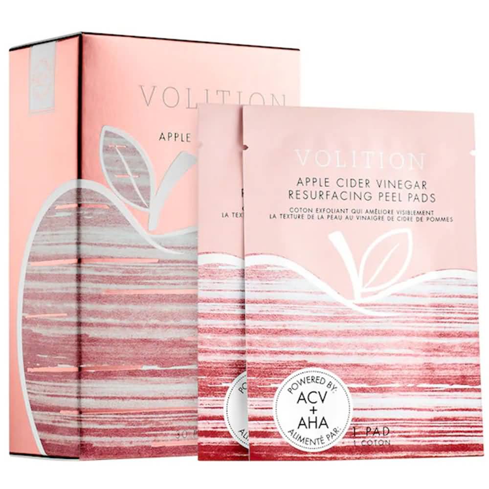
Volition’s mask set has quite a bit more color than most skincare brands, but the pop of pink is effective, especially when paired with the apple logo, which denotes a healthy connotation. Multiple, single-use masks that are individually wrapped with a tear-notch but still packaged conveniently within the cardboard box help for organization and gives the option to pack a mask or two when traveling.

Wishful

Wishful Packaging

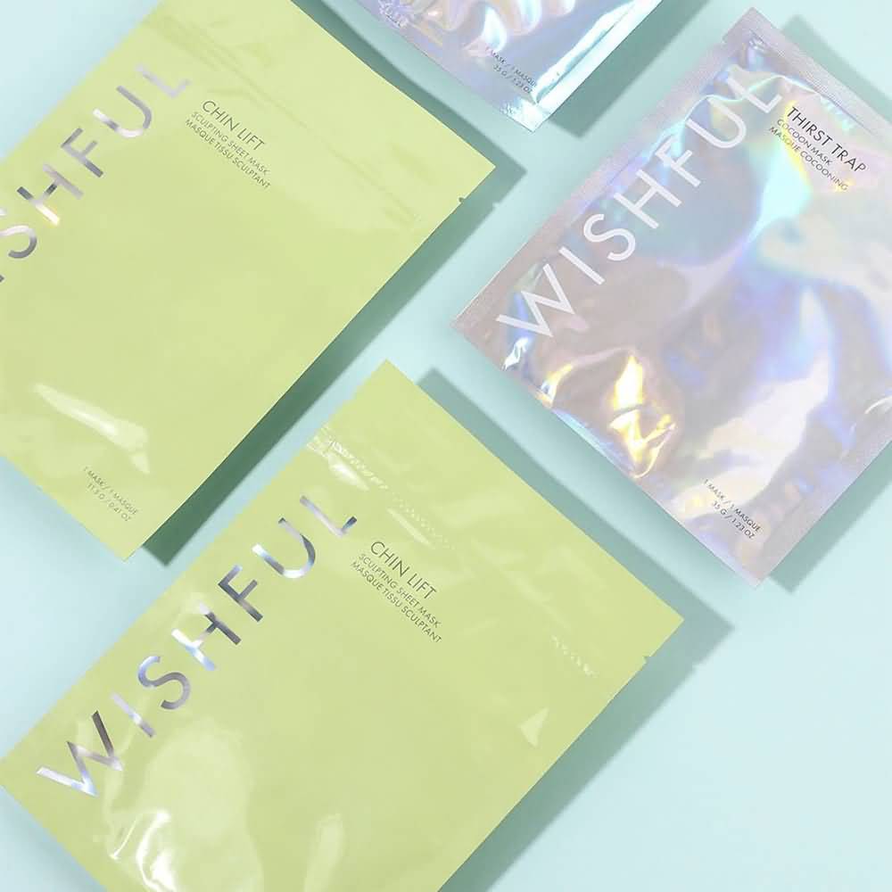
Wishful effectively uses a pop of color – the lime green – and pairs it with the signature holographic lettering that is present on all their various packaging. It’s bright and fun, and their products’ color matches the packaging as well. The typography-focused logo and branding are also straight and to the point, but the colors make it fun and engaging.

Lux Unfiltered 

Lux Unfiltered Packaging

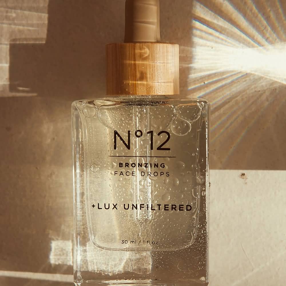
Lux Unfiltered uses a neutral palette and bamboo-toned shades to convey a sense of a natural and healthy product. The typography is central to the design, and the clear packaging also gives off transparency to consumers. It may not be natural and organic, but it gives off that vibe with packaging that seems ‘healthier,’ so to speak.

Amika

Amika Packaging

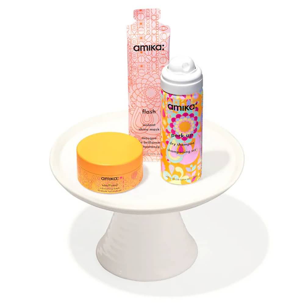
Amika is one of those rare brands that pulls off a lot of color and pulls it off well. They don’t limit their color palette; they don’t focus on their typography (although their font choice is unique and memorable) and it doesn’t give off natural and organic vibes. But what they have works! The patterns are soothing and repetitive, which is consistent across all their products. The color wheel is always well-represented but with colors that pair well rather than clash (orange/blue/lime green, pink/orange/yellow, etc.), and it’s a great energy overall.

Pattern

Pattern Packaging

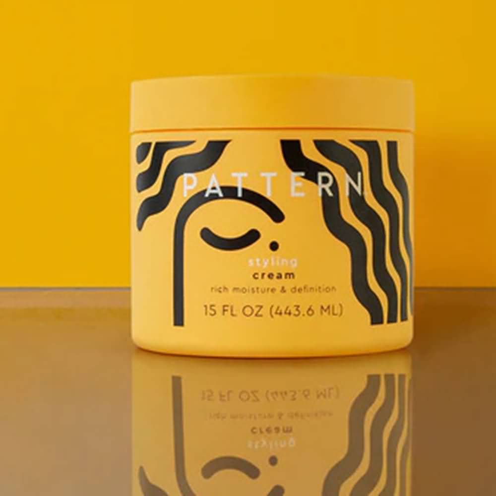
Pattern uniquely caters to textured hair, which is evident by its logo and graphic. The black and yellow color palette keeps it minimal and has a single pop of color. The simple abstract graphic underneath linear, bold typography and a package in full color make for a bold, eye-catching package.

Rael Beauty

Rael Beauty Packaging

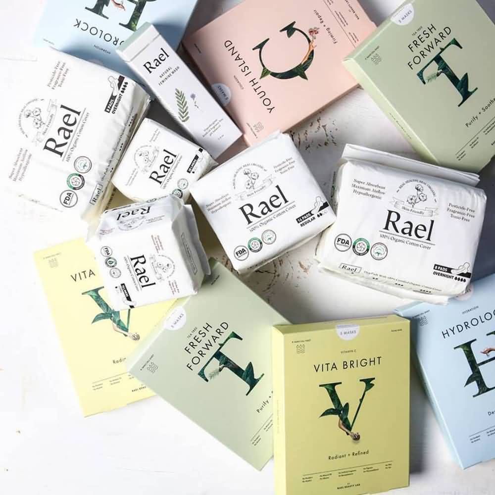
Rael Beauty’s pastel color palette to distinguish the different types of masks they have keeps it easy to tell them apart and easy on the eyes. The single-letter serif font logo wrapped in leaves is earthy yet professional. Single packages keep each mask fresh and make it easy for consumers to take them on travels.

Find the Right Beauty Products Packaging Provider to Bring Your Design to Life

Bags 28 6 Skin Care Packaging Ideas

Finding the perfect combination packaging that looks how you want it to look but also functions well and is on-trend can be a challenge. CarePac offers custom, flexible, full-print packaging in a range of styles, sizes, and shapes. Sheet masks and peel-off face masks are in-demand, so you need packaging that stands out. Resealable packaging, single-use packaging, and easy-to-open packaging are all options depending on the type of product.


Skincare product packaging needs to follow an aesthetic that allows it to stay competitive in today’s market, no matter what your target demographic is. Affordable packaging that keeps your product fresh saves you money and is easy to customize for what you’re trying to sell is easy to get with CarePac.


Contact us today for a quick quote or samples!

Read More
Alabama infographic 07 Weed Laws in Alabama
Other Packaging Topics

Weed Laws in Alabama

Weed Laws in Alabama

Alabama's weed laws are just plain strange. Where do we start? Alabama's law and policy seems to make arbitrary distinctions between the forms of cannabis that are allowed, the amount of cannabis a registered patient or caregiver can maintain on-hand, and retain almost all the draconian punishments for recreational use and personal cultivation. The regulations even stipulate they will establish one universal flavor for all gelatinous cube, cuboid, and lozenge medical cannabis products, this is rather nuts in our opinion.

Alabama cannabis packaging 03 Weed Laws in Alabama

Medical weed is legal in the state of Alabama. Medical use was legalized in 2021 with a bill that passed the legislature and was signed by Governor Kay Ivey. Previous bills passed in 2014 (Carly Law) and 2016 (Leni Law) only allowed the use of CBD oil to treat seizure disorders. 


In juxtaposition to this, recreational use marijuana is illegal and strongly so. The first possession of personal amounts is a misdemeanor, punishable by up to one year in prison, a fine of up to $6,000 and a mandatory six-month suspension of driver's license. Repeat offences and possession with intent to sell are felony offences and may have a mandatory minimum sentence. [1]


ALABAMA MEDICAL CANNABIS PROGRAM OVERVIEW

alabama mediical cannabis 04 Weed Laws in Alabama

The Alabama Medical Marijuana Commission is still establishing the program. While in operation, patients will need to visit a certifying physician who can adjust the amount and form of daily dose of marijuana they can purchase.


The law stipulates that the state cannabis commission will set details around the percentage of THC and maximum daily doses, but it also limits it to 50mg per day unless the patient has improved after 90 days or has a terminal diagnosis. In any of these cases, the maximum increases to 75 mg per day. Per the medical cannabis commission and Alabama law, under no circumstances are minors allowed to consume cannabis containing more than 3%. 

MARIJUANA PROCESSING LICENSE REQUIREMENTS

One of the key licenses in Alabama is the processor license. A processor license authorizes all of the following:

  • The purchase or transfer of cannabis from a cultivator.
  • The processing of cannabis raw plant material (flower) into medical cannabis which shall include "properly packaging and labeling medical cannabis products".
  • The sale or transfer of medical cannabis to a dispensary.
  • A processor license authorizes the processor to transfer medical cannabis only by means of a secure transporter.
  • The commission shall issue no more than four processor licenses.

You heard that right, off the bat Alabama is limiting processor licenses to four (4). Talk about giving those processor's a monopoly. 

GENERAL MARIJUANA LAWS & REQUIREMENTS

All Alabama medical cannabis products must be medical grade product, manufacture using documented good quality practices, and meet Good Manufacturing Practices, such that the product is shown to meet intended levels of purity and be reliably free of toxins and contaminants. Medical cannabis products may not contain any additives other than pharmaceutical grade excipients.

Alabama cannabis packaging 05 Weed Laws in Alabama

GUIDELINES FOR PACKAGING


Most of the packaging and labeling regulations for controlled substances are similar to other states. Packaging and labels cannot be deceptive, false or contain misleading claims. 

Alabama infographic carepac 06 Weed Laws in Alabama


LABELING REQUIREMENTS

cannabis regulations for packaging 02 Weed Laws in Alabama
  • Lot and batch numbers.
  • The license identification number for the cultivator and processor.
  • Cannabinoids content and potency.
  • The commission may require the implementation of a digital image such as a QR for purposes of tracking medical cannabis products. The digital image must interface with the statewide seed-to-sale tracking system.
  • The commission shall determine what information from the label shall be entered into the statewide seed-to-sale tracking system. [2]

 REQUIRED WARNINGS

  • Packaging must contain a label that reads: "Keep out of reach of children."
  • The following statement shall be included on each label, if space permits, or as an insert within the package:

"Warning: this product may make you drowsy or dizzy. Do not drink alcohol with this product. Use care when operating a vehicle or other machinery. Taking this product with medication may lead to harmful side effects or complications. Consult your physician before taking this product with any medication. Women who are breastfeeding, pregnant, or plan to become pregnant should discuss medical cannabis use with their physicians."

cannabis bags carepac 14 Weed Laws in Alabama

UNIVERSAL SYMBOL

The universal state symbol printed in color at least one-half inch by one-half inch in size. It must be present on all packages.

Alabama infographic 02 Weed Laws in Alabama

POSSESSION AND CULTIVATION LIMITS

Possession laws state that registered patients and caregivers 19 years of age or older can legally hold up to 70 daily doses of medical marijuana with a a medical marijuana card. The recommending doctor determines what the daily dose is, but cannot exceed 75mg of THC.

Cultivation is illegal in Alabama. A person who grows cannabis plants at home for personal use may be charged with smuggling marijuana, which is considered a criminal offence. Possession of any amount of processed marijuana, with the exception of patients and caregivers, is considered a misdemeanor, with up to one year in prison or a $6,000 fine. Those convicted of possession of marijuana for any purpose other than personal use can face a felony offense and up to ten years in prison and a maximum fine of $15,000. Possession decriminalization is set to be addressed in the Senate before the corona virus shutdown in 2020.

CONCLUSION- SEEK AN ATTORNEY

Non-medical, recreational, adult marijuana use is currently illegal in the state. Ball possession penalties can still be harsh. The first possession of personal amounts is a misdemeanor, punishable by up to one year in prison, a fine of up to $6,000, and a six-month mandatory driver's license suspension. There have been attempts to legalize adult marijuana for people 21 and older in 2019, but this has been unsuccessful.[3]


When in doubt, reach out to lawyers that specialize in medical marijuana law in your area. 

[2] Ala. Code § 20-2A-63 (1975)

[3] https://weedmaps.com/learn/laws-and-regulations/alabama

Read More
State of Maine Cannabis MAINE CANNABIS REGULATIONS FOR PACKAGING/ LABELING 
Other Packaging Topics

MAINE CANNABIS REGULATIONS FOR PACKAGING/ LABELING 

Maine Cannabis 

Regulations for Packaging/Labeling

State of Maine Cannabis MAINE CANNABIS REGULATIONS FOR PACKAGING/ LABELING 

In November 2016, Maine voters approved a measure calling for the legalization, taxation, and regulation of marijuana in a manner similar to how alcohol is regulated. Later, marijuana legalization bills went through numerous rewrites only to be vetoed in the first round. Then in 2018, Maine lawmakers overturned the governor's veto and passed statutory code LD 1719, an Act to Implement a Regulatory Structure for Adult Use Marijuana. The move made Maine the 8th state to legalize recreational marijuana. The Office of Cannabis Policy under the Department of Administrative and Financial Services is responsible for overseeing cannabis use in Maine.

Maine Cannabis Packaging Laws & THC Labeling Requirements

Basic Packaging Requirements 

For Adult Use Marijuana, Section 11.1 provides that all marijuana or marijuana products must be packaged in containers that:

  • Are fully enclosable: No open top containers. 
  • Are resealable: Include a child resistant zipper.
  • Protect From Contamination: use quality barrier materials.
  • No Toxic Substances: Do not impart any toxic or deleterious substance to the packaged item.[1] 

Child Resistant and Opaque

In addition to the basic requirements Packaging must adhere to these additional restrictions - PL 2017, c. 452, §18

  • Be Child-resistant
  • Opaque ( not see through)
  • Tamper-evident
  • If it's a liquid: Multi-serving liquid products must include a measuring component and a CR cap. [2]

Quick Tip!

Typically a hybrid combination of pre-printed packaging, and labels is best. As some information is variable and other information is always know. For example. Pre-printing cultivation Facility numbers, Net weights, and required warnings, but then labeling, final Testing Results, and production date, and cannabinoid content which are variable. 


Package Labeling Requirements

Required ID and Stats

  • Licensee Identification: It has to be clear who the customer is buying the marijuana product from. This would include your license number. 
  • Batch ID: The unique identification number of the final batch from which the testing sample for the mandatory testing of the contents of the marijuana or marijuana product was taken;
  • Testing Results:
    • For the batch from which the individual product is derived.
    • Including cannabinoid content.
    • Performed by a licensed testing facility.
  • Cultivation Facility License Number and Manufacturing Facility: The license numbers of the cultivation facility and if applicable the manufacturing facility if it is different than the cultivation facility. 
  • The Production Date
  • Net Content / Net Weight: The packaging must include a statement of "net contents" which means it must identify the net weight of the marijuana, concentrate or marijuana product using a "standard of measure compatible with the tracking system". Basically this typically means grams.

The Warning Statement 

There is a rather routine warning statement required in Maine. 

“There may be health risks associated with the use of this product. There may be additional health risks associated with the use of this product for women who are pregnant, breastfeeding, or planning on becoming pregnant. Do not drive a motor vehicle or operate heavy machinery while using this product.”[3]


Font, Language, Size, and Location

All marijuana or marijuana product required label content must comply with the following:

  • 6pt font or bigger Labeling text on any marketing layer must be no smaller than size 6 font or 1/12 inch.
  • Written In English: All information included in the labeling requirements must be clearly written or printed and in the English language. There is no current requirement that we could find for bi-lingual warnings.
  • Unobstructed and Conspicuous: All information included in the labeling requirements, must be displayed on the marketing layer and must be unobstructed and conspicuous.
  • Printed on the "Marketing layer" All warnings and required language All required information must be printed directly on the packaging, or on a label or sticker affixed directly to "the marketing layer", I.E. generally the outside.

Things you can't do...

Well as any good governmental organization the Maine state government has made a good list of prohibitions when labeling, marketing, or packaging cannabis. Most of which are in 

PL 2017, c. 452, §18.

Trademarks

  • Trademark Law Violations: Strangely trademark violations are first on the list. This would mean, for example, you cannot call your cannabis product "Nike's Cannabis" and use a big Nike swoosh. But more commonly, what it means is you can't make riffs on name brands.
  • No Federal Trademarks: Ok, so in addition to no Anything that makes it look like the product has a federal trademark. Alas no claiming trademarks on your brand (at least yet!). 

Humans Animals, or Fruit!

In a somewhat humorously worded regulation, the obvious things like don't make your packaging appealing to children, and don't mislead your customer, or obscure required warnings, or pretend the product doesn't contain THC (Who would do that?). there is also a section about not including depictions of humans, animals, or fruit, on your packaging...  

  • Packaging that appeals to children: This one is going to be very subjective, but here's an example, again remember they are talking the "PACKAGING" so for example making a cannabis infused drink in the capri-sun pouch might be a violation. 
  • Misleading or "obscures" the required labeling: So misleading would be a very broad list of things. Here are a couple of hypothetical examples:
    • Hiding the warning in the design, so it doesn't stand out.
    • Claiming the product came from a certain cultivation facility when it actually came from another.
  • Do not Include Humans, Animals, or Fruit on the design: Last but not least, they don't want your package to use graphics that incorporate humans, animals, or fruit... ok it is what it is. [4]

Other Advertising Prohibitions

The following is prohibited for packaging related advertising adult-use marijuana:

  • Misleading, deceptive, or false advertising.
  • Advertising that appeals to those under 21 years of age: Cartoons, colors pallets that appeal to children, or for example. gummy candy that looks like candy kids eat.
  • Health or physical benefit claims: Ok so we are all probably aware of this one, but just incase you weren't don't make unsubstantiated health and physical benefits, you're just opening yourself up to both the government regulators and people out to catch you. 
Packaging rules infographic 01 MAINE CANNABIS REGULATIONS FOR PACKAGING/ LABELING 

Medicinal Use vs Adult Use

Maine is home to both a medical cannabis program and an adult use industry. The medical program serves patients, while Maine’s adult use industry services consumers 21 years of age and older. Adult use cannabis and medical cannabis may not be dispensed from the same facility.[5]

For use as recreational purpose the adult must be of 21 years of age but for medicinal use only those individuals who have received a patient certification from a medical professional may legally access medical cannabis from a registered caregiver or dispensary. Patients visiting Maine from another state may be able to purchase medical cannabis from a registered caregiver or dispensary if they have valid patient identification credentials (like a registry or patient identification card) and their state of residence allows them to use their state-issued credential to purchase medical cannabis in Maine.[6]

Maine residents are allowed to grow cannabis for personal use. As many as three mature, 12 immature plants, and an unlimited number of seedlings are allowed per resident 21 years of age or older. These restrictions do not apply to the cultivation of cannabis for medical use by a qualifying patient, a caregiver, a registered caregiver or a registered dispensary as authorized by the Maine Medical Use of Marijuana Act.[7]


A Note related to medical use of marijuana act is that if a registered caregiver, dispensary, or facility has information stated on the packaging related to cannabinoid potency, contaminants, or cannabinoid profile, the information needs to be verified by a Marijuana testing facility. 

Interesting Legal Case

NORTHEAST PATIENTS GROUP v. MAINE DEPARTMENT OF ADMINISTRATIVE AND FINANCIAL SERVICES (Docket No. 1:20-cv-00468-NT)

In 2009, the Maine Legislature amended the State’s existing medical marijuana law to establish a comprehensive system authorizing the sale of medical marijuana. The current iteration of the law—the Maine Medical Use of Marijuana Act (the “Act”)—authorized qualified patients who had a certification from a medical provider for the medical use of marijuana to possess, use, and purchase medical marijuana. The Act also authorizes two types of entities—registered dispensaries and caregivers—to possess, cultivate, and sell marijuana to qualified patients. The Act provides that “all officers or directors of a dispensary must be residents of this State,” (the “Dispensary Residency Requirement”). 22 M.R.S.A. § 2428(6) (H).

High Street a Delaware LLC entirely owned by residents of states other than Maine owns and operates three of the seven registered dispensaries in Maine’s medical marijuana program.


Wellness Connection operated as a mutual benefit nonprofit corporation without any equity ownership, but when Maine changed its law in 2020 to allow dispensaries to become for-profit companies, Wellness Connection converted to a for-profit corporation and is currently wholly owned by three Maine residents.

High Street states that it would purchase all of the equity in Wellness Connection if the Dispensary Residency Requirement did not prohibit it from doing so. The Plaintiffs sued the Department—which is responsible for implementing, administrating, and enforcing the Act.
The court concludes that the Dispensary Residency Requirement violates the dormant Commerce Clause and hints it might strike down Maine medical marijuana residency law.

Foot Notes

We hope this blog article has been a entertaining introduction to the state of Maine's Cannabis packaging and labeling rules. You'll always want to make sure to have your packaging and graphics designs reviewed by a qualified compliance consultant, like a state of Maine cannabis attorney. 

[1] https://www.maine.gov/dafs/ocp/sites/maine.gov.dafs.ocp/files/inline-files/Administrative_Rule_18-691_CMR_ch1-Adult_Use_Marijuana_Program_Rule.pdf

[2] https://www.mainelegislature.org/legis/statutes/22/title22sec2429-A.html

[3] https://www.maine.gov/dafs/ocp/sites/maine.gov.dafs.ocp/files/inline-files/Administrative_Rule_18-691_CMR_ch1-Adult_Use_Marijuana_Program_Rule.pdf

[4] https://www.mainelegislature.org/legis/statutes/22/title22sec2429-A.html

[5] 28-B M.R.S. §1501(1)(C)

[6] 22 M.R.S. §2423-A, Id. §2423-C, Id. §2425-A

[7] 28-B M.R.S. §1502(1)

Read More