11 Tea Packaging Ideas For
Inspiration
Finding the perfect packaging aesthetic is no easy feat, especially when it comes to teas. You need to find just the right combination of font and color, pair it with the right logo and graphics, and maintain a visual that evokes the voice of your brand. There’s a reason why major companies pay millions a year to craft their dream packaging design. But with the right know-how, you can skip out on spending millions and develop packaging for your products that works for you and keeps you within budget.
Keep reading to learn more about how to design great tea packaging with a designer like us.
Things to Keep in Mind When Designing Tea Packaging
So, what’s there to remember as you go into designing your new packaging? To create a tea packaging concept that sells, here are some essential trends to keep in mind:
Typography-Focused Tea Packaging Designs
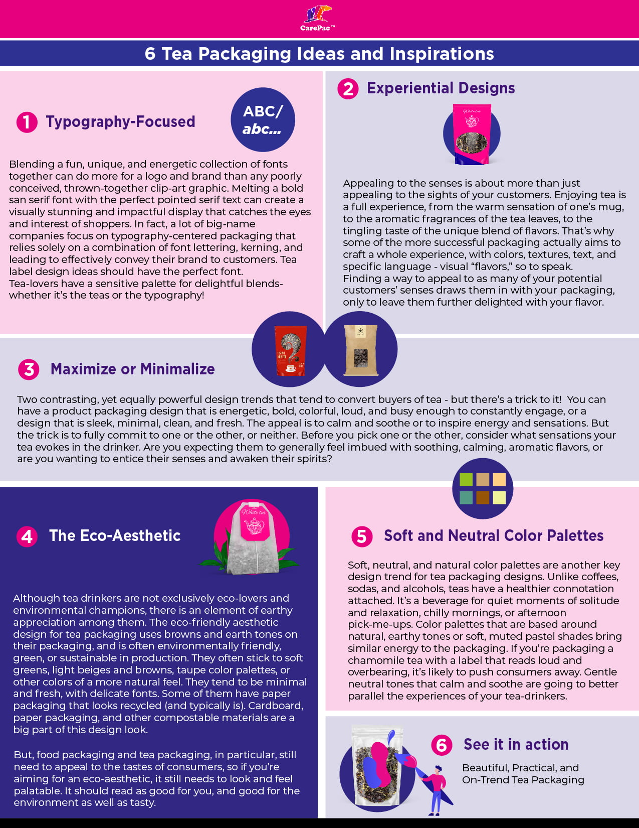
Blending a fun, unique, and energetic collection of fonts together can do more for a logo and brand than any poorly conceived, thrown-together clip-art graphic. Melting a bold san serif font with the perfect pointed serif text can create a visually stunning and impactful display that catches the eyes and interest of shoppers. In fact, a lot of big-name companies focus on typography-centered packaging that relies solely on a combination of font lettering, kerning, and leading to effectively convey their brand to customers. Tea label design ideas should have the perfect font.
Tea-lovers have a sensitive palette for delightful blends- whether it’s the teas or the typography!
Experiential Designs
Appealing to the senses is about more than just appealing to the sights of your customers. Enjoying tea is a full experience, from the warm sensation of one’s mug, to the aromatic fragrances of the tea leaves, to the tingling taste of the unique blend of flavors. That’s why some of the more successful packaging actually aims to craft a whole experience, with colors, textures, text, and specific language - visual “flavors,” so to speak.
Finding a way to appeal to as many of your potential customers’ senses draws them in with your packaging, only to leave them further delighted with your flavor.
Maximize or Minimalize
Two contrasting, yet equally powerful design trends that tend to convert buyers of tea - but there’s a trick to it! You can have a product packaging design that is energetic, bold, colorful, loud, and busy enough to constantly engage, or a design that is sleek, minimal, clean, and fresh. The appeal is to calm and soothe or to inspire energy and sensations. But the trick is to fully commit to one or the other, or neither. Before you pick one or the other, consider what sensations your tea evokes in the drinker. Are you expecting them to generally feel imbued with soothing, calming, aromatic flavors, or are you wanting to entice their senses and awaken their spirits?
The Eco-Aesthetic
Although tea drinkers are not exclusively eco-lovers and environmental champions, there is an element of earthy appreciation among them. The eco-friendly aesthetic design for tea packaging uses browns and earth tones on their packaging, and is often environmentally friendly, green, or sustainable in production. They often stick to soft greens, light beiges and browns, taupe color palettes, or other colors of a more natural feel. They tend to be minimal and fresh, with delicate fonts. Some of them have paper packaging that looks recycled (and typically is). Cardboard, paper packaging, and other compostable materials are a big part of this design look.
But, food packaging and tea packaging, in particular, still need to appeal to the tastes of consumers, so if you’re aiming for an eco-aesthetic, it still needs to look and feel palatable. It should read as good for you, and good for the environment as well as tasty.
Soft and Neutral Color Palettes for Your Creative Tea Packaging
Soft, neutral, and natural color palettes are another key design trend for tea packaging designs. Unlike coffees, sodas, and alcohols, teas have a healthier connotation attached. It’s a beverage for quiet moments of solitude and relaxation, chilly mornings, or afternoon pick-me-ups. Color palettes that are based around natural, earthy tones or soft, muted pastel shades bring similar energy to the packaging. If you’re packaging a chamomile tea with a label that reads loud and overbearing, it’s likely to push consumers away. Gentle neutral tones that calm and soothe are going to better parallel the experiences of your tea-drinkers.
11 Great Tea Packaging Concepts and Ideas for Design
Euphoric Herbals
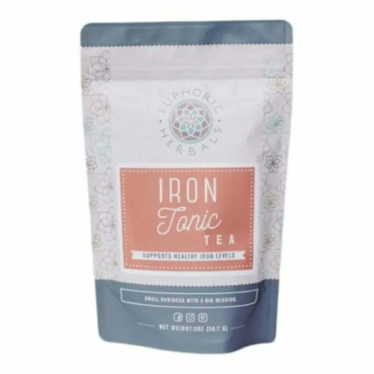
The Euphoric Herbals packaging for their Iron Tonic tea is a great example of the typography-centered packaging that uses a three-font combination. They also have a soft color palette that pairs well with the fonts for an overall calming yet vibrant and eye-catching package. The neutral tones of brick and slate-blue are contrasting, similar to the script and san serif font of the label. Although it’s not the most exciting packaging, it also has a lot going on, with the floral shape graphics covering the side panels of the package.
The Pink Tea Box
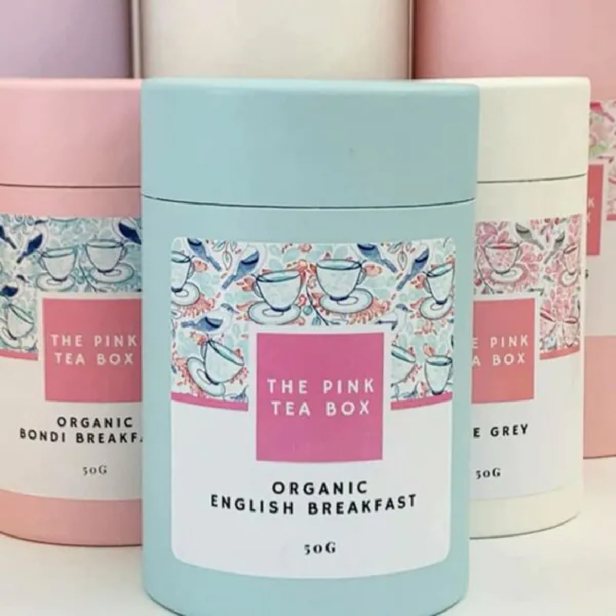
The pastel palette of the Pink Tea Box is cohesive, concise, and effectively conveys the springtime, floral flavors, and subdued energy of the brand. They pair it well with scribbled graphics of teacups on the label to give a bit of pop while not overwhelming the frame of the label. It breathes feminine energy to appeal to its target demographic. The use of the circular cardboard boxes is also circular, smooth and further maintains the serenity of the packaging as a whole.
Zest Tea
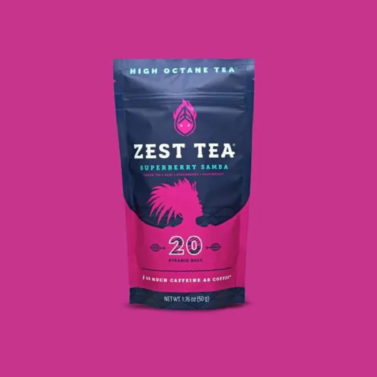
Zest Tea advertises itself as a high-octane tea, a tea that delivers as much caffeine as a cup of coffee. This means their packaging should evoke high energy, with loud, bold, and dynamic colors and fonts. The bright, contrasting colors play with the bold-paired font in a way that is smooth and appealing, but gives off the same dynamic energy of their tea.
Woash
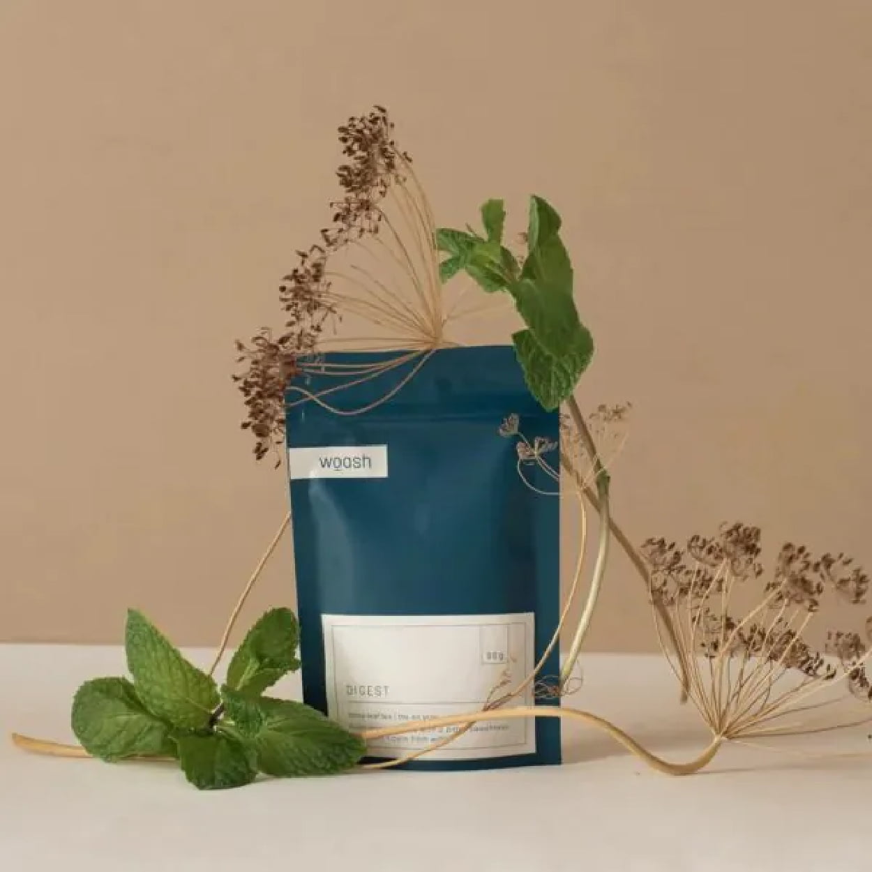
Woash takes minimalism and neutral coloring to the max with a deep blue and beige palette. No real logo is needed when you take your typography and transform it into a cohesive aesthetic. The packaging pairs it with smooth, clean lines for a simple yet sleek package that looks as easy on the stomach as it is on the eyes.
Flowerhead Tea
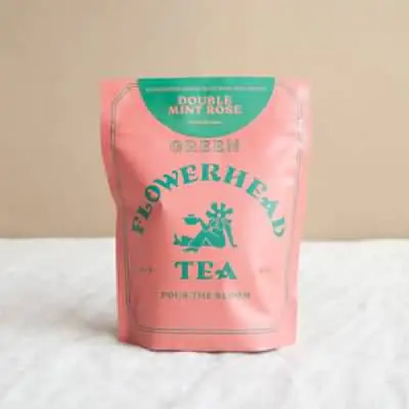
Flowerhead Tea’s packaging follows its own rules of designs for an experiential effect, with a clashing color palette that is almost hard to look at. The bold, all-caps font choice is equally loud and in-your-face. It’s a bold risk, but it somehow works. It’s all simple, with just two colors, three fonts, and one minimal graphic, but it comes together to sell.
August
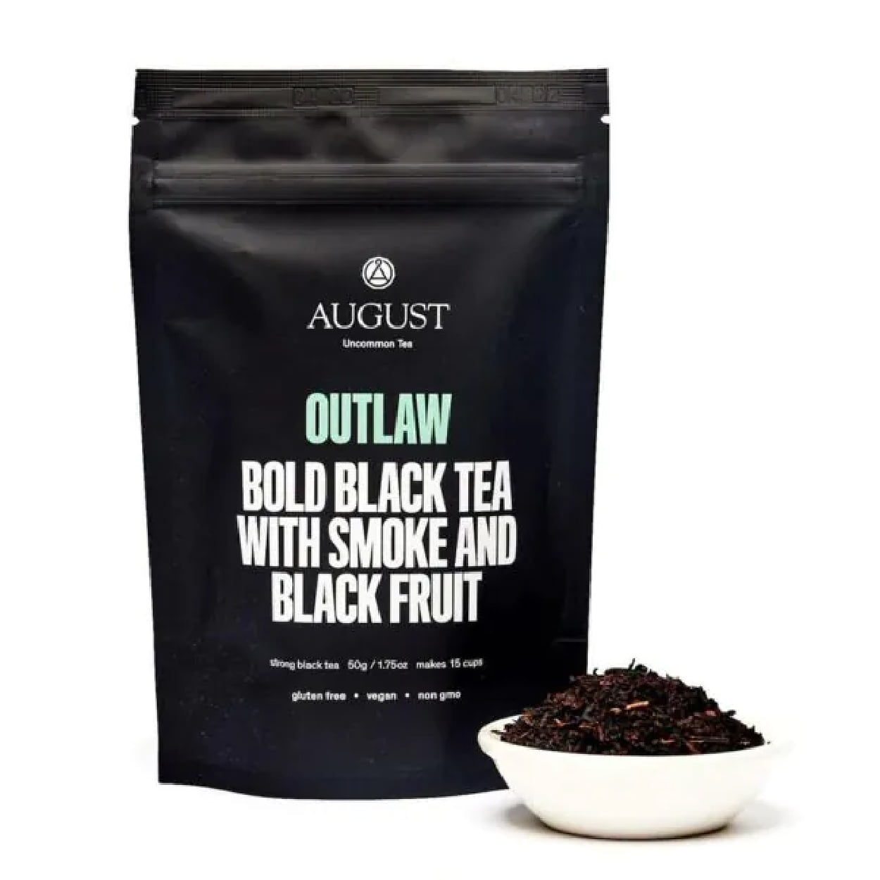
August’s Outlaw tea packaging is all about dramatic and bold. The stark, all-black packaging paired with simple, loud lettering (it’s literally yelling) strays from the more traditional tea packaging. The typography stays focused and centered with minor pops of color. The consumer knows exactly what they’re getting they and can expect a flavor that’s as bold as the look.
Healthify Tea
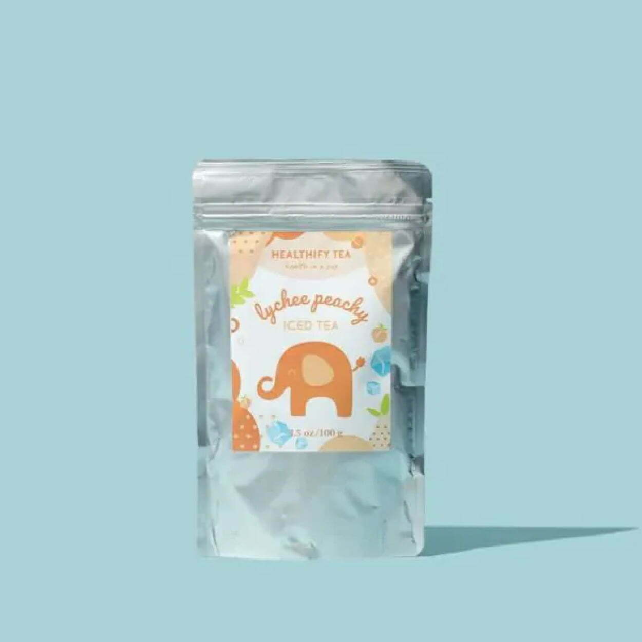
Healthify Tea has cute, bright, cheery, and fun packaging that is visually pleasing. Although full package branding, as opposed to a sticker on a package, would give it more professionalism and pop, the label is experiential in design, with bright colors, textures, graphics, and unique lettering in the typography. You get a little tingle of joy even just looking at the package, let alone sipping the tea.
Blume
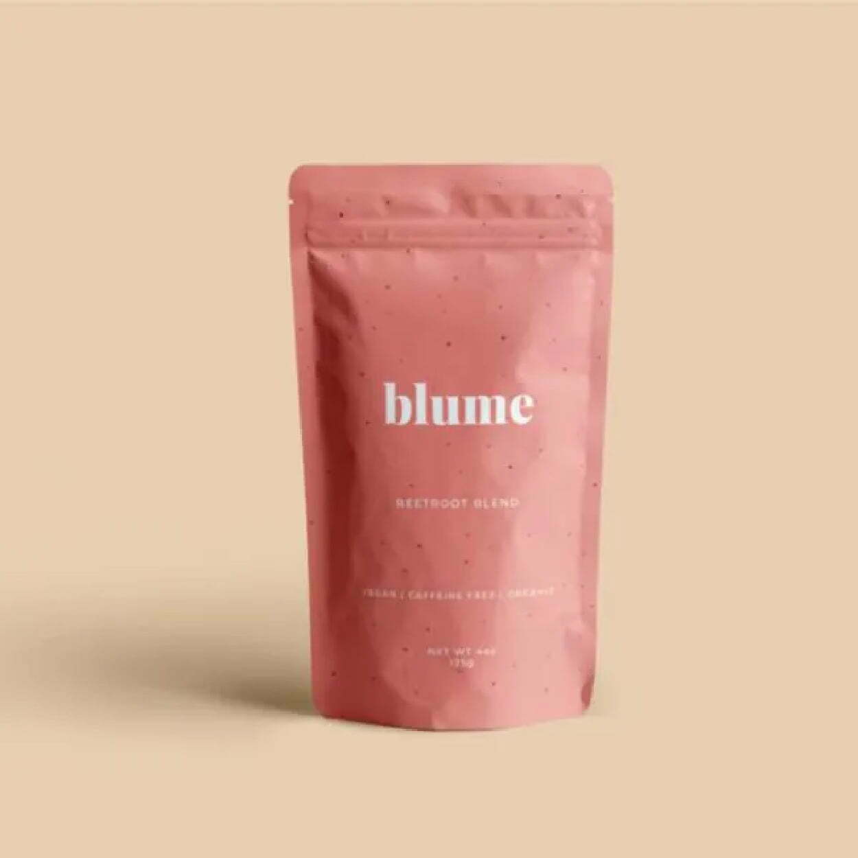
Blume’s minimalist packaging stays consistent across most of its flavors, with the primary difference being the color of the package. They vary but stay neutral and pastel, with faded shades and tones. They’re also typography-focused for the logo and packaging, with the simple, all-lowercase “blume” as their logo in the key font, paired with san serif fonts that are sleek and linear.
Sammee
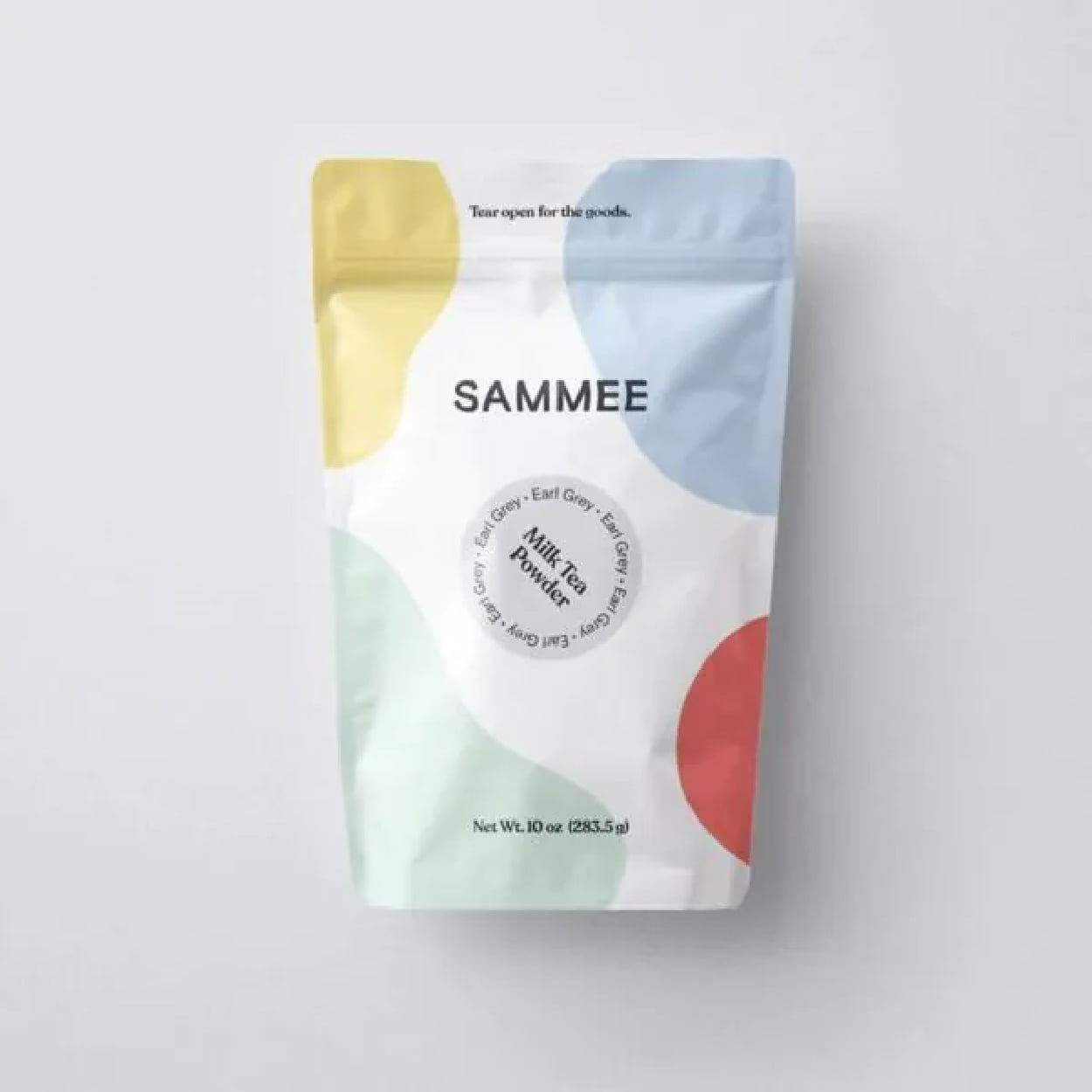
Sammee takes primary colors and shifts them to a soft, gentle pastel. It keeps the aesthetic simple but with a pop of color that gives energy but doesn’t overwhelm. It feels fluid with the unshaped blocks of color and feels palatable. It’s visually stimulating with colorful, abstract shapes, but in a calm and subdued way. The typography could give more than it currently does, but at least it doesn’t detract from the design.
Rishi
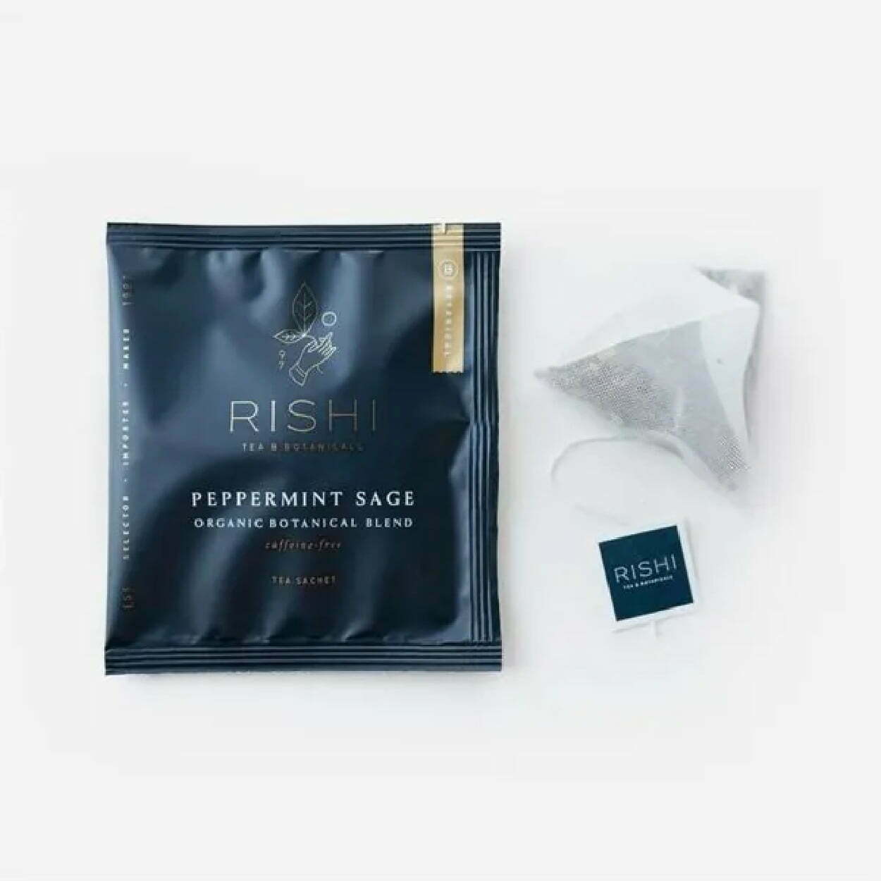
Rishi’s packaging feels luxurious and rich, with an almost velvet matte finish of the sachet that’s coupled with minimal amounts of gold detailing and sleek, thin lettering. Experiential designs make you feel something other than just a visually appealing package. It looks like whatever you drink from it will feel smooth, calming, and rich with flavorful tea.
Alaya
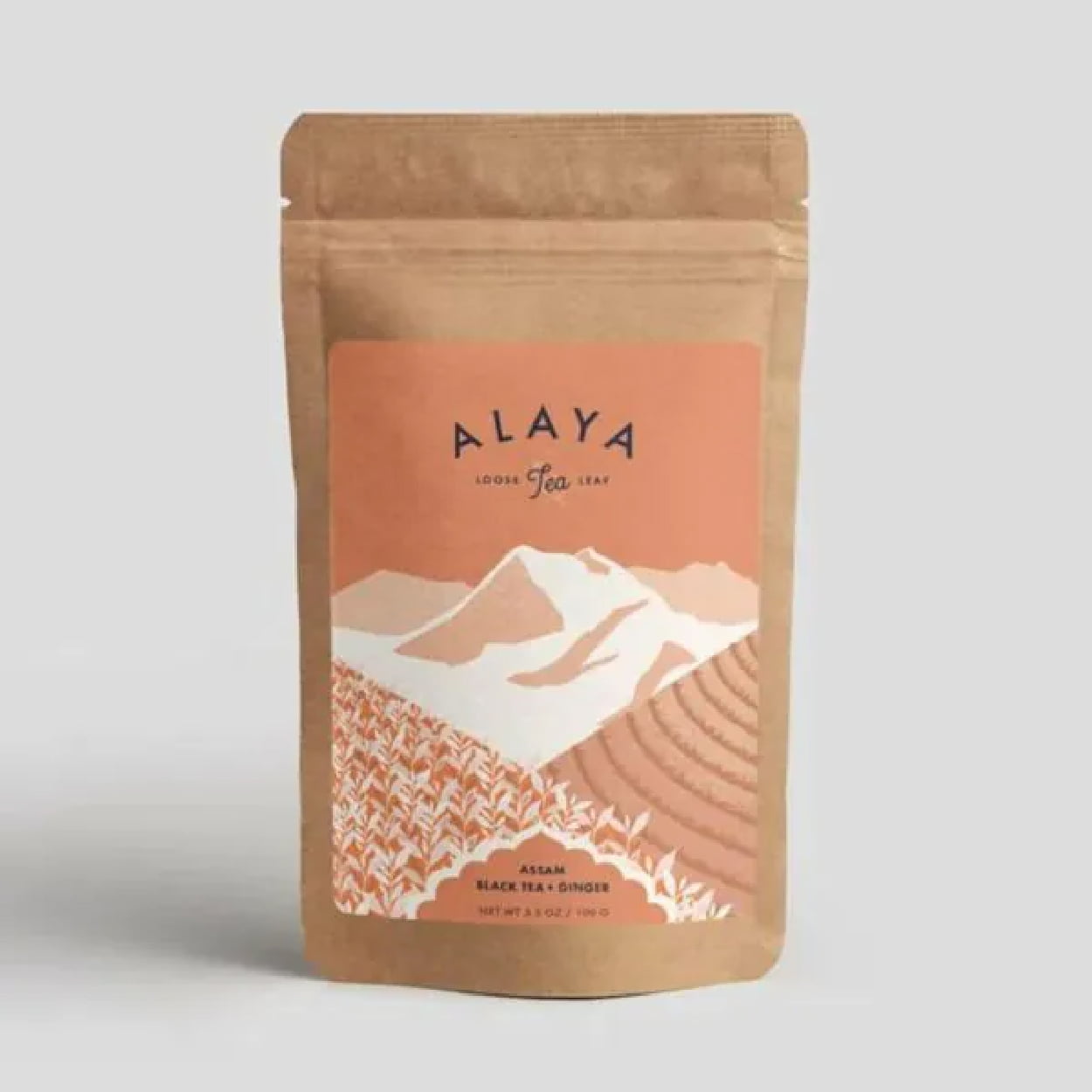
Alaya takes eco-friendly and sustainable packaging and pairs it with a minimalism that feels organic, fresh, and healthy. The colors are earthy, with the natural paper bag of the package and the mint-green and white tones on the label. The graphics add a level of complexity but still keep it minimal on the detailing, which matches well with the eco-friendly feel of the tea packaging.
Professional Packaging with CarePac
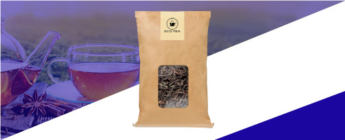
Finding affordable but professional packaging that helps sell your tea is easier said than done - unless you’re using the right custom packaging services. Eliminate your need to stress about quality packaging for sachets, loose leaf tea bags, and sachet bags with our customized tea packaging.
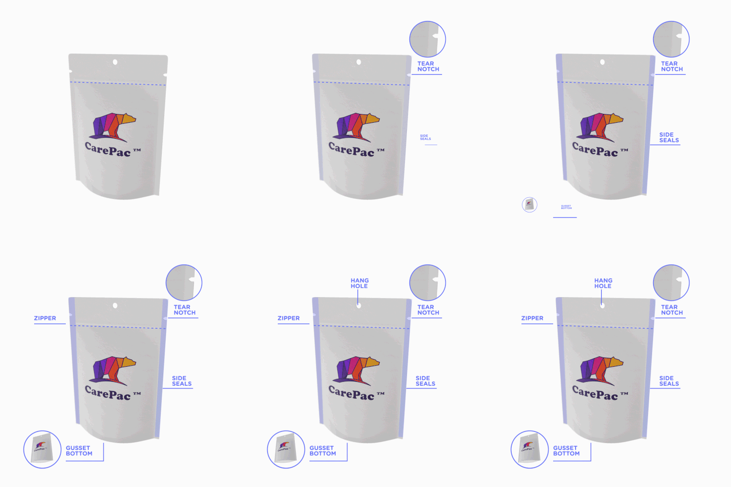
But having a killer packaging design doesn’t mean much if your package isn’t functional, as well. Tea needs to stay dry, preserved and sealed to maintain its aromatic tastiness, and the tea information should be clearly stated on your tea product packaging. Our standup box package design and packaging's feature a multi-layer preservation barrier, easy-to-use zip closures, tear notches, hang holes, and more.
Reach out today to find out how we can help perfect your packaging! Contact us for more information!
Tags

