No products in the cart.
5 Essential Granola
Packaging Ideas
Granola Companies Who Did It Right:
5 Essential Rules for Creative Granola Packaging & 10 Brands for Inspiration
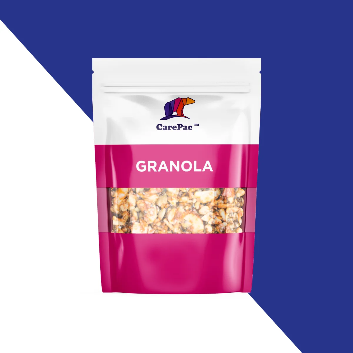

It’s crunchy, tasty, healthy – and maybe a little bit messy – but with big-brand competition on the shelves, how can you package your granola to really make it sell? It’s not just about the flavor because your consumers first have to pick it off the shelf! When it comes to packaging your granola to sell, there are five essential rules any company should follow. Read on for some great granola packaging ideas.
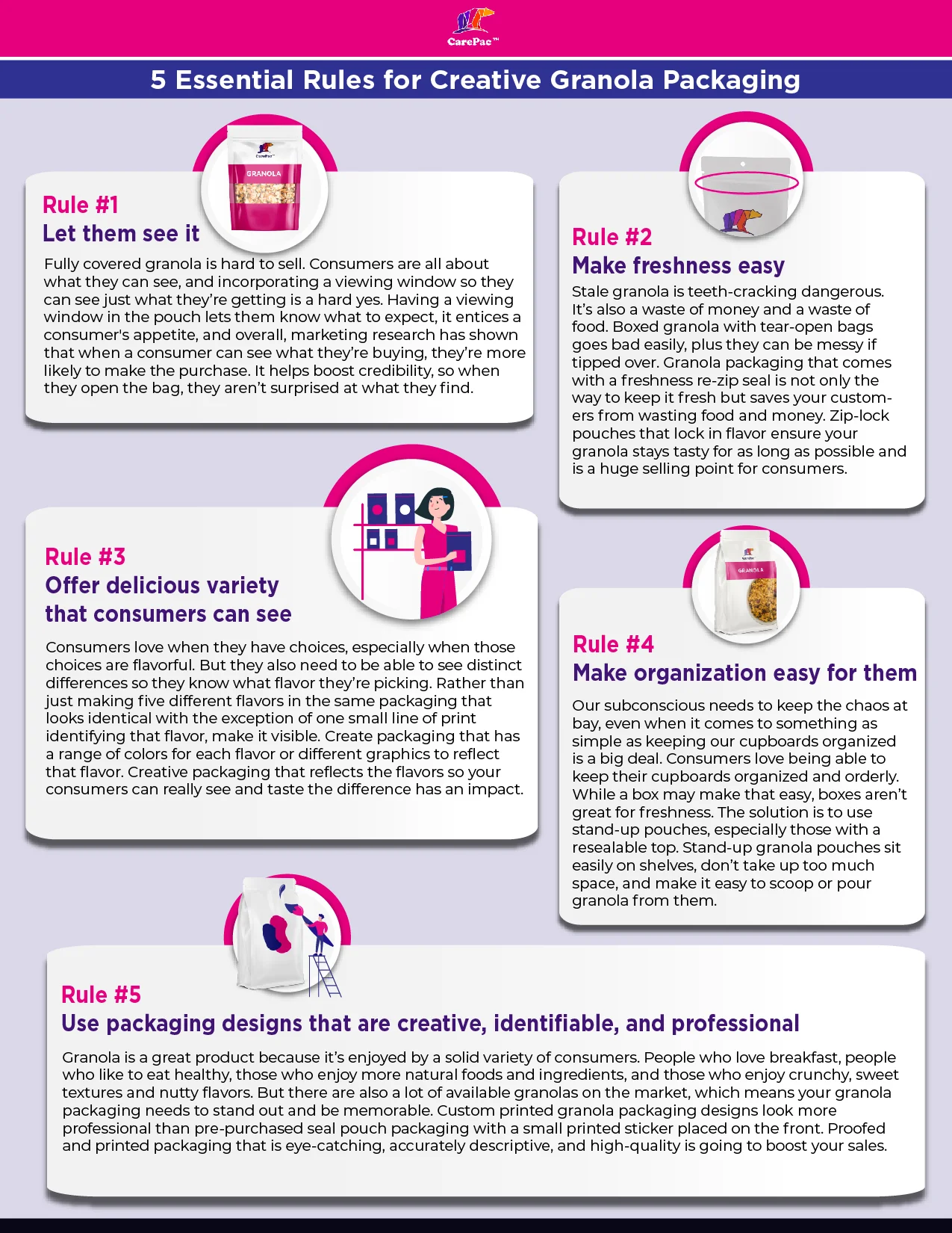
Rule #1: Let them see the snack.
Fully covered granola is hard to sell. Consumers are all about what they can see, and incorporating a viewing window so they can see just what they’re getting is a hard yes. Having a viewing window in the pouch lets them know what to expect, it entices a consumer's appetite, and overall, marketing research has shown that when a consumer can see what they’re buying, they’re more likely to make the purchase. It helps boost credibility, so when they open the bag, they aren’t surprised at what they find.
Rule #2: Make food freshness easy.
Stale granola is teeth-cracking dangerous. It’s also a waste of money and a waste of food. Boxed granola with tear-open bags goes bad easily, plus they can be messy if tipped over. Granola packaging that comes with a freshness re-zip seal is not only the way to keep it fresh but saves your customers from wasting food and money. Zippered pouches that lock in flavor ensure your granola stays tasty for as long as possible and is a huge selling point for consumers. Also consider using a high barrier material like CareClear-XP.
Rule #3: Offer delicious variety that consumers can see.
Consumers love when they have choices, especially when those choices are flavorful. But they also need to be able to see distinct differences so they know what flavor they’re picking. Rather than just making five different flavors in the same packaging that looks identical with the exception of one small line of print identifying that flavor, make it visible. Create packaging that has a range of colors for each flavor or different graphics to reflect that flavor. Creative packaging that reflects the flavors so your consumers can really see and taste the difference has an impact.
As a bonus, if you create limited-edition flavors or flavors that go with the seasons, you can create a new sense of demand with your buyers. A sense of urgency over a delicious flavor leaving at the end of summer, with fun, creative packaging to match, encourages them not to want to miss out.
Rule #4: Make organization easy for them.
Our subconscious needs to keep the chaos at bay, even when it comes to something as simple as keeping our cupboards organized is a big deal. Consumers love being able to keep their cupboards organized and orderly. While a box may make that easy, boxes aren’t great for freshness. The solution is to use stand-up pouches, especially those with a resealable top. Stand-up granola pouches sit easily on shelves, don’t take up too much space, and make it easy to scoop or pour granola from them.
Rule #5: Use packaging designs that are creative, identifiable, and professional.
Granola is a great product because it’s enjoyed by a solid variety of consumers. People who love breakfast, people who like to eat healthy, those who enjoy more natural foods and ingredients, and those who enjoy crunchy, sweet textures and nutty flavors. But there are also a lot of available granolas on the market, which means your granola packaging needs to stand out and be memorable. Custom printed granola packaging designs look more professional than pre-purchased seal pouch packaging with a small printed sticker placed on the front. Proofed and printed packaging that is eye-catching, accurately descriptive, and high-quality is going to boost your sales.

10 brands that understand packaging!
Manna Granola
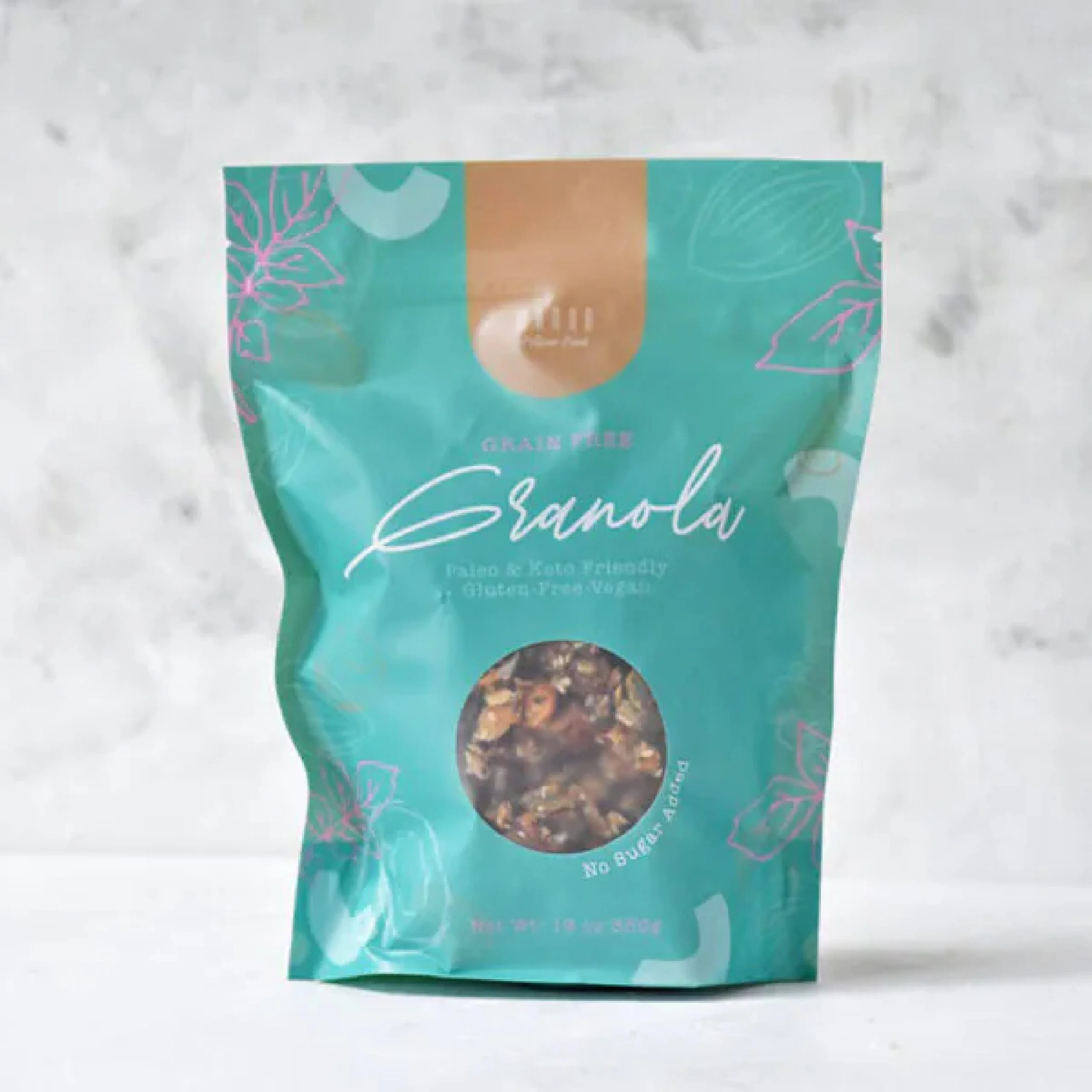

Manna Granola does a lot right with their artisanal granola packaging. The matte finish package, a vibrant color that doesn’t overwhelm, minimal graphics to match a minimal-ingredient granola, and a peephole so buyers can see their food. The color palette is a bit retro, but it works. The only questionable choice is the script font for the word “Granola,” which is hard to read. Good thing we have that window to know what we’re getting.
Sacura
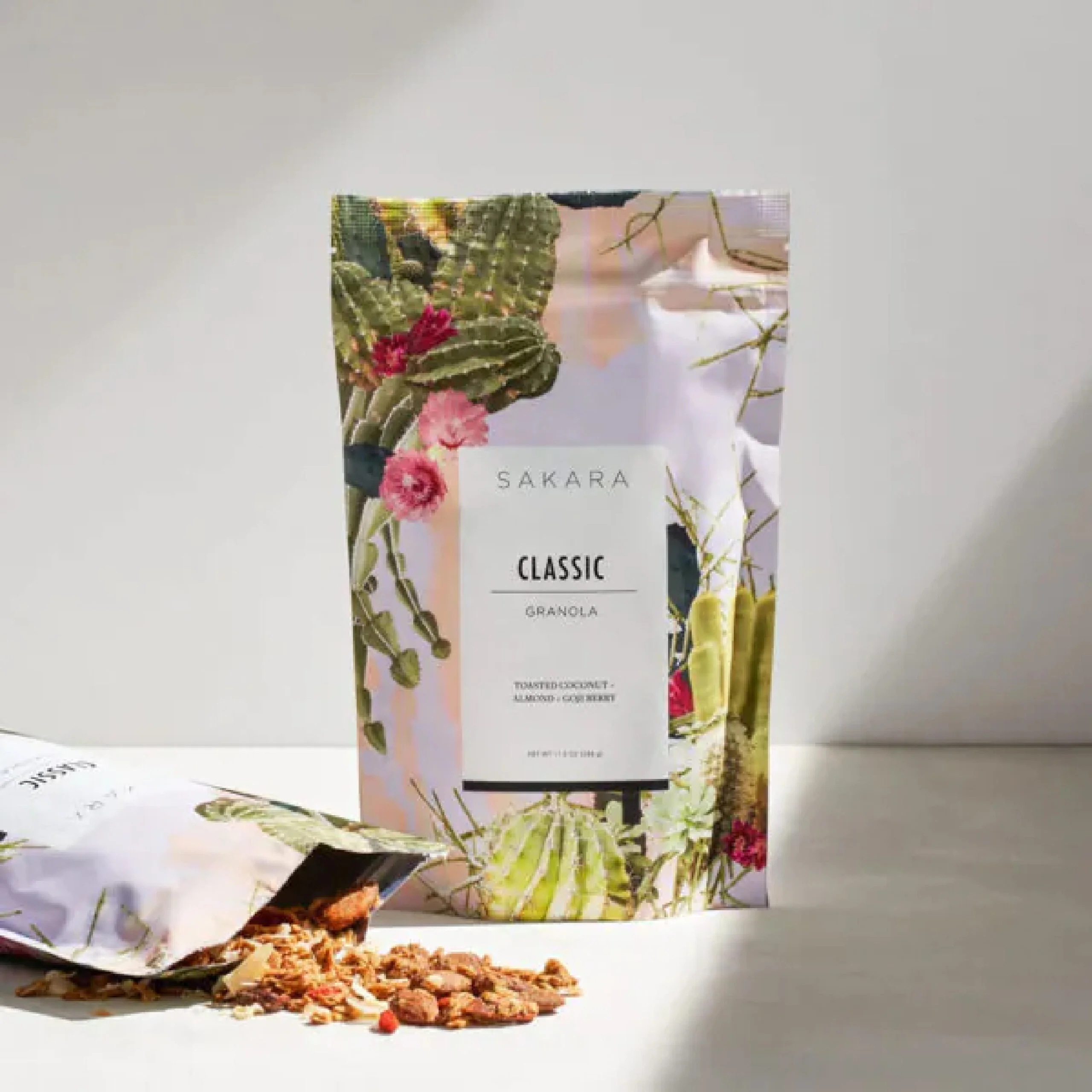

Sakura’s granola packaging brings bright, colorful, and exciting graphics to their granola in a resealable stand-up pouch. Although they’re missing the window for viewing the granola, it’s still a very appealing package. The choice for the graphics is questionable, though, because although they are pretty, what do the cacti and florals have to do with the flavor? Overall, it’s eye-catching and likely to grab a consumer's attention.
Small Batch Organics
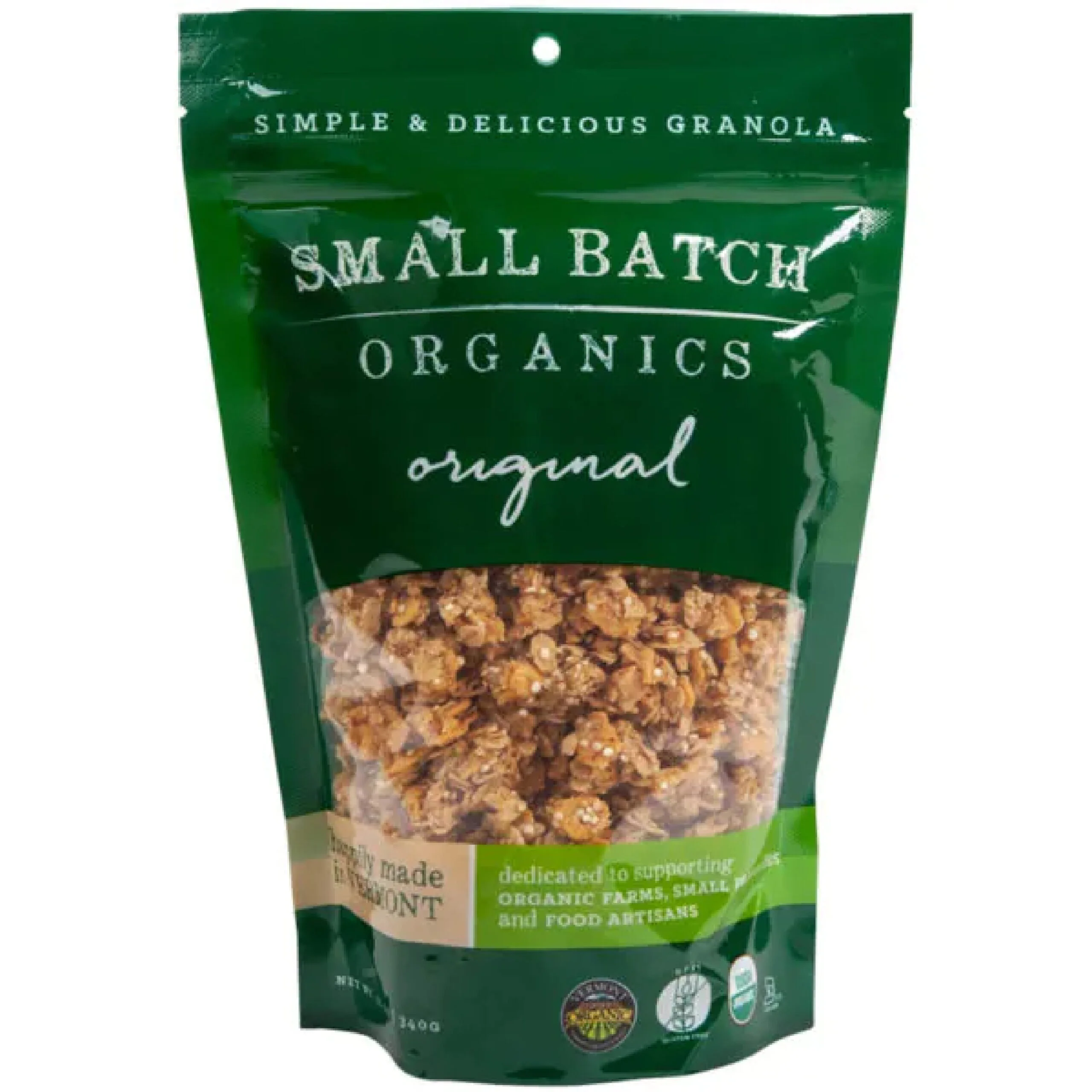

Small Batch Organics checks off most of the rules. They don’t have the most exciting, stand-out packaging, but it hits their target demographic well. It is simple and easy on the eye. The font choices go well together. The color palette is very much reflective of a natural, organic product with greens and browns. It may not be the most eye-catching product on the market, but when it comes to finding a healthy and wholesome granola product, the package reflects the product.
Lark Ellen Granola
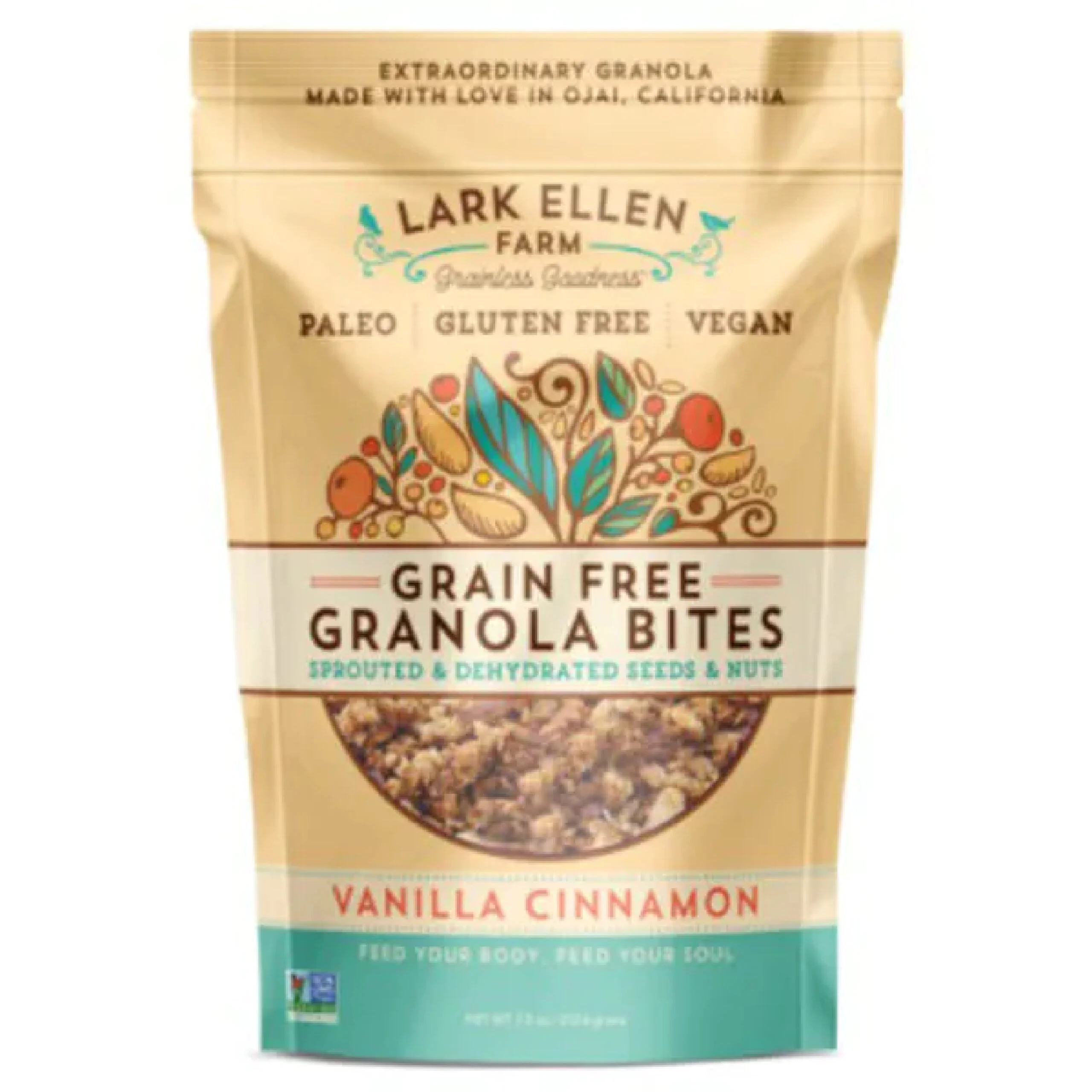

Lark Ellen Farm’s packaging gives off a cute, friendly, and wholesome with a matching color palette, fun typography, and inviting graphics. It combines fun and functional together well, with a package that keeps the granola fresh and the packaging fresh. It’s easy to read, it’s easy to see, and it looks like it’s going to taste good.
Public Goods
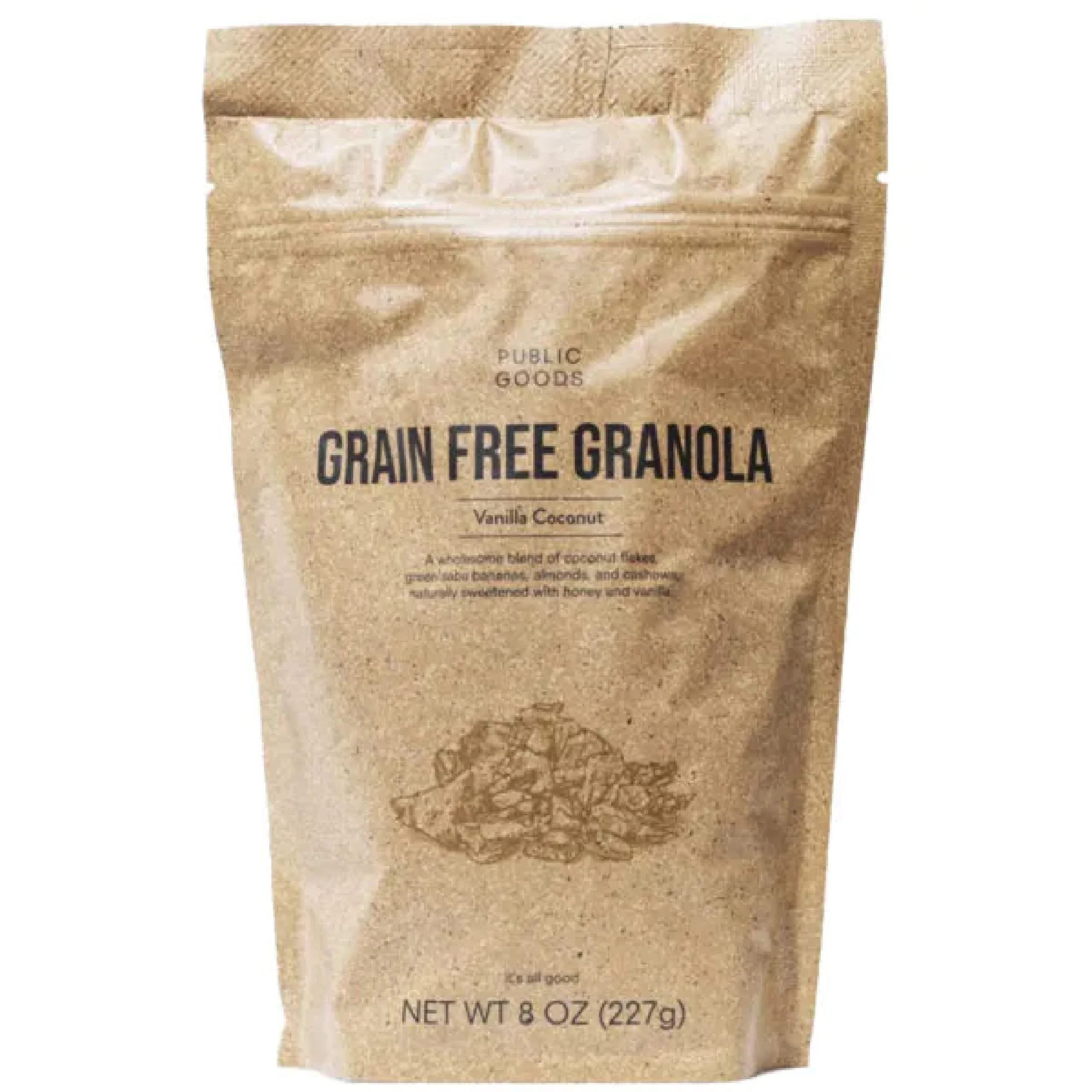

Public Goods goes with an ultra-minimalist packaging that works for their product and their brand identity. It keeps it simple and to the point. The packaging would definitely benefit from a viewing window, which would match the packaging with the shades of brown and make it a bit more appetizing to the consumer. However, the rest of it is right on the money.
Thrive Granola
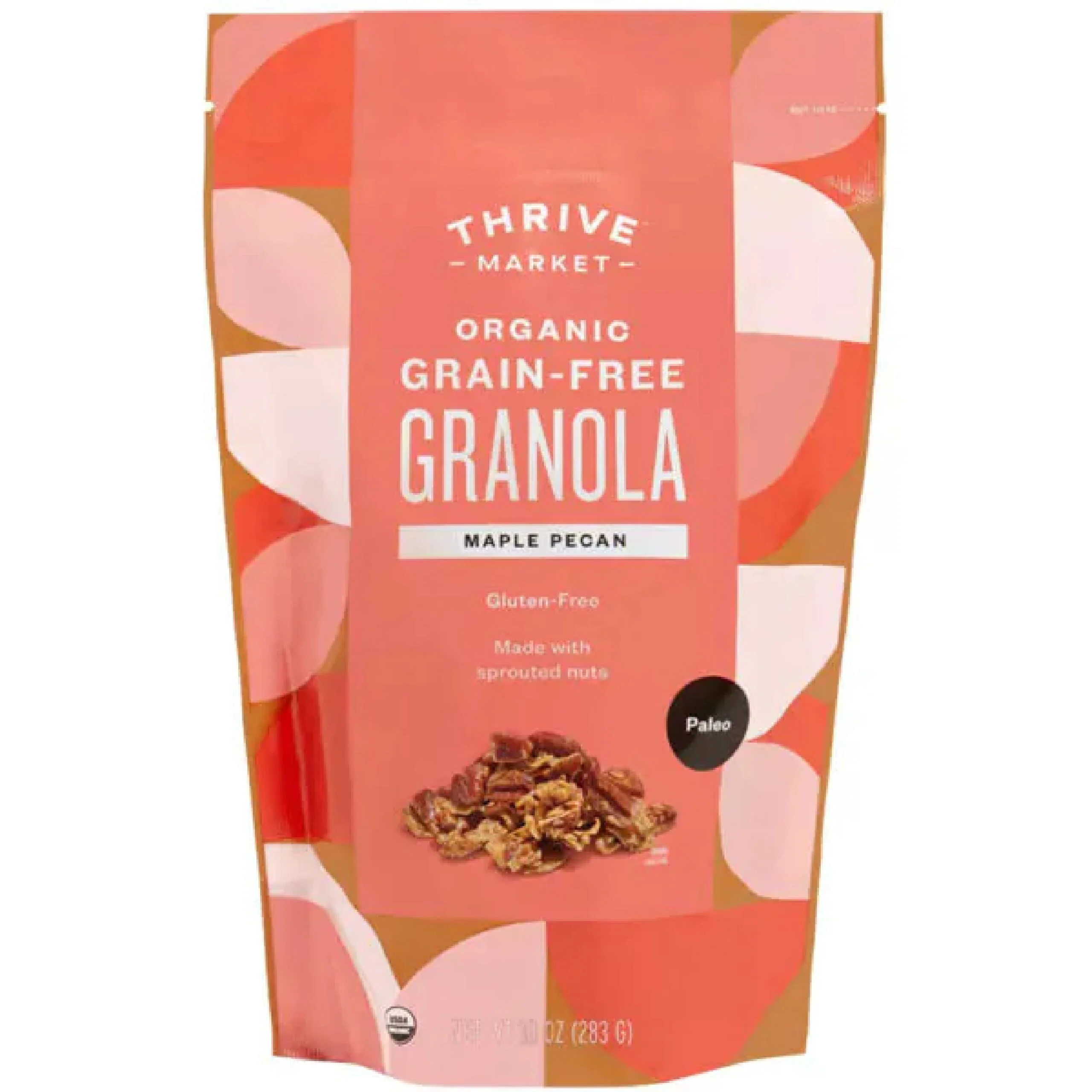

The soft yet colorful shades of pink and peach on the Thrive granola packaging, along with the large color blocks, make it stand out without being overbearing. The easy-tear, stand-up pouch with fun graphics is certainly going to appeal to a consumer. The biggest downside is going to be the lack of a zip-lock top to keep it fresh and to avoid any spillage from a tipped bag.
Keto Hana
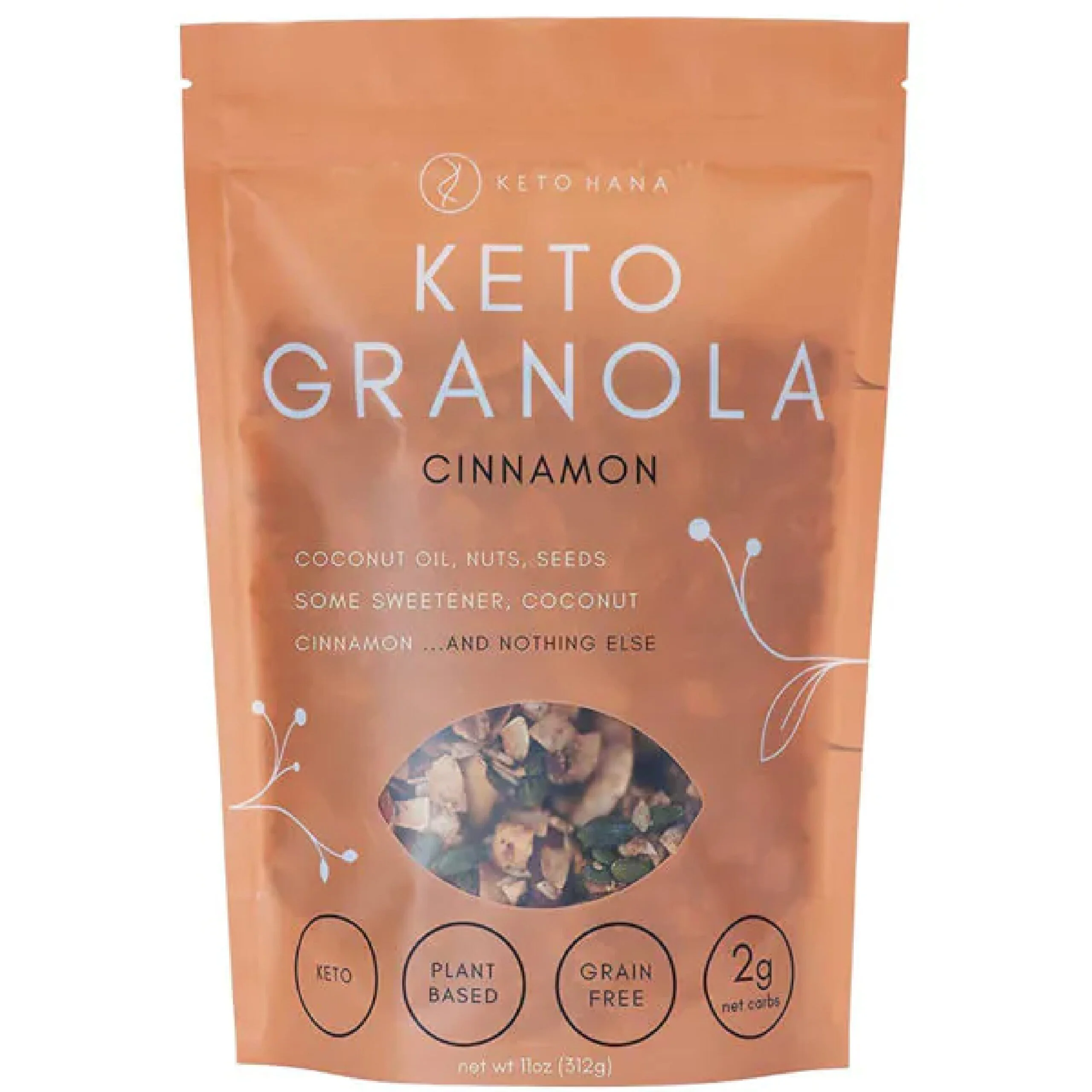

Keto Hanas font choice is simple and direct, but the typography goes perfectly with their brand premise and the limited ingredient, simplified granola concept. The faded packaging with a peekaboo window gives the impression of transparency, literally with the ingredients. Although it is simple, the vine graphics elevate it with a touch of sophistication.
Just Live a Little
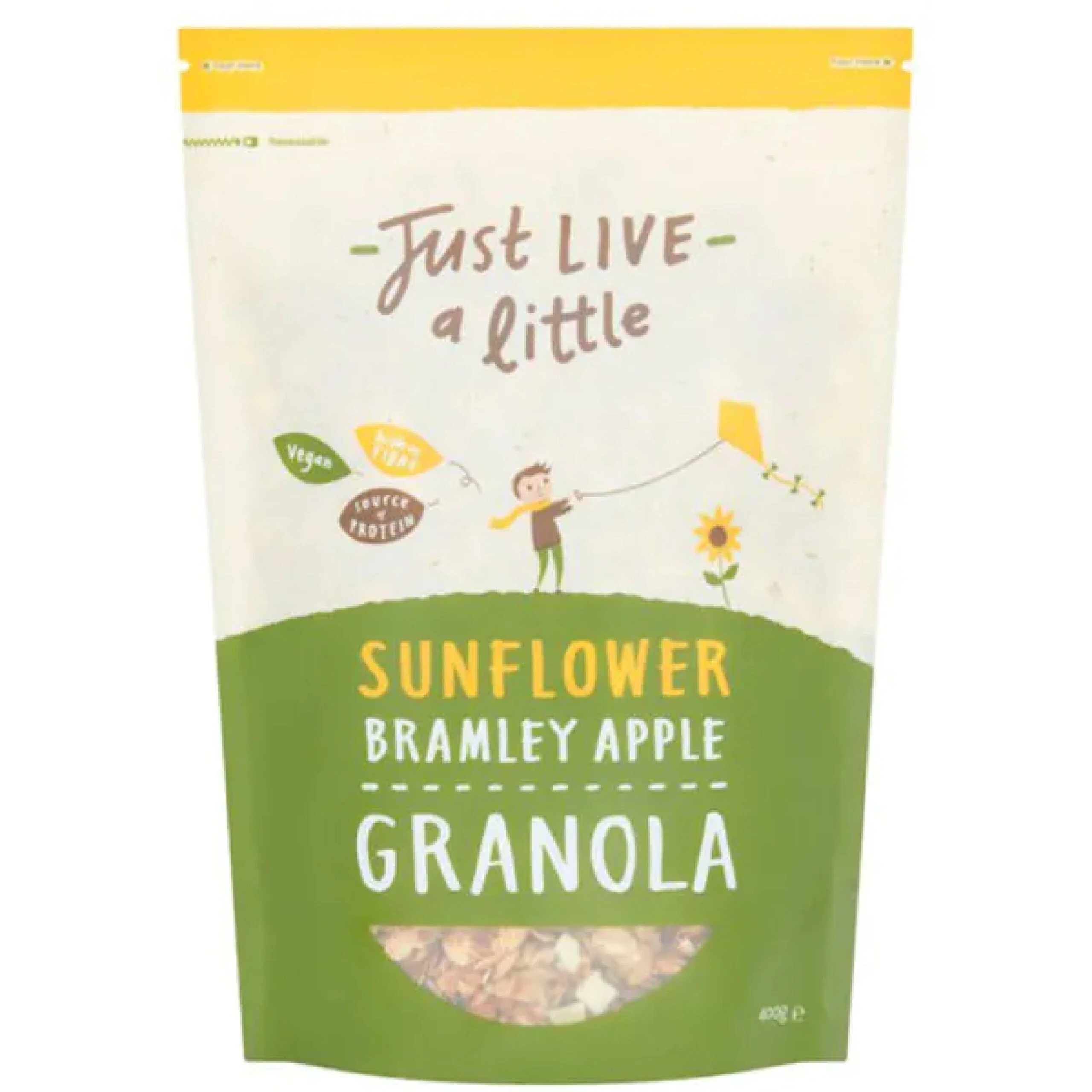

Just Live a Little has cute and wholesome energy, just like the Lark Ellen Granola. Their typography is inconsistent but in a cohesive way with two unique fonts. They have different color packaging for all their flavors, so it’s easy to tell them apart, but they all stick to the same color palette. It stands up, and it’s easy to tear open and just as easy to reseal.
NuTrail Keto Granola
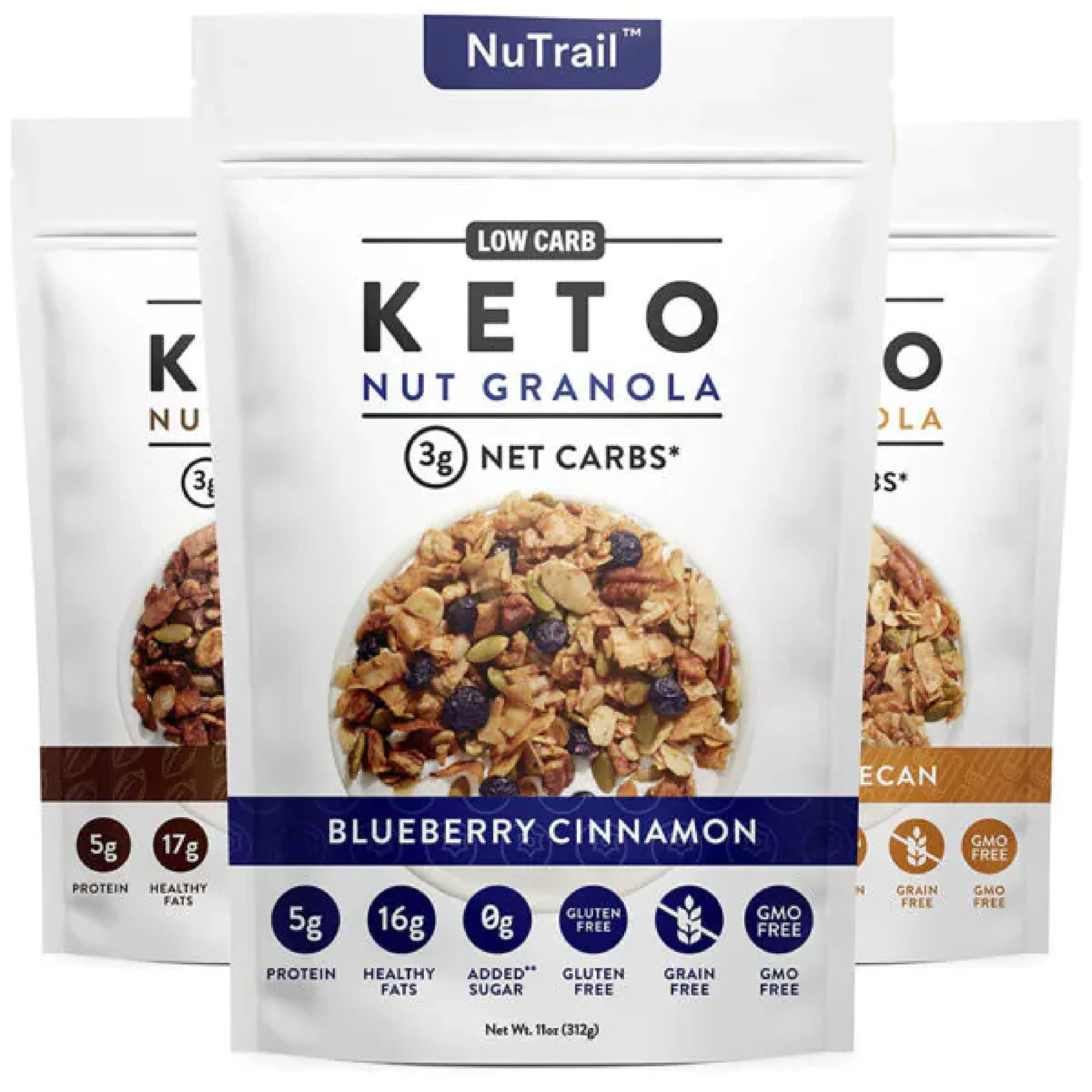

The packaging for NuTrail looks clean-cut and healthy. There’s nothing fancy or exciting, but most people who follow a keto diet just need to know what they’re putting in their body, which is the focus of the packaging. They don’t have a window, but at least provide a picture of the granola itself. The small color bands differentiate flavors. Clean fonts, clean colors, and clean graphics for clean eating.
Spoon Granola
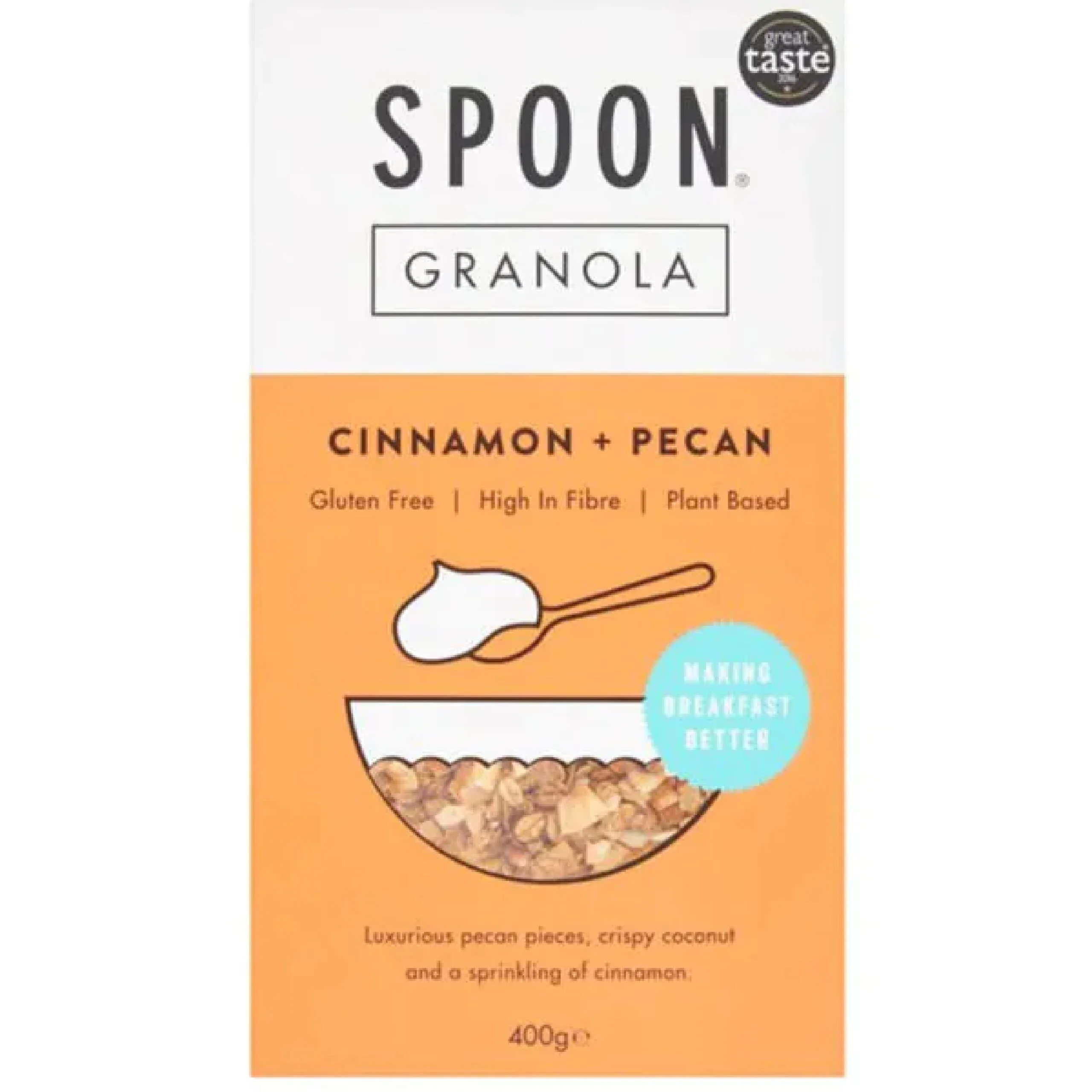

Spoon Granola is a great example of minimalist design. The graphics are super simple, and the same can be said of the font choices. The typography pairs well with the colors, the lines, and the creative use of the little bowl for the viewing window. Boxes are much harder to stay fresh, but the square packaging still works with the overall design.
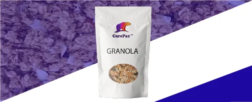

Whether you’re looking to get your granola product into grocery stores or you want to elevate your stand at your local farmers’ market, custom seal pouch packaging for granola should be your next step. CarePac offers budget-friendly professional packaging that features stay-fresh packaging and seals with viewing windows and stand-up packages that will hit all the branding rules. With product packaging design you can print directly on, we have three different film materials to choose from and can help bring your vision to life. Customize each aspect of your flexible packaging and elevate your granola brand for 2022!
Reach out to us today to find out more about our customizable food packaging and what makes us one of the best flexible packaging companies in the U.S. Don't make a mistake -- call or email us today!
Tags

