No products in the cart.
6 Skin Care Packaging Ideas
Skin Care Packaging Ideas | Packaging for Cosmetics
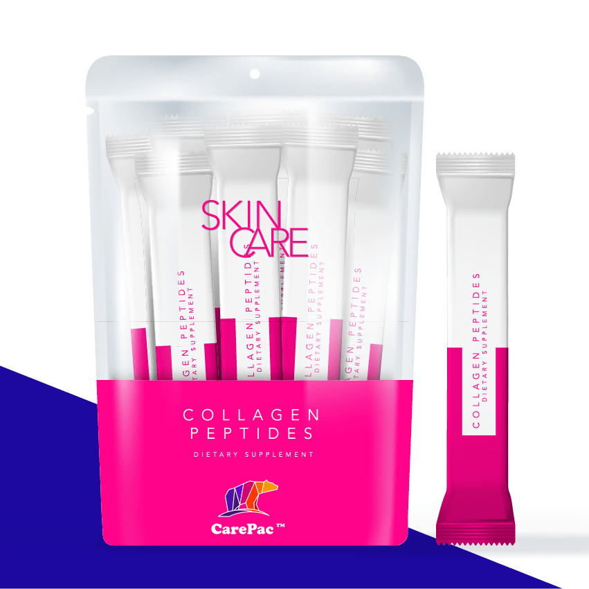

Expectations are high when it comes to skincare and the cosmetics container it comes in, and in an aesthetic-driven industry, the aesthetic of your packaging is extremely important to your customer when it comes to creating a product that sells. Skincare brands focus on clean products, convenience, minimalism, a fresh look, limited ingredients, and eye-catching designs that attract without overwhelming.
Help your skincare brand and skin care products catch the spotlight with these 6 skin care packaging tips.
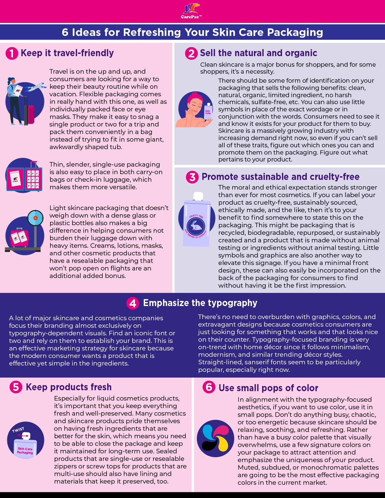
Six Skin Care Packaging Ideas
1. Keep it travel-friendly.
Travel is on the up and up, and consumers are looking for a way to keep their beauty routine while on vacation. Flexible packaging comes in really hand with this one, as well as individually packed face or eye masks. They make it easy to snag a single product or two for a trip and pack these cosmetics conveniently in a bag instead of trying to fit in some giant, awkwardly shaped tub or bottles. Thin, slender, single-use packaging is also easy to place in both carry-on bags or check-in luggage, which makes them more versatile. Light skincare packaging that doesn’t weigh down with a dense glass or plastic bottles also makes a big difference in helping consumers not burden their luggage down with heavy items. Creams, lotions, masks, and other cosmetic products that have a resealable packaging that won’t pop open on flights are an additional added bonus.
2. Sell the natural and organic.
Clean skincare is a major bonus for shoppers, and for some shoppers, it’s a necessity. There should be some form of identification on your packaging that sells the following benefits: clean, natural, organic, limited ingredient, no harsh chemicals, sulfate-free, etc. You can also use little symbols in place of the exact wordage or in conjunction with the words. Consumers need to see it and know it exists for your product for them to buy. Skincare is a massively growing industry with increasing demand right now, so even if you can’t sell all of these traits, figure out which ones you can and promote them on the packaging. Figure out what pertains to your product and make sure your buyers know it.
3. Promote sustainable and cruelty-free.
The moral and ethical expectation stands stronger than ever for most cosmetics. If you can label your cosmetics product as cruelty-free, sustainably sourced, ethically made, and the like, then it’s to your benefit to find somewhere to state this on the packaging. This might be packaging or bottles that are recycled, biodegradable, repurposed, or sustainably created and a product that is made without animal testing or ingredients without animal testing. Little symbols and graphics are also another way to elevate this signage. If you have a minimal front design, these can also easily be incorporated on the back of the packaging for consumers to find without having it be the first impression.
4. Emphasize the typography.
A lot of major skincare and cosmetics companies focus their branding almost exclusively on typography-dependent visuals. Find an iconic font or two and rely on them to establish your skin care brands. This is an effective marketing strategy for skincare because the modern consumer wants a product that is effective yet simple in the ingredients. There’s no need to overburden with graphics, colors, and extravagant designs because cosmetics consumers are just looking for something that works and that looks nice on their counter. Typography-focused branding is very on-trend with home décor since it follows minimalism, modernism, and similar trending décor styles. Straight-lined, sanserif fonts seem to be particularly popular, especially right now.
5. Keep products fresh.
Especially for liquid cosmetics products or facial care products, it’s important that you keep everything fresh and well-preserved. Many cosmetics and skincare products pride themselves on having fresh ingredients that are better for the skin, which means you need to be able to close the package and keep it maintained for long-term use. Sealed products that are single-use or resealable zippers or screw tops for products that are multi-use should also have lining and materials that keep it preserved, too.
6. Use small pops of color.
In alignment with the typography-focused aesthetics, if you want to use color on your cosmetics packaging, use it in small pops. Don’t do anything busy, chaotic, or too energetic because skincare should be relaxing, soothing, and refreshing. Rather than have a busy color palette that visually overwhelms, use a few signature colors on your package to attract attention and emphasize the uniqueness of your product. Muted, subdued, or monochromatic palettes are going to be the most effective packaging colors in the current market.

Skin Care Packaging Design Inspirations
These brands get it, and have implemented a lot of the best practices. The designs below should inspire some creative ideas of your own! Check out the best skin care trends and cosmetic packaging ideas.
Drunk Elephant
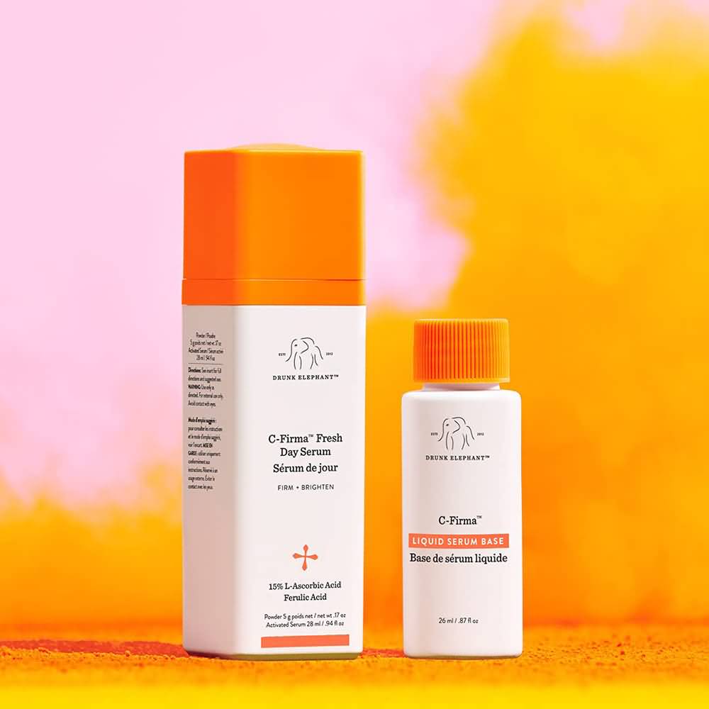

The entire Drunk Elephant line of facial care products features white bottles with colorful, monochromatic lids. The minimal use of color is refreshing and eye-catching, and the minimalistic, drawn elephant graphic is cute yet professional. They pair it with little pops of additional orange throughout the bottle (or whatever the signature color is for that product). The typography isn’t anything crazy, but overall, the packaging is effective and sells well.
JLO Beauty
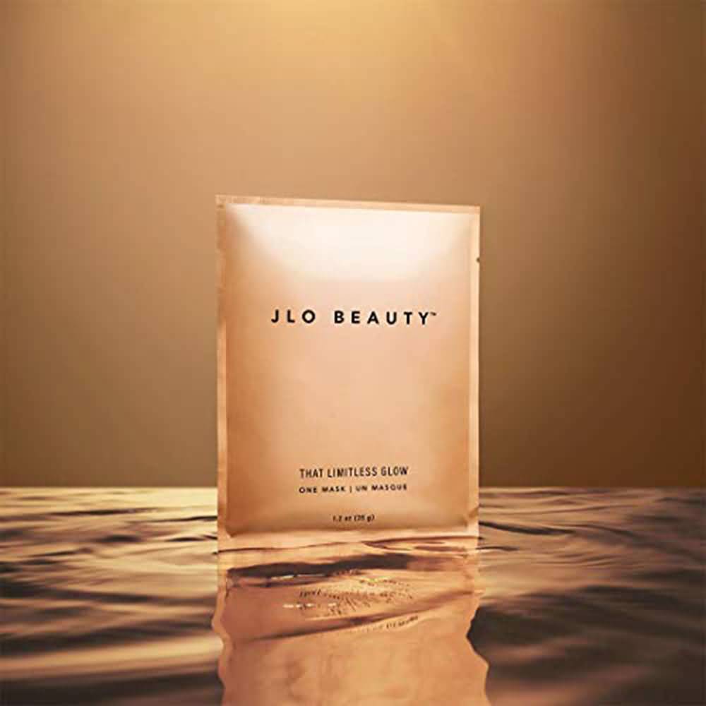

Jennifer Lopez’s new skincare and cosmetics line is typography-focused, with no graphics, no color, and a simple font pairing that looks professional, sleek, and stylish. It’s modern and aesthetically pleasing for facial care products, which particularly targets the modern consumer. Two bold san-serif fonts strategically placed on the package that is single-use with one mask are all it took to sell. It’s also in convenient tear-open packaging that contains one mask and makes it easy to pack or store.
Sephora Hair
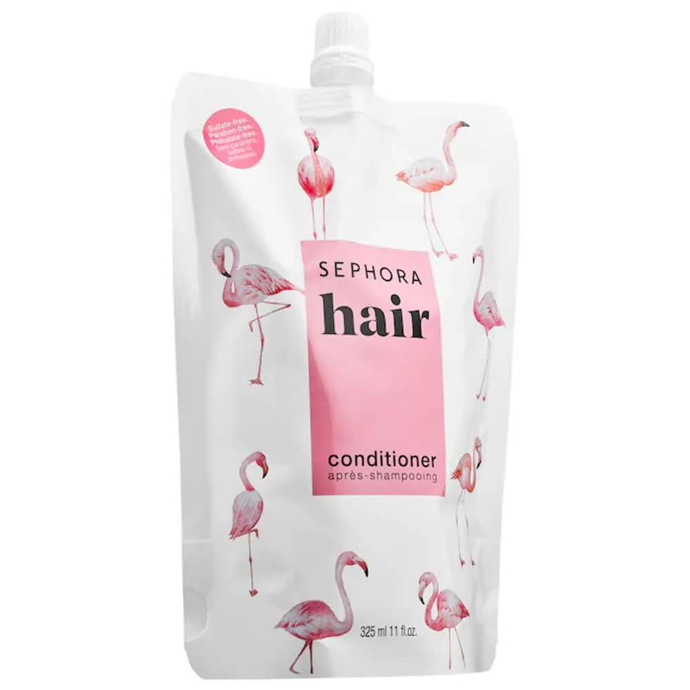

The Sephora brand of skin care formulas and cosmetics products all follow similar packaging designs, although they have plenty of variety with the types of packaging they use. Simple color palettes, usually just one or two colors that are engaging and often energetic and bright, are characteristic of them. Most of their Sephora brand packaging also has cute graphics, fun colors and styles, and bold and funky fonts. It strays from the norm but still keeps it fun on a visual level.
Youth to the People
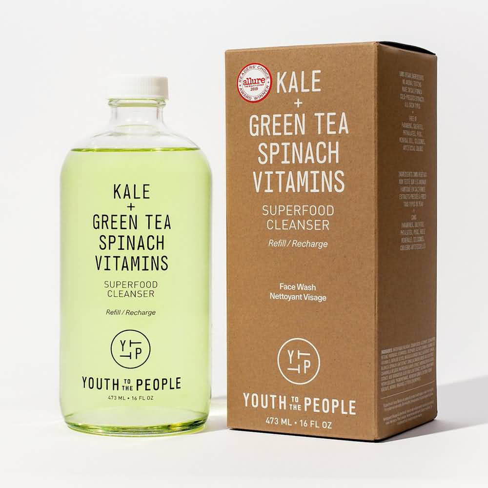

Youth to the People markets itself with its beauty products packaging as being nutrient-rich, health-food-focused, and made with natural ingredients. Clear packaging bottles and cosmetic containers gives off a sense of transparency, which consumers want since they want to know what is in their product (although clear packaging works better for clear liquids and not for thicker creams). They emphasize “kale” and “green tea” on most of their packaging. They also give off a natural and eco-friendly tone with the simple brown cardboard packaging.
Volition
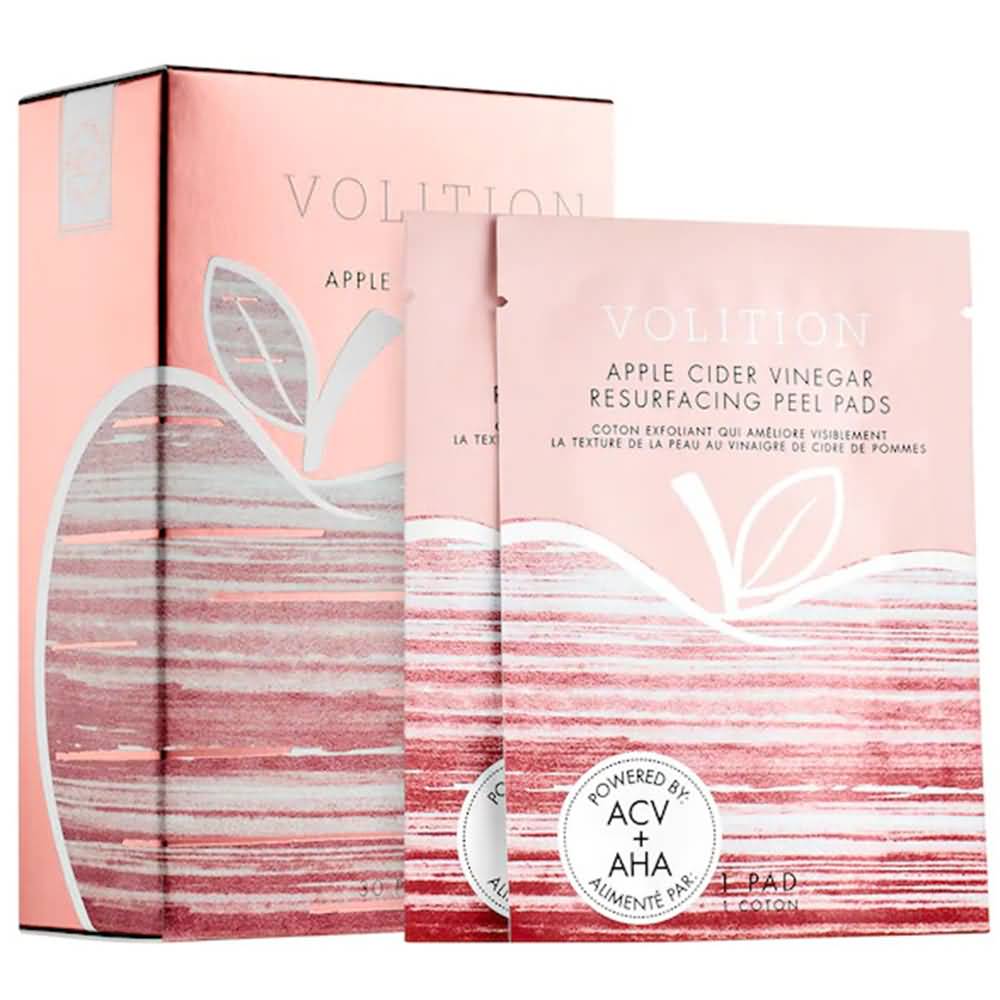

Volition’s mask set has quite a bit more color than most skincare brands, but the pop of pink is effective, especially when paired with the apple logo, which denotes a healthy connotation. Multiple, single-use masks that are individually wrapped with a tear-notch but still packaged conveniently within the cardboard box help for organization and gives the option to pack a mask or two when traveling.
Wishful
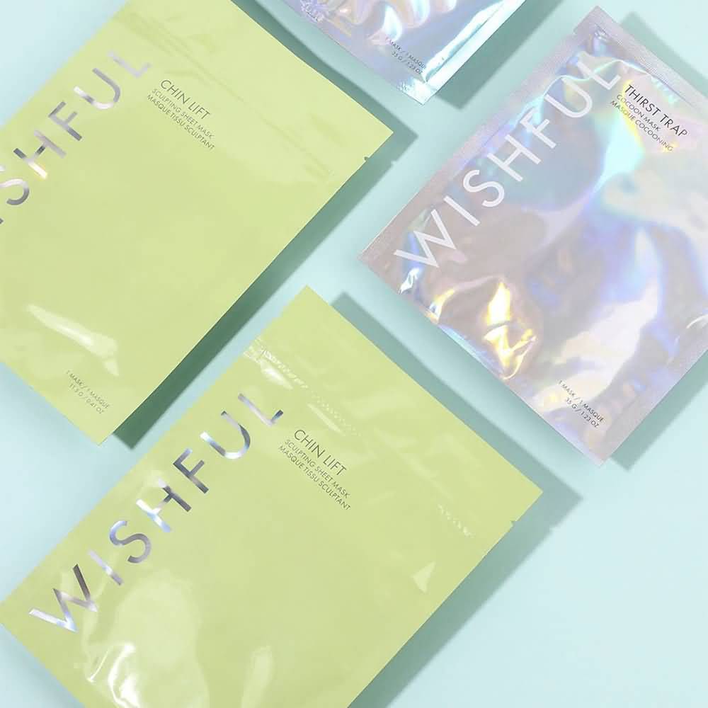

Wishful effectively uses a pop of color – the lime green – and pairs it with the signature holographic lettering that is present on all their various packaging. It’s bright and fun, and their products’ color matches the packaging as well. The typography-focused logo and branding are also straight and to the point, but the colors make it fun and engaging.
Lux Unfiltered
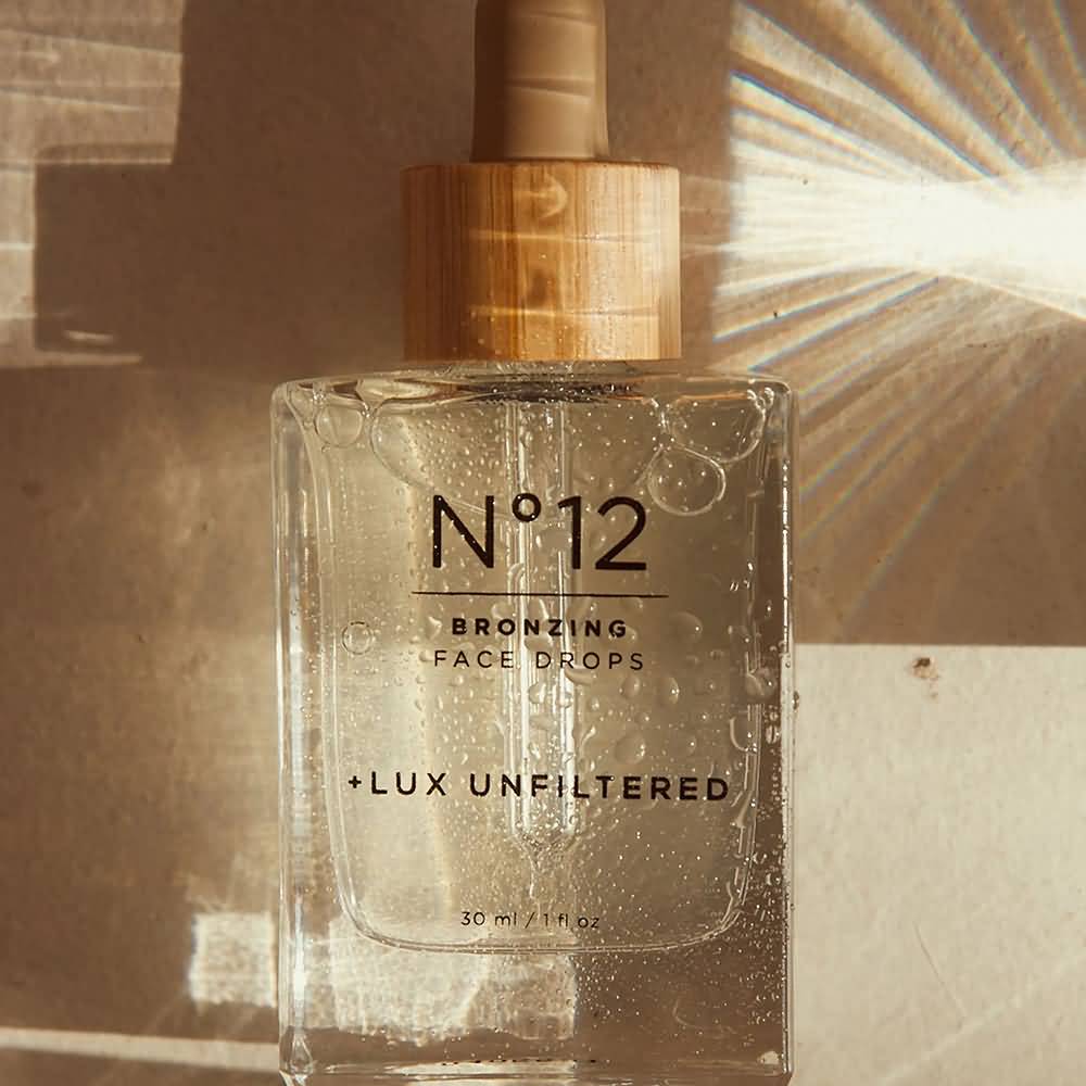

Lux Unfiltered uses a neutral palette and bamboo-toned shades to convey a sense of a natural and healthy product. The typography is central to the design, and the clear packaging also gives off transparency to consumers. It may not be natural and organic, but it gives off that vibe with packaging that seems ‘healthier,’ so to speak.
Amika
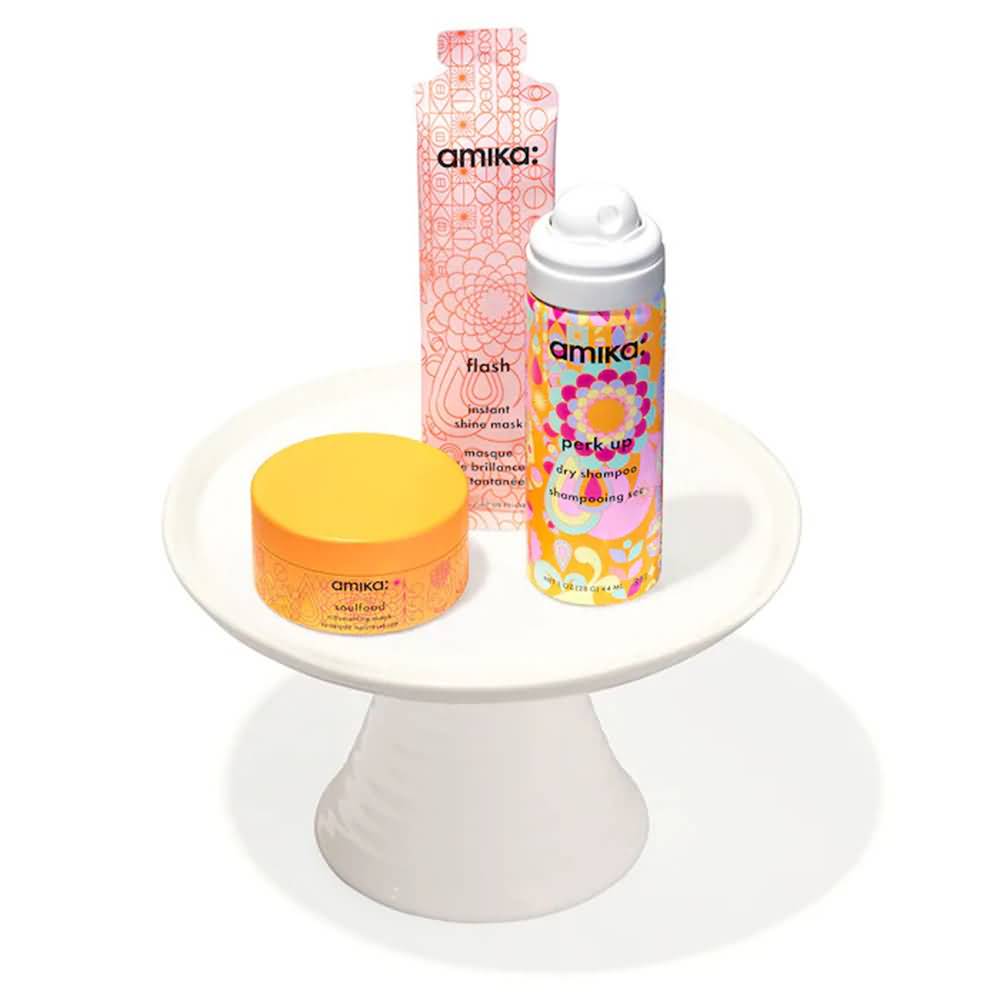

Amika is one of those rare brands that pulls off a lot of color and pulls it off well. They don’t limit their color palette; they don’t focus on their typography (although their font choice is unique and memorable) and it doesn’t give off natural and organic vibes. But what they have works! The patterns are soothing and repetitive, which is consistent across all their products. The color wheel is always well-represented but with colors that pair well rather than clash (orange/blue/lime green, pink/orange/yellow, etc.), and it’s a great energy overall.
Pattern
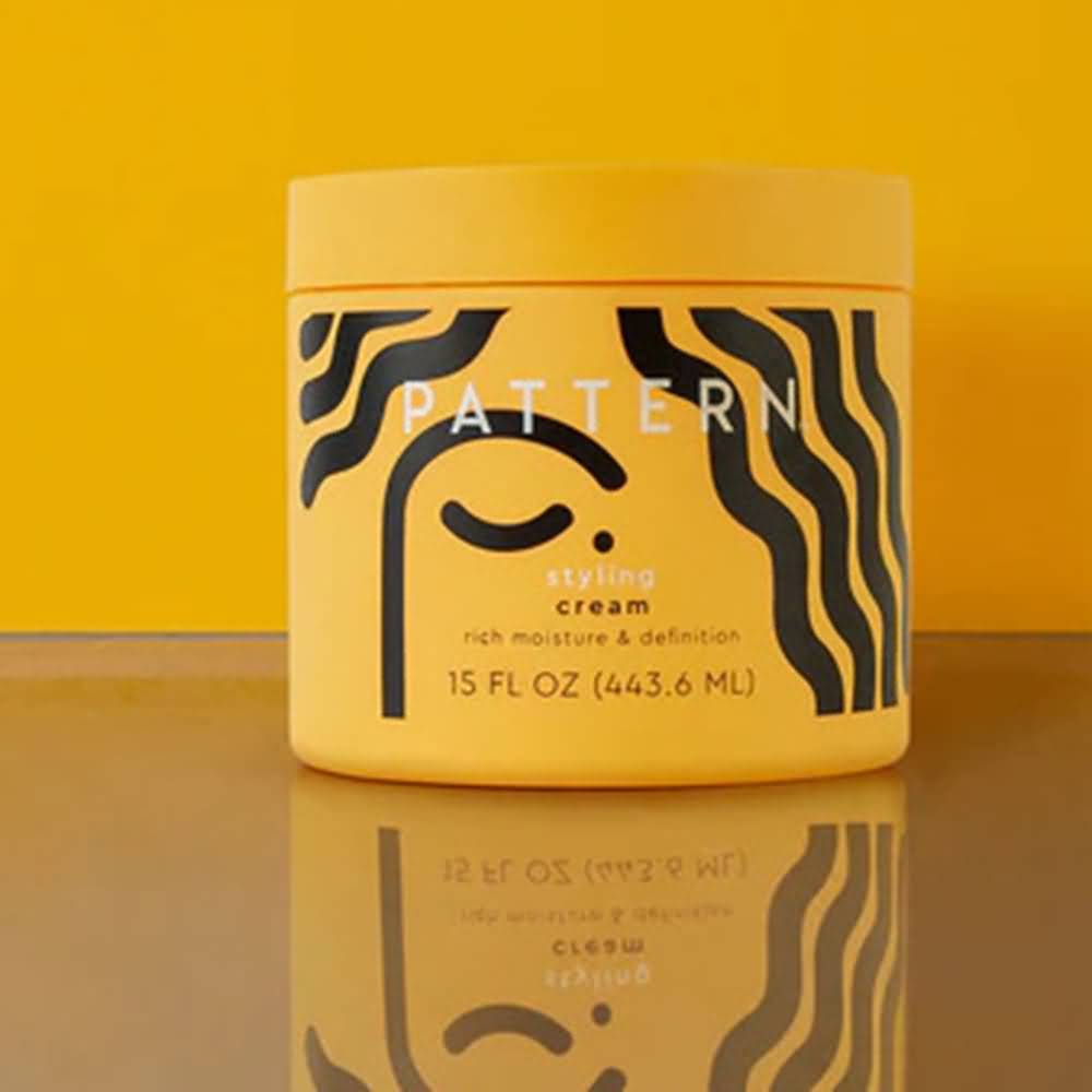

Pattern uniquely caters to textured hair, which is evident by its logo and graphic. The black and yellow color palette keeps it minimal and has a single pop of color. The simple abstract graphic underneath linear, bold typography and a package in full color make for a bold, eye-catching package.
Rael Beauty
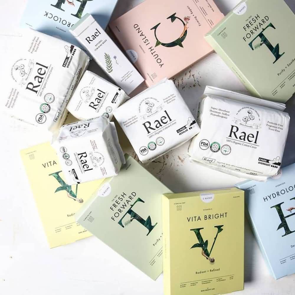

Rael Beauty’s pastel color palette to distinguish the different types of masks they have keeps it easy to tell them apart and easy on the eyes. The single-letter serif font logo wrapped in leaves is earthy yet professional. Single packages keep each mask fresh and make it easy for consumers to take them on travels.
Find the Right Beauty Products Packaging Provider to Bring Your Design to Life
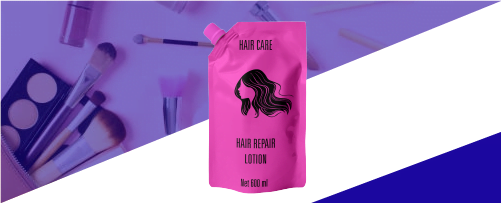

Finding the perfect combination packaging that looks how you want it to look but also functions well and is on-trend can be a challenge. CarePac offers custom, flexible, full-print packaging in a range of styles, sizes, and shapes. Sheet masks and peel-off face masks are in-demand, so you need packaging that stands out. Resealable packaging, single-use packaging, and easy-to-open packaging are all options depending on the type of product.
Skincare product packaging needs to follow an aesthetic that allows it to stay competitive in today’s market, no matter what your target demographic is. Affordable packaging that keeps your product fresh saves you money and is easy to customize for what you’re trying to sell is easy to get with CarePac.
Contact us today for a quick quote or samples!
Tags

