No products in the cart.
15 Awesome Coffee Bag Design
& Packaging Ideas
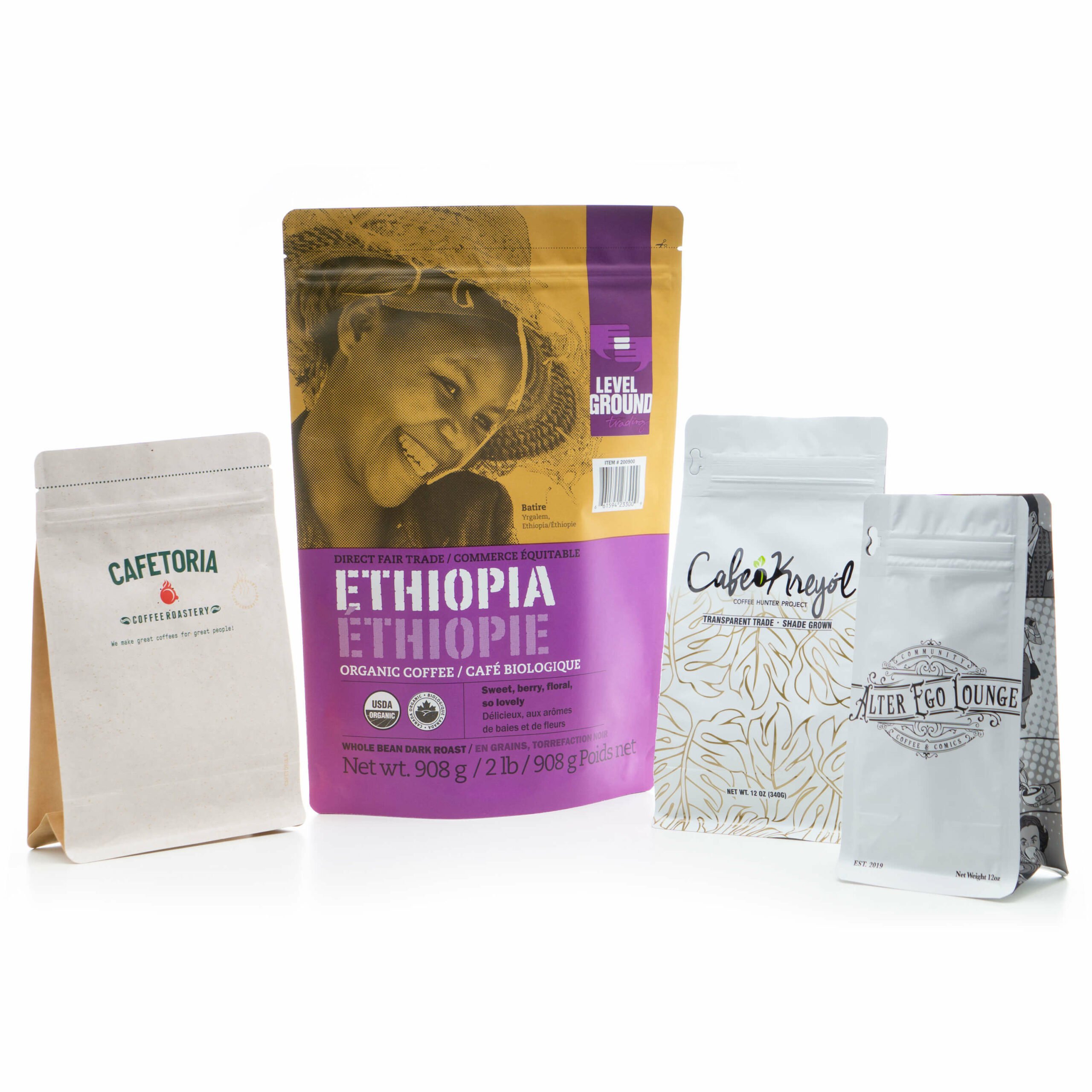

Some of the Best Coffee Packaging Designs
On the shelf or on a pop-up webshop, coffee is a massive commodity sold by the large, established brands, and the up-and-comers who’ve gained trust and traction from their consumers. The aesthetic, the visual identity, and the graphic design is the workhorse that guides every effective coffee brand. If you’re looking to push your coffee brand out there, the first step may be in looking at these shelves and seeing which draws your eye, and why.
Here are a few great brands to study, and contemplate why their coffee packaging stands out among the rest. The reason they are good, or are effective, can be answered by looking at what they focused on in their designs. And it’s also important to see, from a graphic design perspective, why these brands have either found a niche or climbed their way to the top of a particular demographic.
Packaging only requires a few pieces of information to be effective as long as customers can see that this is coffee, your company makes it, and lesser information like a slogan, tag-line, roast location, or facts on sourcing and nutrition. But to make those details stand out on the shelf or anywhere on the internet, you need a way of organizing the visuals, or a good design/dieline, to guide them. Think of your packaging design like a blank canvas, and your palette generally consists of: A logo (or logomark), typography (or wordmarks), illustrations, patterns, and colors. It’s up to you how much you want to turn the dial on each of these categories, but many great brands have achieved success through their own interpretations.
“Design is the silent ambassador of your brand.”-Paul Rand
1. Intelligentsia
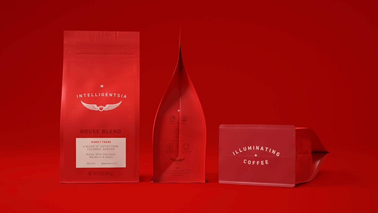

Intelligentsia Coffee is a far - reaching brand united under their solid logo design and confident red packaging. In this strategy, their wingtip logo is central to the packaging design, backed by a deliberate choice in bold color. The typographic elements are low contrast, simple, and easily read on a closer look, as if the bag wants to catch your eye with the royal red and immediately give you the necessary information. Intelligentsia sources from multiple farms, sporting a “democratic” approach to artisanal coffee. Using square bottom configuration makes the bag stand out emphasize details more. When you’re looking for coffee blends and you see these wings, you know it’s Intelligentsia.
2. Fuel America
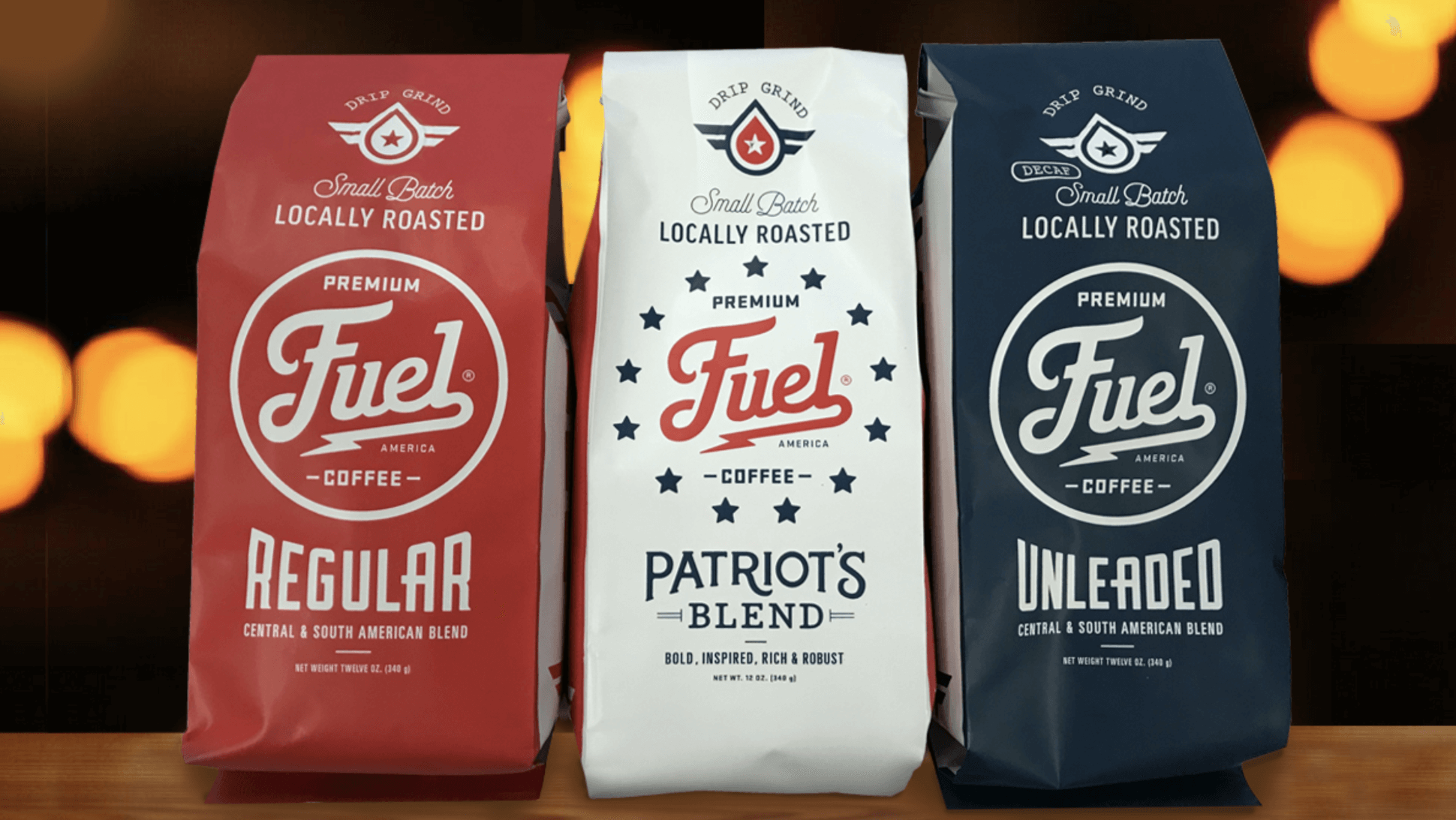

To contrast the driving force of a logo, Fuel America’s wordmark-centric identity borrows from the vintage American automobile and “trucker” aesthetic to deliver playful but legible typography. Their wordmark is front and center, decorated with circular layouts and modified lettering that calls attention to itself. This side gusseted style uses the information to decorate the bag, without losing the ability to read it quickly. You’ll notice that while Fuel America does have its own logomark at the top of the bag, the wordmark itself is what catches the eye first and foremost.
3. Ozo Coffee
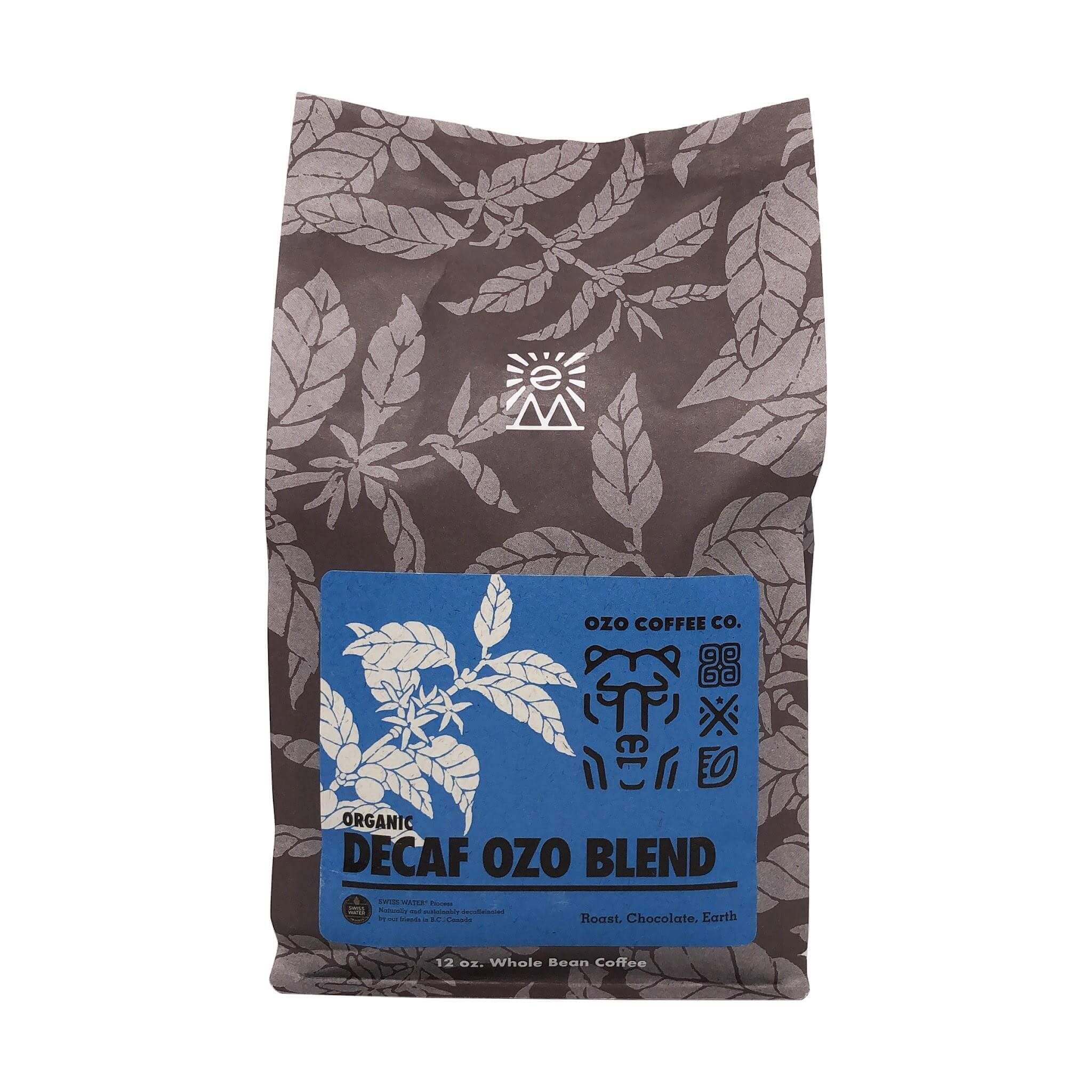

Ozo Coffee has made the rounds online for their “glyph system,” which they’ve transitioned into a smaller role for their new bag designs. This brand is a great example of pattern designs, with the earth-toned grainy florals covering their entire square bottom bag. On the label, their “glyphs” are still used to signify the specifics of their coffee sourcing: region, origin, processing, taste, and elevation.
These are a series of icons and symbols with a “key” to decode each shape, developed so that the dedicated buyer is rewarded for reading into the design. It’s not necessarily a game like the back of a cereal box because it actually provides the patient eye with more information on the brand. That’s an accomplishment on its own, but their use of these glyphs and florals to texturize and add intrigue to the overall look is what marks them as a great example of pattern usage.
4. Koffee Kult
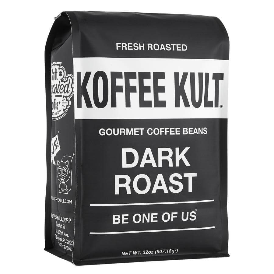

Koffee Kult grabs attention by running the opposite direction from other bags on the shelf: simple black-and-white with strong modern typography. The letters are doing the work in this presentation without being shaped or warped for decoration. Typography is an entire industry built around making letters legible, playful, professional, or nearly any aesthetic a business might need. For this square bottom bag, the use of the tried and true, simple yet effective modern typeface accomplishes so much on its own. Koffee Kult complements this with small playful drawings on the side folds.
Monochromatic designs represent a deliberate choice not to use color. This trend is used to great effect by many brands, where the choice of what color to pick can be avoided altogether and still be as visually competent as a bag in royal red, for example. When color is removed, a strong focus can be applied to the package design.
5. Death Inc. Coffee
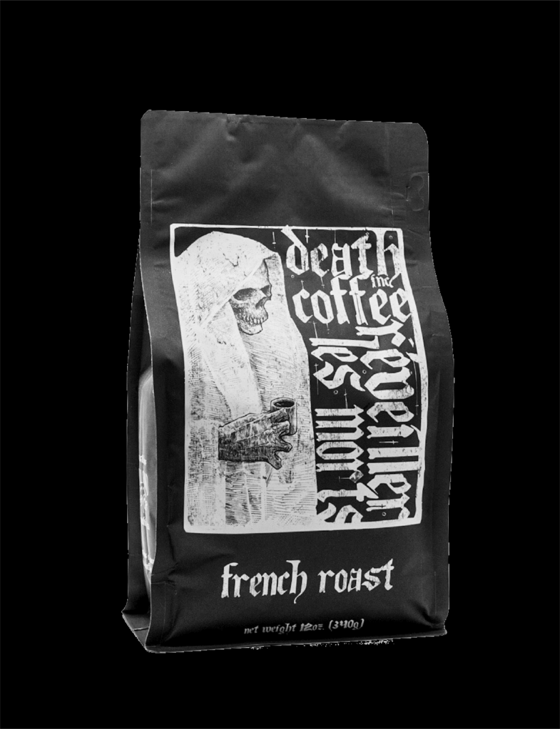

The death metal aesthetic of skulls and blackletter calligraphy are well-executed by Death Inc. Coffee, with another set of monochromatic bag designs that rely on their illustrations to catch the buyer’s eye. Multiple illustrations across their selection give each roast its own curated appeal, and the sharp ink-work of the grim reapers dominates the focus of the box bottom bag. Strong illustration work will present a great use of the “negative space”: how the blacks and the whites are distributed in an aesthetically pleasing way.
Death Inc. Coffee maintains an edge of visual interest with its monochromatic choice, rather than a contemporary focus. The typography here is scratchy, brutal, and more decorative than the extremely functional sans-serif fonts out there. The calligraphic letters are used primarily for style, but hearken back to the beginnings of typography when the digital touch didn’t exist.
6. Catfight Coffee

The death metal aesthetic of skulls and blackletter calligraphy are well-executed by Death Inc. Coffee, with another set of monochromatic side gusset bag designs that rely on their illustrations to catch the buyer’s eye. Multiple illustrations across their selection give each roast its own curated appeal, and the sharp ink-work of the grim reapers dominates the focus of the bag. Strong illustration work will present a great use of the “negative space”: how the blacks and the whites are distributed in an aesthetically pleasing way.
Death Inc. Coffee maintains an edge of visual interest with its monochromatic choice, rather than a contemporary focus. The typography here is scratchy, brutal, and more decorative than the extremely functional sans-serif fonts out there. The calligraphic letters are used primarily for style, but hearken back to the beginnings of typography when the digital touch didn’t exist.
7. Oddly Correct
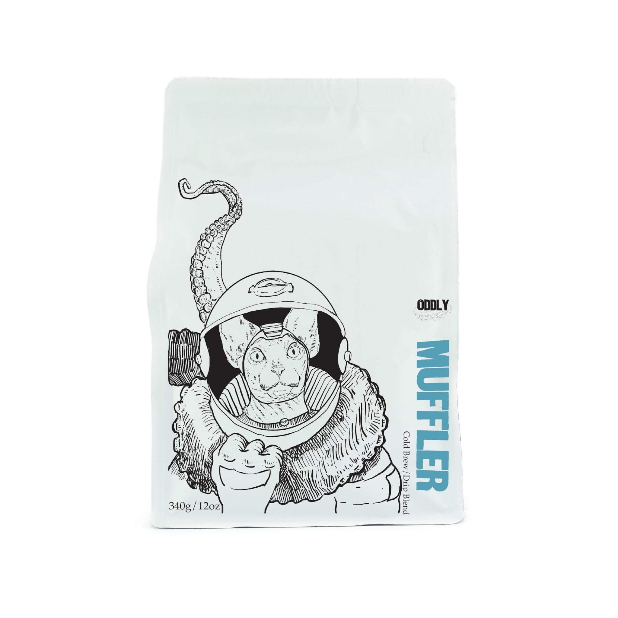

There’s a simplicity in black, white, or even paper brown bags when they’re chosen over bold matte or gloss colors; a reliable trend that is unlikely to disappear soon. Oddly Correct Coffee places itself on the shelves as a “low-brow/high-quality” brand. Their white square bottom bags are penned with eccentric and thin-lined ink illustrations of space cats, antlered bears, and turtles who all love coffee as much as you do.
Well-selected illustration is a strong compliment and proven guide for any brand on this list. The past three bags have proven the uses of art for the sake of branding, with each their own unique take on the medium, as well as strong use of the monochromatic. Illustrations tell a story where patterns may serve as pure decoration or texture.
8. Maiden Coffee Roasters
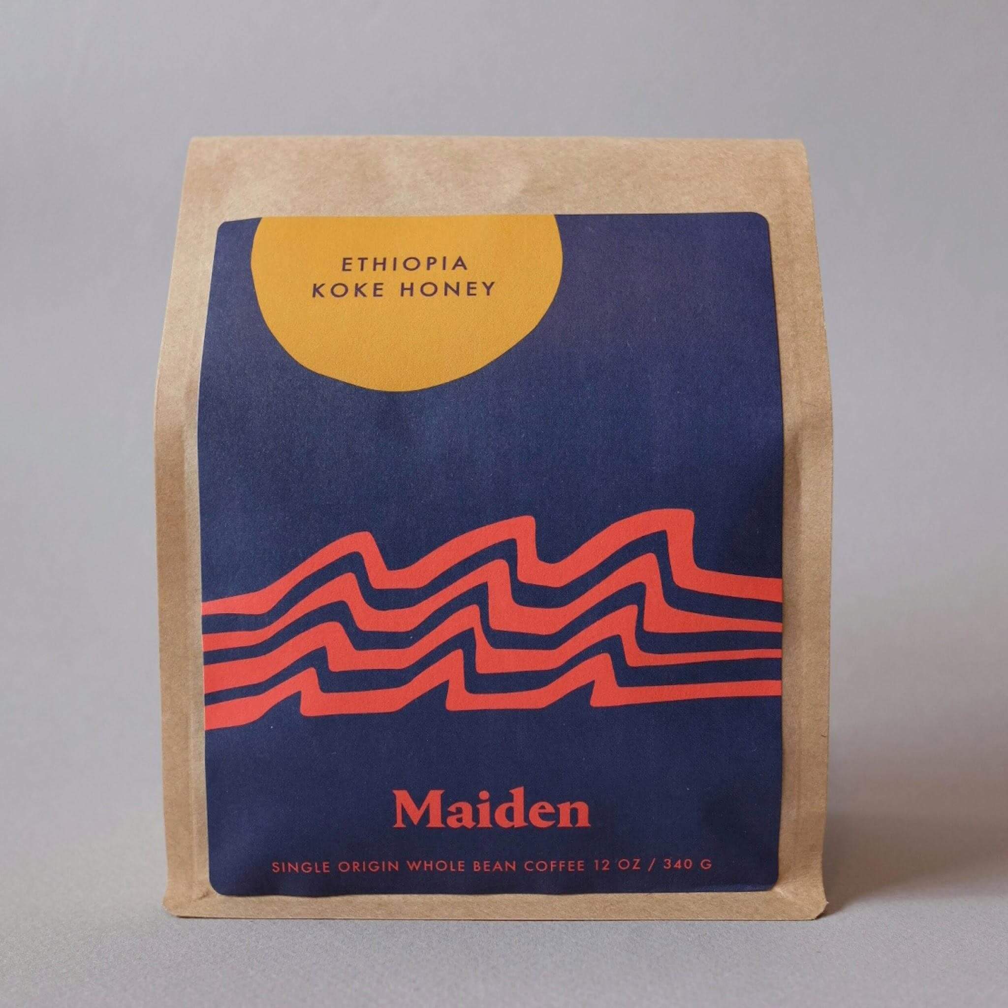

Each of the previous bag designs represented a different use of logo, type, pattern, or illustration to stake their claim on the shelves, along with deliberate use of color (or black and white). While there is no right answer and each brand’s visual layout has spoken well for itself, sometimes the nuance of design elements is what achieves results.
Maiden Coffee Roasters, for example, has a strong wordmark that can stand on its own. But their main bag designs consist of smooth, geometric nature shapes that sweep across and seem to pass through the print area. They play with slightly subdued primary reds, yellows, and blues; and Maiden elects to strengthen all this real estate by placing only the roast location, in small capitals, wherever the composition allows them to fit.
Maiden’s new line of square bottom bags utilizes the wordmark first and foremost in gold, with these subtle colors backing them for a cleaner look that still rests in the realm of “Well thought-out, but not pretentious.” They confidently stride out into olive greens, ambers yellows, and oceanic teal while feeling united to their original brand identity.
9. Devocion Coffee
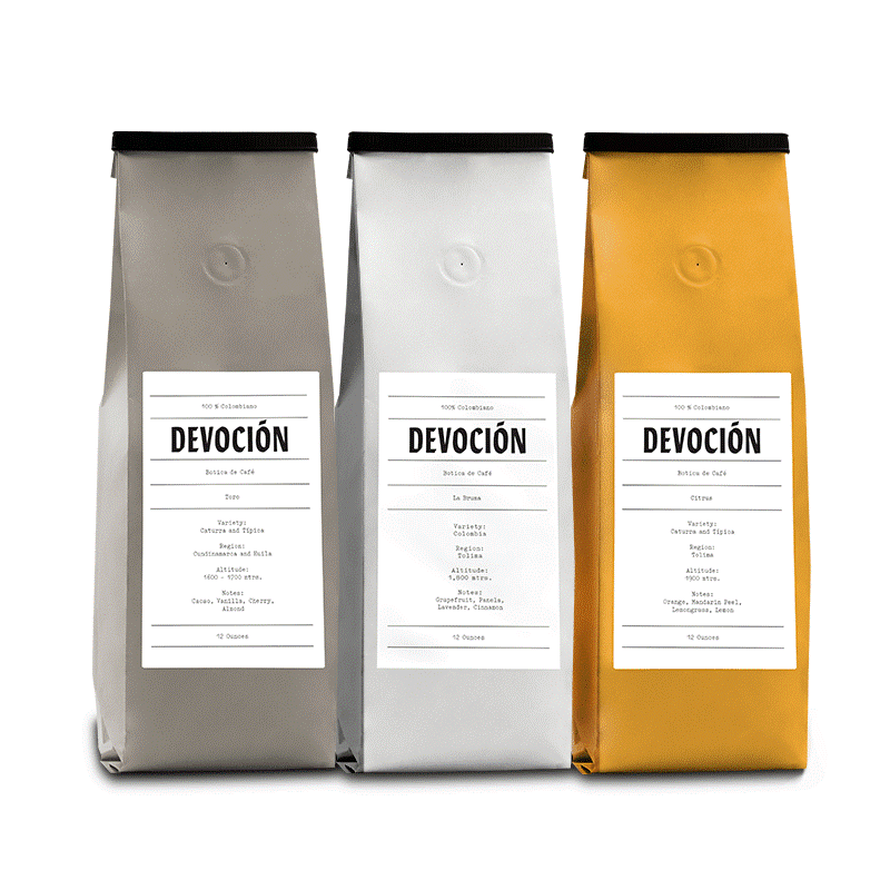

Somewhere between the timeline of typographic standards lies Devocion’s wordmark: A typeface that might represent the legibility, efficiency, and contemporary nature of Helvetica, but with echoes of hand-drawn Gothic calligraphy from centuries past. All this to say: Devocion’s bags are very simple in design. Everything you need to know is punched on to the bag in small letters, on a traditional elongated bag colored in earth tone or their trademark yellow.
This simplicity is used to great effect. These side gusseted bags aren’t trying to lure your eye with illustration or pattern; they’re just speaking for themselves. Designs like these emphasize a “come and see” attitude, where the package design isn’t represented as the selling point per se. If your brand’s wordmark can speak volumes, and your coffee bag provides all the information necessary without drawing attention to itself, then the roaster is drawing interest to what they actually do. The focus is on the bean, even though the bag is well-designed.
10. SEY Coffee
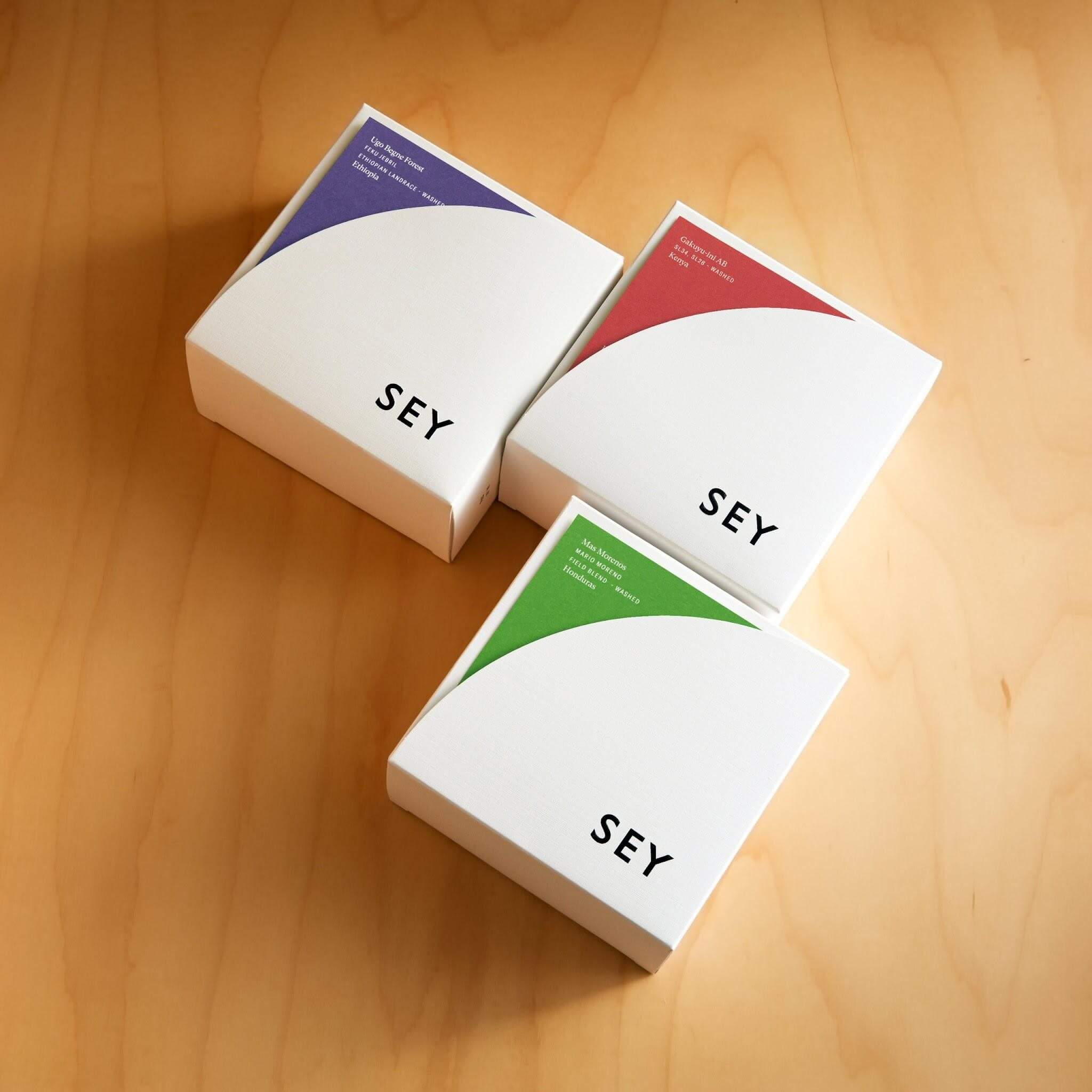

Another Brooklyn-based roaster, SEY Coffee presents itself to the artisanal coffee drinker with sustainable practice at the forefront of their philosophy. Up until now, the aesthetics have been the driving force in this article, for good reason. Done well, they are visual cues to a brand’s ethos. SEY Coffee’s focus on sustainability is perhaps one of the most important factors in proving that coffee brands do have a mission statement besides sales.
SEY Coffee presents its roasts in square white boxes denoted with mellow, sweet colors. The three-letter wordmark sits opposite the roast information. You will always know where the beans are sourced from immediately from the package. And, judging on the simplicity in delivering this information, there’s not much more SEY Coffee wants to sell you on, which makes for an excellent package design.
11. Dark Matter Coffee
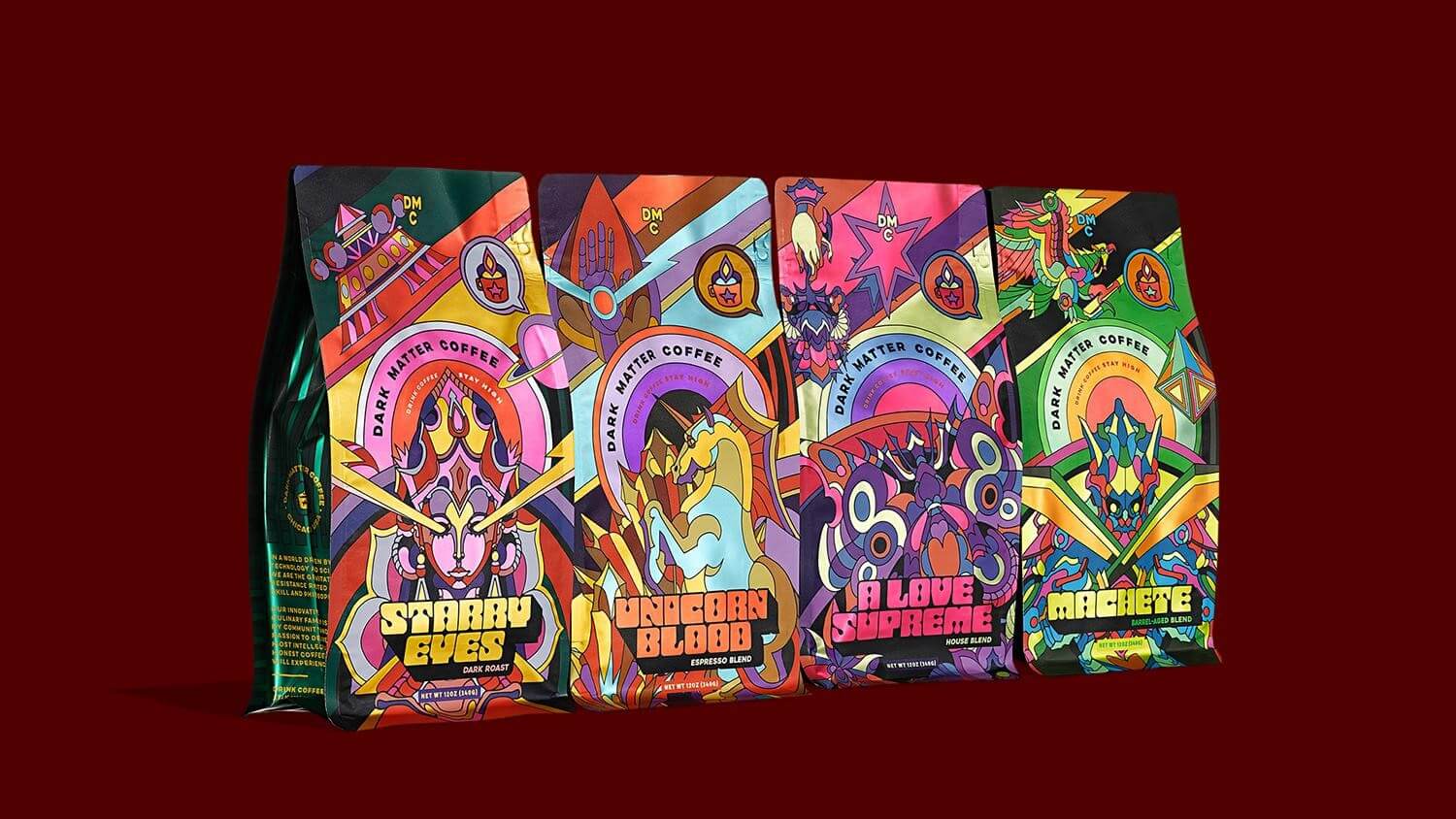

Coming in with a shotgun blast of psychedelic color, Dark Matter Coffee attempts to astral-project its beans off the shelves with non-primary magentas, pinks, cyans, and greens. The wild color-play of these illustrated bags creates an undeniable allure. The groovy, abnormal titling follows suit and travels back to the 70s and 80s while naming each roast. The illustrations themselves depict mystical beings and creatures of cosmic fantasy, and combined coatings of gloss and matte truly push the limit of a visual hierarchy in this category.
In all of this organized chaos, you can still make out the brand, the roast, and all of the necessary information. The visual interest of the square bottom bag itself is so strong that it could make a buyer enthusiastic before even trying the blend. If the shelf is a competition of visuals, Dark Matter Coffee races to the top of bags that “pop,” gravitating the consumer’s eyes by sheer force of will and hue.
12. Abracadabra Coffee Co.
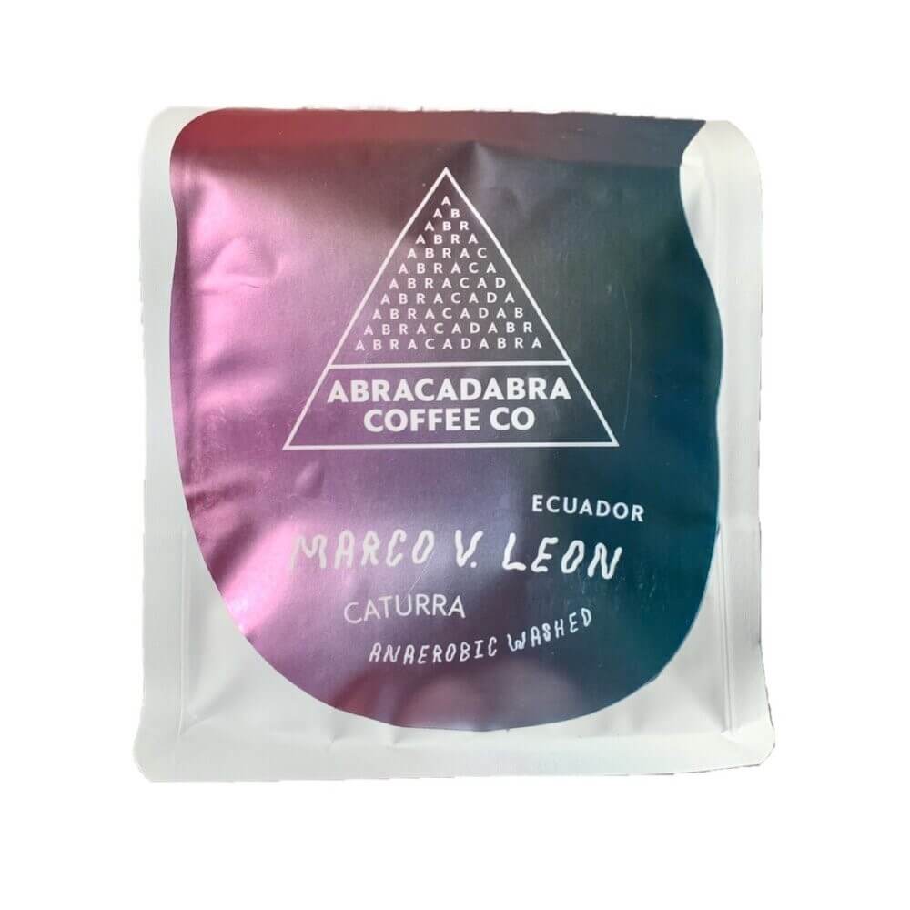

Abracadabra Coffee Co takes a similar approach to color, but captures the aurora in a hazy pearlescent coated label on plain black-and-white designs. The Vermont roaster creates a unique logo out of letters (where definitions of wordmark and logomark become blurred), and uses this as the texture to stand out. They're colorful but contained
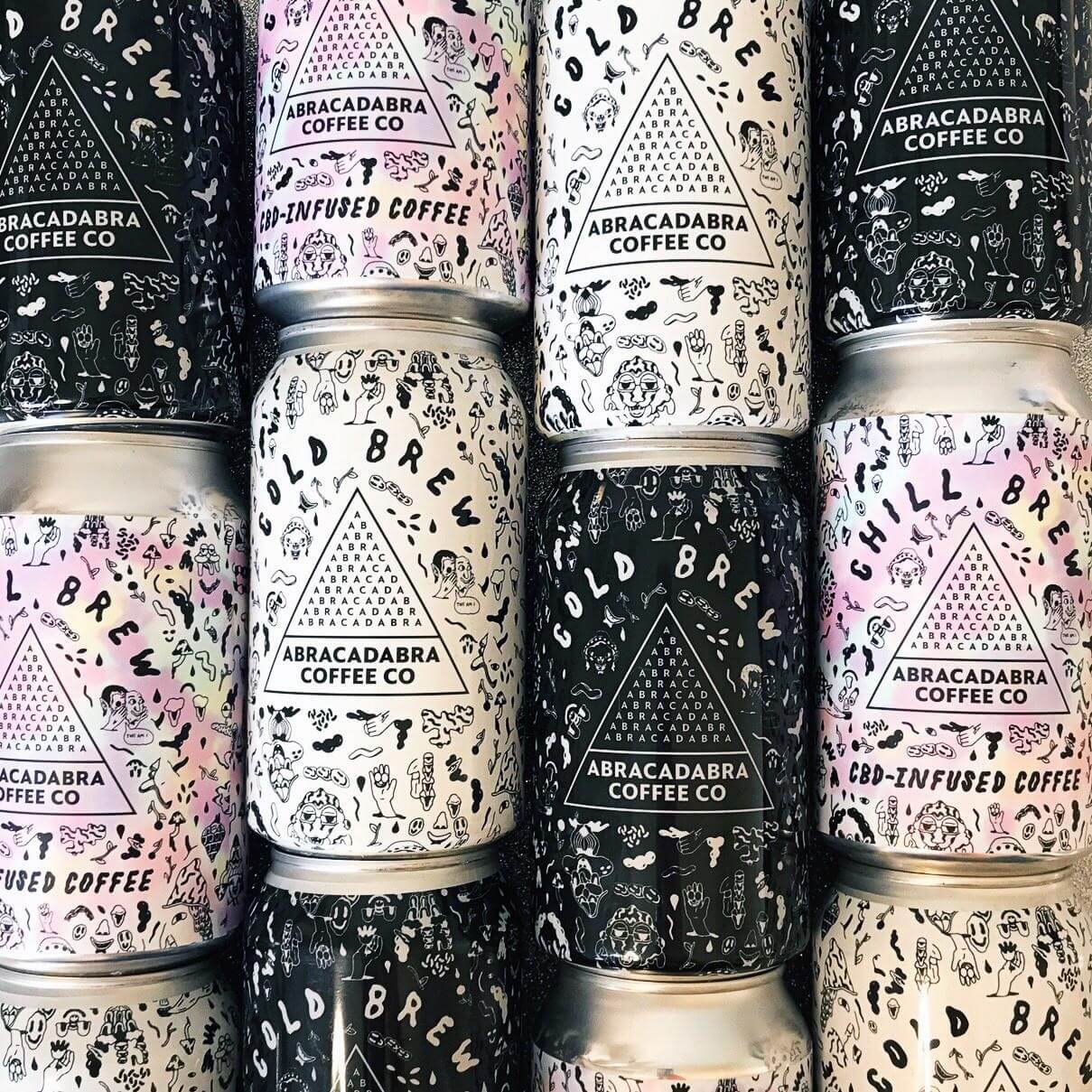

Their cold brew cans surround the logo with an overflow of sketched imagery: hands, noses, faces, and other symbols texturize the white or the black coating. This layout creates a layered complexity that doesn’t bog you down. In Abracadabra’s case, all this information still feels straightforward, not fueled by its decoration, but instead using that intrigue to generate interest in their coffee practice and ethos.
Where brands like Koffee Kult or SEY take the road of minimal space, these two brands exemplify the opposite. All of these brands are highly effective and well-designed, but their different use of design rules slowly reveal how vast your palette of design is, how much choice you have, and where you can narrow your focus and find your own voice. Again, there is seemingly no wrong answer as long as intent and smart design guide the way.
13. Necessary Coffee
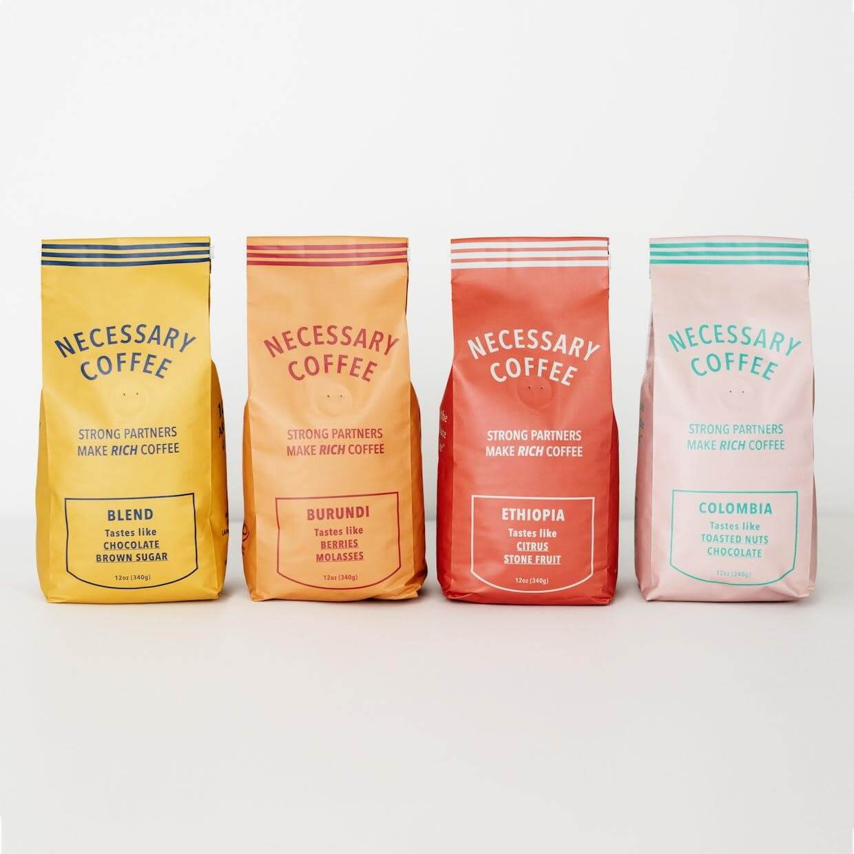

Many of the top coffee brands in the world have traveled long and far on the basis of safe design. Folgers, for example, has kept its design plain, homey, and rooted in the 19th Century American consumer approach before decoration became a common advertising technique. Nowadays, graphic design innovates by looking at the past, the future, and everything in between.
In the case of Necessary Coffee, their bags hearken back into the honest and frontier-like beginnings of product design. The simple type and linework presents its product plainly, but with the austere and humble side gusseted style that befriends basement shelves and camping tents. They succeed on a vintage minimalism and a two-color setup of their bag designs.
14. Onyx Coffee Lab
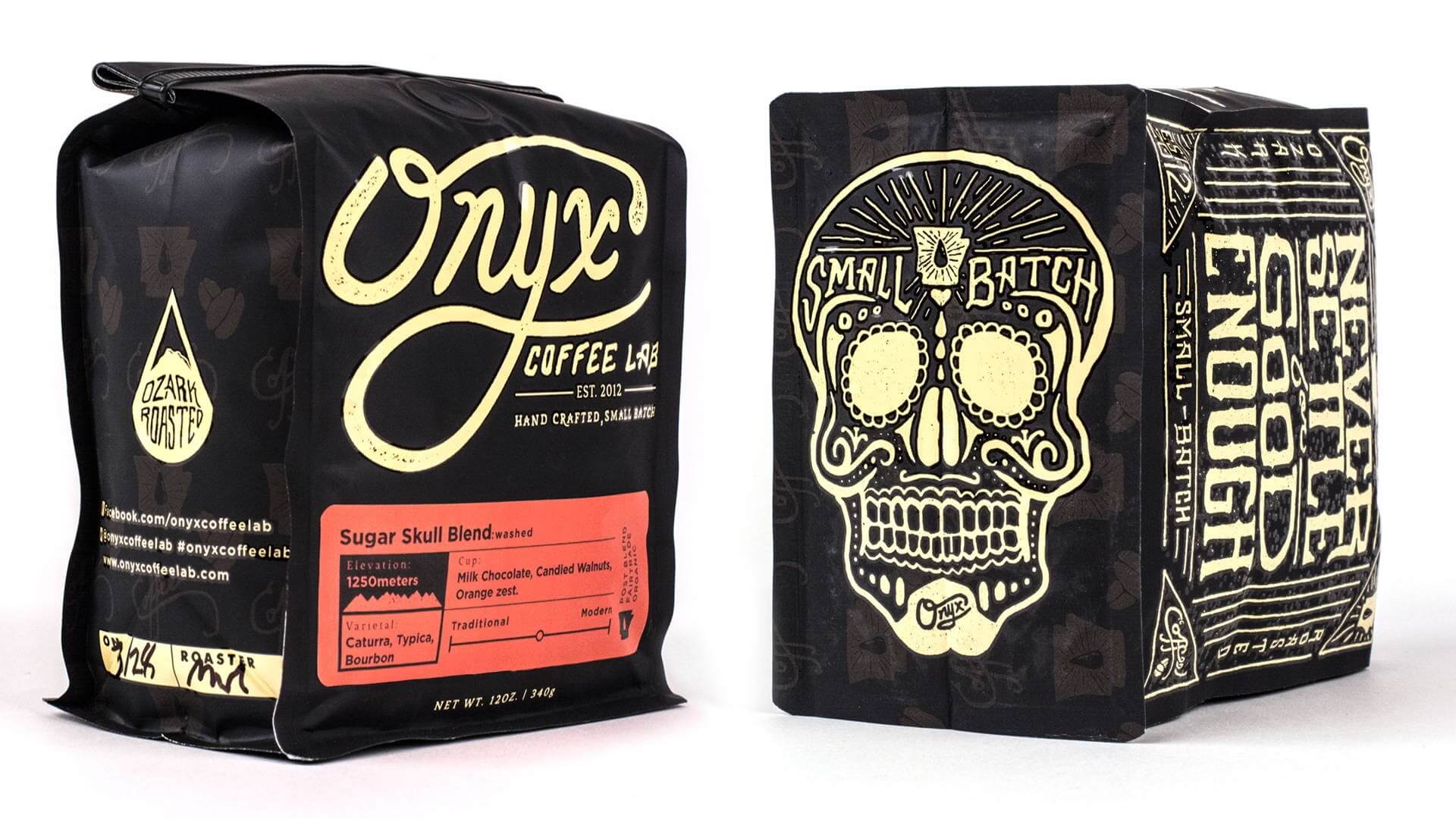

Onyx Coffee Lab may be the best all-rounder on this list in terms of maintaining visual interest and inviting the consumer to learn more. Onyx combines the black side gusseted bag, playful lettering, vibrant color accents, illustration, and pattern-work on a legible bag design. On paper, all these elements should lead to something rather “ornate,” but Onyx has taken a good swathe of trends and distilled it into its own visual identity. Onyx smooths the “edge” and hones tattoo parlour visuals just enough to appeal to a wider audience.
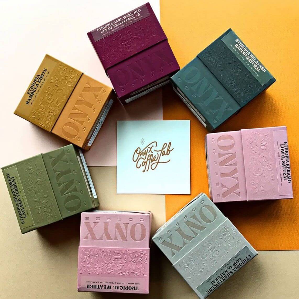

Their recent coffee box offerings sport a much more luxurious appeal as one-half embossed floral patterns and one-half gorgeous imprinted wordmark. Both of these looks, tattooed and embossed, are achievable through Onyx’s commitment to balanced design. Much could be said on the efficacy, but largely it all boils down to the fact that Onyx Coffee Labs sends a clear message, and can jump between the aesthetics because of the solid foundation of graphic design work they’ve given to their brand.
15. PT’s Coffee
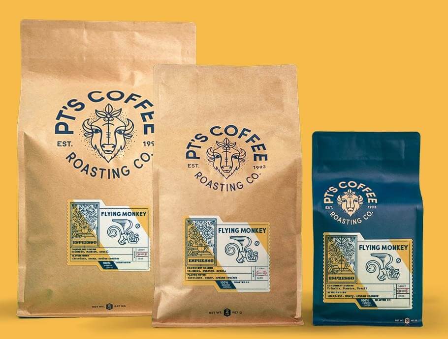

There have been enough examples of black-and-white bags and ultra-colorful bags. Like Intelligentsia’s design has proven, sometimes one color is all you need. Here, PT’s Coffee chooses a denim blue to lead their wordmark/logomark combination in a circular layout. The superb monoline illustrations add depth and decor to the label. Every element of PT’s Coffee has been treated with thoughtful design so that the whole system is undeniable. And while this circular type and logo is popular, PT’s Coffee is comfortable and honest with their presentation. Trend or not, this is their voice.
These are a series of illustrations designed to characterize the Kansas roaster’s Midwestern agrarian roots, while also tagging important roast details. The work done on the label and the logo are worthy of their own analysis, but the color is what draws the eye first. The blue is interchangeable to the complementary light brown, and larger square bottom bags sport a classic exposed brown paper that matches the scheme just as well. All of these components work in a wonderful harmony, led by that denim blue that exists either as a matte coat or as print on bare paper.
All of these champions of great package design are inspirational, sure, but the image is hard work in cooperation with good design and a firm understanding of the packaging process. There are a lot of moving parts involved, but thankfully, the ability to bring your visual identity to life and onto the shelves is getting easier.
Tags

