No products in the cart.
Color Gamut: Maximizing Vibrancy
in Flexible Packaging Design
Introduction to Color Gamuts
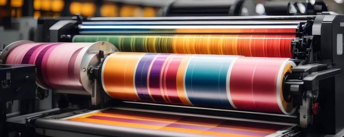
Ever picked up a product, drawn in by its flashy packaging, only to find the actual item a shade or two duller than expected? Frustrating, right? That is the persuasive power of colors (specifically red, green, and blue) in flexible packaging. This visible color spectrum (in addition to accurate printing of the colors and how it can affect image quality) may make or break our views and influence our decisions to buy.
Welcome to the vibrant world of packaging design, where each tone, hue, color temperature, and shade serves as a calculated visual trick to grab your attention in addition to being a visual pleasure. The vivid pop of colors in your favorite candy wrapper, or the lively crimson of a just plucked apple. These eye-catching moments? They're not random—they're carefully crafted using the wonders of color standards and the color gamut.
Now, hold your horses! What is color gamut, you ask? Think of it as a magician's palette, but instead of tricks, it conjures up the exact cmyk or rgb color space, shades, and tones a designer needs to make your packaging pop. The color gamut refers to the secret sauce for delivering graphic design with accurate, vibrant colors that leap off the shelf and into your shopping cart. Without these color standards, the colors you see commonly represented on a product's packaging would be dull and washed out.
Understanding this wider color gamut isn't just insider knowledge for designers. It serves as your pass to enter a world where packing is an experience rather than merely an outer layer. Come along on a vibrant journey as we explore the mysteries of color gamuts and learn how perfecting the color space enhances the appearance, texture, and appeal of the printed image on flexible packaging.
Understanding Color Gamut in Flexible Packaging Design
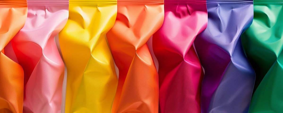
The color gamut is limited, yet it is like a treasure trove of a range of colors, hues, and tones. It's the range of colors at our disposal, similar to selecting the same colors from a box of crayons. But here’s the catch—not all surfaces or materials play nice with every crayon in the box. This is where the larger color gamut comes into play.
When it comes to flexible packaging, think of it as a canvas that comes with its quirks. It's what allows your designer to produce colors and depict colors on paper as they are in your mind. The type of material used, the printing methods, and even the inks—they all have their say in how vibrant the wider range of colors on your favorite snack bag turn out. Essentially, the wider color gamut won't always play nicely with every type of material.
Ever wondered why that fiery red on a plastic pouch doesn’t quite match the same red on paper when viewed with the human eye or on LCD monitors? The visual differences between these color spaces on a computer monitor, an analog television, or on digital cinema is the broader color gamut at play!
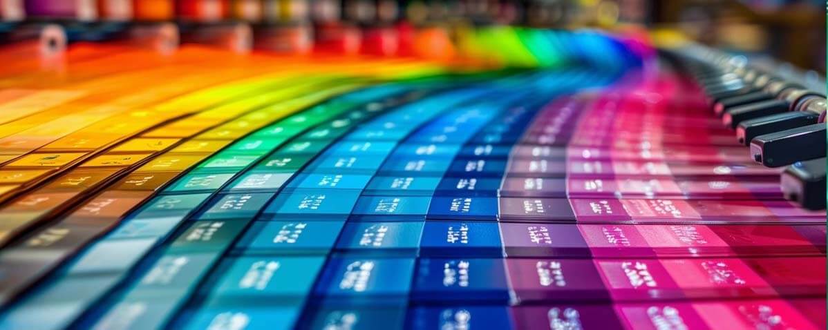
These factors, from the material of the package to how the colors are applied during photo or video editing, dance a complicated tango affecting the reproduction of a wider range of actual colors. Some colors might look bolder on certain materials while the image quality may appear a tad lackluster on most displays. It's like trying to reproduce different color standards on different surfaces—each one gives a slightly different outcome.
But fear not! The color gamut dance gives designers the upper hand with color spaces. They tweak and tune their color selections to match the strengths and limitations of these packaging materials, ensuring what you see is what you get. It's like having a magical recipe that cooks up the exact colors they intend, making that bag of chips or that shampoo bottle pop off the shelf with just the right shades.
Importance of Accurate Color Reproduction in Flexible Packaging
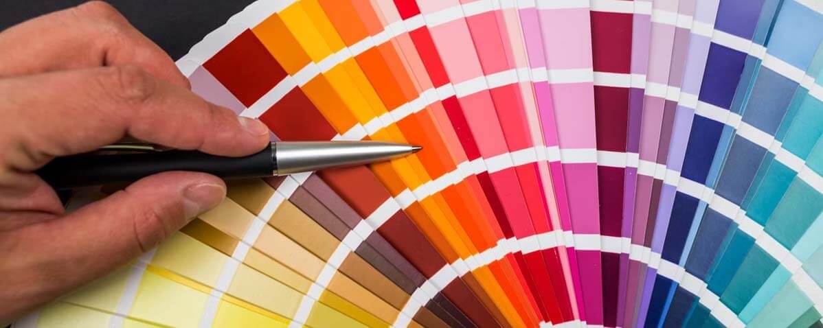
Ever picked out a product from a lineup because you recognized its packaging primary colors from a mile away? That's the magic of using a consistent range of colors —your brain's way of saying, "Hey, that's my favorite brand!" But what happens when this range of colors play a game of hide-and-seek due to the limitations of such a wide gamut?
Imagine this: your go-to cereal box suddenly appears a shade lighter than usual. Or worse, the vibrant blue or CMYK inks on your favorite snack bag seems more like a faded memory. It's not just a visible spectrum color change—it's a hit to brand identity! Consistent colors hitting the human eye are the superhero capes of branding, instantly signaling familiarity and trust.
When color gamuts throws a curveball, it's not just about a change in hue; it's a hit to the brand's harmonious symphony. The RGB color space and hues that consumers have grown to identify with dependability and image quality may not be as accurate as they recall, leading them to second-guess their selections. It's similar like meeting a buddy disguised; you may ultimately identify them, but it will take some time and isn't exactly the same.

Consider the success stories: iconic brands that have nailed the color coverage game. Think about the saturated colors of Coca-Cola red or the Tiffany blue. These brands have mastered the art of consistent color reproduction, becoming instantly recognizable just by their hues. On the flip side, imagine a product whose packaging fails to keep up with its color promise—confusing, right? That's the gamble when the color gamut limitations muddy the waters of recognition. If you want more accurate printing, pay special attention to your display's color gamut, particularly in ultra high definition resolutions.
So, hold tight to that familiar feeling, because in the world of flexible packaging, accurate color reproduction isn't just about making things look pretty. It's the glue that holds brand recognition together, ensuring you reach for that familiar package on the shelf without a second thought.
Importance of Accurate Color Reproduction in Flexible Packaging
Printing technologies take center stage here.
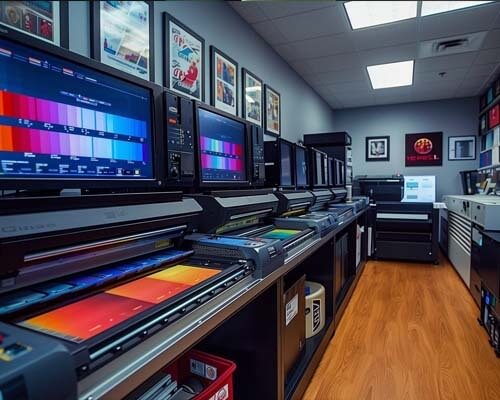
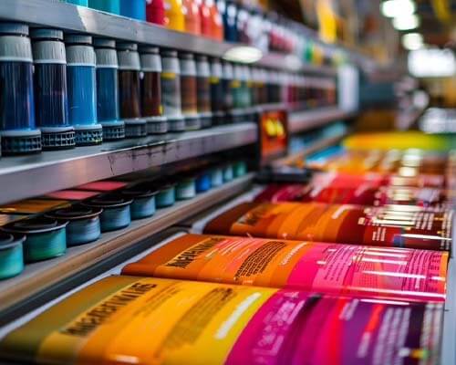
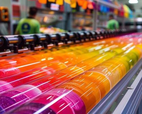
Rotogravure, the go-to rockstar of printing on flexible packaging, making the wide gamut of colors sing on materials like plastic and films. Then there's digital printing, the newer kid on the block, showing off its prowess in reproducing intricate designs with vibrant colors. These technologies aren't just different ways to print—they're the conductors orchestrating the wider color gamut you see. They're what take photography technology and color gamut standards to the next level!

But wait, there’s more to this colorful ensemble! The substrate materials
The very canvas for these colors to dance upon—play a crucial role. Some materials, like paper or certain plastics, embrace colors with open arms, while others might be a bit more reluctant, causing those colors to shy away a bit.
Enter the color management heroes!
These systems and tools are like wizards wielding their magical wands to ensure that the wider color gamut you see is what the designer intended. They tweak and fine-tune the color model to fit the capabilities of the printing devices (and technology like LCD monitors, OLED technology, and the internal camera on a laptop) the materials, ensuring a harmonious visual feast for your eyes.
Yet, despite all these enchantments, challenges abound. Imagine attempting to create a masterpiece with a little supply of brushes and a canvas that doesn't exactly take paint well. That's the struggle designers face with the color gamut—juggling the desire for specific colors within the boundaries set by printing devices, LCD monitors, digital video capture, or an iPhone x's internal camera.

Strategies to Maximize Color
Gamuts for Effective Packaging Design
First up: color profiling.
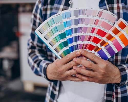
Color profiling in the context of a color gamut is like tailoring a suit to fit just right. It's similar to customizing a garment to fit perfectly. To ensure that colors are as brilliant as possible when they reach the package, especially if you're designing using most computer monitors, designers precisely adjust colors for the printing process and the materials utilized. Then comes color separation—it's like breaking down colors into their individual components to ensure each one stands out, playing its part in creating a vivid visual symphony.
But hold your horses! We're not done yet. Ever heard of color space?
Think of them as different playgrounds for colors. Designers have access to a broader range of tints and tones when they select the appropriate location, which allows them to broaden their palette. It's similar to having more crayons in a larger box, allowing designers to better reproduce color, from light magenta to the white point on a package.
Now, here's the big secret: collaboration is key!
Designers, printers, and manufacturers need to join forces like superheroes in a league. When they work hand in hand, sharing insights and expertise, that's when the magic happens. It's not just about one person wielding the color wand or adhering to the SRGB standard—it's a team effort to ensure those red, green, and blue colors dazzle from the shelf to your hands.
Imagine a world where every color on your favorite snack bag or beverage bottle looks as vivid and enticing as it does in your imagination. That's the promise of these color model strategies—taking the limitations of the color gamut and stretching them like a canvas, letting designers create vibrant, eye-catching packaging that's nothing short of a work of art.
Conclusion
In the world of flexible packaging and image quality, the standard color gamut isn't just a toolbox—it's the magician's wand that transforms ordinary packaging into captivating experiences. Its limitations and possibilities dictate the vibrancy and accuracy of colors that catch our eye. From the dance of printing technologies to the harmony of color management, it's a symphony of technical prowess and artistic finesse. Remember, in the realm of packaging design, understanding and mastering the wider gamut of accurate colors is the gateway to making colors speak volumes!

