No products in the cart.
How to Find the PMS Code/Color
Step-by-Step Tutorial
Everyone knows Tiffany blue means diamonds, and McDonald's yellow means French fries. These brand colors are synonymous with the company's name and what they sell, which is no easy feat. If colors matter to a brand, making sure the colors are accurate when printing marketing and branding materials matters more. But, if you're reading this blog about Pantone color, we don't have to tell you this!
In this blog, we'll walk you through how to easily find your Pantone color in Adobe Illustrator so you can effortlessly perfect and print your color choices for stunning designs on paper, plastic, or other materials. But first, we'll walk you through the background and basics of colors in Adobe Illustrator.
Understanding Pantone Color
PMS is an acronym for "Pantone Matching System". As such, PMS colors are Pantone colors that can be specified for commercial printers. Pantone colors are custom-mixed ink colors that you can request for something like your logo, company name, or other branding asset.
Just like a homeowner might select a Pantone color for their walls or custom couch, you can choose Pantone color group for your marketing materials using Pantone colors in Illustrator.
Why? Well, accurate color representation matters in design almost more than the logo or "about the company" section on a package or pouch. Your customers see Pantone color before they see branding, and by using the Pantone color system to find the appropriate Pantone color number you can be sure you're using the right Pantone color.
Pantone Connect
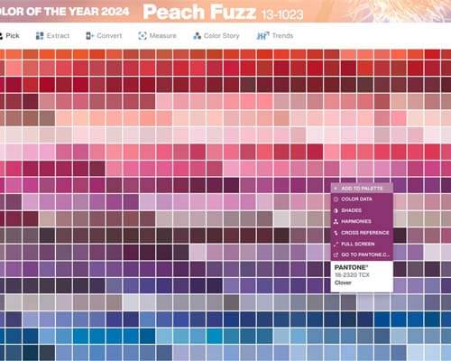
Pantone Connect is a new service from Pantone which combines a website app and an Adobe plugin to work with Pantone colors.
Using Adobe Illustrator's color tools
Within the latest version of Adobe Illustrator, there are a variety of Pantone color tools that designers can use to choose colors and use them to create marketing materials. From swatches panel to the eyedropper tool, it can quickly get confusing! Here are just a few of the color tools you'll find within Adobe Illustrator, not all of which are directly related to Pantone colors:
Eyedropper Tool
By using the eyedropper tool in Adobe Illustrator menu, you can sample colors from anywhere in an image and add them to your swatches panel. This way, you can easily apply the sampled color to another object on the Illustrator canvas.
Color Guide Panel
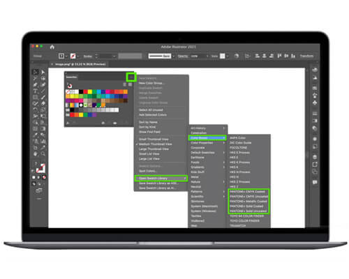
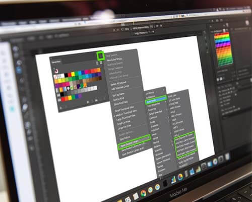
The Color Guide Panel generates a set of color swatches that go well with a base color that you define, also referred to as an "open swatch library". Think of the color guide panel as a color inspiration tool that you can use while you create or recolor artwork.
Color Picker Dialog Box
This is where you fine-tune your choice of colors in Adobe. Here you can create a custom color by entering color values, or by choosing from a library of colors, or a swatch library.
Now that you know more about the different Pantone color tools within the menu of Adobe Illustrator, we'll walk you through how to use the Pantone system color library using Illustrator.
How to find PMS color in Illustrator
If you're using Adobe Illustrator, it's easy to find the PMS color of your logo. Just follow these steps, and you can easily apply the PMS color to other marketing materials. Here's how to find Pantone colors in Adobe programs:
- Open the file and click on your logo using the "Direct Selection" tool in the drop down menu.
- On the right side of the window, click on "Colors Panel".
- After you find Pantone color or hue, it will be displayed on the overhead menu of the window.
You can then use the search bar or pop up menu to recolor artwork or incorporate the Pantone panel of colors into your marketing materials using the recolor artwork tool. Just be sure to use the 'Save File' option so you can pick up your printed project at a different time in the future.
An important note about Pantone colors in Adobe Illustrator
Told you it's easy! One important thing to keep in mind: this tool will not show you the exact color of your logo, rather it'll show you the PMS color that most closely matches the color you're currently using in your logo. You can find the same colors in the preferred color mode your printer uses, whether that's the CMYK system or RGB.
This is a great tool to use in Adobe Illustrator if you're looking for the closest PMS match, or if you're in the process of re-branding and want to switch your logo color to one that's part of the Pantone swatch panel or Pantone palette.

Applying Pantone Colors to Your Design
So, now that you know what your Pantone color is, how should you apply Pantone swatches to your marketing materials? Well, that's purely up to you! Here are a few ideas on how to apply Pantone colors to your artwork:
- Incorporate your Pantone color into your logo image, or use it in lieu of a logo on your artwork or packaging.
- Remember that certain CMYK, RGB, or Pantone colors mean certain things to customers. For example, green is often used for natural or healthy foods, while yellow is typically used for serotonin-inducing products.
- Use colors to draw attention to the most important parts of your packaging.
- Just remember: once you've confirmed your Pantone palette, make sure every member of your design team knows how to access the Pantone colors in Illustrator. This way, they can use the palette on your brand's artwork and printed materials.
Pantone Colors & Adobe Illustrator FAQs:
Here are some common questions we've received from customers about finding and using Pantone colors in Illustrator, whether it's being used on an image, a swatches panel, or in Pantone color books.
Can I use Pantone colors in all types of design projects?
Yes. The goal of using Pantone colors in graphic design is that it ensures consistent colors across all platforms. This way, your audience has the same impression of your brand, regardless of the specific asset, package, or marketing material they're looking at.
Are there differences between PMS colors in print and digital design?
Yes, there are. One important thing to remember as you navigate Pantone colors in Illustrator is that digital printing devices can't reproduce Pantone colors; you'll have to first convert them to CMYK color mode.
How do I ensure accurate Pantone color reproduction across different printing methods?
The best way to ensure accurate PMS color reproduction across different printing methods is to convert them to the appropriate color group. This will be either CMYK or RGB codes. If your printer uses and prefers Pantone (PMS), you won't need to make any conversions. But if they prefer CMYK or RGB, you'll need to take the time to convert them to CMYK or RGB.
CarePac: Your Partners in Packaging Design
At CarePac, we have decades of experience with packaging design and Illustrator. In fact, it's all we do!
Our helpful CareDesign team is well versed in using the Pantone matching system to correlate your brand's colors to the colors in the Pantone palettes, and we're more than happy to help guide you through the matching system process.
Whether you have a graphic design team or it's just you, we can help you create the packaging of your dreams. Connect with us today to discuss your project, or get an Instant Quote using our convenient online platform.


