No products in the cart.
Mastering Triadic Color Schemes in CPG Packaging Design
What is a triadic color scheme?
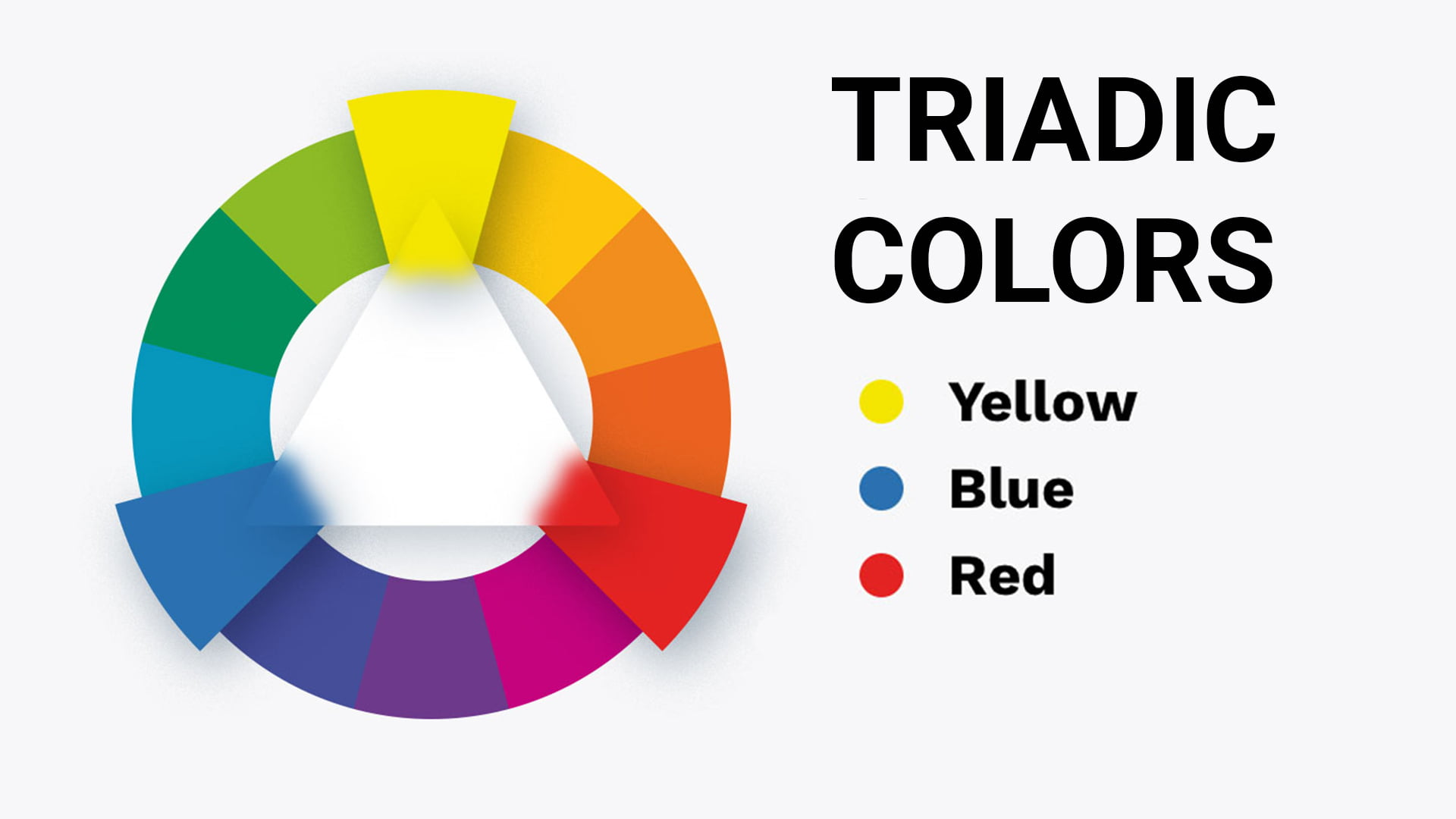
A triadic color scheme consists of three colors that are of equal distance on the color wheel. In color theory, opting for triadic color schemes that use complementary colors is a bold move, as it produces an incredibly rich and vibrant effect. When triadic colors are combined and used together in a color palette, it's sure to result in a perfect color combination, regardless of the packaging you're designing.

The most common triadic color scheme is red, blue, yellow, green, orange, and violet. Red, yellow, and blue are primary colors. If you alter the triadic colors a bit, say by using pink, gold, and navy, you're still technically sticking to triadic color combinations that rely on primary colors. To find triad colors, just look at a color wheel and find colors equally spaced out. Are the colors evenly spaced? If so, the three colors are considered to be triadic color combinations.
Triadic color schemes in design
As mentioned, using triadic color schemes in design is considered to be a bold approach in color psychology. Using triadic colors can help leave a lasting impression and create an emotional response among your customers. Whether you opt for bright colors, subdued shades, or pale or unsaturated versions of the colors, using triadic color combinations in your design projects is a great choice.
In this blog, we'll take a deep dive into these beautiful and unique color combinations and how you can use these color palettes in your marketing and packaging materials.

Triadic color scheme examples on the color wheel
If you're looking at a traditional color wheel, there are a few triadic colors that pop out. Here are some common examples of triadic color schemes:
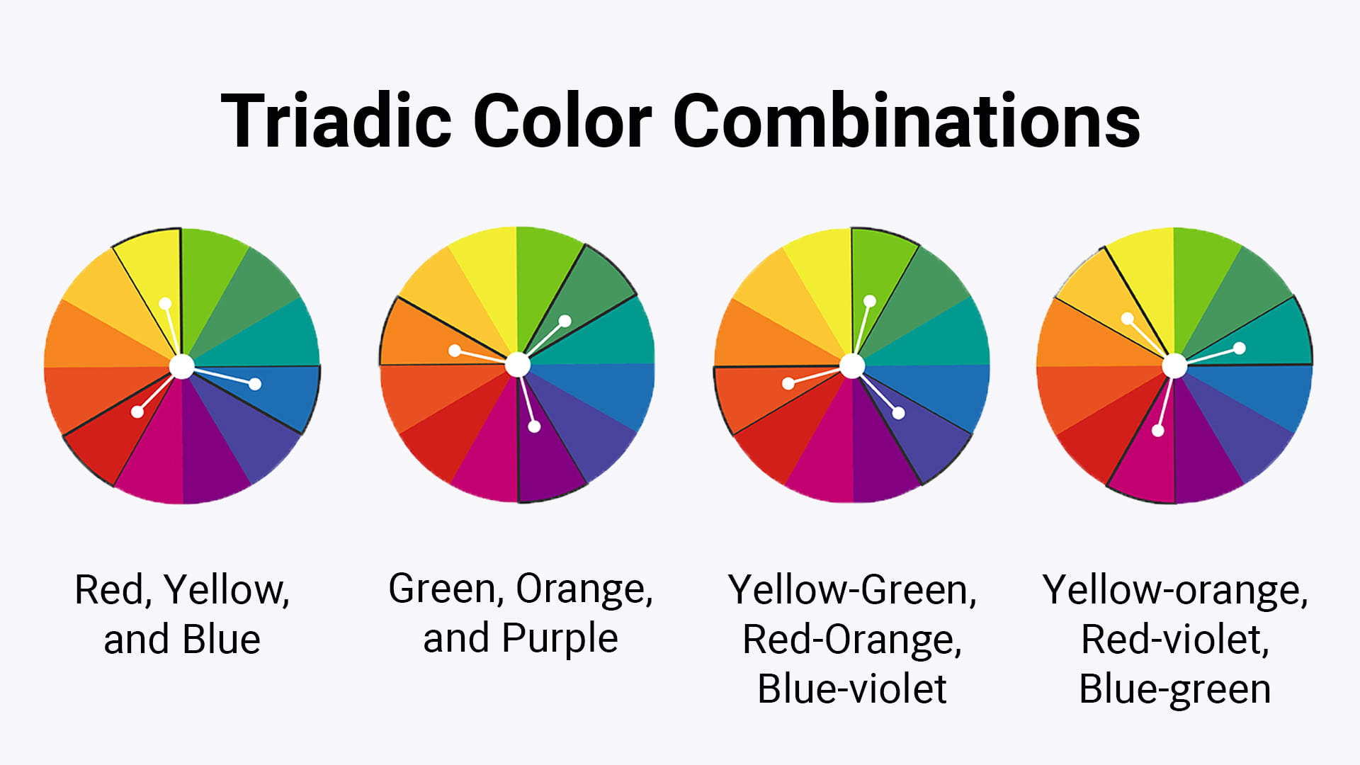
Red, yellow, and blue
Though the red, yellow, and blue triadic color scheme may be thought of as elementary, it's the most common triadic color scheme used on the color wheel. These triad colors evoke feelings of comfort and familiarity and are perfect examples of sticking with something that's tried and true.
Orange, green, purple
Like the red, yellow, and blue triadic color scheme, the orange, green, purple triadic color scheme is also a very common color palette. Whether you opt for pastel variation, lighter shades, or an analogous color scheme, this triadic color scheme is another mainstay to consider.
Combinations, like red orange, yellow green, and blue violet
Triadic color schemes don't need to be "basic" -- you can experiment with color theory, and mix primary colors together. Colors like blue violet, yellow orange, red orange, red violet, and yellow green all work well together in triadic color harmony.
Whether you're choosing subdued shades or a triadic scheme that involves an accent color, don't be afraid to get creative with your color palettes. Though these are common triad colors used in combination with each other, as long as the lead color and the third color (or accent color) are equidistant on the color wheel, you have yourself a color palette that uses complementary colors.
Implementing a triadic color palette in packaging design
Primary colors and secondary colors alike can both be used to create balance and harmony. Use triadic colors to achieve visual balance, and don't forget to use white space and neutral tones accordingly. If you're looking to create contrast within your triadic color schemes, don't forget to pay attention to color hierarchy.
Finally, make sure to use the same triadic color scheme throughout your brand's packaging and marketing materials. Regardless of the triadic combination you choose (i.e., the basic red blue and yellow or a cohesive blend of other tertiary colors), using the same triadic schemes and the same colors across your brand's materials is key.


Design tips for using triadic color schemes
If you're new to using a triadic color combination, here are some tips to keep in mind.
Understand the color wheel
First, make sure you fully understand the color wheel and its three color groups: primary colors, secondary colors, and tertiary colors, and how they work together to create color harmony.
Pick a dominant color
When creating a triadic color scheme, don't forget to pick a primary color (also referred to as a main color.) This will help set the overall tone and create a focal point -- the other two colors in the color scheme should be used as a secondary color and accent colors, respectively. We cannot stress the importance of selecting one dominant color, and making sure the three shades work together.
Color saturation makes a difference
If you're looking for a more cohesive blend, you can lower the saturation of the secondary and tertiary colors in your triadic color schemes. If you're hoping for a more calming and relaxed effect, use pastel variations of the colors you've selected. Regardless of the triadic color schemes you're working with, it's important to remember that saturation can make a big difference.
Pay attention to contrast
To ensure triadic harmony, make sure the complimentary colors also contrast with each other. The triad colors you choose should be equally spaced on the color wheel, otherwise you are not sticking to color theory and choosing colors that are actually triadic colors.
CarePac: Masters of the color wheel
At CarePac, our designers have mastered the color wheel. We understand color theory and triadic colors, and can help you select color schemes that incorporate a dominant color and secondary colors to match. Whether you opt for red orange, red violet, a golden yellow, or yellow orange as your dominant color, we will help you find secondary colors that are evenly spaced on the color wheel. This way, you're adhering to color theory and using three colors that truly complement each other.
Have questions about how to use a color wheel? Looking for help with crafting the perfect color scheme for your brand? We'll help you craft cohesive color palettes and design packaging materials to match. We're experts in triadic colors, color schemes, and color palettes of all types, and are ready to support you throughout the process. From selecting a dominant color to finalizing your color scheme with triadic colors, we're here to help. Contact us today!

