No products in the cart.
10 Creates Uses of Flexible Packaging for Health Supplements and 5 Packaging Trends for your Brand
Getting healthy and starting a new wellness journey is always going to be trending, with consumers perpetually on the lookout for newer, modernized supplements, treatments, pills, powders, and more. Make sure that your product stands out among the crowd with supplement packaging design that sells.
Supplement Packaging Design Trends
The easiest way to do this is by keeping up with industry trends. Learn about five current trends as you create your packaging.
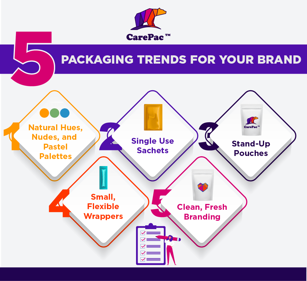

1. Use Natural Hues, Nudes, and Pastel Palettes for Your Health Supplement Packaging
Your color palette is often the first thing your potential clients are going to notice. It's what's going to catch their eye- but is it what's going to sell them on your product and make them open the package? Wellness-oriented products tend to attract customers who are looking to treat their body and mind. They look for things that are "all-natural", "organic", "non-GMO", "plat-based", etc. Having a color palette that is either a natural, earthy shade like creams, beiges, browns, and sage greens, or nudes with various shades of taupe, or muted, pastel variations of bright and bold colors tend to evoke the right energy for selling a health product.
2. Single Use Sachets
Modernization is all about convenience, and convenience helps consumers save time in their day. For a lot of people, this means having single-use pouches for supplements or daily packs for vitamins. They can grab just one sachet and know exactly what they’re getting without having to measure and pour scoops or count out vitamins. When you offer single-use sachets or one-a-day packs of a product, it's seen as a time-saver as well as an easy way to grab what the consumer needs and head out the door! A small sachet of vitamins is easier to grab and put in a purse to take later with breakfast rather than sorting and grabbing a handful of loose vitamins and losing them. Get on the same page as your customers, and make your product packaging simple and convenient.
3. Stand-Up Pouches are Great for Dietary Supplement Packaging
Protein powders, collagen blends, smoothie mixes, supplements, and more are in powder forms that most consumers want to be able to store on the shelves in their cupboards. If you're offering a product that needs to be stored and saved, having it be a sealable stand-up pouch is going to make their life easier. It's also going to help sell your product as opposed to having a bulky box or a saggy bag, both of which are harder to keep stored and prevent spillage. Stand-up pouches not only fit better in a pantry but they also make it easier to count out portions, which can be poured into a measuring cup or scooped out.
4. Small, Flexible Wrappers and Packagings
Small and flexible wrappers as packaging are ideal for supplement design for similar reasons having single-use sachets are. They offer consumers the convenience of transportation. No time to grab an electrolyte drink, but keeping the small, flexible single-use pack (or a few) in a purse, pocket, backpack, or work desk make for a world of convenience. The size and flexibility mean they’re subtle and easier to transport than having to truck along a whole box of the product. The same can be said for certain products, like hand wipes or ED pills, that would only need to be used in certain moments, but one wouldn't want to be caught without them.
5. Clean, Fresh Branding for Supplement Label Design
When it comes to what we put in our bodies, consumers are looking for products that are clean with better-for-you ingredients and protein, so your branding should convey the same message as the ingredients in your product. This includes clean lines, calm colors, mellow fonts, simple yet creative design elements, and avoiding loud, messy, chaotic, or in-your-face designs that may work for other products on Pinterest.
Supplement Design and Supplement Packaging Design We Love
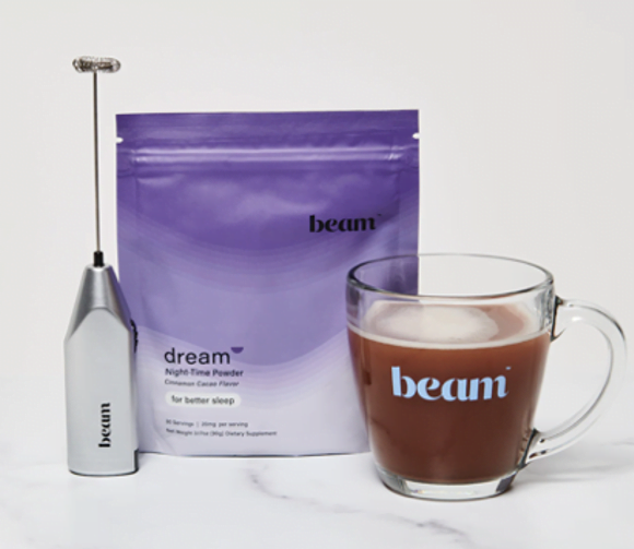

1. beam
As a supplement and protein powder manufacturer, beam has a series of products that are designed to supplement consumers' daily lifestyle, with products like dream, which support sleep, or revive, which supports recovery. The matte packaging is sleek, with stand-up pouches that reseal for convenience. The ombre transition of the package from purple to white is subtle and calming, much like their products. Their logo is simple and all lowercase, which furthers their message effectively.
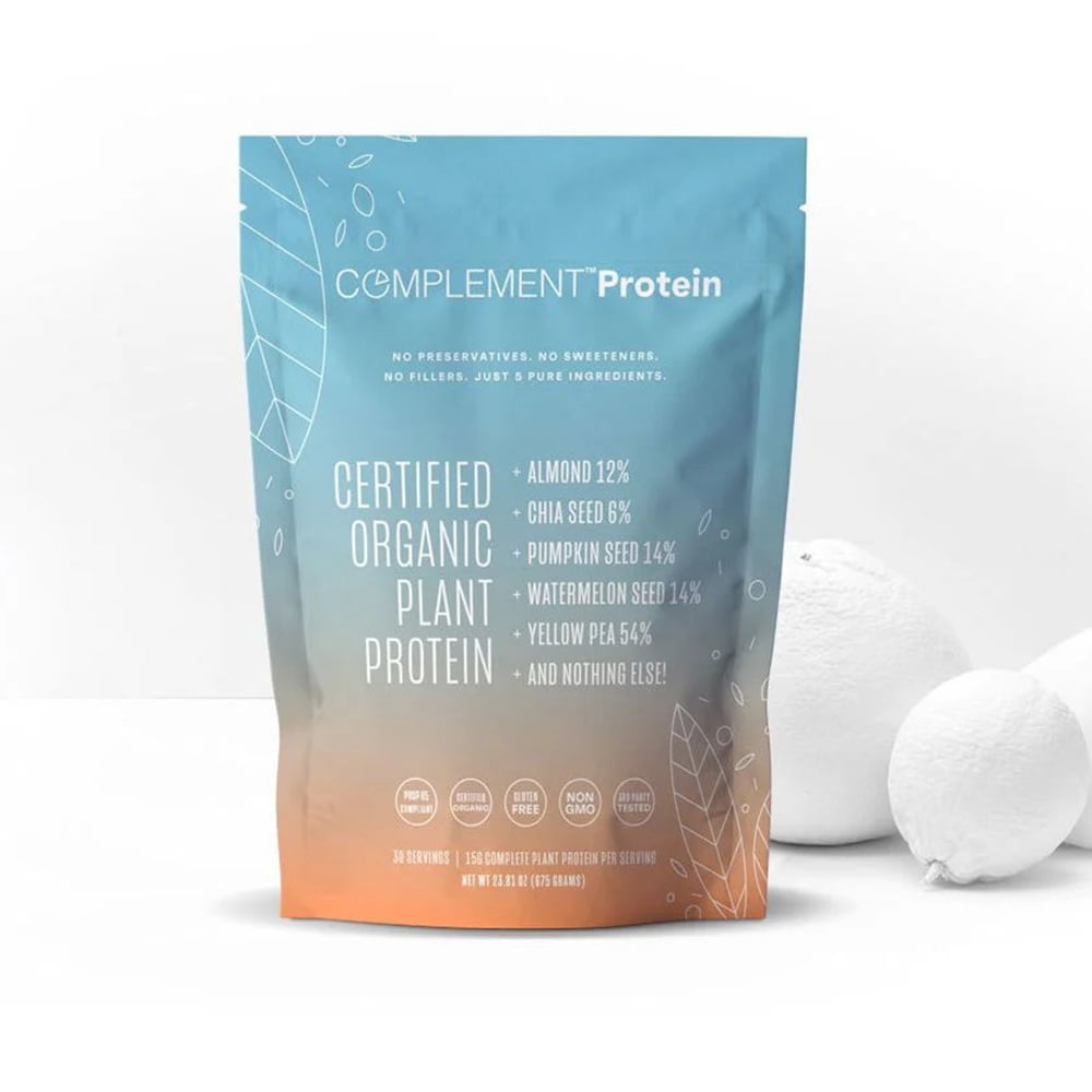

2. Complement
Complement Protein is a plant-based, organic brand that offers capsules, powders, snacks, dps, and more similar types of wellness products. The flexible, stand-up package has a resealable top for maintaining freshness and allowing easy storage. The source is simple, with an ombre transition from blue to orange, san serif fonts that are easy to read, and minimal graphics that convey the plant-based product messaging.
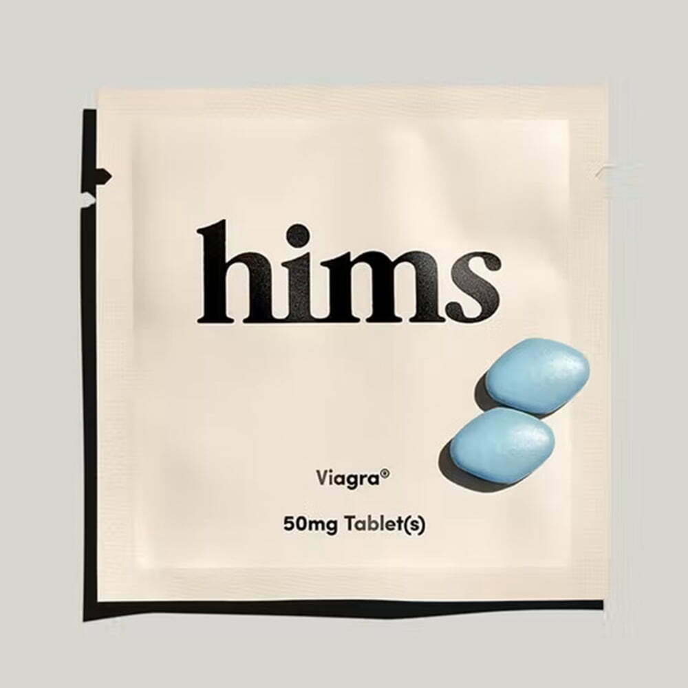

3. hims
As a big market item, hims products are simple, minimal, yet incredibly effective. The brand came in hard and fast, with its own variation of the Viagra pill and other men's and women's wellness and supplement products. Very simple serif font with little to no elements on the package keep it sleek yet subtle. The beige is neutral and natural in shade. The single-use tear package is convenient to allow the consumer to keep a single pack with them for the time when it's needed most.
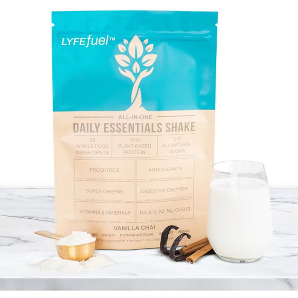

4. Lyfefuel
Lyfefuel offers daily shake and protein powders for consumers in a variety of flavors. Their reseal packages are flexible and stand-up, which is ideal (if not essential) for bulk powder supplements. The color palette runs on a nature-based aesthetic, with a beige tone on the bottom half (earth) and a blue tone on the top half (sky). They incorporate little badges of essential information across the package as well to alert consumers to need-to-know information.
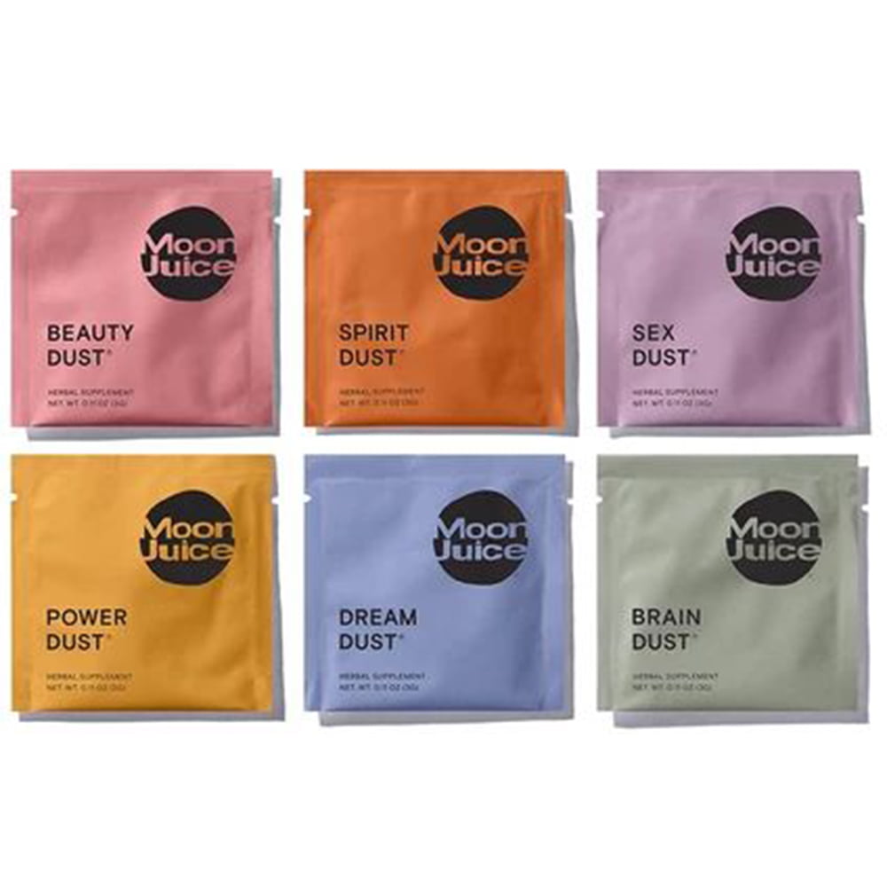

5. Moon Juice
Moon Juice markets off supplement powders for a variety of effects, including sleeping, energizing, calming, libido support, focus and concentration, and more. These small, single-use sachets are perfect for consumers who want a grab-and-go when they have the need come up. The matte colors are sleek and help convey the different protein powders from one another. They're also small and flexible and easy to keep in a purse or desk drawer until needed.
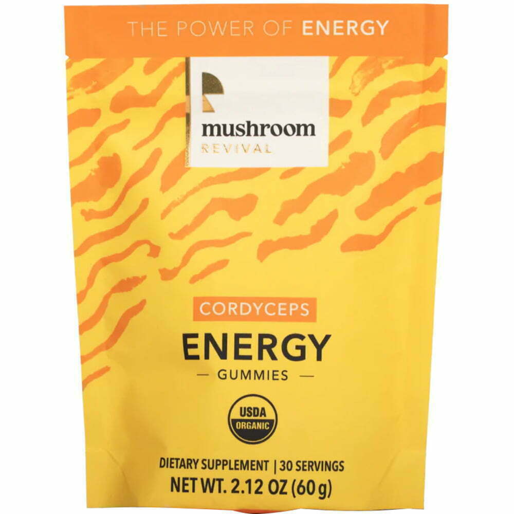

6. Mushroom Revival
Mushroom Revival offers consumers gummies, drops, powders, capsules, and more, all enhanced with mushrooms for various effects. They distinguish their different products with bright, vibrant colors that parallel the effects, as well. The flexible packaging stands up, has a resealable top to preserve the gummies, and has design elements that don’t overwhelm the visual palette.
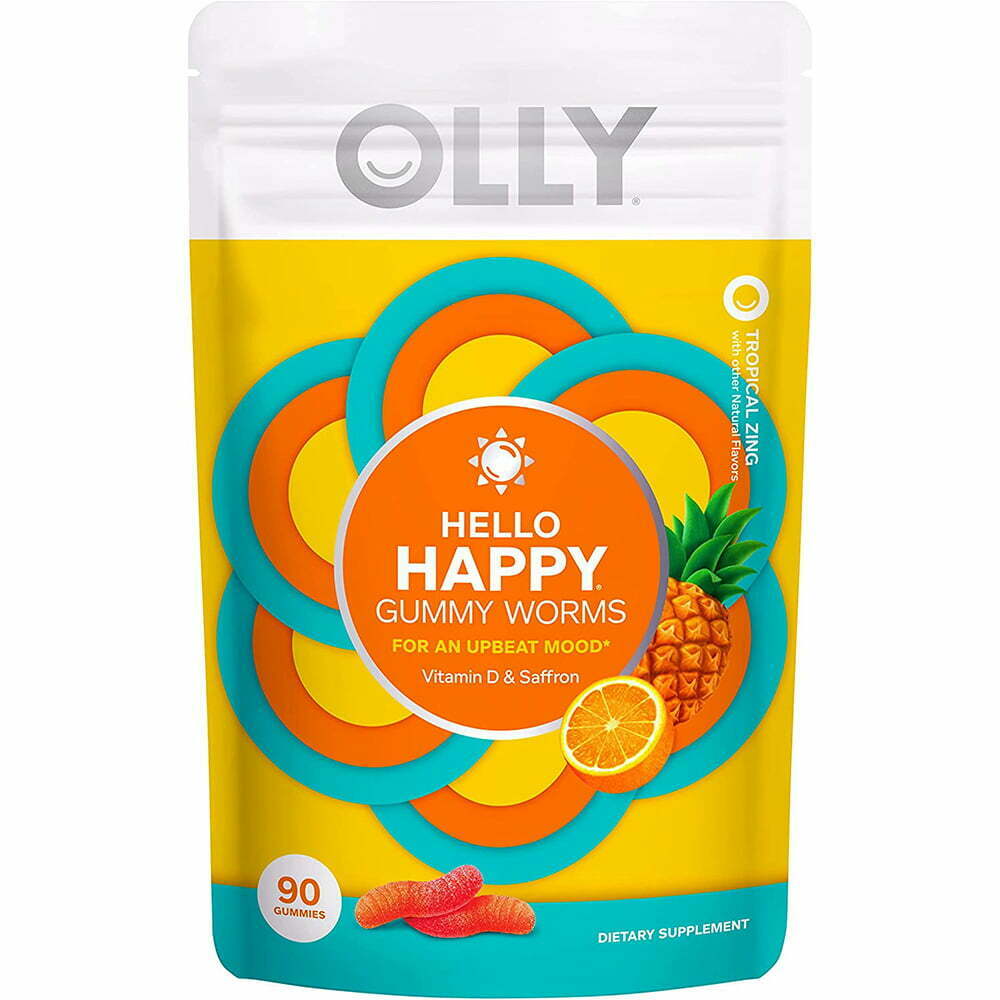

7. Olly
Olly is one of the bigger names in wellness on the web, offering a variety of gummy vitamins and supplements. These are their "Happy Gummy Worms," taking on the form of a treat instead of the traditional block gummy pieces. The Happy gummies are designed to be a natural mood-booster, and the packaging is intended to reflect that with bright colors with positive connotations, like yellow, orange, and teal, for a sunshine combo. The packaging is also flexible and seals shut to preserve the remaining treats.
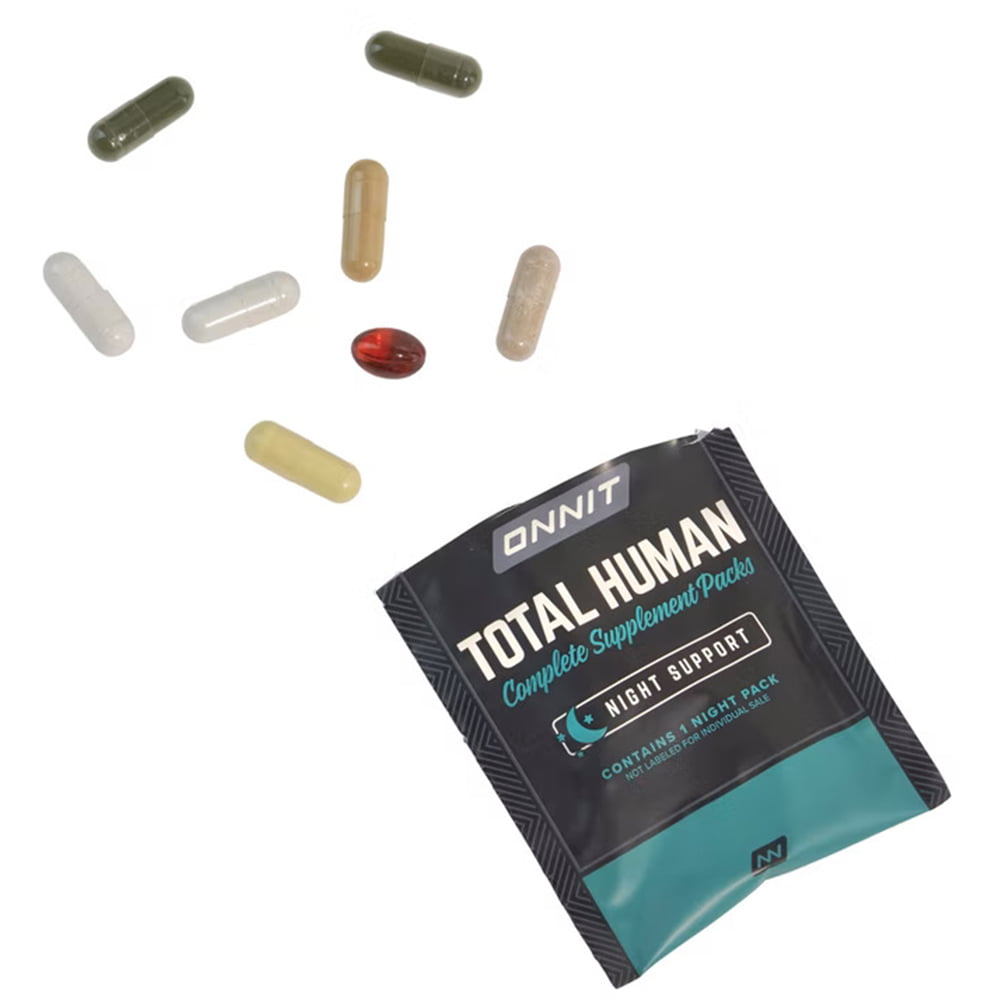

8. Onnit
Onnit doesn't have the most attractive packaging, but it gets the job done. Their daily sachets for single-serve vitamins make it easy for consumers to take their daily vitamins without needing to count out vitamins or keep dozens of pill containers in their cupboard. The brown earth tones give a message that reads natural and healthy. The easy-tear top is also convenient.
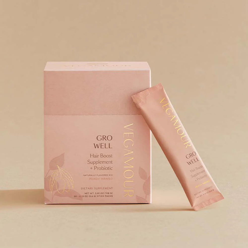

9. Vegamour
Vegamour’s effective packagings are as elegant as can be. The whole aesthetic feels glamorous, rich, and visually pleasing, with a neutral color palette in shades of tan, pink, and orange that pair well with their signature gold lettering. The individual sachets are ideal for grab-and-go usage and convenient to keep on hand for whenever one wants to enjoy the powder in a beverage. Their supplement label design and typography is clean, sharp and elegant at the forefront of their dietary supplement packaging.
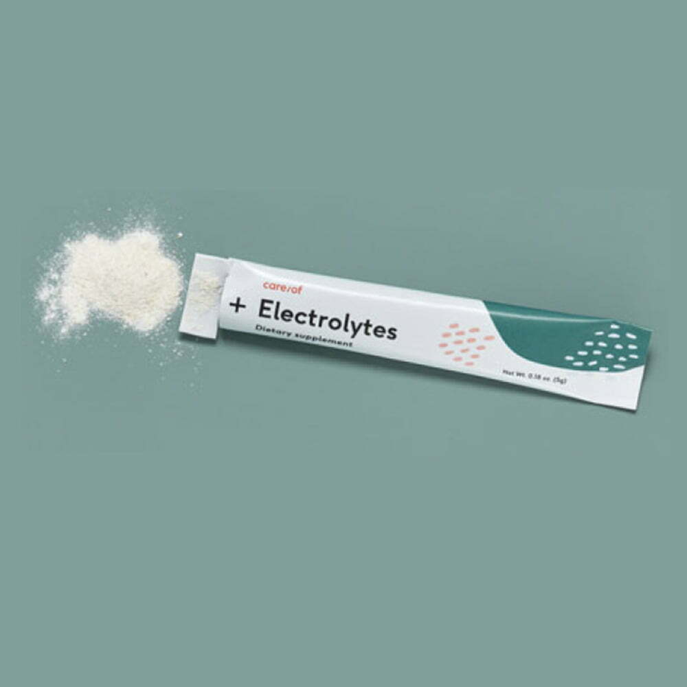

10. Care Of
Care Of sells a line of products, including their best seller, which is the personalized daily vitamins, name-stamped for individualism and all. Their packages are all artsy with abstract minimalism, and most are sold as single-packs, like their powder supplements. The clean, refreshing, and simple product label design is aesthetically pleasing, and the packs are easy to keep on hand.
Health supplement packaging and wellness products have increasing market trends as consumers look for award winning products on the market. Catch their eye on the shelves with packaging that is clean, refreshing, and convenient. Care Pac offers a variety of pouches, sachets, and packs that are perfect for daily vitamins, powder supplements, single-use vitamins, and more. Check out their product line to figure out the right packaging for your small business.
Tags

